Plotting Timeseries Data in Matplotlib
Plotting time series data in Matplotlib can be a bit tricky, especially when it comes to making your tick labels look clean and readable. Customizing tick locators and formatters helps you get those labels just right, whether you're dealing with dates or times. In this post, we’ll cover how to use Matplotlib’s Locator and Formatter classes to tweak your time-based ticks. From handling different date ranges to formatting labels in a way that makes sense for your data, we’ll walk through some useful tricks. Let’s jump in and make those time series plots a little easier to read!
Years, Months, Days
from pandas import DataFrame, date_range
from numpy.random import default_rng

rng = default_rng(0)

df = DataFrame(
    index=(idx := date_range('2000', '2004', freq='D')),
    data={
        'A': 10_000 + rng.normal(1, .01, size=idx.size).cumprod(),
        'B': 10_000 + rng.normal(1, .01, size=idx.size).cumprod(),
    }
)

df.head()| A | B | |
|---|---|---|
| 2000-01-01 | 10001.001257 | 10001.016768 |
| 2000-01-02 | 10000.999935 | 10001.007860 |
| 2000-01-03 | 10001.006338 | 10001.020082 |
| 2000-01-04 | 10001.007394 | 10001.012434 |
| 2000-01-05 | 10001.001998 | 10000.989487 |
%matplotlib agg

from matplotlib.pyplot import rc
rc('font', size=16)
rc('figure', facecolor='white', figsize=(10, 4))
from matplotlib.pyplot import subplots
fig, ax = subplots()
ax.plot(df.index, df['A'])
ax.plot(df.index, df['B'])
display(fig)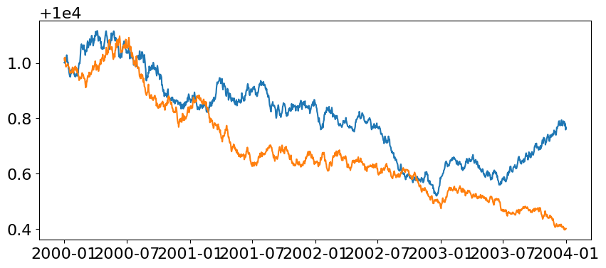
Background: Locators & Formatters
In Matplotlib, Locators and Formatters work together to control how the ticks (the markers along the axes) are positioned and labeled in a plot.
Numeric Locators & Formatters
A Locator determines where the ticks should appear on the plot. There are different types of locators depending on the type of data you're working with:
FixedLocator: Places at specific, predefined positions. You provide it with an explicit list of positions, and it will only place ticks at those points, regardless of the data range. This is useful when you know exactly where you want ticks to appear and don't need them to adjust dynamically.
MaxNLocator: Designed to place a maximum number of evenly spaced ticks on the axis, without overlapping or cluttering the labels. You can specify the maximum number of ticks, and Matplotlib will adjust the spacing to fit within that limit.
MultipleLocator: Places ticks at regular intervals, which you define. For example, if you want ticks every 5 units along the x-axis, you can use this locator. This is especially useful for numeric data when you want consistent intervals between ticks.
AutoLocator: Tries to find an optimal balance between tick density and readability by automatically selecting tick positions based on the data range and the size of the plot. It takes into account the amount of space available and adjusts the tick intervals accordingly. If you don’t specify any locator, Matplotlib will use AutoLocator by default.
A Formatter Is responsible for how the ticks are labeled, i.e., the text that appears at each tick mark. Formatters convert the tick values (such as dates or numbers) into strings that are displayed on the plot. While you have many formatters to choose from, my favorite are:
NullFormatter: Places no labels on the plot, whatsoever.
FuncFormatter: Calls a function on each tick value to produce a label. This is the most flexible formatter allowing one to specify near arbitrary behavior, and is the formatter I reach for in many of my charts.
Date Locators & Formatters
When working with timeseries data, we are often working with an abstraction on top of numeric values. This means that our typical locators and formatters do not carry much meaning when they encounter datetime/date-like values. Instead, we can reach into matplotlib.dates for some specialized locators and formatters.
AutoDateLocator: This locator automatically selects the most appropriate time intervals for the ticks based on the date range.
YearLocator: Places ticks at regular intervals of one or more years. You can specify how many years between each tick.
MonthLocator: Places ticks at specific months. You can define whether you want ticks every month or at intervals like every third or sixth month.
DayLocator: Places ticks at day intervals. It is useful when working with short time ranges where individual days matter.
HourLocator / MinuteLocator / SecondLocator These locators place ticks at hourly, minute, or second intervals, respectively. They’re useful when you’re dealing with high-frequency time data, like sensor readings or logs.
Date formatters determine how the tick labels are displayed. For example, you may want to format dates as "Jan 2020" or "2020-01-01", depending on the context of your plot.
DateFormatter: Allows you to specify the exact format for date tick labels using Python’s date formatting syntax (the same as in datetime.strftime).
ConciseDateFormatter: Automatically reduces the verbosity of tick labels to make them more concise, especially when dealing with long time ranges. For example, it might display years only once and then show just months or days after that.
Locators and Formatters are applied at the Axes where each individual Axis (x/y-axis) will have their own independent locators and formatters.
fig, ax = subplots()
# ... some plotting code

# specify a locator & formatter for the a-axis
ax.xaxis.set_major_locator(FixedLocator([1, 2, 3])) # set tick positions
ax.xaxis.set_major_formatter(NullFormatter())       # remove tick labels
AutoDateLocator & DateFormatter
Using AutoDateLocator and DateFormatter: We introduce Matplotlib’s AutoDateLocator and DateFormatter to improve the formatting of the tick labels. AutoDateLocator automatically chooses the tick positions based on the date range, and DateFormatter('%b\n%Y') formats the tick labels to show the month and year on separate lines. This results in more readable ticks but can still lead to redundancy (e.g., repeating the same year for consecutive months).
from matplotlib.dates import AutoDateLocator, DateFormatter

locator = AutoDateLocator()
ax.xaxis.set_major_formatter(DateFormatter('%b\n%Y'))
display(fig)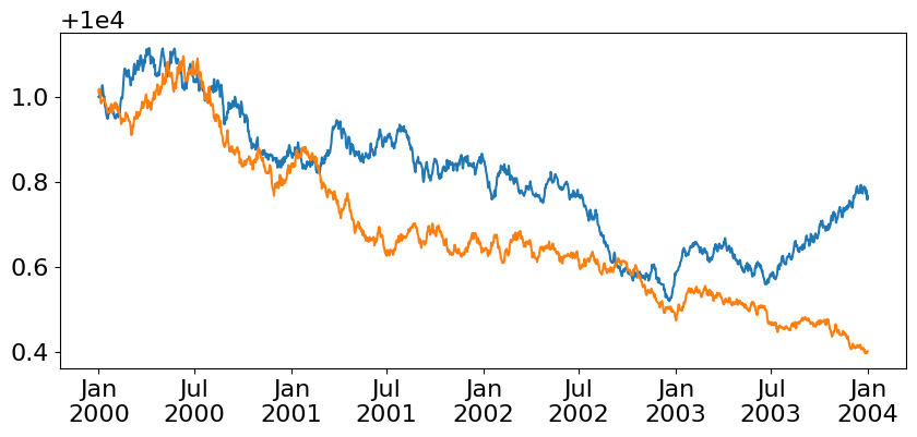
Flexible FuncFormatter
To address this redundancy, a custom formatter function is created. It checks whether the current tick label should include the year by keeping track of the last seen year. If the year has changed, it formats the label with both month and year ('%b\n%Y'). Otherwise, it only shows the month ('%b'), reducing visual clutter. This custom approach ensures the year is only shown once, when necessary. We can pass a function to our ax.xaxis.set_major_formatter, and thankfully Matplotlib is intelligent enough to register it appropriately as a FuncTickFormatter with out us needing to explicitly pass it in as one.
In this example we'll use a closure to track the state of all previously encountered tick values so that we can identify if the currently evaluated tick has a year that is different (or the same) than the previously encountered tick.
from matplotlib.dates import num2date

def custom():
    seen = []
    def _inner(value, pos):
        cur = num2date(value)
        if not seen or seen[-1].year != cur.year:
            label = f'{cur:%b\n%Y}'
        else:
            label = f'{cur:%b}'
        seen.append(cur)
        return label
    return _inner

ax.xaxis.set_major_formatter(custom())
display(fig)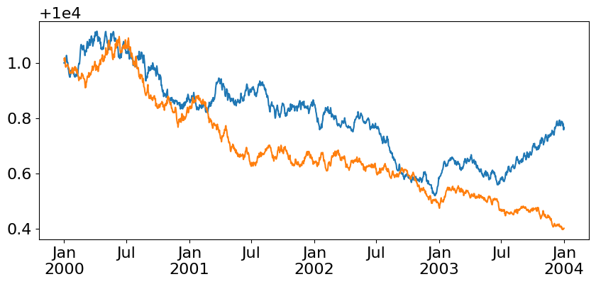
Given the above closure pattern, we can accomplish the same result through the use of a Python Generator. This is mainly for fun and doesn't necessarily provide any benefits to your plotting code.
from matplotlib.dates import num2date

def custom():
    seen = []
    seen.append(num2date((yield)))
    while True:
        if len(seen) <= 1 or seen[-2].year != seen[-1].year:
            label = f'{seen[-1]:%b\n%Y}'
        else:
            label = f'{seen[-1]:%b}'
        seen.append(num2date((yield label)))

formatter = custom()
next(formatter)
ax.xaxis.set_major_formatter(lambda value, pos: formatter.send(value))
display(fig)
ConciseDateFormatter
Finally, we switch to Matplotlib's ConciseDateFormatter, which is a built-in class designed to handle the formatting of date ticks in a concise way. It reduces redundancy in tick labels and is ideal for time series plots where long labels might be distracting. We pass an AutoDateLocator to the ConciseDateFormatter, which automatically adjusts the tick positions. By default, the formatter picks appropriate formats for different levels of time (e.g., years, months, days, hours).
from matplotlib.dates import AutoDateLocator, ConciseDateFormatter

locator = AutoDateLocator()
formatter = ConciseDateFormatter(locator)

ax.xaxis.set_major_locator(locator)
ax.xaxis.set_major_formatter(formatter)

display(fig)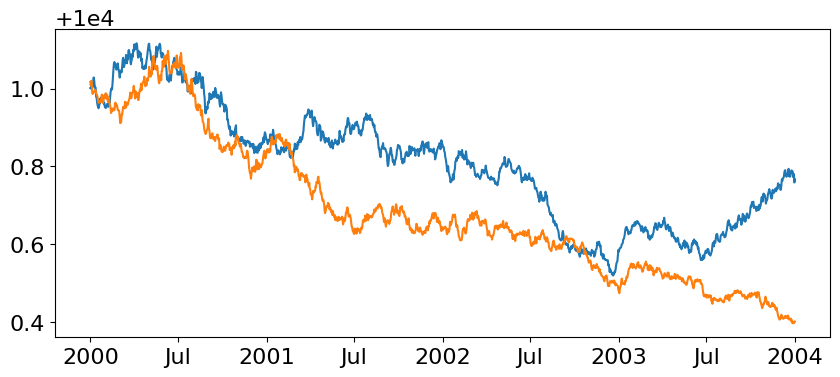
We can even further customize the ConciseDateFormatter by specifying the formats for different time levels. The formats argument takes a list where each entry corresponds to how the formatter should display:
Years '%Y'
Months '%b'
Days '%d'
Hours and minutes '%H:%M'
Seconds '%S.%f'
By customizing these formats, you can tailor the tick labels to match the precision of the data you’re plotting, whether it’s at the year level or down to the second.
locator = AutoDateLocator()
formatter = ConciseDateFormatter(
    locator,
    formats=[    # default precision levels
        '%Y',    # years
        '%b',    # months
        '%d',    # days
        '%H:%M', # hours
        '%H:%M', # minutes
        '%S.%f', # seconds
    ],
)

ax.xaxis.set_major_locator(locator)
ax.xaxis.set_major_formatter(formatter)

display(fig)
locator = AutoDateLocator()
formatter = ConciseDateFormatter(
    locator,
    formats=[     # update the format when we have precision at the Year level
        '%b\n%Y', # years (show month + year)
        '%b',     # months
        '%d',     # days
        '%H:%M',  # hours
        '%H:%M',  # minutes
        '%S.%f',  # seconds
    ],
)

ax.xaxis.set_major_locator(locator)
ax.xaxis.set_major_formatter(formatter)

display(fig)
Wrap Up
And there we have it! In this post, we explored how to customize the placement and formatting of tick labels when plotting time series data in Matplotlib. By using different locators like AutoDateLocator, you can control where ticks appear on the axis to match the scale of your data. Pairing these with formatters such as DateFormatter and ConciseDateFormatter allows you to display date and time labels in a clear, concise way. Whether you're working with years, months, or even seconds, Matplotlib provides flexible tools to fine-tune your plots. The key takeaway is that by combining locators and formatters, you can make complex time series data visually intuitive. Hopefully, these tips make your next plot a little easier to read!
Talk to you all next week.
Want to talk data viz? Matplotlib? Locators and Formatters? Come join the DUTC Discord server and let's chat!