Matplotlib: Arbitrary Precision
It's no secret that matplotlib is one of my favorite tools in Python (sorry, pandas, I promise you're a close second). But, I'm not sure if I've shared why I think matplotlib is such a great tool. I don't love it because of its redundant APIs or simply because I'm familiar with it, I think matplotlib is a great tool because it has near-infinite flexibility. I refer to this as "arbitrary precision" as you can be as precise or imprecise as you want.
Want to put a Polygon in some arbitrary location?
Want to create numerous plots from various sources of non-tabular data?
Want to place some text exactly where you want to?
Matplotlib has you covered in all of these cases.
I've been thinking about this idea because of a recent Stack Overflow question I answered, wherein a user wanted to place their x & y labels in a location that made sense to them. They wanted to only plot the end points of their x & y limits and insert the x/y labels between those limits.
Their MRE code looked like this:
from matplotlib.pyplot import rc
from IPython.display import display

rc('figure', facecolor='white', dpi=110)
rc('font', size=16)
rc('axes.spines', top=False, right=False)
from matplotlib.pyplot import subplots
fig, ax = subplots(figsize=(3, 3))
ax.plot([0,1], [1000, 1001])
ax.set_xticks([0, 1])
ax.set_yticks([1000, 1001])
ax.set_xlabel("x", labelpad=-8)
ax.set_ylabel("y", labelpad=-18)Text(0, 0.5, 'y')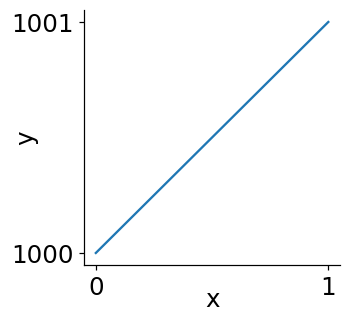
Essentially, they wanted x to be top aligned between 0 & 1 and y to be right aligned between 1000 and 1001. While this approach adds an arbitrary amount of labelpad until we get the text in just the right spot, this is not the type of arbitrary-ness that I love in matplotlib.
This user wanted to find a programmatic way of aligning those x/y labels with their corresponding ticklabels, which we can do by taking advantage of matplotlib's transforms.
My approach to this problem went as follows:
The easy part of this problem is the centering of the labels—the x/y labels are centered (50%) along their respective axis.
The tricky part is that, once the label is centered along its axis, we then need to figure out how far away the label should be moved from the axis so it aligns with the ticklabels.
To answer this question, we need to investigate how ticklabels are added. Of course, you could dive into the code, or you could play around with it yourself:
import matplotlib.pyplot as plt

fig, ax = plt.subplots(figsize=(3, 3))

ax.plot([0,1], [1000, 1001])
ax.set_xticks([0, 1])
ax.set_yticks([1000, 1001])

# increase xtick length to 10 AND
# set tick pad (space between tick and label) to 30
ax.xaxis.set_tick_params(length=20, pad=23)

ax.set_title('Long XTicks + Extra Pad', y=1.05)
Text(0.5, 1.05, 'Long XTicks + Extra Pad')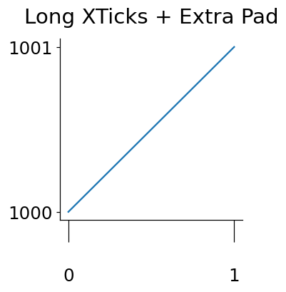
From a little experimentation with the parameters {x,y}axis.set_tick_params exposed, I was able to deduce that the distance of the ticklabel from the plot is simply the length of the label tick + some padding.
So if we can extract those values, we should be able to place our x/y-axis where we want!
Leveraging Transforms
With just a small amount of digging, I was able to find that the length of the major ticks and their padding can be obtained via the following methods:
# tick length                 # tick padding
print(
    f'{ax.xaxis.get_tick_padding()      = }', # length=20!
    f'{ax.xaxis.majorTicks[0].get_pad() = }', # pad=23!
    sep='\n',
)
ax.xaxis.get_tick_padding() = 20.0
ax.xaxis.majorTicks[0].get_pad() = 23From here, we use a transform to center-align our x/y labels against the parent Axes. We then wrap that transform in an offset_copy to move that label away from its respective axis by the same amount that the ticklabels are.
import matplotlib.pyplot as plt
from matplotlib.transforms import offset_copy

fig, ax = plt.subplots(figsize=(3, 3))

ax.plot([0,1], [1000, 1001])
ax.set_xticks([0, 1])
ax.set_yticks([1000, 1001])

# Create a transform that vertically offsets the label
#   starting at the edge of the Axes and moving downwards
#   according to the total length of the bounding box of a major tick
t = offset_copy(
    ax.transAxes, y=-(ax.xaxis.get_tick_padding() + ax.xaxis.majorTicks[0].get_pad()),
    fig=fig, units='points'
)
ax.xaxis.set_label_coords(.5, 0, transform=t)
ax.set_xlabel('x', va='top')

# Repeat the above, but on the y-axis
t = offset_copy(
    ax.transAxes,
    x=-(ax.yaxis.get_tick_padding() + ax.yaxis.majorTicks[0].get_pad()),
    fig=fig, units='points'
)
ax.yaxis.set_label_coords(0, .5, transform=t)
ax.set_ylabel('y', va='bottom')
Text(0, 0.5, 'y')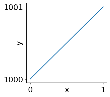
Change DPI & Tick Lengths/Pad
Now we need one final test with an altered DPI to magnify our result and really determine if we got this right.
import matplotlib.pyplot as plt
from matplotlib.transforms import offset_copy

fig, ax = plt.subplots(figsize=(3, 3), dpi=150)

ax.plot([0,1], [1000, 1001])
ax.set_xticks([0, 1])
ax.set_yticks([1000, 1001])
ax.xaxis.set_tick_params(length=10, pad=10)
ax.yaxis.set_tick_params(length=15, pad=20)

t = offset_copy(
    ax.transAxes,
    y=-(ax.xaxis.get_tick_padding() + ax.xaxis.majorTicks[0].get_pad()),
    fig=fig, units='points'
)
ax.xaxis.set_label_coords(.5, 0, transform=t)
ax.set_xlabel('x', va='top')

# Repeat the above, but on the y-axis
t = offset_copy(
    ax.transAxes,
    x=-(ax.yaxis.get_tick_padding() + ax.yaxis.majorTicks[0].get_pad()),
    fig=fig, units='points'
)
ax.yaxis.set_label_coords(0, .5, transform=t)
ax.set_ylabel('y', va='bottom')
Text(0, 0.5, 'y')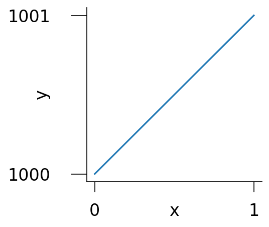
Wrap Up
The above illustrates why I love matplotlib! Want to place your x & y labels in line with the ticklabels? Matplotlib can do that, and much, much more.
Nothing is impossible and, with just a little digging, you can make these very arbitrary adjustments to your plot.
Hope you all enjoyed this post. Talk to you next week!