Dealing With Dates in pandas - Part 3
Welcome back, everyone!
In my previous post, we discussed how we can work effectively with datetimes in pandas, including how to parse datetimes, query our dataframe based on datetimes, and perform datetime-aware index alignment. This week, we'll be exploring one final introductory feature for working with datetimes in pandas.
Resampling Data on Datetimes
The ability to resample datetime-aware data is incredibly powerful in pandas. If you're not familiar with the concept, here's a quick tour.
When resampling, we have two choices:
upsampling - create more data, usually based on some interpolation approach
downsampling - create less data, usually from some aggregation method
In pandas, we can choose to either upsample or downsample our data according to some recurrence rules using the .resample method.
Let's go ahead and construct some sample data to work with!
Downsampling
from pandas import Series, to_datetime, to_timedelta
from numpy.random import default_rng

rng = default_rng(0)

s = Series(
    100 * rng.normal(1, scale=.001, size=(size := 5_000)).cumprod() + rng.normal(0, 1, size=size),
    index=(
        to_datetime('2023-02-15')
        + to_timedelta(rng.integers(100, 1_000, size=size).cumsum(), unit='s')
    )
)

s
2023-02-15 00:04:32 99.832599
2023-02-15 00:14:17 101.808084
2023-02-15 00:25:55 100.408377
2023-02-15 00:33:08 99.377474
2023-02-15 00:41:32 100.497132
...
2023-03-18 19:32:49 99.182457
2023-03-18 19:48:59 97.360439
2023-03-18 20:01:38 97.320022
2023-03-18 20:10:43 96.435843
2023-03-18 20:16:58 98.548733
Length: 5000, dtype: float64That's a lot of data points! Thankfully, we can use the .resample method to downsample and aggregate these datapoints into something that we can inspect. Let's go ahead and downsample this data to every 7 days:
# can only use resample with a recurrence rule if the `Series` has a DatetimeIndex

s.resample('7D').mean()
2023-02-15 98.525649
2023-02-22 96.258934
2023-03-01 92.028368
2023-03-08 93.536134
2023-03-15 96.601203
Freq: 7D, dtype: float64Upsampling
From these values, we start to see a trend of values that start high in February, dip at the beginning of March, and increase again towards the middle of March.
While downsampling is useful for aggregating data (say we wanted to examine each month independently), we can also choose to upsample our data. This is typically done to align one timeseries against an external one so that they have data points all on the same frequency.
Let's go ahead and upsample to the minute frequency:
s.resample('min').mean()2023-02-15 00:04:00 99.832599
2023-02-15 00:05:00 NaN
2023-02-15 00:06:00 NaN
2023-02-15 00:07:00 NaN
2023-02-15 00:08:00 NaN
...
2023-03-18 20:12:00 NaN
2023-03-18 20:13:00 NaN
2023-03-18 20:14:00 NaN
2023-03-18 20:15:00 NaN
2023-03-18 20:16:00 98.548733
Freq: min, Length: 45853, dtype: float64But wait! There are so many NaNs in my output. That is because when we upsample, we can only generate datapoints where we have data. In this example, we're aligning our data into 1-minute wide bins and performing an aggregation such that we end up with a single value per bin. There are, however, many 1-minute wide bins that do not have any data! In that case, we receive a NaN result for those time points.
Thankfully, pandas has many options to choose from to help us fill in the NaNs to complete our upsampling.
Interpolation
Let's create a graphic to enumerate these options:
from matplotlib.pyplot import subplot_mosaic
from matplotlib.dates import ConciseDateFormatter, AutoDateLocator
from numpy import nan, where
from pandas import date_range
from flexitext import flexitext
from textwrap import dedent

sparse_s = Series(
    data=[1, nan, 10, nan, 7, nan, 4],
    index=to_datetime([
        '2020-02-01', '2020-02-02', '2020-02-03', '2020-02-04',
        # note that we jump forward by 3 days here!
        '2020-02-10', '2020-02-11', '2020-02-12'], format='%Y-%m-%d')
)

links = {
    'observed': lambda s: s,
    'ffill':      lambda s: s.ffill(),
    'linear':   lambda s: s.interpolate(method='linear'),
    'cubic':    lambda s: s.interpolate(method='cubic'),
    'time':     lambda s: s.interpolate(method='time'),
}

mosaic = [
    ['ffill', 'linear'],
    ['cubic', 'time'],
]
fig, axd = subplot_mosaic(
    mosaic, figsize=(12, 4), sharex=True, sharey=True,
    gridspec_kw={'right': .8, 'left': .1, 'top': .85, 'hspace': .4}
)

for title in axd.keys():
    method, ax = links[title], axd[title]

    interpolated = sparse_s.pipe(method)
    ax.plot(interpolated.index, interpolated, label='interpolated')
    ax.scatter(
        interpolated.index, interpolated,
        c=where(sparse_s.notna(), 'tab:blue', 'tab:orange'),
        zorder=4, s=80, clip_on=False,
    )

    ax.set_title(title, loc='left', size='large')
    locator = AutoDateLocator()
    ax.xaxis.set_major_locator(locator)
    ax.xaxis.set_major_formatter(ConciseDateFormatter(locator))
    ax.margins(y=.1)


annotbbox = flexitext(
    s=(
        '<size:x-large>Pandas Interpolation Methods</>'
        ' <size:large><color:tab:blue,weight:bold>observed</> and'
        ' <color:tab:orange,weight:bold>interpolated</> values</>'
    ),
    x=0,
    y=1.1,
    va='bottom',
    ha='left',
)

annotbbox.xycoords = annotbbox.anncoords = fig.axes[0]._left_title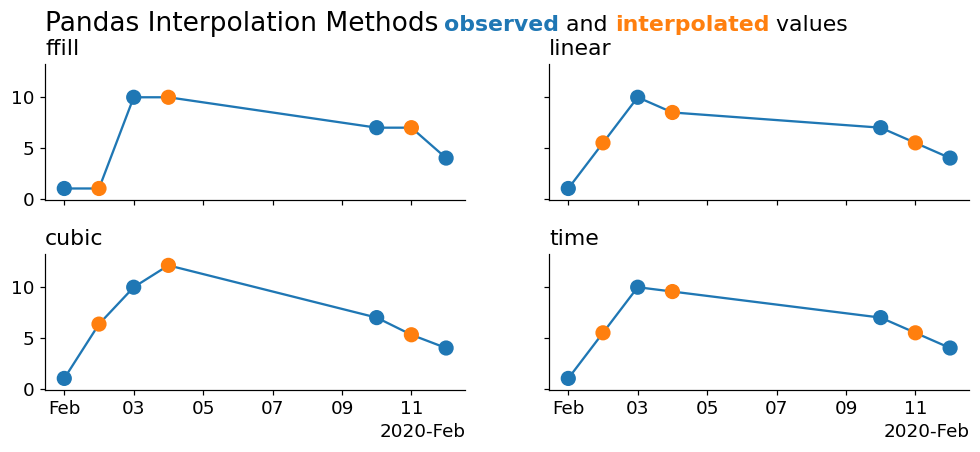
As you can see, the cleanest interpolation is from the 'time' method. This is because none of the above methods are using the information contained in the index to perform the interpolation! We can actually cheat a little bit and downsample our data to a higher fidelity in order to make them appear to interpolate correctly.
Remember that matplotlib is performing a linear interpolation under the hood to draw those lines. Let's alleviate some of that control and rely more on pandas to perform a larger interpolation for us:
from matplotlib.pyplot import subplot_mosaic
from matplotlib.dates import ConciseDateFormatter, AutoDateLocator
from numpy import nan, where
from pandas import date_range
from flexitext import flexitext

sparse_s = Series(
    data=[1, nan, 10, nan, 7, nan, 4],
    index=to_datetime([
        '2020-02-01', '2020-02-02', '2020-02-03', '2020-02-04',
        # note that we jump forward by 3 days here!
        '2020-02-10', '2020-02-11', '2020-02-12'], format='%Y-%m-%d')
)

links = {
    'ffill':      lambda s: s.ffill().ffill(),
    'linear':   lambda s: s.interpolate(method='linear'),
    'cubic':    lambda s: s.interpolate(method='cubic'),
    'time':     lambda s: s.interpolate(method='time'),
}

mosaic = [
    ['ffill', 'linear'],
    ['cubic', 'time'],
]
fig, axd = subplot_mosaic(
    mosaic, figsize=(12, 4), sharex=True, sharey=True,
    gridspec_kw={'right': .8, 'left': .1, 'top': .85, 'hspace': .4}
)

for title in axd.keys():
    method, ax = links[title], axd[title]

    interpolated = sparse_s.resample('min').pipe(method)
    ax.plot(interpolated.index, interpolated, lw=2, color='tab:orange')
    ax.scatter(
        sparse_s.index, sparse_s, color='tab:blue', s=60, zorder=4, clip_on=False
    )

    ax.set_title(title, loc='left', size='large')
    locator = AutoDateLocator()
    ax.xaxis.set_major_locator(locator)
    ax.xaxis.set_major_formatter(ConciseDateFormatter(locator))
    ax.margins(y=.1)


annotbbox = flexitext(
    s=(
        '<size:x-large>Pandas Interpolation Methods</>'
        ' <size:large><color:tab:blue,weight:bold>observed</> and'
        ' <color:tab:orange,weight:bold>interpolated</> values</>'
    ),
    x=0,
    y=1.1,
    va='bottom',
    ha='left',
)

annotbbox.xycoords = annotbbox.anncoords = fig.axes[0]._left_title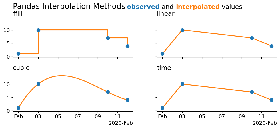
Now we're seeing some cleaner interpolations! Our 'pad' method is simply a forward fill. The cubic draws a cubic spline through the data, and the linear and time interpolations are both linear- with the only difference being that the 'time' method uses information from the index, which is useful as it doesn't require us to manually perform a large downsampling for it to work (which is why this method worked fine in the previous plot).
Wrap Up
That takes us to the end of today's blog post and the final bit of introductory material for working with timeseries in pandas! Hopefully you enjoyed this brief series covering datetimes. I can't wait to talk to you all again next week!