Tufte’s NYC Weather in 2003 In Matplotlib
Edward Tufte is one of the pioneers of modern-day data visualization. In his work, he is brilliantly able to distill core concepts that can then be applied to nearly any form of visual communication. If you aren't familiar with his work and are interested in the topic of data visualization in general, I highly recommend Tufte’s book, “The Visual Display of Quantitative Information”.
Given the era in which they were created, almost all of Tufte's original works are hand drawn, relying on pen and paper. As such, his work is as artistic as it is informational, providing unique visualizations that focus attention and convey meaningful messages.
In this Cameron's Corner, I'd like to focus on his visualization of the weather in New York City over the course of the year 1980.
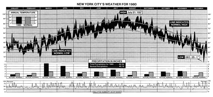
While visually impressive, this single graphic also manages to communicate an abundance of information about how temperature changes across seasons and how 1980 was unique compared to other years.
Tufte revisited this visualization and created the 2003 version of "New York City's Weather in 2003."
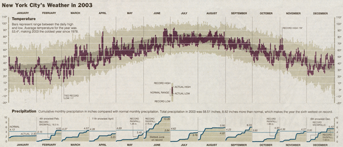
In the more recent version, you can see there is a bit more artistic flair through the use of colors as a highlighting tool as well as the removal of hatching patterns. The precipitation data that was represented as monthly bar charts is now represented as area charts, and the humidity information was completely removed.
Given the high quality of these graphics, I am challenging myself to recreate these works in matplotlib over this week and next. I often tout that matplotlib is a drawing tool that enables one to place completely arbitrary decorations and annotations to create complex data visualizations, but does it stand up against the high quality productions that Edward Tufte creates? Let's find out.
Finding Historical Weather Data
Step 1 to recreate Tufte's “New York City's Weather in 2003” is finding a comparative data set. While I do not know the exact source Tufte used, I was able to find a government website that provided csv data with daily observations spanning back to the 1800s! Unfortunately, I found this source after I had written a script that scraped 365 queries for the 2003 calendar year from a different website, but here we are.
To download the data, I used the following:
from pandas import read_csv

dtype={
    'station': 'category',
    'date': 'string', # later converted to datetime,
    'measurement': 'category',
    'value': 'int',
    'm_flag': 'category',
    'q_flag': 'category',
    's_flag': 'category',
    'obs_time': 'string',
}

nyc_weather = (
    read_csv(
        "https://www.ncei.noaa.gov/pub/data/ghcn/daily/by_station/USW00014732.csv.gz",
        header=None, names=dtype.keys(), usecols=[*range(len(dtype))],
        parse_dates=['date'], infer_datetime_format=True,
        dtype=dtype
    )
)

nyc_weather.to_parquet('data/NYC_weather.parquet')
While the volume of data isn't too large (30k+ rows), I decided to use the parquet file format which is columnar oriented, maintains accurate dtype information (meaning I won't need to re-parse my dates or categoricals), and is faster than reading in a .csv file.
I often see debates about speed differences between .csv vs .parquet, but I find that, since I don't work with enormous volumes of data, the preservation of column data types is far more motivating than the speed of reading data.
Data Pre-Processing
Now that we have our data downloaded and stored locally, we can have a much tighter iteration loop with our work since I won't need to re-download the data set. However, there are a few cleaning steps that I will need to carry out on this data set first:
Remove rows with poor quality values (specified by the 'q_flag' and 'm_flag' columns).
Filter data down to the necessary measurement types. This data contains measurements such as wind speed, wind direction, and much more. For this viz, I will only need precipitation, maximum daily temperature, and minimum daily temperature.
Convert temperature units to degrees Fahrenheit (from 1/10th degrees Celsius) and convert precipitation from 10s of millimeters to inches. I do hope that someone in the weather community can one day explain to me the choice of these original units as I found them to be quite bizarre.
Derive cumulative monthly precipitation, historical ranges, and historical averages to add as contextual elements to our visualization.
Once I accomplish these steps, we will be ready to create our visualization!
Filter & Convert units
from IPython.display import display, Markdown
from pandas import read_parquet

nyc_historical = (
    read_parquet(
        'data/NYC_weather.parquet',
        columns=['date', 'measurement', 'value', 'm_flag', 'q_flag'],
    )
    .loc[lambda df:
         ~df['q_flag'].isin(['I', 'W', 'X'])
         & df['m_flag'].isna()
         & df['measurement'].isin(['PRCP', 'TMAX', 'TMIN', 'SNOW'])
    ]
    .pivot(index='date', columns='measurement', values='value')
    .eval('''
        TMAX = 9/5 * (TMAX/10) + 32
        TMIN = 9/5 * (TMIN/10) + 32
        PRCP = PRCP / 10 / 25.4
        SNOW = SNOW / 25.4
    ''')
    .rename(columns={               # units post-conversion
        'TMAX': 'temperature_max',  # farenheit
        'TMIN': 'temperature_min',  # farenheit
        'PRCP': 'precipitation',    # inches
        'SNOW': 'snowfall'          # inches
    })
    .rename_axis(columns=None)
    .sort_index()
)

nyc_2003 = nyc_historical.loc['2003'].copy()

display(
    nyc_2003.head(3),
    Markdown('...'),
    nyc_2003.tail(3),
    Markdown(f'{len(nyc_2003)} rows')
)| precipitation | snowfall | temperature_max | temperature_min | |
|---|---|---|---|---|
| date | ||||
| 2003-01-01 | 1.098425 | 0.000000 | 50.00 | 37.04 |
| 2003-01-02 | 0.039370 | NaN | 39.02 | 30.02 |
| 2003-01-03 | 0.299213 | 0.393701 | 35.06 | 30.02 |
...
| precipitation | snowfall | temperature_max | temperature_min | |
|---|---|---|---|---|
| date | ||||
| 2003-12-29 | 0.0 | 0.0 | 55.04 | 37.04 |
| 2003-12-30 | NaN | 0.0 | 53.06 | 41.00 |
| 2003-12-31 | 0.0 | 0.0 | 46.94 | 37.94 |
365 rows
Historical Elements
I'll need daily historical averages and ranges for this viz. Thankfully, this is a quick .groupby operation, grouping on the day of year that is contained within our index.
from pandas import to_datetime, to_timedelta

historical_range = (
    nyc_historical.groupby(nyc_historical.index.dayofyear)
    .agg(
        historical_min=('temperature_min', 'min'),
        historical_max=('temperature_max', 'max'),
        normal_min=('temperature_min', 'mean'),
        normal_max=('temperature_max', 'mean'),
    )
)

historical_range.head()| historical_min | historical_max | normal_min | normal_max | |
|---|---|---|---|---|
| date | ||||
| 1 | 8.24 | 60.08 | 29.938571 | 41.315000 |
| 2 | 8.96 | 60.08 | 29.197143 | 40.871429 |
| 3 | 10.22 | 62.96 | 29.930000 | 39.881429 |
| 4 | 3.92 | 66.02 | 29.252857 | 40.625000 |
| 5 | 8.96 | 64.04 | 28.250000 | 39.410000 |
Combine Data
Since I will be plotting this data onto a set of shared (time-based) x-axes, it will be to my benefit to first manually align all of my data. This will make accessing any specific observation straightforward and allow me to work seamlessly with pandas and matplotlib. We'll also quickly derive our cumulative monthly precipitation and add that as a feature to our data set.
historical_align_index = (
    to_datetime('2002-12-31') + to_timedelta(historical_range.index, unit='D')
)

plot_data = (
    nyc_2003.join(historical_range.set_index(historical_align_index))
    .assign(
        monthly_cumul_precip=lambda d:
            d.fillna({'precipitation': 0})
            .resample('MS')['precipitation']
            .cumsum()
   )
)

plot_data.head()| precipitation | snowfall | temperature_max | temperature_min | historical_min | historical_max | normal_min | normal_max | monthly_cumul_precip | |
|---|---|---|---|---|---|---|---|---|---|
| date | |||||||||
| 2003-01-01 | 1.098425 | 0.000000 | 50.00 | 37.04 | 8.24 | 60.08 | 29.938571 | 41.315000 | 1.098425 |
| 2003-01-02 | 0.039370 | NaN | 39.02 | 30.02 | 8.96 | 60.08 | 29.197143 | 40.871429 | 1.137795 |
| 2003-01-03 | 0.299213 | 0.393701 | 35.06 | 30.02 | 10.22 | 62.96 | 29.930000 | 39.881429 | 1.437008 |
| 2003-01-04 | 0.031496 | NaN | 35.96 | 32.00 | 3.92 | 66.02 | 29.252857 | 40.625000 | 1.468504 |
| 2003-01-05 | 0.051181 | 0.393701 | 35.06 | 33.08 | 8.96 | 64.04 | 28.250000 | 39.410000 | 1.519685 |
Recreating the Tufte
Whew! Preparing that data required a fair bit of code (though, to be fair, locating the data was much harder than cleaning it). Now we can get started with our visualization!
When creating high-touch visualizations, I prefer to get my "canvas" started by laying out all of the Axes that I will be plotting on and configuring them so they appear how I want before adding my data layers to the plot.
In the below code, I use a mix of global parameters alongside some local options. I won't try to explain all the ins and out of the matplotlib code here. Instead, I will heavily comment the code so that you can follow along if you aren't very familiar with matplotlib!
Choosing The Defaults
Selecting defaults in matplotlib is always an interesting procedure. There are many places to set options in:
create your own .style file
setting rcParams within the script (as seen below)
setting parameters locally within method calls
When creating visualizations, I often reach for a combination of options 2 & 3. The typical options I'll set are the default fontsize as I find a font size of 10 is too small for most graphics, and will bump this up to 14. For most visualizations I create, this is often the only default setting (rcParameter) that I typically change. However since this visual will contain a lot of complexity, I set a few more default options that all Axes will abide by. I try to keep broad/shared options separate from the plotting code as the plotting code itself will be fairly complex without having stylistic options cluttering it.
from matplotlib.pyplot import close
close('all')
from matplotlib.pyplot import figure, GridSpec, rc, rcdefaults, close, setp
from matplotlib.dates import DateFormatter, DayLocator
from matplotlib.ticker import FixedLocator, MultipleLocator
from matplotlib.transforms import blended_transform_factory, offset_copy
# Some colors I grabbed from the original plot. There aren't many as color can
# distract from the overall message being communicated.
palette = {
'background': '#e5e1d8',
'daily_range': '#5f3946',
'record_range': '#c8c0aa',
'normal_range': '#9c9280',
}
# Configure background color, default font size, as well as some tick locations
rcdefaults()
rc('figure', facecolor=palette['background'], dpi=110)
rc('axes', facecolor=palette['background'])
rc('font', size=14)
rc('xtick', bottom=False)
rc(
'ytick', direction='inout', left=True,
right=True, labelleft=True, labelright=True
)
rc('axes.spines', left=True, top=False, right=True, bottom=False)Setting the Canvas
With some defaults out of the way, we are ready to draw! The next thing I'll do is set the canvas, wherein I'll lay out each of the Axes I'll be plotting on and make some tweaks to their appearances. I like to do this separately from adding my data to my plots to keep a conceptual separation of manipulating the appearance of the plot from the underlying data of the plot.
Here I'll creates 2 Axes to draw on, update their minor and major ticks on both Axes, stylistically determine whether those x & y ticks should appear relative to the Axes, create the visual grid that Tufte uses, and finally set x & y limits to fully copy Tufte's original graphic.
If my goal was not to recreate Tufte's original graphic, I would not manually set the x & y limits. As this is a non-repeatable workflow, meaning that if my data changed I would need to manually change these values thus reducing the re-usability of my plotting code if my data change. The topic of viz workflows could encompass a short blogpost all on its own, so I might save further discussion on this topic for the future.
from matplotlib.dates import date2num
from pandas import date_range, Timestamp, Timedelta

fig = figure(dpi=160, figsize=(25, 12))

# 2 Axes in a single column, shared-x, top Axes is 3x the height of the bottom
gs = GridSpec(
    2, 12, height_ratios=[3, 1], hspace=.2,
    top=.9, left=.03, right=.97, bottom=.03
)

temperature_ax = fig.add_subplot(gs[0, :])
precip_ax = fig.add_subplot(gs[1, :])
precip_ax.sharex(temperature_ax)

# Custom Locator to remove Jan-1 so grid does not overlap with left spine
#   since x-axis is shared, x-axis tick locators are also shared
class ExcludeDayLocator(DayLocator):
    def __init__(self, *args, exclude=None, **kwargs):
        super().__init__(*args, **kwargs)
        self.exclude = date2num(exclude)

    def tick_values(self, vmin, vmax):
        values = super().tick_values(vmin, vmax)
        values = [v for v in values if v not in self.exclude]
        return values

# The temperature Axes should have its ticklabels along the top
temperature_ax.xaxis.set_tick_params(labeltop=True, labelbottom=False, pad=10)

# temperature Axes: y-axis tick every multiple of 10
temperature_ax.yaxis.set_major_locator(MultipleLocator(10))
temperature_ax.yaxis.set_major_formatter('{x:g}°')

# Major ticks correspond to middle of each month (used for month labels only)
# Minor ticks correspond to beginning of each month (will have grid lines)
precip_ax.xaxis.set_major_locator(DayLocator(15))
precip_ax.xaxis.set_major_formatter(DateFormatter('%B'))
precip_ax.xaxis.set_minor_locator(
    ExcludeDayLocator(1, exclude=to_datetime(['2003-01-01']))
)

# precipitation Axes: y-axis tick every multiple of 2
precip_ax.yaxis.set_major_locator(MultipleLocator(2))

# Set options for BOTH temperature and precipitation Axes:
for ax in fig.axes:
    ax.spines[['left', 'right']].set_color(palette['normal_range'])
    ax.spines[['left', 'right']].set_lw(3)

    # This is part matplotlib/part dirty w1orkaround to have the ticks appear
    #  on top of the spines.
    ax.spines[['left', 'right']].set_zorder(1)
    # Lines in matplotlib have some extra padding on either end by default.
    #  This removes that padding from the spines
    ax.spines[['left', 'right']].set_capstyle('butt')

    # I want the ticks to appear as transparent breaks in each spine,
    #   so I need to ensure that the tick is the same color as the background
    #   and are longer than the spine is wide.
    length = ax.spines['left'].get_lw() + 1

    # The grid on the y-axis is illusory and will only be apparent when there
    #  is data on the Axes
    ax.yaxis.grid(
        which='major', lw=1, color=palette['background'], ls='-', clip_on=False
    )
    ax.yaxis.set_tick_params(
        length=length, width=2, color=palette['background']
    )

    # A non-illusory vertical grid
    ax.xaxis.grid(
        which='minor', color='gray', linestyle='dotted', linewidth=1, alpha=.8
    )

# Lastly, I copy Tufte's x & y limits for a more identical looking reproduction
temperature_ax.set_ylim(-20, 110)
temperature_ax.yaxis.set_major_locator(MultipleLocator(10))
temperature_ax.yaxis.set_major_formatter('{x:g}°')

precip_ax.set_xlim(nyc_2003.index.min(), nyc_2003.index.max())
precip_ax.set_ylim(0, 10)

# since the temperature and percipitation Axes share an x-axis, changing the
#  limits on one will change the limits on the other.
precip_ax.set_xlim(nyc_2003.index.min(), nyc_2003.index.max())

setp(temperature_ax.get_xticklabels(), weight='bold')
setp(precip_ax.get_xticklabels(), weight='bold')

display(fig)
With the canvas set we are ready to start adding our data and annotations to these plots! Let's focus first on the top Axes where we'll visualize the daily temperature ranges from 2003.
Layer Temperature Data
Before I populate the plot with data, I wanted to discuss how we can simultaneously tackle layering the data as well as the visual legend of Tufte's original plot. These can both be done in a single motion since they represent the same underlying data.
The visual legend is the indicator in the center of Tufte's original plot that zooms in on a single data point and annotates the "Record High/Low", "Actual High/Low", and the "Normal Range". In terms of matplotlib, you can think of this as an exact copy of the larger data set, just zoomed in with a limited xlim.
Since they reflect the same underlying data, I'll create an inset_axes in the center of my temperature_ax, spanning just part of its height. Then, I'll add my temperature data to each of these axes, and, finally, I'll zoom in on the newly created inset_axes to create the final effect.
temperature_legend_ax = temperature_ax.inset_axes([.5, 0, .01, .3])
temperature_legend_ax.set_anchor('SC')
temperature_legend_ax.axis('off')

for ax in [temperature_ax, temperature_legend_ax]:
    ax.bar(
        plot_data.index,
        plot_data['historical_max'] - plot_data['historical_min'],
        bottom=plot_data['historical_min'],
        color=palette['record_range'], edgecolor=palette['record_range'],
    )

    ax.bar(
        plot_data.index,
        plot_data['normal_max'] - plot_data['normal_min'],
        bottom=plot_data['normal_min'],
        color=palette['normal_range'], edgecolor=palette['normal_range'],
    )

    ax.bar(
        plot_data.index,
        height=plot_data['temperature_max'] - plot_data['temperature_min'],
        bottom=plot_data['temperature_min'],
        color=palette['daily_range'], linewidth=0, width=.9,
        zorder=1.1 # daily data should sit on top of grid lines
    )

# limit the `temperature_legend_ax` to just show part of a day of data
legend_date = Timestamp('2003-07-07')
temperature_legend_ax.set_xlim(legend_date, legend_date + Timedelta(1, 'h'))
temperature_legend_ax.set_ylim(50, 100) # zoom in y-axis

display(fig)
Annotate the Temperature Legend
Adding the data to the plot is the easy part! As you can see, annotation is a very verbose process. Thankfully we have extreme precision when placing these onto our axes due to our transforms. This lets me easily determine which matplotlib coordinate system I am placing the annotations onto.
temperature_legend_ax.annotate(
    'RECORD HIGH',
    xy=(0, plot_data.loc[legend_date, 'historical_max']),
    xycoords=temperature_legend_ax.get_yaxis_transform(),
    xytext=(-5, 0),
    textcoords='offset points',
    ha='right', va='center',
)
temperature_legend_ax.annotate(
    'RECORD LOW',
    xy=(0, plot_data.loc[legend_date, 'historical_min']),
    xycoords=temperature_legend_ax.get_yaxis_transform(),
    xytext=(-5, 0),
    textcoords='offset points',
    ha='right', va='center',
)
temperature_legend_ax.annotate(
    'ACTUAL HIGH',
    xy=(1, plot_data.loc[legend_date, 'temperature_max']),
    xycoords=temperature_legend_ax.get_yaxis_transform(),
    xytext=(10, 0),
    textcoords='offset points',
    arrowprops={'arrowstyle': '-', 'linewidth': 2},
    ha='left', va='center',
)
temperature_legend_ax.annotate(
    'ACTUAL LOW',
    xy=(1, plot_data.loc[legend_date, 'temperature_min']),
    xycoords=temperature_legend_ax.get_yaxis_transform(),
    xytext=(10, 0),
    arrowprops={'arrowstyle': '-', 'linewidth': 2},
    textcoords='offset points',
    ha='left', va='center',
)

display(fig)
This next part dives a little deeper into matplotlib. By decomposing the elements that Axes.annotate offers into its constituent parts, we can create some incredible custom annotations. Here, I want to build a connection between two points for the "Normal Range" annotation that one simply cannot do with the Axes.annotate interface.
The aptly named ConnectionPatch is useful for creating a line that connects two points. I'll use two of these to create the half-rectangle annotation line that Tufte had in his original plot.
from matplotlib.patches import ConnectionPatch

offset_trans = offset_copy(
    temperature_legend_ax.get_yaxis_transform(),
    x=-10, y=0, fig=fig,
    units='points'
)
for point in ['normal_min', 'normal_max']:
    conn = ConnectionPatch(
        (0, plot_data.loc[legend_date, ['normal_min', 'normal_max']].mean()),
        (0, plot_data.loc[legend_date, point]),
        coordsB=temperature_legend_ax.get_yaxis_transform(),
        coordsA=offset_trans,
        lw=2, color='k', zorder=20,
        connectionstyle='angle',
    )

    temperature_legend_ax.add_artist(conn)

temperature_legend_ax.annotate(
    'NORMAL RANGE',
    xy=(0, plot_data.loc[legend_date, ['normal_min', 'normal_max']].mean()),
    xycoords=offset_trans,
    xytext=(-5, 0), textcoords='offset points',
    ha='right', va='center'
)


display(fig)
Title & Temperature Axes Description
Now we need to add the title to the figure and description of the temperature Axes. But, before we throw them on, we need to figure out how they're aligned on Tufte's original figure. Taking a close look, we see that the figure title, "New York City's Weather in 2003," is left aligned to the y-tick labels of the top Axes.
In order to do this, we'll need to take advantage of the Axes.get_tightbbox method to calculate where the left edge of these y-tick labels exist and set our title there.
For our description, we'll need to revisit the data to calculate some of the reported descriptive statistics there.
from matplotlib.transforms import IdentityTransform
from matplotlib.offsetbox import TextArea, AnchoredOffsetbox, VPacker, HPacker

bbox = temperature_ax.get_tightbbox()
ytrans = offset_copy(temperature_ax.transAxes, x=0, y=50, fig=fig, units='points')
transform = blended_transform_factory(IdentityTransform(), ytrans)
fig.text(
    s='New York City’s Weather in 2003', x=bbox.x0, y=1,
    ha='left', va='bottom', transform=transform,
    weight='bold', size='xx-large'
)

annual_avg_temps = (
    nyc_historical.filter(like='temperature')
    .resample('YS')
    .mean().mean(axis='columns') # no NumPy-like axis=None
)
avg_year_temp = annual_avg_temps.at['2003-01-01']
prev_cold_year = annual_avg_temps.loc[
    lambda s: (s <= avg_year_temp) & (s.index.year < 2003)
].index[-1]

temperature_annot = VPacker(
    children=[
        TextArea('Temperature', textprops={'weight': 'bold', 'size': 'large'}),
        TextArea('\n'.join([
            'Bars represent range between the daily high',
            'and low. Average temperature for the year was',
            f'{avg_year_temp:.1f}°, making 2003 the coldest year since {prev_cold_year:%Y}',
            ])
        )
    ], pad=0, sep=5
)

p = AnchoredOffsetbox(
    child=temperature_annot, loc='upper left',
    pad=0, bbox_to_anchor=(0, 1), borderpad=0,
    bbox_transform=(
        offset_copy(temperature_ax.transAxes, x=20, y=0, units='points', fig=fig)
    )
)
p.patch.set(facecolor=palette['background'], ec='none')
temperature_ax.add_artist(p)

display(fig)
Masking Parts of the Grid
Now we're down to very fine details. There is a vertical grid line between June and July in the Tufte original that is invisible from the bottom of the Axes until it encounters the historical range of the data. Additionally, there is a grid line between January and February that is invisible from the top of the Axes (behind the "Temperature" text annotation) until it hits the top of the historical range.
There is no direct way to hide part of a grid line, so, instead, we can cover those lines via a vertical line with the same color as the background, providing the apparent effect of a hidden grid line.
grid_masks = [
    ('2003-02-01', 'above'), ('2003-03-01', 'above'), ('2003-07-01', 'below')
]

low, high = temperature_ax.get_ylim()

xs, ymins, ymaxes = [], [], []
for date, pos in grid_masks:
    xs.append(Timestamp(date))
    if pos == 'above':
        ymins.append(plot_data.loc[date, 'historical_max'])
        ymaxes.append(high)
    elif pos == 'below':
        ymins.append(low)
        ymaxes.append(plot_data.loc[date, 'historical_min'])

temperature_ax.vlines(xs, ymins, ymaxes, lw=2, color=palette['background'])

display(fig)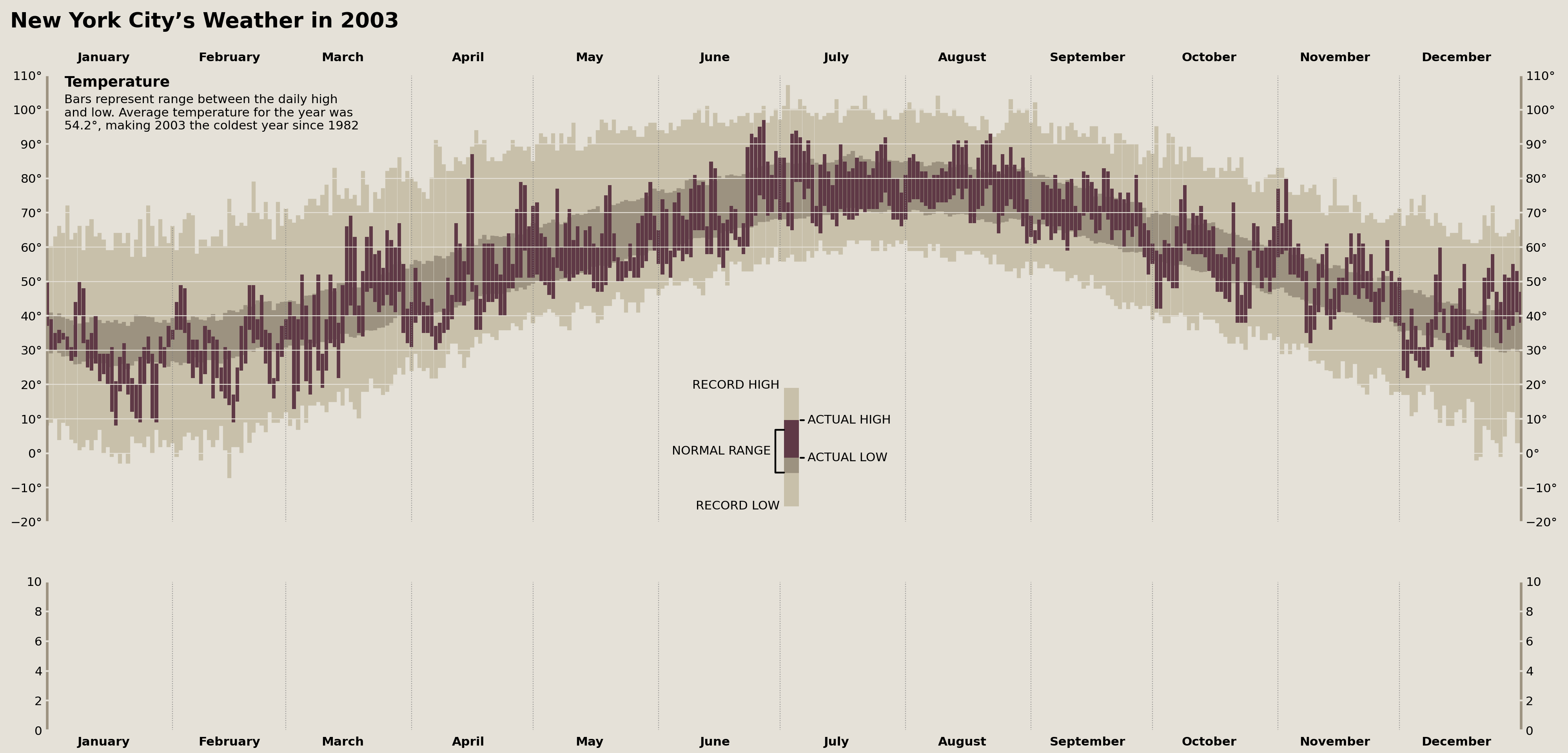
The above was a VERY subtle change, but we're reproducing Edward Tufte here, so we need to be thorough.
Adding Temperature Record Annotations
To complete our top Axes (which will display our temperature data), we need to add a final set of annotations that indicate whether any observed daily temperature is a historical record. Tufte’s dataset contains two records: a low in March and a high in November.
While the specific data set I have doesn't replicate these values/months perfectly, we do see two record highs. We can use pandas to locate when these records occur in 2003 and add annotations accordingly.
In order to replicate the style that Tufte used for his annotations—where a vertical line comes out of the data and touches the furthest left corner of the annotation—I had to use another manual ConnectionPatch and Annotation. The result is visually very similar to Tufte's annotations.
daily_temperature_records = (
    nyc_historical
    .groupby(nyc_historical.index.dayofyear)
    .agg({
        'temperature_max': ['idxmax', 'max'],
        'temperature_min': ['idxmin', 'min']}
    )
)

trans = offset_copy(temperature_ax.get_xaxis_transform(), x=5, y=0, fig=fig, units='points')
max_temp_annot_kwargs = {'va': 'top', 'y': .98, 's': 'RECORD HIGH {}°'}
temp_high_records_in_2003 = (
    daily_temperature_records['temperature_max']
    .loc[lambda d: d['idxmax'].dt.year.eq(2003)]
)
for _, row in temp_high_records_in_2003.iterrows():
    text = temperature_ax.text(
        x=date2num(row['idxmax']), y=.98, s=f'RECORD HIGH {row["max"]:.0f}°',
        transform=trans, va='top', ha='left',
        fontsize='small'
    )

    conn = ConnectionPatch(
        xyA=(date2num(row['idxmax']), row['max']),
        coordsA=temperature_ax.transData,
        xyB=text.get_position(),
        coordsB=temperature_ax.get_xaxis_transform(),
        color='gray', zorder=5
    )
    temperature_ax.add_artist(conn)

temp_low_records_in_2003 = (
    daily_temperature_records['temperature_min']
    .loc[lambda d: d['idxmin'].dt.year.eq(2003)]
)

for _, row in temp_low_records_in_2003.iterrows():
    text = temperature_ax.text(
        x=date2num(row['idxmin']), y=.05, s=f'RECORD LOW {row["min"]:.0f}°',
        transform=trans, va='bottom', ha='left',
        fontsize='small'
    )

    conn = ConnectionPatch(
        xyA=(date2num(row['idxmin']), row['min']),
        coordsA=temperature_ax.transData,
        xyB=text.get_position(),
        coordsB=temperature_ax.get_xaxis_transform(),
        color='gray', zorder=5
    )
    temperature_ax.add_artist(conn)

display(fig)
Whew. That wraps up the top set of Axes completely!
Let's move onto plotting the precipitation for the year. Similar to the previous plot we constructed, we should have an easy time plotting the data but a trickier time adding annotations.
Plot Cumulative Precipitation Data
We’ll need to use a trick here to create distinct lines representing the cumulative monthly precipitation and averages. We could use a for-loop and plot each line separately, OR we can use NaN values to represent breaks in our lines. Since we don't want to mask any of our existing values, we can use pandas to .reindex our DataFrame to include datetimes that don't exist in our data (one second after the first day of each month). This will enable us to plot all distinct lines with a single call to .plot, .fill_between, and .hlines.
Let's take a look at this approach below:
from pandas.tseries.offsets import DateOffset

null_idx = plot_data.index.union(
    date_range('2003-01-01 00:00:01', freq='MS', periods=12)
)

# Use `reindex` to introduce `null` values between each of our months
precip_plotting = plot_data['monthly_cumul_precip'].reindex(null_idx)

precip_ax.plot(
    precip_plotting.index, precip_plotting, lw=5, solid_capstyle='butt'
)
precip_ax.fill_between(
    precip_plotting.index, precip_plotting, color=palette['record_range']
)

# Draw horizontal lines representing the
#   average total monthly precip across all years
precip_monthly = (
    nyc_2003.resample('MS')['precipitation'].sum()
    .to_frame('actual')
    .assign(normal=(
        nyc_historical.resample('MS')['precipitation'].sum()
        .pipe(lambda s: s.groupby(s.index.month).mean())
        .pipe(lambda s:
              s.set_axis(
                  [Timestamp(year=2003, month=i, day=1) for i in s.index]
              )
        ))
    )
)

precip_ax.hlines(
    precip_monthly['normal'],
    xmin=precip_monthly.index,
    xmax=precip_monthly.index + DateOffset(months=1)
)

display(fig)
And that plots all of our precipitation data!
That was pretty easy, but now comes the hard part: adding all of those annotations.
Precipitation Title
First up, we need a long label between the temperature plot and the precipitation plot to serve as a title for the precipitation plots. This isn't too hard, but we need to make sure that it perfectly lines up with the large "Temperatue" annotation in the top left of our temperature plot.
We'll need to calculate some averages to report on, and, while we're at it, we can create ranks for the months in 2003 vs the rest of the years for some annotations in the next section.
precip_annual = (
    nyc_historical.resample('YS')['precipitation'].agg(['sum', 'count'])
    .query('count > 300')
    .assign(rank=lambda d: d['sum'].rank(ascending=False))
)

precip_annots = {
    'total': precip_annual.loc['2003-01-01', 'sum'],
    'rank': precip_annual.loc['2003-01-01', 'rank'],
    'normal_diff': (
        precip_annual.loc['2003-01-01', 'sum'] -
        precip_annual.loc[:'2003-01-01', 'sum'].mean()
    )
}

precip_annot_trans = offset_copy(precip_ax.transAxes, x=20, y=30, units='points', fig=fig)
precip_annot = HPacker(
    children=[
        TextArea('Precipitation', textprops={'weight': 'bold', 'size': 'large'}),
        TextArea(' '.join([
            'Cumulative monthly precipitation in inches compared with normal',
            'monthly precipitation. Total precipitation in 2003 was',
            '{total:.2f} inches, {normal_diff:.2f} more than normal, which',
            'makes the year the {rank:.0f}th wettest on record',
            ]).format(**precip_annots),
        )
    ], pad=0, sep=9,
)
p = AnchoredOffsetbox(child=precip_annot, loc='upper left', pad=0, bbox_to_anchor=(0, 1), borderpad=0, bbox_transform=precip_annot_trans, frameon=False)
temperature_ax.add_artist(p)

display(fig)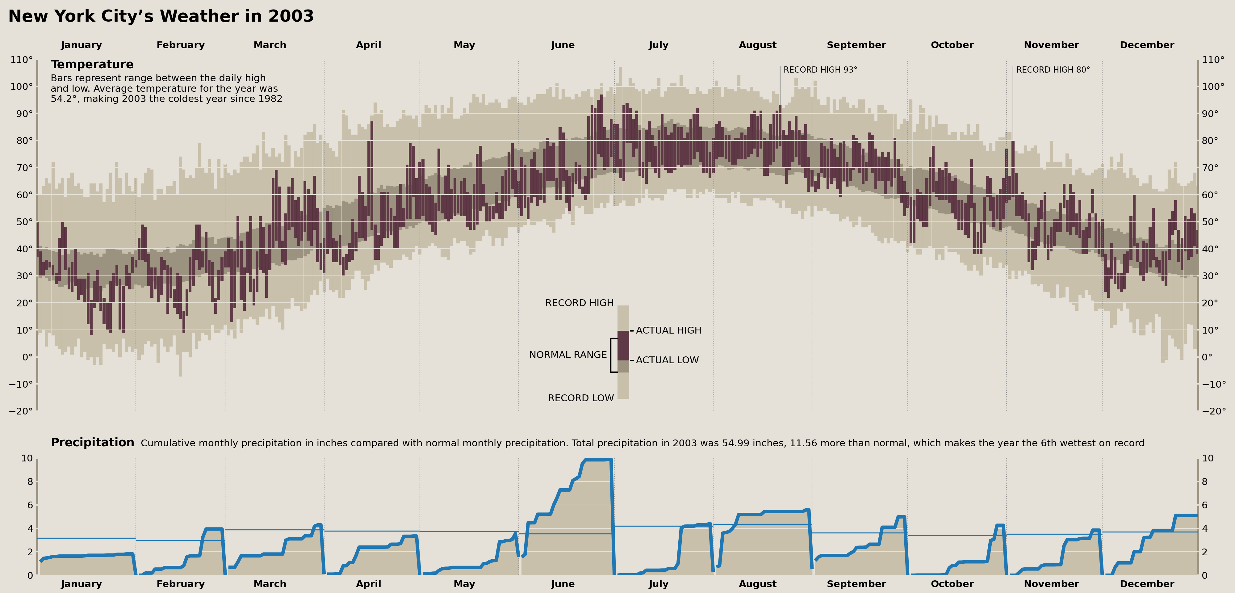
Precipitation Records
We can easily add annotations denoting any monthly precipitation/snowfall records. These will take the form of something akin to "fourth snowiest Feb." and appear at the top of each month (if there was a top-fifteen placement for the record).
Annotations layered on top of data are typically the most finicky part of creating data visualizations, and, when it comes to finicky non-reproducible work, I don't want to waste any time. So, instead of creating some automated, loop-based approach to creating annotations, I'm simply going to query my data for what annotations need to be created and include them on a list of annotations to add onto my plot!
This enables me to make small adjustments to individual annotations without needing to refactor any code.
monthly_records = (
    nyc_historical.resample('MS')[['precipitation', 'snowfall']].sum()
    .pipe(lambda s: s.groupby(s.index.month).rank(ascending=False))
    .loc['2003']
    .loc[lambda d: d.lt(15).any(axis=1)]
)

monthly_records| precipitation | snowfall | |
|---|---|---|
| date | ||
| 2003-02-01 | 21.0 | 6.0 |
| 2003-04-01 | 39.0 | 3.0 |
| 2003-06-01 | 1.0 | 42.0 |
| 2003-12-01 | 17.0 | 3.0 |
Using the table above, fill in the annotations below:
monthly_annots = [
    {'x': '2003-02-15', 's': '6th snowiest Feb.', 'y': .95},
    {'x': '2003-04-15', 's': '4th snowiest April.', 'y': .95},
    {'x': '2003-06-15', 's': 'Wettest June\non record', 'y': .05, 'va': 'bottom'},
    {'x': '2003-12-15', 's': '3rd snowiest Dec.', 'y': .95},
]
monthly_annots_defaults = {
    'ha': 'center', 'va': 'top',
    'transform': precip_ax.get_xaxis_transform(),
    'fontsize': 'small'
}


for m in monthly_annots:
    m['x'] = to_datetime(m['x'])
    m = monthly_annots_defaults | m
    precip_ax.text(**m)

display(fig)
Precipitation Monthly Normal & Actual Annotations
Now we need to add our first set of annotations labeling the observed total monthly precipitation as well as the “Normal” amount reflecting an average total precipitation from each month across all years of data we have.
Thankfully, we've already calculated all of the needed data above and just need to write some code that will let us retain fine control over where these annotations are placed. This is similar to the workflow above, but we are forcing each annotation to appear in the same place on each plot and adjusting some options after placement.
from calendar import month_name

precip_annot_defaults = {
    'normal': {'xytext': (1,  3), 'ha': 'left', 'va': 'bottom', 'fontsize': 'small', 'style': 'italic'},
    'actual': {'xytext': (-1, 3), 'ha': 'right', 'va': 'bottom', 'fontsize': 'small'}
}

monthly_options = {
    'April': {'actual': {'va': 'top', 'xytext': (-2, -18)}},
    'June': {
        'normal': {'ha': 'right', 'xytext': (-2, 3)},
        'actual': {'va': 'top', 'xytext': (-2, -5)}
    },
    'August': {'normal': {'ha': 'right', 'xytext': (-5, -5), 'va': 'top'}}
}

for m in month_name[1:]:
    opts = monthly_options.get(m, {})
    opts['normal'] = precip_annot_defaults['normal'] | opts.get('normal', {})
    opts['actual'] = precip_annot_defaults['actual'] | opts.get('actual', {})
    monthly_options[m] = opts


for i, (date, row) in enumerate(precip_monthly.iterrows()):
    if i == 0:
        normal_prefix, actual_prefix = 'NORMAL\n', 'ACTUAL '
    else:
        normal_prefix, actual_prefix = '', ''

    left, right = date + DateOffset(days=1, minutes=-1), date + DateOffset(months=1, days=-1)
    options = (
        monthly_options.get(date.strftime('%B'))
    )

    x = left if options['normal']['ha'] == 'left' else right
    precip_ax.annotate(
        f"{normal_prefix}{row['normal']:.2f}",
        xy=(x, row['normal']), textcoords='offset points',
        **options['normal']
    )

    x = left if options['actual']['ha'] == 'left' else right
    precip_ax.annotate(
        f"{actual_prefix}{row['actual']:.2f}",
        xy=(x, row['actual']), textcoords='offset points',
        **options['actual']
    )

display(fig)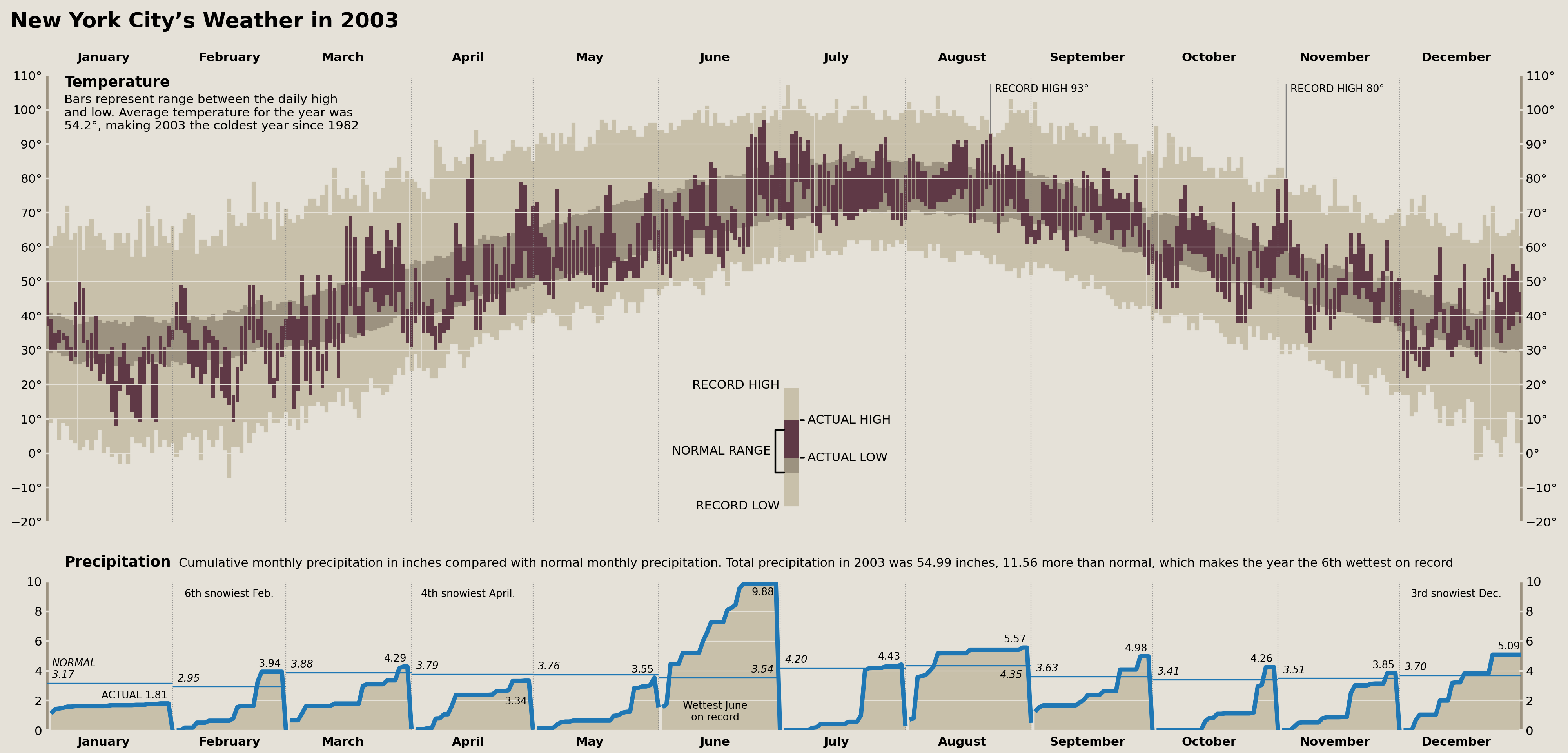
Precipitation Daily Records
Wow, we have put a lot of love into this graphic and are finally on the last step! All we need to do now is add annotations for our daily records of precipitation & snowfall amounts.
Since we are again doing 'on data' text annotations, I am going to adopt a similar workflow to what we saw above where I first query the respective data and create annotations based on their position.
To determine which days in 2003 had record amounts of snowfall or precipitation, I'll use the following pandas code:
daily_records = (
    nyc_historical.groupby(nyc_historical.index.dayofyear)
    [['precipitation', 'snowfall']].rank(ascending=False)
    .loc['2003']
    .mask(lambda d: d > 1)
    .stack()
)

daily_records
date
2003-02-17 snowfall 1.0
2003-02-22 precipitation 1.0
2003-04-07 snowfall 1.0
2003-06-04 precipitation 1.0
2003-07-22 precipitation 1.0
2003-08-04 precipitation 1.0
2003-10-27 precipitation 1.0
2003-11-19 precipitation 1.0
2003-12-06 snowfall 1.0
2003-12-11 precipitation 1.0
2003-12-14 snowfall 1.0
2003-12-24 precipitation 1.0
dtype: float64Then I'll manually write up annotations for these amounts, update them with some default options, and, finally, add them to our Axes.
daily_annots = [
    {'date': '2003-02-17', 'col': 'snowfall',      'text': 'RECORD\nSNOWFALLS\n{}', 'xytext': (-65, 40)},
    {'date': '2003-02-22', 'col': 'precipitation', 'text': 'RECORD\nRAINFALL\n{}',  'xytext': (-25, 40)},
    {'date': '2003-04-07', 'col': 'snowfall',      'text': 'RECORD\nSNOWFALLS {}',  'xytext': (-15, 70)},
    {'date': '2003-06-04', 'col': 'precipitation', 'text': 'RECORD\nRAINFALL\n{}',  'xytext': (0, 40)},
    {'date': '2003-07-22', 'col': 'precipitation', 'text': 'RECORD\nRAINFALL\n{}',  'xytext': (-20, 40)},
    {'date': '2003-08-04', 'col': 'precipitation', 'text': 'RECORD\nRAINFALL {}',   'xytext': (-10, 50)},
    {'date': '2003-10-27', 'col': 'precipitation', 'text': 'RECORD\nRAINFALL {}',   'xytext': (-80, 65)},
    {'date': '2003-11-19', 'col': 'precipitation', 'text': 'RECORD\nRAINFALL {}',   'xytext': (-50, 60)},
    {'date': '2003-12-06', 'col': 'snowfall', 'text': 'RECORD\nSNOWFALLS\n{}',      'xytext': (-10, 60)},
    # Too many annotations for December to fit in at once
    # {'date': '2003-12-11', 'col': 'precipitation', 'text': 'RECORD\nRAINFALL {}'},
    # {'date': '2003-12-14', 'col': 'snowfall', 'text': 'RECORD\nSNOWFALLS {}', 'xytext': (0, 60)},
    {'date': '2003-12-24', 'col': 'precipitation', 'text': 'RECORD\nRAINFALL\n{}',  'xytext': (-20, -65)},
]
daily_annots_defaults = {
    'xytext': (0, 0), 'textcoords': 'offset points',
    'fontsize': 'x-small', 'ha': 'left', 'va': 'bottom',
    'arrowprops': {
        'arrowstyle': '-', 'connectionstyle': 'angle', 'shrinkB': 0
    }
}

for d in daily_annots:
    date = to_datetime(d['date'])
    y = plot_data.loc[date, 'monthly_cumul_precip']
    value = nyc_2003.loc[date, d['col']]
    d['xy'] = (date, y)
    d['text'] = d['text'].format(f'{value:.2f} in')
    d.pop('date')
    d.pop('col')

    d = daily_annots_defaults | d
    precip_ax.annotate(**d)

fig.savefig('matplotlib/tufte_2003_matplotlib.png')
display(fig)
The Comparison
Whew! And there we have it. A full recreation of Edward Tufte's "New York City's Weather in 2003" plot in matplotlib. Let's show both the original and the recreation for comparison.
Edward Tufte (2003)
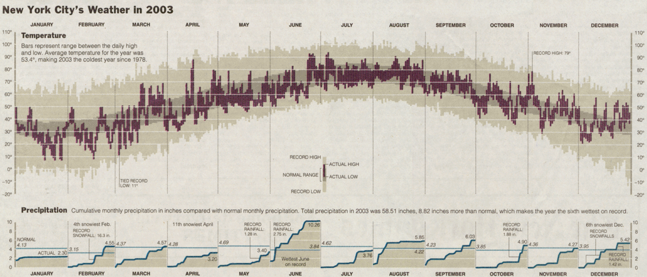
Cameron Riddell Recreation (2023)

Wrap Up
~400 lines of pandas and matplotlib code later, we have arrived at our end result. There are some things I could tinker with further, but I think overall we achieved the core goal. This is easily the most detailed visualization I've ever (re)created, and would definitely take on a project like this again in the future.
If you enjoy data visualization as much as I do, and want to see even more matplotlib, then come join me for my short seminar on Thursday, March 23, 2023, “Your matplotlib is Trash.” I'll show you common plotting pitfalls you can fall into and how you can make better use of matplotlib to avoid them. Hope to see you there!