Gantt Charts in Matplotlib
Hey everyone! Welcome to this week’s entry into Cameron's Corner. This week, I've been busy teaching courses, working on some exciting TOPS updates, and helping James prep for a FREE popup seminar coming up on August 10th, "Solving Uno... the Right Way!" I can't wait for you to see what he in store.
For today's post, I wanted to share a fun consulting project I'm working on which involves visualizing binary signals (on/off states) across multiple devices. These types of data are often visualized using stateful lines where they rapidly increase to a value of 1 to indicate an "on" state or drop to 0 to indicate an "off" state. However, for the volume of data that we are working with, the vertical lines become nearly impossible to track because there is no ramp-up in our signal.
For our purposes, we decided to move forward with a Gantt chart, where we use a colored rectangle to indicate the "on" state and a lack of color to indicate an "off" state.
Data Creation
But, before we can get into the visualization, let’s create some data to play around with. In our data set, we have multiple signals we're tracking ('signal_id'), and on top of that, we wanted to track multiple related—but separate—sources of those signals ('buffer_id').
from numpy.random import default_rng
from pandas import DataFrame

rng = default_rng(0)

df = DataFrame({
    'signal_id': rng.choice(['A', 'B'], size=(n := 500)),
    'buffer_id': rng.choice([*range(7)], size=n),
    'start': (start := rng.uniform(-300, 1_000, size=n).cumsum().clip(0)),
    'stop': start + rng.uniform(100, 1_500, size=n),
}).eval('delta = stop - start')

df.head()| signal_id | buffer_id | start | stop | delta | |
|---|---|---|---|---|---|
| 0 | B | 0 | 0.000000 | 118.210743 | 118.210743 |
| 1 | B | 2 | 643.517529 | 1902.385616 | 1258.868088 |
| 2 | B | 3 | 1567.735531 | 2362.476165 | 794.740634 |
| 3 | A | 2 | 1608.158751 | 2318.444043 | 710.285292 |
| 4 | A | 4 | 1323.890592 | 2266.403194 | 942.512602 |
First Pass Gantt Chart
Let’s explore how we can create a Gantt chart in Matplotlib. The most direct way is to use the Axes.broken_barh method, which differs in behavior from the Axes.barh, primarily because it can draw numerous rectangles more efficiently and allows them to not be locked to the left/bottom spine (see Artist.sticky_edges). This is used on the Rectangle instances returned from Axes.bar.
The interface that Axes.brokeh_barh exposes is quite similar to Axes.barh except we need to specify the x, xrange, y, and yrange.
%matplotlib inlinefrom matplotlib.pyplot import rc
rc('figure', facecolor='white')
rc('font', size=16)
rc('axes.spines', top=False, right=False, left=False)from matplotlib.pyplot import subplots
fig, ax = subplots(figsize=(16, 4))
ax.broken_barh(xranges=df[['start', 'delta']].to_numpy(), yrange=(0, 1))
ax.margins(0)
ax.yaxis.set_tick_params(left=False, labelleft=False)
ax.xaxis.set_major_formatter(lambda x, pos: f'{x/1000:g}')
ax.set_xlabel('Elapsed Time (ms)');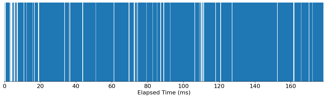
You can see that, while this chart highlights whenever the signals are on/off, it's missing much of the context that we're interested in: which signal, and where did it originate?
Juxtapose the Signals
Let’s see if we can accomplish this with juxtaposition. By that, I mean that I'll create two separate charts (one for each unique signal ID) and, at the same time, create a splay out each 'buffer_id' along the y-axis to pull apart these pieces better.
from matplotlib.pyplot import subplots, rc, get_cmap

colors =  get_cmap('Set1').colors
rc('font', size=16)

fig, axes = subplots(
    df['signal_id'].nunique(), 1, figsize=(16, 8), sharey=True, sharex=True
)

for c, ax, (sig, group) in zip(colors, axes.flat, df.groupby('signal_id')):
    for i, (buffer, group) in enumerate(group.groupby('buffer_id')):
        ax.broken_barh(xranges=group[['start', 'delta']].to_numpy(), yrange=(i-.4, .8), facecolor=c)


    ax.set_yticks(sorted(df['buffer_id'].unique()))
    ax.set_yticklabels(sorted(df['buffer_id'].unique()))
    ax.set_title(f'Signal {sig}', loc='left', size='large')
    ax.spines['left'].set_visible(False)
    ax.xaxis.set_tick_params(labelbottom=True)
    ax.set_ylabel('Buffer ID')

    ax.xaxis.set_major_formatter(lambda x, pos: f'{x/1000:g}')
    ax.set_xlabel('Elapsed Time (ms)')

    ax.margins(0)

fig.tight_layout();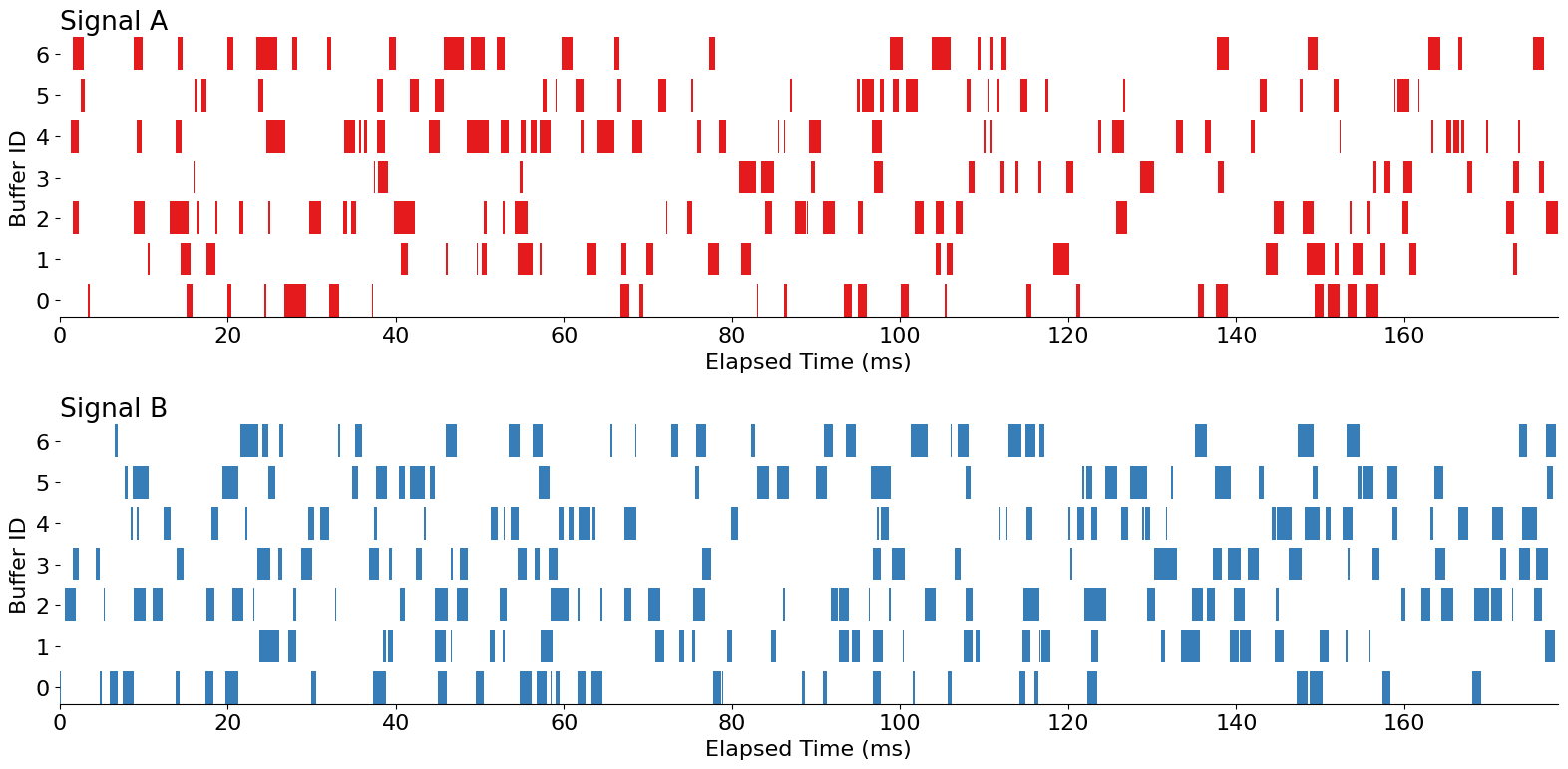
This is looking quite nice! But, by relying on juxtaposition, we can't easily compare "Signal A" to "Signal B" within the same 'buffer_id'. In this case, we can use a different approach–superimposition–to better facilitate that comparison.
Superimpose the Signals
Creating a superimposed chart will require more care than the previous approach. In Matplotlib, we need to manually track the positions of each PolyCollection. We want two sets of Gantt bars for each 'buffer_id' (one for "Signal A" and another for "Signal B"). From there, we’ll clean up some of the aesthetics and add an inline legend so that we know which bars/colors relate to which signal.
from matplotlib.pyplot import subplots, rc, get_cmap
from matplotlib.ticker import MultipleLocator

colors =  get_cmap('Set1').colors
rc('font', size=16)

fig, ax = subplots(figsize=(16, 8))

for i, (buffer, group) in enumerate(df.groupby('buffer_id')):
    for color, (sig, group) in zip(colors, group.groupby('signal_id')):
        height = .3
        if sig == 'A':
            offset = 0
        elif sig == 'B':
            offset = -height

        ax.broken_barh(
            xranges=group[['start', 'delta']].to_numpy(), yrange=(i+offset, height),
            color=color, label=sig, lw=0
        )

        if i == 0:
            ax.annotate(
                f'Signal {sig}',
                xy=(1, i + offset + (height / 2)), xycoords=ax.get_yaxis_transform(),
                xytext=(5, 0), textcoords='offset points',
                size='large', ha='left', va='center',
                color=color
            )

ax.set_yticks(sorted(df['buffer_id'].unique()))
ax.set_yticklabels(sorted(df['buffer_id'].unique()))

ax.set_title(f'Visualization of Signal Overlap', loc='left', size='x-large', pad=15)
ax.set_ylabel('Buffer ID')
ax.spines['left'].set_visible(False)

ax.yaxis.set_tick_params(left=False, which='both')
ax.yaxis.set_minor_locator(MultipleLocator(.5))
ax.yaxis.grid(color=ax.get_facecolor(), which='major')
ax.yaxis.grid(which='minor')
ax.margins(0)

ax.xaxis.set_major_formatter(lambda x, pos: f'{x/1000:g}')
ax.set_xlabel('Elapsed Time (ms)')

ax.invert_yaxis();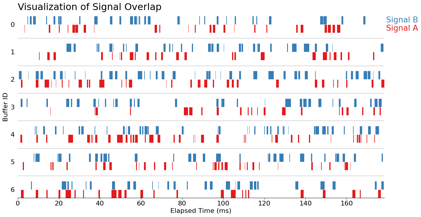
And there we have it: a superimposed Gantt chart to explore our binary signals. A future addition to consider is that we have yet to pick out a message to communicate here. Although we've created a fairly nice exploratory chart, I would need to supplement additional visuals if I wanted to truly communicate something about how much overlap occurred between each signal.
Wrap Up
Thanks for checking out my blog post this week! Gantt charts are a great way to communicate a binary signal in a fairly dense format.
And, don't forget to check out James' FREE seminar, "Solving Uno... the Right Way!" I'll see you there!