Business Jet Demand In North America
Hello, everyone! This week, I'm recreating a visualization from Data is Beautiful on Reddit.
Before I get started, I want to remind you of the final part of the Correctness seminar series, "How do I Check that my Data and Analyses are Correct?". We'll join James Powell as he unravels the art of performing data analysis with confidence in Python. Explore the challenges of data analysis pipelines and learn how to write robust analyses that have observable hooks. Discover methods for data cleaning and validation to avoid silent errors that can pollute your results.
Back to the visualization. Let's see what we're starting with:
Posts from the dataisbeautiful
community on Reddit
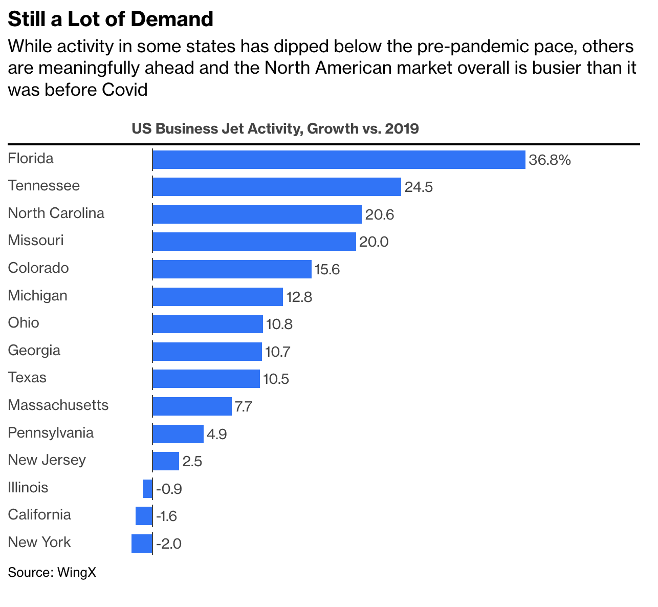
I thought this data visualization was quite nice as it employed minimal visual elements to convey a clear message. The message in the subtitle is a good takeaway, and the chart itself was cleanly done, while still also faithfully conveying the data. The author has also shared the source of both the data as well as the chart:
Comment
byu/bloombergopinion from discussion
indataisbeautiful
This chart is quite far from the visual defaults you'll find in Matplotlib, but I am confident that we can recreate this chart!
Gather the Data
The data are sourced from a consulting company, so instead of digging for the data values, I'll simply use the values on the chart itself:
from pandas import Series

data = Series({
    'Florida':        36.8,
    'Tennessee':      24.5,
    'North Carolina': 20.6,
    'Missouri':       20.0,
    'Colorado':       15.6,
    'Michigan':       12.8,
    'Ohio':           10.8,
    'Georgia':        10.7,
    'Texas':          10.5,
    'Massachusetts':  7.7,
    'Pennsylvania':   4.9,
    'New Jersey':     2.5,
    'Illinois':      -0.9,
    'California':    -1.6,
    'New York':      -2.0,
}).sort_values(ascending=True)
Pretty easy, right? Let's move onto the visualization itself. I'll make everything in pure Matplotlib.
:::{note} You are going to see a lot of small Matplotlib tricks relying heavily on the use of the Transforms API. I am primarily doing this because I need the margins of my Figure to align perfectly with the text from the chart. For most Matplotlib usage, you do not need to dive this deeply into the Transforms API. :::
Recreate the Text
We're going to need to build this chart backwards. This is due to the careful alignment of text and data features in the reported chart. Specifically, we need to keep very careful track of how wide our figure is going to be- as we want the width of our text to become bounds of our plot.
We can do this by first drawing our text before we add any Axes. Then from there we will resize our Figure to match the width of our text.
%matplotlib agg
%config InlineBackend.print_figure_kwargs = {'bbox_inches':None}
%config InlineBackend.figure_formats = ['svg']
from matplotlib.pyplot import subplots, rc, rcdefaults, figure
from matplotlib.offsetbox import AnchoredOffsetbox, VPacker, TextArea
from textwrap import dedent
from math import ceil
rc('font', size=(fontsize := 14), family='open sans')
margins = {'left': .02, 'right': .98, 'top': .98, 'bottom': .08}
aspect_ratio = 643 / 593 # grab the aspect ratio from the original image
fig = figure(dpi=100, facecolor='white')
_fakeax = fig.add_axes([0, 0, 0, 0]) # jupyter refuses to render Figures with no Axes
_fakeax.set_visible(False)
vpack = VPacker(children=[
TextArea(
'Still a Lot of Demand',
textprops={'weight': 700, 'size': 'x-large'}
),
TextArea(
dedent('''
While activity in some states has dipped below the pre-pandemic pace, others
are meaningfully ahead and the North American market overall is busier than it
was before Covid
''').strip(),
textprops={'linespacing': 1.5, 'weight': 600}
)],
pad=0,
sep=5
)
fig.add_artist(
text_box := AnchoredOffsetbox(
child=vpack,
loc='upper left',
bbox_to_anchor=(margins['left'], margins['top']),
bbox_transform=fig.transFigure,
frameon=False,
borderpad=0,
pad=0
)
)
text_width_px = ceil(text_box.get_tightbbox().width)
text_height_px = text_width_px / aspect_ratio
fig.set_size_inches(
text_width_px / (1 - (margins['left'] + (1 - margins['right']))) / fig.dpi,
text_height_px / (1 - (margins['bottom'] + (1 - margins['top']))) / fig.dpi,
)
display(fig)
It doesn’t look like much, but we've resized our Figure so that its width matches that of our written text. From here we can easily add our Axes and start plotting!
Adding Data
Now we just need to be careful adding in our Axes to make sure the top of the Axes doesn’t overlap with the bottom of our text. We’ll also need to leave space for the title of our chart as well!
While we’re at it, we can quickly label our bars using Axes.annotate
from numpy import array, zeros

rc('axes.spines', top=False, right=False, left=False, bottom=False)
rc('ytick', left=False)

identity_to_frac = fig.transFigure.inverted().transform
ax_top = identity_to_frac([0, text_box.get_tightbbox().y0])[1]
ax_bbox_frac = [
    margins['left'],
    margins['bottom'],
    margins['right'] - margins['left'],
    ax_top - margins['bottom'] - .06
]
ax = fig.add_axes(ax_bbox_frac)

bc = ax.barh(data.index, data, color='#0072ff', height=(bar_height := .7))
for i, rect in enumerate(bc):
    _, ceny = rect.get_center()
    rhs = rect.get_corners()[:, 0].max()
    label = ax.annotate(
        f'{rect.get_width()}', xy=(rhs, ceny),
        xytext=(5, 0), textcoords='offset points',
        va='center',
    )
label.set_text(f'{label.get_text()}%')
ax.set_xlim(right=ax.get_xlim()[1] * 1.2)
ax.margins(y=0)
ax.xaxis.set_visible(False)

display(fig)
Well it certainly looks funny- the labels on our y-axis are off of the image! We’ll need to adjust the position and width of our Axes so that we nudge those labels back into the image and align them with the text in the description.
Adjust Axes Position
Now we're onto a tricky part: we need to move the left hand side of our Axes to the right until we can see the text labels. To do this, we'll need to move each text label, calculate all of their widths and then adjust our Axes by the width of the widest text label.
from matplotlib.transforms import blended_transform_factory, offset_copy

transform = blended_transform_factory(fig.transFigure, ax.transData)
text_rhs = []

for text in ax.get_yticklabels():
    text.set_position((margins['left'], 0))
    text.set_transform(transform)
    text.set_fontsize(fontsize - 1)
    text.set_horizontalalignment('left')
    text.set_weight(500)
    text.set_color('#444444')
    text_rhs.append(text.get_tightbbox().width)

ax_bbox = ax.get_position()
new_left = identity_to_frac([max(text_rhs) + 5, 0])[0]
ax.set_position([
    margins['left'] + new_left,
    ax_bbox_frac[1],
    ax_bbox_frac[2] - new_left,
    ax_bbox_frac[3]
])

display(fig)
Add Zero Baselines
Let's now add those small vertical lines at the base of each bar. This is used to visually indicate where 0 is on our x-axis without having an actual x-axis. We can use Axes.vlines to draw multiple vertical lines at the location we want. We'll need to add a small padding around the height of each bar in order to have the line span a bit further than the height of each individual bar.
center_y = array([rect.get_center()[1] for rect in bc])
bar_padding = bar_height * 1.2
ax.vlines(
    zeros(len(bc)),
    ymin=center_y - bar_padding * .5, ymax = center_y + bar_padding * .5,
    color='black',
    lw=.5
)

display(fig)
Axes Title, Underline, & source
Now onto the final finishing touches. We'll add the Axes title, the line that separates the message text from the rest of the chart, and finally the annotation in the lower left hand side of the chart indicating the source for these data.
We need to be careful adding our title and separating line: the line should span the whole width of the text and rest just slightly above the Axes. Then, the title should sit slightly above that.
from matplotlib.lines import Line2D

# title
ax.set_title(
    'US Business Jet Activity, Growth vs. 2019', weight=700,
    pad=10, color='#444444', loc='left', size=fontsize - 1,
)

# underline
offset_transform = offset_copy(
    blended_transform_factory(fig.transFigure, ax.transAxes),
    fig=fig, x=0, y=5, units='points'
)
line = fig.add_artist(
    Line2D(
        [margins['left'], margins['right']], [1, 1],
        transform=offset_transform,
        color='black'
    )
)

# source
offset_transform = offset_copy(
    blended_transform_factory(fig.transFigure, ax.transAxes),
    fig=fig, x=0, y=-10, units='points'
)
fig.text(
    s='Source: WingX', x=margins['left'], y=0,
    fontsize=fontsize - 1,
    weight=600,
    transform=offset_transform,
    va='top'
)

display(fig)
Comparison
Original
Recreation

Wrap Up
And there we have it! A fully recreated bar chart, all done in Matplotlib. Hope you all enjoyed this recreation because there will definitely be more to come!
And, don’t forget to attend James’ seminar, "How do I Check that my Data and Analyses are Correct?"!
Talk to you all next time!