Visualizing Temperature Deviations
This week, I wanted do some data manipulation in Polars and recreate a data visualization I came across a while ago from the Python Graph Gallery, titled "Area Chart Over Flexible Baseline." I liked this type of chart because it highlights an aggregate measure of interest that is easy to understand and demonstrates how much that measure deviates from some context. In this case, the chart communicates how much the temperature across a given year in a specific city has deviated with respect to historical aggregations.
Fetching Data
Most free historical weather data APIs that I have encountered consume latitude and longitude coordinates instead of addresses. However, to make the code I am using here, I am going to use an address API to query the location of a given city/state. We can use the response from this API to feed into the weather API. This makes it very trivial to query different locations across the world!
Data accessed on 2023-12-20, note that this API may not exist in this format at the time you are reading this blog post. Please see the Nominatim Usage Policy as well as the Nominatim Search API for more details
from requests import get

location_resp = get(
    url='https://nominatim.openstreetmap.org/search',
    params={
        'city': 'Sacramento',
        'country': 'USA',
        'state': 'CA',
        'format': 'json',
        'limit': 1,
        'addressdetails': 1,
    },
)

location_resp.raise_for_status()
location_data = location_resp.json()[0]
# caching the above response from 2023-12-20
location_data = {
'place_id': 310488782,
'licence': 'Data © OpenStreetMap contributors, ODbL 1.0. http://osm.org/copyright',
'osm_type': 'relation',
'osm_id': 6232940,
'lat': '38.5810606',
'lon': '-121.493895',
'class': 'boundary',
'type': 'administrative',
'place_rank': 16,
'importance': 0.6243009020596028,
'addresstype': 'city',
'name': 'Sacramento',
'display_name': 'Sacramento, Sacramento County, California, United States',
'address': {'city': 'Sacramento',
'county': 'Sacramento County',
'state': 'California',
'ISO3166-2-lvl4': 'US-CA',
'country': 'United States',
'country_code': 'us'},
'boundingbox': ['38.4375740', '38.6855060', '-121.5601200', '-121.3627400']
}Now, let’s used the resultant lat/lon values to feed into the weather API, then store our data into a polars.DataFrame for quick analysis!
from datetime import date as dt_date

start_date = dt_date(1961,  1,  1)
end_date   = dt_date(2022, 12, 31)
metric     = 'temperature_2m_mean'
from requests import get
from polars import DataFrame, col
weather_resp = get(
"https://archive-api.open-meteo.com/v1/archive",
timeout=30,
params={
'latitude': location_data['lat'],
'longitude': location_data['lon'],
'start_date': start_date.strftime('%Y-%m-%d'),
'end_date': end_date.strftime('%Y-%m-%d'),
'daily': metric,
'timezone': 'auto',
'temperature_unit': 'fahrenheit',
}
)
weather_resp.raise_for_status()
weather_data = weather_resp.json()
weather_df_raw = (
DataFrame({
'date': weather_data['daily']['time'],
'temp': weather_data['daily'][metric],
})
.with_columns(
date=col('date').str.to_date('%Y-%m-%d'),
)
.sort('date')
.with_columns(
year=col('date').dt.year(),
month=col('date').dt.month(),
day=col('date').dt.day()
)
)
weather_df_raw.write_parquet('data/open-meteo-2023-12-20.parquet')from datetime import date as dt_date
from polars import read_parquet, col, Config
weather_df_raw = read_parquet('data/open-meteo-2023-12-20.parquet')
with Config(tbl_rows=6):
display(weather_df_raw)| date | temp | year | month | day |
|---|---|---|---|---|
| date | f64 | i32 | i8 | i8 |
| 1961-01-01 | 40.3 | 1961 | 1 | 1 |
| 1961-01-02 | 37.2 | 1961 | 1 | 2 |
| 1961-01-03 | 37.6 | 1961 | 1 | 3 |
| … | … | … | … | … |
| 2022-12-29 | 47.6 | 2022 | 12 | 29 |
| 2022-12-30 | 53.2 | 2022 | 12 | 30 |
| 2022-12-31 | 53.6 | 2022 | 12 | 31 |
Data Preparation/Cleaning
Now that we have all of the historical data that we'll need, let's go ahead and start building our final DataFrame to facilitate the plotting we want to do.
We will set up two primary parameters for this:
ref_years → the range of years to be included as a reference
show_year → the year to overlay on top of the ref_years
In this first step, I will focus on collecting all of the reference (or contextual) data that I want to show. This will be an aggregation across years to obtain an average, upper bound, and lower bound of the temperature on each day of the year.
ref_years = (start_date.year, 1990)
show_year = 2022

weather_df_ref = (
    weather_df_raw
    .filter(col('year').is_between(*ref_years))
    .group_by(['month', 'day'])
    .agg(
        temp_ref_lb=col('temp').quantile((lb_value := .05)),
        temp_ref_ub=col('temp').quantile((ub_value := .95)),
        temp_ref_avg=col('temp').mean(),
    )
    .sort(['month', 'day'])
)

weather_df_ref.head()| month | day | temp_ref_lb | temp_ref_ub | temp_ref_avg |
|---|---|---|---|---|
| i8 | i8 | f64 | f64 | f64 |
| 1 | 1 | 35.3 | 50.3 | 42.49 |
| 1 | 2 | 36.7 | 49.0 | 42.343333 |
| 1 | 3 | 36.6 | 49.4 | 43.02 |
| 1 | 4 | 36.8 | 51.2 | 43.45 |
| 1 | 5 | 35.9 | 52.8 | 44.113333 |
Our visualization will ultimately be a comparison of show_year against the above reference data. To make our lives easier when it comes time to plot, we can store all of this data in the same DataFrame. Additionally, we will apply a slight smoothing to the temperature data to make the resultant plot a little less jagged.
We'll also need a separate calculation to map the distance (how far the observed value is from the historical mean). This should also be normalized so that we can freely use it in our plotting code. We will use this column to doubly encode deviance from the mean in our plot.
from polars import Datetime
from polars.selectors import starts_with

weather_df_plotting = (
    weather_df_ref
    .join(
        weather_df_raw.filter(col('date').dt.year() == show_year),
        on=['month', 'day'],
        how='left',
        coalesce=True,
    )
    .drop_nulls()
    .with_columns(
        date=col('date').cast(Datetime),
        distance=(
            (col('temp') - col('temp_ref_avg'))
            .pipe(lambda c: c / c.abs().max())
        ),
    )
    .sort('date')
)

weather_df_plotting.head()| month | day | temp_ref_lb | temp_ref_ub | temp_ref_avg | date | temp | year | distance |
|---|---|---|---|---|---|---|---|---|
| i8 | i8 | f64 | f64 | f64 | datetime[μs] | f64 | i32 | f64 |
| 1 | 1 | 35.3 | 50.3 | 42.49 | 2022-01-01 00:00:00 | 39.2 | 2022 | -0.152739 |
| 1 | 2 | 36.7 | 49.0 | 42.343333 | 2022-01-02 00:00:00 | 38.2 | 2022 | -0.192355 |
| 1 | 3 | 36.6 | 49.4 | 43.02 | 2022-01-03 00:00:00 | 44.1 | 2022 | 0.050139 |
| 1 | 4 | 36.8 | 51.2 | 43.45 | 2022-01-04 00:00:00 | 49.6 | 2022 | 0.285515 |
| 1 | 5 | 35.9 | 52.8 | 44.113333 | 2022-01-05 00:00:00 | 49.9 | 2022 | 0.268647 |
Now that we have all of the data components of our final chart, let's get to creating our visualization!
Building The Visualization
The first thing I'll do is layer the contextual information. To do this, we should have a shaded area representing the span between our historical upper and lower bounds (5th and 95th percentiles; .05 and .95 quantiles). Then we'll use a black line to represent the mean for that same span of time.
%matplotlib aggfrom matplotlib.pyplot import subplots, rc
pdf = weather_df_plotting
rc('font', size=16)
rc('axes.spines', left=False, top=False, bottom=False, right=False)
fig, ax = subplots(figsize=(18, 6))
lb_line, = ax.plot('date', 'temp_ref_lb', color='k', data=pdf, ls='--', lw=.7, zorder=6)
ub_line, = ax.plot('date', 'temp_ref_ub', color='k', data=pdf, ls='--', lw=.7, zorder=6)
context_pc = ax.fill_between(
'date', 'temp_ref_lb', 'temp_ref_ub', data=pdf, color='gainsboro', ec='none', zorder=5
)
avg_line = ax.plot('date', 'temp_ref_avg', data=pdf, color='k', lw=1, zorder=6)
display(fig)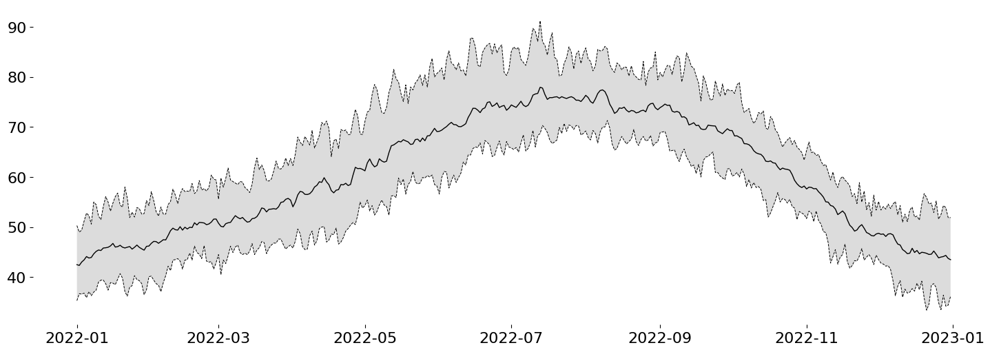
Now I want to overlay the observed data onto the chart. The Python Graph Gallery Blog Post used a trapezoidal interpolation. However, this means that Python will be involved in a significant amount of the computation. I'd rather let Matplotlib handle the color interpolation within a Polygon because their implementations should be much better than anything I can come up with off the top of my head.
Custom Gradient on an Arbitrary Artists
This trick requires a little knowledge of some advanced Matplotlib, but, effectively, I will draw my signal of interest using the Axes.fill_between method. This will create a Polygon Collection with the correct shape that I want to convey. However, I will completely hide this object from view by setting alpha=0.
The reason for the above is that I want to fill that area with a very custom shading. To accomplish this, I can actually leverage Axes.imshow to draw the desired color gradient like so:
from numpy import linspace
from matplotlib import colormaps
from matplotlib.colors import LinearSegmentedColormap, TwoSlopeNorm

# Use the `RdBu` colormap, removing the very dark shades at either end
colors = colormaps['RdBu_r']([*linspace(.05, .4, 128), *linspace(.6, .95, 128)])
cmap = LinearSegmentedColormap.from_list('cut_RdBU_r', colors)

raw_pc = ax.fill_between( # the raw data are not visible (alpha=0)
    'date', 'temp', 'temp_ref_avg', data=pdf, fc='none', ec=ax.get_facecolor(), zorder=5,
    lw=.5
)

arr = raw_pc.get_paths()[0].vertices
(x0, y0), (x1, y1) = arr.min(axis=0), arr.max(axis=0)

gradient = ax.imshow(
    pdf.select(col('distance')).to_numpy().reshape(1, -1),
    extent=[x0, x1, y0, y1],
    aspect='auto',
    cmap=cmap,
    norm=TwoSlopeNorm(0), # should color intensities be symmetrical around 0?
    interpolation='bicubic',
    zorder=5,

    # redundant encoding of color on alpha. Focus on extreme values.
    alpha=pdf.select(col('distance').abs().sqrt()).to_numpy().reshape(1, -1),
)

display(fig)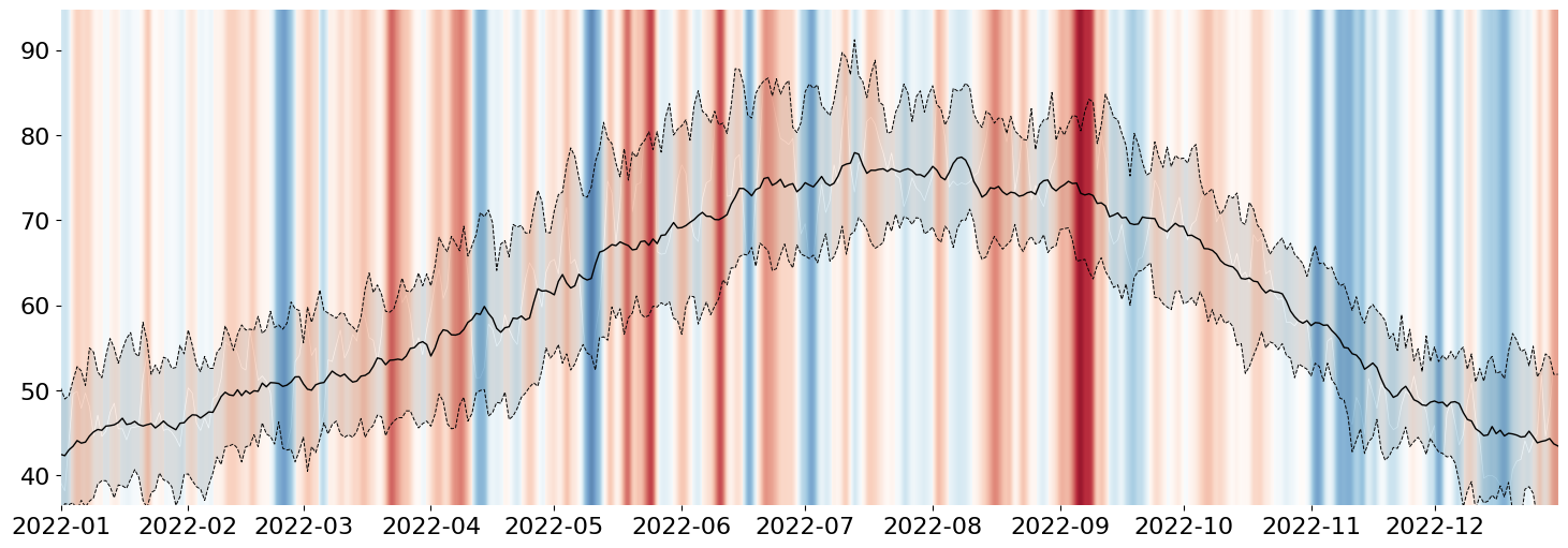
But, of course, that doesn't look fully correct, so we need to apply our final step: constrain the generated AxesImage (result of Axes.imshow) by our invisible PolyCollection (result of Axes.fill_between). While the code looks straightforward, you likely need to be very familiar with Matplotlib's artist interface (or poke around Stack Overflow for long enough), and you'll end up with this:
# use the raw `fill_between` object (PolyCollection)
#  to mask the gradient generated from imshow
gradient.set_clip_path(raw_pc.get_paths()[0], transform=ax.transData)
ax.use_sticky_edges = False
ax.margins(x=0, y=.01)

display(fig)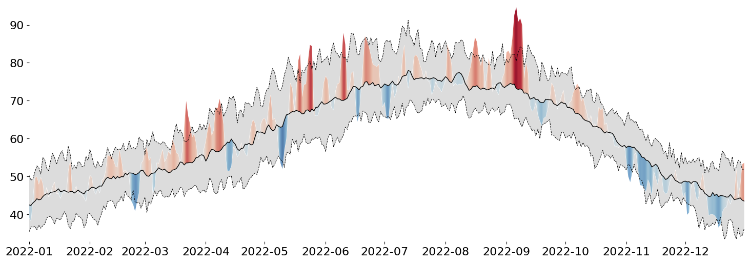
While our PolyCollection is invisible, we can use it to clip away any part of the generated gradient that we are not interested in seeing. This is a very simple way to doubly encode deviance from the mean: in the form of the height of a peak/valley AND in the intensity of its color.
This trick works for most Artists in Matplotlib, so whenever you need to map a gradient on top of a Shape, this is how I would do it!
Clean up The Axes
With the base visualization done, we can focus on the smaller details.
Add a unit to our ytick labels
Visually distinguish between adjacent months
Remove repeated values from the xtick labels (the year)
from itertools import pairwise
from matplotlib.ticker import MultipleLocator, NullFormatter
from matplotlib.dates import MonthLocator, DateFormatter

ax.yaxis.grid(True)
ax.yaxis.set_tick_params(left=False)
ax.yaxis.set_major_formatter(lambda x, pos: f'{x:g}°F')

ax.xaxis.set_major_locator(MonthLocator())
ax.xaxis.set_major_formatter(NullFormatter())
ax.xaxis.set_minor_locator(MonthLocator(bymonthday=16))
ax.xaxis.set_minor_formatter(DateFormatter('%B'))
ax.xaxis.set_tick_params(which='both', bottom=False, labelsize='small')

for i, (left, right) in enumerate(pairwise(ax.get_xticks())):
    if i % 2 == 0:
        ax.axvspan(left, right, 0, 1, color='gainsboro', alpha=.2)

display(fig)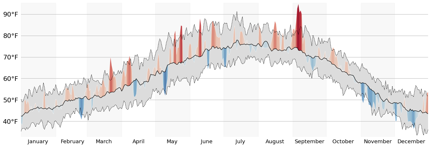
Add Annotations
Now that's much more presentable! Let's wrap up this visualization by adding some much needed Annotations. In any static data visualization code, placing the Annotations in the correct spot will usually require some fiddling. However, I reduced the degree to which I need to fiddle by making extensive use of Matplotlib's transforms.
Annotations should ALWAYS result in verbose code. Since it is a fiddly part of a data visualization, we should leave ourselves plenty of areas to make adjustments.
def text_in_axes(*text, ax):
    """Force all Text objects to appear inside of the data limits of the Axes.
    """
    for t in text:
        bbox = t.get_window_extent()
        bbox_trans = bbox.transformed(ax.transData.inverted())
        ax.update_datalim(bbox_trans.corners())

ref_span_annot = ax.annotate(
    f'{round((ub_value-lb_value)*100)}% of reference period data fall within the gray area',
    xy=(
        ax.xaxis.convert_units(x := dt_date(2022, 7, 1)),
        pdf.filter(col('date') == x)
        .select((col('temp_ref_ub') - col('temp')) / 2 + col('temp'))
        .to_numpy().squeeze()
    ),
    xycoords=ax.transData,
    xytext=(
        .55, pdf.filter(col('date') >= x).select(['temp', 'temp_ref_ub']).to_numpy().max()
    ),
    textcoords=ax.get_yaxis_transform(),
    va='bottom',
    ha='left',
    arrowprops=dict(lw=1, arrowstyle='-', relpos=(0, 0)),
    zorder=10,
    fontsize='small',
)

ref_avg_annot = ax.annotate(
    f'Mean temperature {ref_years[0]}-{ref_years[1]}',
    xy=(
        (x := dt_date(2022, 2, 1)),
        pdf.filter(col('date') == x).select(['temp_ref_avg']).to_numpy().squeeze()
    ),
    xytext=(.15, .09), textcoords=ax.transAxes,
    va='top',
    ha='left',
    arrowprops=dict(lw=1, arrowstyle='-', relpos=(0, .7), shrinkB=0),
    zorder=10,
    fontsize='small',
)

text_in_axes(ref_span_annot, ref_avg_annot, ax=ax)

for line, label in {lb_line: 'P05', ub_line: 'P95'}.items():
    ax.annotate(
        text=label,
        xy=line.get_xydata()[-1],
        xytext=(5, 0), textcoords='offset points',
        va='center',
        size='small',
    )

ax.autoscale_view()
display(fig)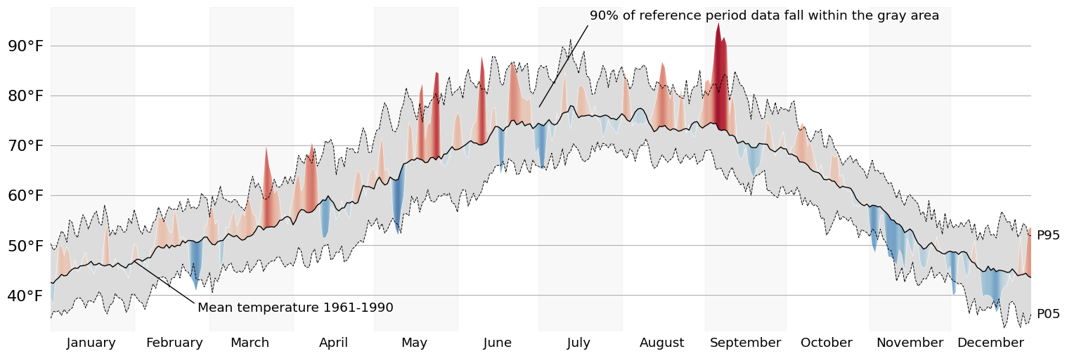
Finally, lets add a title! The flexitext package allows us to easily format Text objects to communicate information about the chart in the title. This is a trick we can use to reduce our visualizations reliance on a legend to communicate the meaning of various channels.
from flexitext import flexitext
from matplotlib.colors import to_hex

chunksize = 8
position = cmap.N // chunksize
blue, red = cmap(position), cmap((chunksize-1) * position)
ad = location_data['address']

flexitext(
    s=(
        f'<size:large,weight:semibold>{show_year} <color:{to_hex(red)}>Hot</>'
        f' and <color:{to_hex(blue)}>Cold</> Temperature Deviations from'
         ' Historical Average\n</>'
        f'<size:medium>{ad["city"]} {ad["state"]}, {ad["country"]}</>'
    ),
    x=0, y=1.01,
    va='bottom',
    ax=ax
)

display(fig)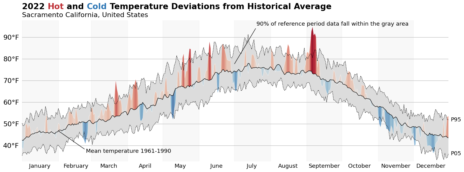
from matplotlib.pyplot import close
close('all')
Wrap-Up
And there we have it: a fully recreated chart using data that is local to me. I hope you all enjoyed this blog post, and I can't wait to talk to you again in the new year!
Happy holidays!