Tiered Bar Chart in Matplotlib
Welcome back to Cameron's Corner! This week, I wanted to share an answer I posted on Stack Overflow to a question entitled Create a bar chart in Python grouping the x-axis by two variables. This question sought to create a grouped bar chart, but also have hierarchical x-tick labels.
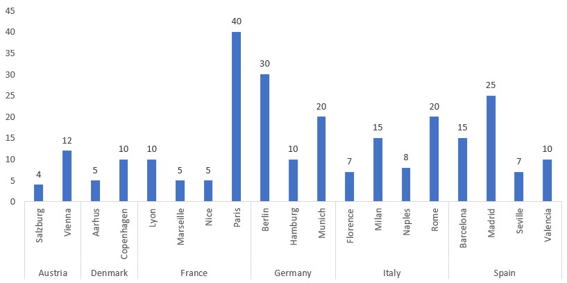
The question effectively asked how to create a chart like the one below.
Now, we have the Matplotlib documentation for multilevel ticks, but the placement of the tick labels are manually selected based off of visual overlap. Here, I devised a more programmatic approach to place the ticks.
So, I put on my Matplotlib hat and got to work.
But, before I get started, make sure you sign up for our upcoming µTraining, "Blazing Fast Analyses with Polars." This µtraining is comprised of live discussion, hands-on problem solving, and code review with our instructors. You won't want to miss it!
Now, back to the bar chart!
Data
Of course, we’ll first need to define our data:
import pandas as pd
import numpy as np

df = pd.DataFrame({
    'Country': [
        'Germany', 'Germany', 'Germany', 'France', 'France', 'France', 'France',
        'Spain', 'Spain', 'Spain', 'Spain', 'Denmark', 'Denmark', 'Italy',
        'Italy', 'Italy', 'Italy', 'Austria', 'Austria'
    ],
    'City': [
        'Berlin', 'Munich', 'Hamburg', 'Paris', 'Marseille', 'Lyon', 'Nice',
         'Madrid', 'Barcelona', 'Valencia', 'Seville', 'Copenhagen', 'Aarhus',
         'Rome', 'Milan', 'Naples', 'Florence', 'Vienna', 'Salzburg'
    ],
    'Number of Universities': [
        30, 20, 10, 40, 5, 10, 5, 25, 15, 10, 7, 10, 5, 20, 15, 8, 7, 12, 4
    ]
})

plot_df = df.sort_values(['Country', 'City'])

plot_df.head()| Country | City | Number of Universities | |
|---|---|---|---|
| 18 | Austria | Salzburg | 4 |
| 17 | Austria | Vienna | 12 |
| 12 | Denmark | Aarhus | 5 |
| 11 | Denmark | Copenhagen | 10 |
| 5 | France | Lyon | 10 |
%matplotlib aggA First Look
For the most basic chart, we can create our Figure and Axes, then use the Axes.bar and Axes.bar_label to quickly create an annotated bar-chart in the same style suggested by the question.
Additionally here is a breakdown of the Axes.xaxis.set_tick_params method to make sense of the parameters we'll see today:
Axes.xaxis.set_tick_params
Axes.yaxis.set_tick_params
Axes.tick_params(… axis='x') | axis='y' | axis='both'
The interesting arguments we will see come up are as follows:
Axes.xaxis.set_tick_params(
    length=      How long (in display units) should the tick lines be?
    pad=         How much padding (in display units) should there be between
                   the tickline and the ticklabel?
    labelbottom= Should we display the xticklabels?
    bottom=      Should we display the ticklines?
)
Of course you can always visit the documentation to find the rest of the possible arguments you may pass here.
To make use of this method, we will manually calculate the desired length to create our tiered x-axis.
But first, let’s create the base for our plot:
from matplotlib import pyplot as plt
plt.rc('font', size=12)

fig, ax = plt.subplots(figsize=(12, 6))
ax.spines[['left', 'top', 'right']].set_visible(False) # turn off all spines

bc = ax.bar('City', 'Number of Universities', data=plot_df, width=.6)
ax.bar_label(bc)
ax.xaxis.set_tick_params(
    rotation=90,
    bottom=False,
    length=0,
    pad=1,   # adjust pad to move individual labels further/closer to bottom spine
)
ax.yaxis.set_tick_params(left=False)

display(fig)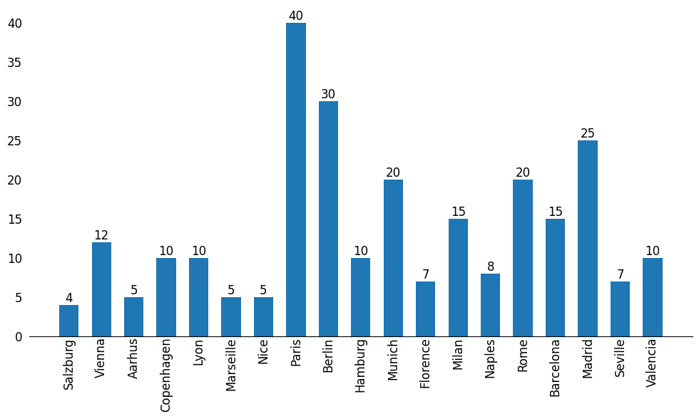
Next Level of Ticks
Now, to add the next layer of ticks, we have two approaches we can take:
Use an Axes.secondary_axis and offset its height by the height of the current xaxis
Use Axes.annotate to manually create Text-objects for the 2nd tier of the Axis.
Both of these routes are viable, but I opted to use the former as I was less familiar with it and wanted to learn more about it.
Before diving too far into where our labels should be placed vertically, we can calculate where they belong horizontally. We can take our current x-ticks, assign their positions to our DataFrame, and take the mean of those tick locations.
This calculates the the location along the x-axis to center each of the group labels:
## Add group labels underneath existing rotated labels
label_locs = (
    plot_df.assign(tick_loc=np.arange(len(plot_df)))
    .groupby('Country')['tick_loc']
    .mean()
)

label_locs
Country
Austria 0.5
Denmark 2.5
France 5.5
Germany 9.0
Italy 12.5
Spain 16.5
Name: tick_loc, dtype: float64Now that we know where each label should exist horizontally (in data-space), we can concern ourselves with computing where they belong vertically. To do this, I wrote a short function that takes in an Axes object and calculates the height of the xaxis based on the current BoundingBox and padding for the tick labels.
These values will be in display units (unlike our horizontal positions, which were in data-units). Then we can pass this value directly to the length parameter of Axes.ticks_params on our secondary x-axis. This will ensure the ticks are moved out of the way enough as to not overlap the upper tier of labels.
def get_xaxis_height(ax):
    height = 0
    axes = [ax] + ax.child_axes
    for ax in axes:
        height += ax.xaxis.get_tightbbox().height
        height += ax.xaxis.get_tick_params().get('pad', 5)
    return height * 72 / fig.dpi

ax_bottom = get_xaxis_height(ax)
group_label_ax = ax.secondary_xaxis(location='bottom')
group_label_ax.set_xticks(label_locs, labels=label_locs.index, ha='center')
group_label_ax.tick_params(
    bottom=False,
    pad=10,  # adjust pad to move your group labels further/closer to the individual labels
    length=ax_bottom
)

display(fig)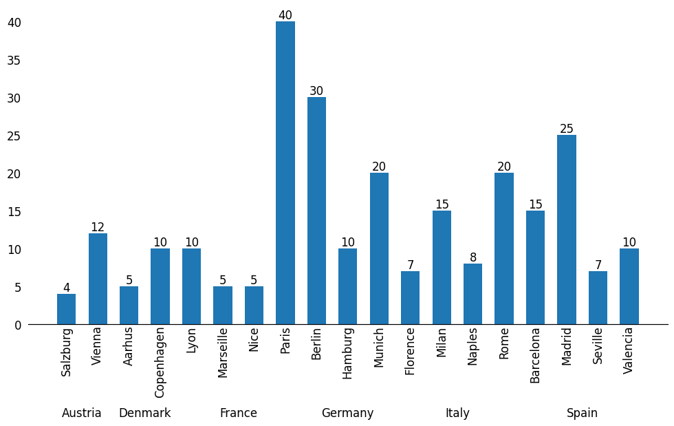
The last set of calculations are the placement of the vertical tick lines. These should exist between each group AND before/after the first/last groups. We can again calculate these positions using pandas with a slightly different approach than before:
## add long tick lines where needed
line_locs = (
    plot_df.assign(tick_loc=np.arange(len(plot_df)))
    .loc[lambda d:
        d['Country'] != d['Country'].shift(), 'tick_loc'
    ]
    - 0.5
).tolist()
line_locs.append(len(df) - .5) # last tick line position

line_locs
[-0.5, 1.5, 3.5, 7.5, 10.5, 14.5, 18.5]With the horizontal position of our ticks figured out, we can move on to their length. These ticks should be as long as our current x-axis so that they visually group our x-tick labels.
ax_bottom = get_xaxis_height(ax)
tickline_ax = ax.secondary_xaxis(location='bottom')
tickline_ax.set_xticks(line_locs)
tickline_ax.tick_params(labelbottom=False, length=ax_bottom, pad=0)
ax.set_xlim(-.5, len(ax.containers[0]) - .5)

display(fig)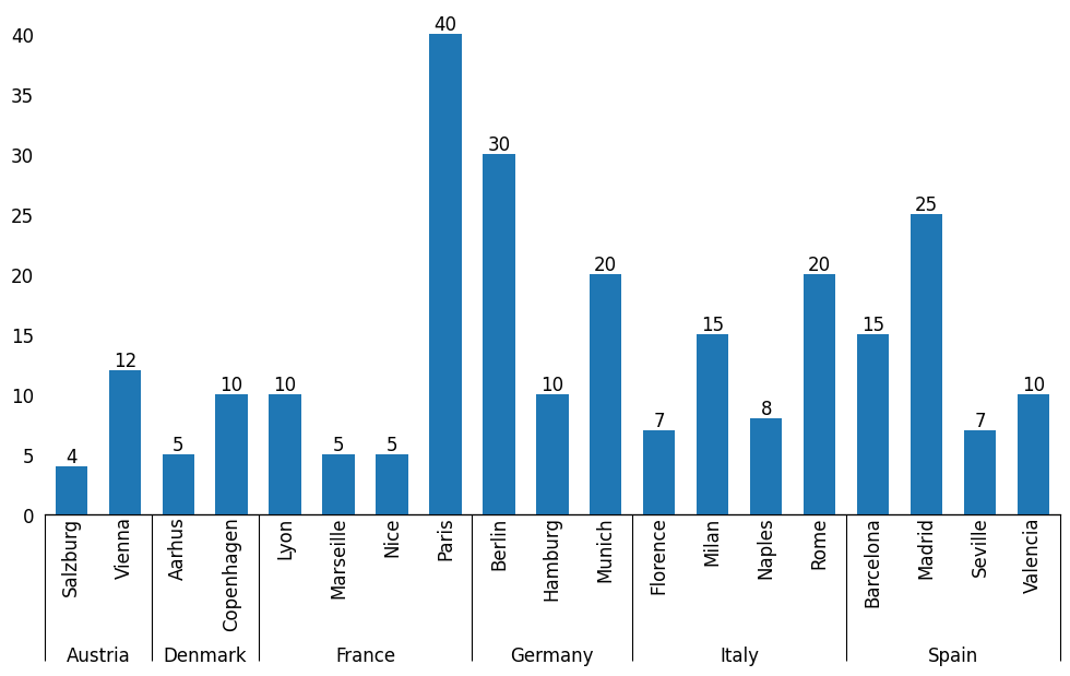
Fine-tuning
With the finish line in sight, we can turn our attention to some finishing details. I wanted to replicate the original chart, so I decided to...
change the tick/spine color
update our y-axis ticks
change the relative amount of vertical padding on the chart
ax.spines['bottom'].set_color('gainsboro')
tickline_ax.xaxis.set_tick_params(
    color='gainsboro',
    labelcolor='black',
    width=ax.spines['bottom'].get_linewidth() * 2
)

## Force y-ticks to be multiples of 5
from matplotlib.ticker import MultipleLocator
ax.yaxis.set_major_locator(MultipleLocator(5))
ax.margins(y=.2)

fig.tight_layout()
display(fig)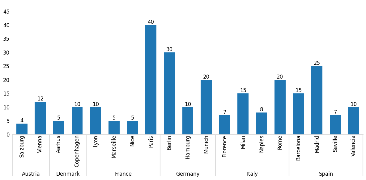
Wrap-Up
And there you have it: a more programmatic approach to place ticks on a bar chart.
What do you think about my approach? Let us know on the DUTC Discord server.
Talk to you all again next week!