United States President’s Age
Welcome to Cameron’s Corner! This week, I want to recreate a chart from a post on r/dataisbeautiful by u/graphguy.
This project turned out to be both a fun data-cleaning and visualization task, so this blog post will be released into multiple parts. We'll see a lot of Polars syntax for data cleaning and Matplotlib for data visualization.
Data
Of course, we’ll first need to gather our data. I'll use pandas here—primarily for the convenience—because it allows me to skip over some requests and BeautifulSoup4 code to manually locate and extract the table from this web page.
from pandas import read_html

url = 'https://en.wikipedia.org/wiki/List_of_presidents_of_the_United_States_by_age'

df = (
    read_html(url)[0]
    .droplevel(0, axis=1)
    .dropna(how='all')
    .drop(columns=['No.'])
)

df.to_csv('data/presidents_age.csv', index=False)
Now, let’s load that data back into memory using Polars.
from datetime import date
from polars import read_csv, col

snapshot_date = date(2024, 2, 21)
df = read_csv('data/presidents_age.csv')
display(
    df.sample(7, seed=4),
    df[0, 'Age at end of presidency'],
)| President | Born | Age at start of presidency | Age at end of presidency | Post-presidency timespan | Died | Age |
|---|---|---|---|---|---|---|
| str | str | str | str | str | str | str |
| "Theodore Roosevelt" | "Oct 27, 1858" | "42 years, 322 days Sep 14, 190… | "50 years, 128 days Mar 4, 1909" | "9 years, 308 days" | "Jan 6, 1919" | "60 years, 71 days" |
| "Millard Fillmore" | "Jan 7, 1800" | "50 years, 183 days Jul 9, 1850" | "53 years, 56 days Mar 4, 1853" | "21 years, 4 days" | "Mar 8, 1874" | "74 years, 60 days" |
| "Bill Clinton" | "Aug 19, 1946" | "46 years, 154 days Jan 20, 199… | "54 years, 154 days Jan 20, 200… | "23 years, 18 days" | "–" | "77 years, 172 days" |
| "Harry S. Truman" | "May 8, 1884" | "60 years, 339 days Apr 12, 194… | "68 years, 257 days Jan 20, 195… | "19 years, 341 days" | "Dec 26, 1972" | "88 years, 232 days" |
| "William Henry Harrison" | "Feb 9, 1773" | "68 years, 23 days Mar 4, 1841" | "68 years, 54 days Apr 4, 1841" | "[b]" | "Apr 4, 1841" | "68 years, 54 days" |
| "Joe Biden" | "Nov 20, 1942" | "78 years, 61 days Jan 20, 2021" | "(incumbent)" | "(incumbent)" | "–" | "81 years, 79 days" |
| "John F. Kennedy" | "May 29, 1917" | "43 years, 236 days Jan 20, 196… | "46 years, 177 days Nov 22, 196… | "[b]" | "Nov 22, 1963" | "46 years, 177 days" |
'65\xa0years, 10\xa0days Mar 4, 1797'Whew! We have a fair amount of cleaning to do here. Thankfully, I don't know anyone else who enjoys a good data cleaning more than I do!
Clean
At first glance, the above output has a couple of issues:
General parsing: the dates in each of the columns seem like they follow a format: "{abbrev-month-name} {day}, {year}".
Zooming into the 'Age at start/end of presidency' columns, we can see there are both the president's age and start date. We can easily parse out the date component, and then derive the age by subtracting the 'Born' column.
"(incumbent)" is used to represent a "to be determined date/amount". We can probably treat this as a null value and fill it in with the date of the analysis (today).
Some type of character, "_", is used to represent missing data, in the same fashion as the above point. Let’s also treat this as null.
The data has footnotes embedded, "[b]". Thankfully, we can just remove those as they do not provide metadata that we are using for this chart. If they did, I would need beautifulsoup to parse the footnote definitions and map them back into the columns where necessary.
Let’s address each of these points. Thankfully, Polars expressions allows us to structure this pipeline quite well.
As a final note, I am simply relying on Polars' eager API. Since the volume of data is <50 rows, there is no need to make use of any optimizations. Instead, we can focus on our code instead of its performance.
from datetime import date
from polars import String, col, when, selectors as cs

def sequential(df, *expressions):
    """Sequence expressions to apply them in order.

    uses the eager API to avoid repeated calls to `with_columns`
    """
    for expr in expressions:
        df = df.with_columns(expr)
    return df

presidents = (
    df
    .pipe(sequential,
        col(String).str.replace('\[.*\]', ''),         # remove footnotes

        when(col(String).is_in(['–', '(incumbent)']))  # Null out string data
            .then(None).otherwise(col(String))
            .name.keep(),

        cs.starts_with('Age at')  # Age at … → Start/End of Presidency
            .str.replace('\d+\syears, \d+\sdays\s+', '')
            .name.map(lambda name: name.removeprefix('Age at').strip().capitalize()),
     )
    .select( # filter down to the columns we want for our analysis
        col('President'),
        cs.matches('^(Start|End) of').str.to_date('%b %d, %Y', strict=False),
        col('Born').str.to_date('%b %d, %Y'),
        col('Died').str.to_date('%b %d, %Y', strict=False),
    )
)

presidents.sample(7, seed=4)| President | Start of presidency | End of presidency | Born | Died |
|---|---|---|---|---|
| str | date | date | date | date |
| "Theodore Roosevelt" | 1901-09-14 | 1909-03-04 | 1858-10-27 | 1919-01-06 |
| "Millard Fillmore" | 1850-07-09 | 1853-03-04 | 1800-01-07 | 1874-03-08 |
| "Bill Clinton" | 1993-01-20 | 2001-01-20 | 1946-08-19 | null |
| "Harry S. Truman" | 1945-04-12 | 1953-01-20 | 1884-05-08 | 1972-12-26 |
| "William Henry Harrison" | 1841-03-04 | 1841-04-04 | 1773-02-09 | 1841-04-04 |
| "Joe Biden" | 2021-01-20 | null | 1942-11-20 | null |
| "John F. Kennedy" | 1961-01-20 | 1963-11-22 | 1917-05-29 | 1963-11-22 |
This is looking much better; we have converted away all of the string values where possible and can easily derive columns like 'Age at start of presidency.' Instead of computing it now, we can handle it when needed.
Derive
With our raw data nice and tidy, we are ready to start deriving values. Most of the values we need for this chart will be easily created by with simple arithmetic from the existing columns (e.g., 'Age at start of presidency' = 'Start of presidency' - 'Born')
Colors
However, we also need to create a color mapping to identify the circles on the lefthand side of our chart that we want to recreate. This is a tricky problem because these groups are not mutually exclusive. Instead, they are partially overlapping and promotion-based. In this context, "promotion-based" refers to nested groupings. For example, some presidents died or were assassinated in office. However, the circles that denote these values are different colors. If a president was assassinated in office, then we should use a different color to indicate this, even though that president also technically died in office.
In order to account for nesting of colors, we will use polars.coalesce to reproduce this behavior.
from polars import coalesce

assassinated = [
    'Abraham Lincoln' , 'James A. Garfield',
    'William McKinley', 'John F. Kennedy'
]

# {output-name : (expression, hex-color)
circle_exprs = { # order matters for color coalesce
    'Still Alive': (
        col('Died').is_null(),
        '#aa85fd',
    ),
    'Assassinated in Office': (
        col('President').is_in(assassinated).fill_null(False),
        '#f183bb'
    ),
    'Died in Office': (
        col('Died').le(col('End of presidency')).fill_null(False),
        '#f8b66a',
    ),
    'Died of Natural Causes': (
        when(col('Died').is_not_null())
            .then(~col('President').is_in(assassinated))
            .otherwise(False),
        '#dcdcdc'
    ),
}

colors = (
    presidents.select( # apply our expressions
        **{name: expr for name, (expr, _) in circle_exprs.items()}
    )
    .with_columns(
        coalesce( # map the colors to those expressions
            col(c).replace_strict({True: color, False: None})
            for c, (_, color) in circle_exprs.items()
        ).alias('color')
    )
)

colors.sample(5, seed=0)| Still Alive | Assassinated in Office | Died in Office | Died of Natural Causes | color |
|---|---|---|---|---|
| bool | bool | bool | bool | str |
| false | false | false | true | "#dcdcdc" |
| true | false | false | false | "#aa85fd" |
| false | false | false | true | "#dcdcdc" |
| false | false | false | true | "#dcdcdc" |
| true | false | false | false | "#aa85fd" |
With the colors figured out, we can add this derived column to our inputted DataFrame. While were at it, let’s also add a couple of other derived columns that we need for our visualization as well.
from datetime import date

def duration_since(current, begin):
    return (
        (col(current).fill_null(date.today()) - col(begin))
        .dt.total_days() / 365 # assuming number of days in a year
    )

presidents = presidents.with_columns(**{
    'Age at Start of Presidency': duration_since('Start of presidency', 'Born'),
    'Age at End of Presidency': duration_since('End of presidency', 'Born'),
    'Term Length': duration_since('End of presidency', 'Start of presidency'),
    'color': colors['color'], # carry the `'color'` column. it is already aligned.
})

presidents.sample(7, seed=4)| President | Start of presidency | End of presidency | Born | Died | Age at Start of Presidency | Age at End of Presidency | Term Length | color |
|---|---|---|---|---|---|---|---|---|
| str | date | date | date | date | f64 | f64 | f64 | str |
| "Theodore Roosevelt" | 1901-09-14 | 1909-03-04 | 1858-10-27 | 1919-01-06 | 42.909589 | 50.383562 | 7.473973 | "#dcdcdc" |
| "Millard Fillmore" | 1850-07-09 | 1853-03-04 | 1800-01-07 | 1874-03-08 | 50.534247 | 53.189041 | 2.654795 | "#dcdcdc" |
| "Bill Clinton" | 1993-01-20 | 2001-01-20 | 1946-08-19 | null | 46.454795 | 54.460274 | 8.005479 | "#aa85fd" |
| "Harry S. Truman" | 1945-04-12 | 1953-01-20 | 1884-05-08 | 1972-12-26 | 60.967123 | 68.747945 | 7.780822 | "#dcdcdc" |
| "William Henry Harrison" | 1841-03-04 | 1841-04-04 | 1773-02-09 | 1841-04-04 | 68.106849 | 68.191781 | 0.084932 | "#f8b66a" |
| "Joe Biden" | 2021-01-20 | null | 1942-11-20 | null | 78.221918 | 82.191781 | 3.969863 | "#aa85fd" |
| "John F. Kennedy" | 1961-01-20 | 1963-11-22 | 1917-05-29 | 1963-11-22 | 43.676712 | 46.515068 | 2.838356 | "#f183bb" |
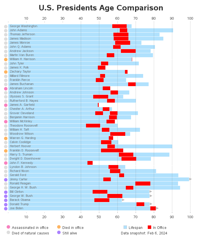
Recreate The Visualization
Hello, everyone! This week, I want to jump back into a recreation of a data visualization from a post on r/dataisbeautiful. As a reminder, this is what we have set out to do:
When we left off last time, we had just cleaned the data, so now we are ready to recreate our visualization! Some of the key visual elements on this chart are...
Horizontal bars representing
President’s age
Time in office
Legend explaining the colors of the bars
Labels embedded in horizontal bars
Colored circles representing additional information
Legend indicating meaning of these circles
X-axis
Mirrored on bottom and top of chart
Omits age == 0
Vertical grid lines with specific onset/spacing (lines start at age >= 40)
Triangles (on the right side of the bars) indicating whether the President is still alive
Annotation specifying when data was queried
Chart Title
%matplotlib agg
%config InlineBackend.print_figure_kwargs = {'bbox_inches':None}
Horizontal Bars
Let's start with the largest visual elements: the horizontal bars. We can create these using Axes.barh. For the bars representing the time spent in office, we will also need to specify the left= parameter to prevent the bars from beginning at x=0.
Aside
A side note is that I am using the square-bracket [] syntax with Polars. This
is because Matplotlib can treat Polars.Series as a 1D NumPy ndarray, and this
is the easiest way to do conduct that hand-off.
from matplotlib.pyplot import subplots, rc
from datetime import date

p = presidents

rc('font', size=18)
rc('axes.spines', top=False, right=False, bottom=False, left=False)
fig, ax = subplots(figsize=(18, 18), gridspec_kw={'left': .1, 'bottom': .1})

age_bc = ax.barh(
    y=p['President'],
    width=(p['Died'].fill_null(date.today()) - p['Born']).dt.total_days() / 365,
    fc='#aee3fe',
    ec='none',
    height=.9,
)
inoffice_bc = ax.barh(
    y=p['President'],
    left=p['Age at Start of Presidency'],
    width=p['Term Length'],
    height=age_bc[0].get_height(), # preserve same height as previous bars
    fc='#ff0201',
)
ax.invert_yaxis()
ax.margins(y=.01, x=.005)

display(fig)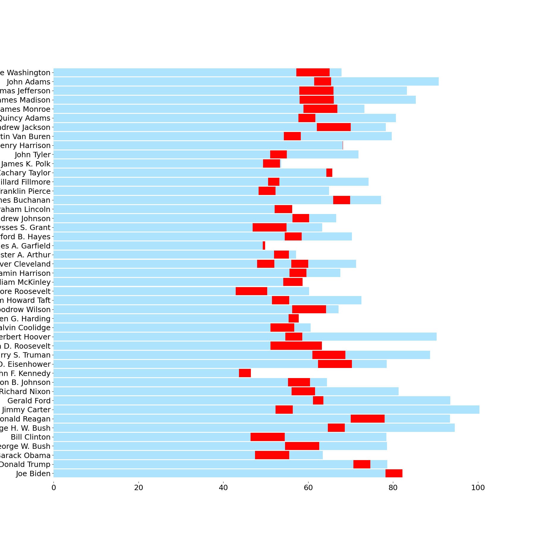
Y-Axis Bar Labels
Now we need to add labels to our bars. The usual approach for this problem would be to guess a font size and check on the rendered result; however, I am taking a more dynamic approach by working from the data → dots conversion and setting my font size based on the resulting number of dots. This should allow me to readily change the figsize and rerun this notebook to produce proportionally accurate text in the bars without needing to manually resize the text.
from math import floor
from matplotlib.pyplot import setp
from matplotlib.ticker import MultipleLocator

fig.canvas.draw() # force a draw for display unit calculation
bbox = age_bc[0].get_tightbbox()
labelsize = floor((bbox.y1 - bbox.y0) * .6)
ax.tick_params(
    axis='y',
    labelsize=labelsize, # label size is proportional to bar height
    pad=-2,              # move left side of labels into chart area
    left=False, labelleft=True, length=0, labelcolor='#6B767C',
    labelfontfamily='DejaVu Sans',
)
setp(ax.get_yticklabels(), ha='left', va='center'); # adjust label alignment

display(fig)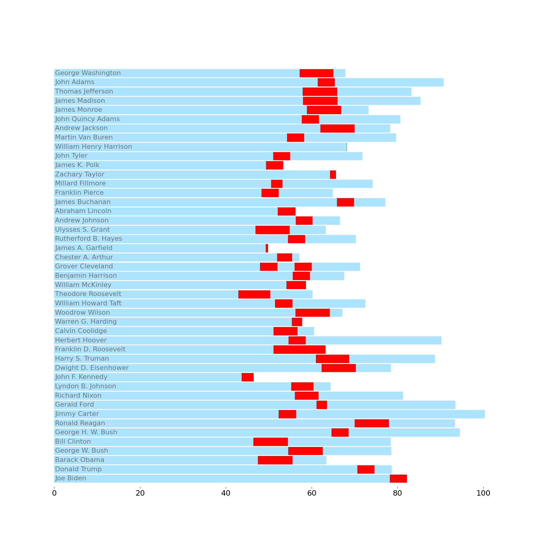
X-Axis
Let's set our xticks to appear on the bottom and top of the chart, spacing them out every 10 data units. Then we can cover up the label when x==0 by using a custom label formatter.
Finally, I'll use the Axes.vlines API to create the vertical lines. Going through the Axes.grid interface will require some additional effort to hide the vertical grid lines when Age < 40.
ax.xaxis.set_major_locator(MultipleLocator(10))
ax.xaxis.set_major_formatter(lambda x, pos: '' if x == 0 else f'{x:g}')
ax.vlines(
    [x for x in ax.get_xticks() if x >= 40],
    ymin=0, ymax=1,
    transform=ax.get_xaxis_transform(),
    ls=(0, (1, 2)), color='darkgray',
)

ax.tick_params(axis='x', top=True, labeltop=True, labelsize=labelsize, color='darkgray')
display(fig)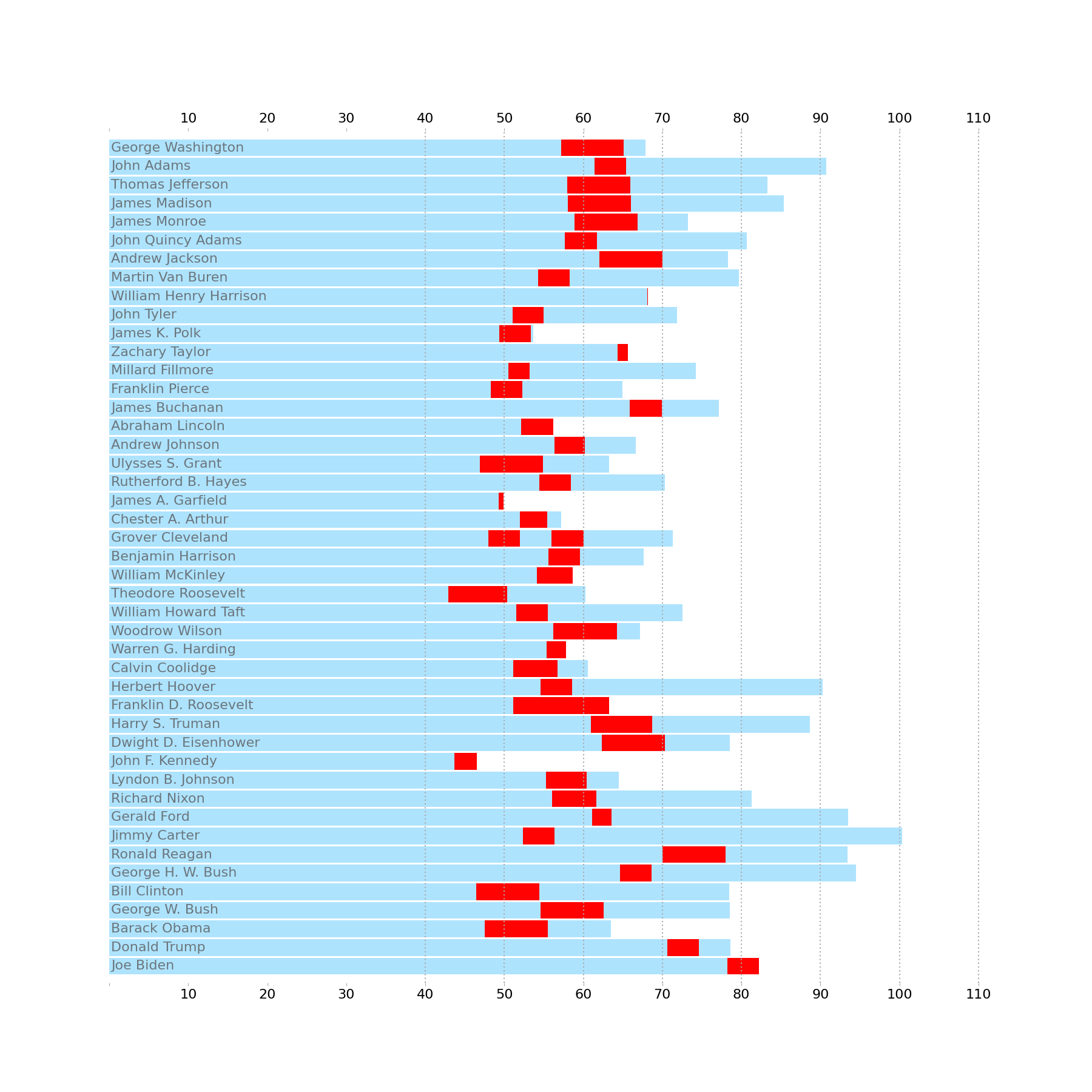
Colored Circles
There are two approaches to this: we can create many Ellipse objects and add them to the chart individually, or we can use an EllipseCollection. For this chart, I will opt for the former because the code to introduce these circles is a bit more digestible. The EllipseCollection is very handy if you need to add a large number of Ellipses, but, since we have less than 50, we're in pretty good form to opt for the simpler approach.
aspect = ax.get_data_ratio()
diameter = age_bc[0].get_height()
width = diameter/aspect

from matplotlib.patches import Ellipse
for pres, c in zip(p['President'], p['color']):
    ellipse = Ellipse(
        xy=(-1.5, pres), width=width, height=diameter, clip_on=False, color=c
    )
    ax.add_artist(ellipse)

display(fig)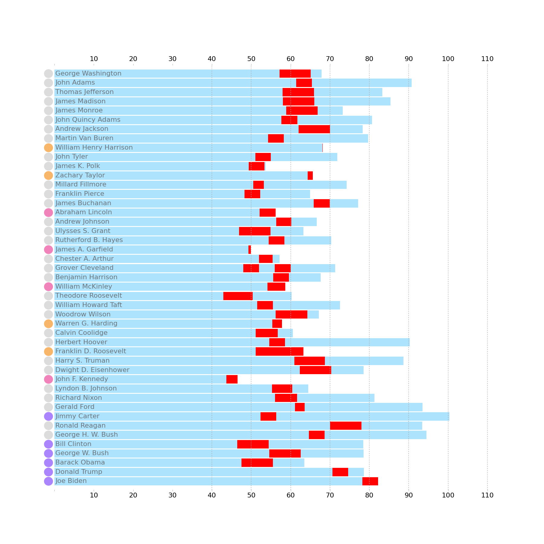
Alive Indicators
Now let’s add our triangle indicators to the right side of our bars. In the original, this is used to doubly annotate which President is still alive at the time of the data snapshot. However, setting this up in Matplotlib is a touch tricky. To reduce some of the manual calculation, I use the patches.RegularPolygon to construct the original triangle- but then manipulate the vertices to match the desired shape and pass these into a new Polygon. The adjustments I make to the Triangle are:
Shift the x-values of the vertices to the right by the amount of the radius.
Shift the right facing point of the triangle further to the right to elongate the triangle.
from matplotlib.patches import RegularPolygon, Polygon
from math import pi

ages = p.filter(col('Died').is_null()).select(
    col('President'),
    ((snapshot_date - col('Born')).dt.total_days() / 365).alias('Age')
)
radius = .4

for pres, age in zip(*ages):
    tri = RegularPolygon(
        (age, ax.convert_yunits(pres)),
        numVertices=3,
        radius=radius,
        orientation=-pi/2,
    )
    verts = tri.get_verts()
    verts[:, 0] += (radius * 1.05)
    verts[[0, -1], 0] *= 1.01

    tri = Polygon(
        verts,
        facecolor='#bbbbbb',
        clip_on=False,
        zorder=6
    )
    ax.add_patch(tri)

display(fig)
Legends & Title
For the final annotations on this chart, we can recreate both legends and add a title. Matplotlib does not have a dedicated Ellipse/Circle patch for the legend, so we will need to circumvent this problem by creating dummy artists to feed into the legend (lines with marker='o' is represented as a circle in the legend).
The legend for the bar chart is much more straightforward as we can just pass in the Artists and their labels without any additional effort.
## Circles Legend
from matplotlib.lines import Line2D
order = [
    'Assassinated in Office',
    'Died of Natural Causes',
    'Died in Office',
    'Still Alive',
]
color_map = {k: color for k, (_, color) in circle_exprs.items()}
order_colors = {
    label: color_map[label] for label in order
}

kwargs = dict(
    marker='o', markersize=labelsize*1.1, mec='none', linestyle='none'
)
handles = [
    Line2D([], [], mfc=order_colors[o], **kwargs) for o in order
]
leg = ax.legend(
    labels=order, handles=handles, ncols=2, frameon=False,
    bbox_to_anchor=(0, -.03), loc='upper left', handleheight=1,
)
ax.add_artist(leg)

## Bar Legend
leg = ax.legend(
    labels=['Lifespan', 'In Office'], handles=[age_bc, inoffice_bc], frameon=False,
    bbox_to_anchor=(.75, -.03), loc='upper center', ncols=2,
)
ax.annotate(
    f'Data Snapshot {date(2024, 2, 21): %b %d, %Y}', xy=(0, 0), xycoords=leg, va='top',
    size='large',
)

## Chart Title
ax.set_title(
    'U.S. Presidents Age Comparison',
    size=36, weight='bold', y=1.04
)


display(fig)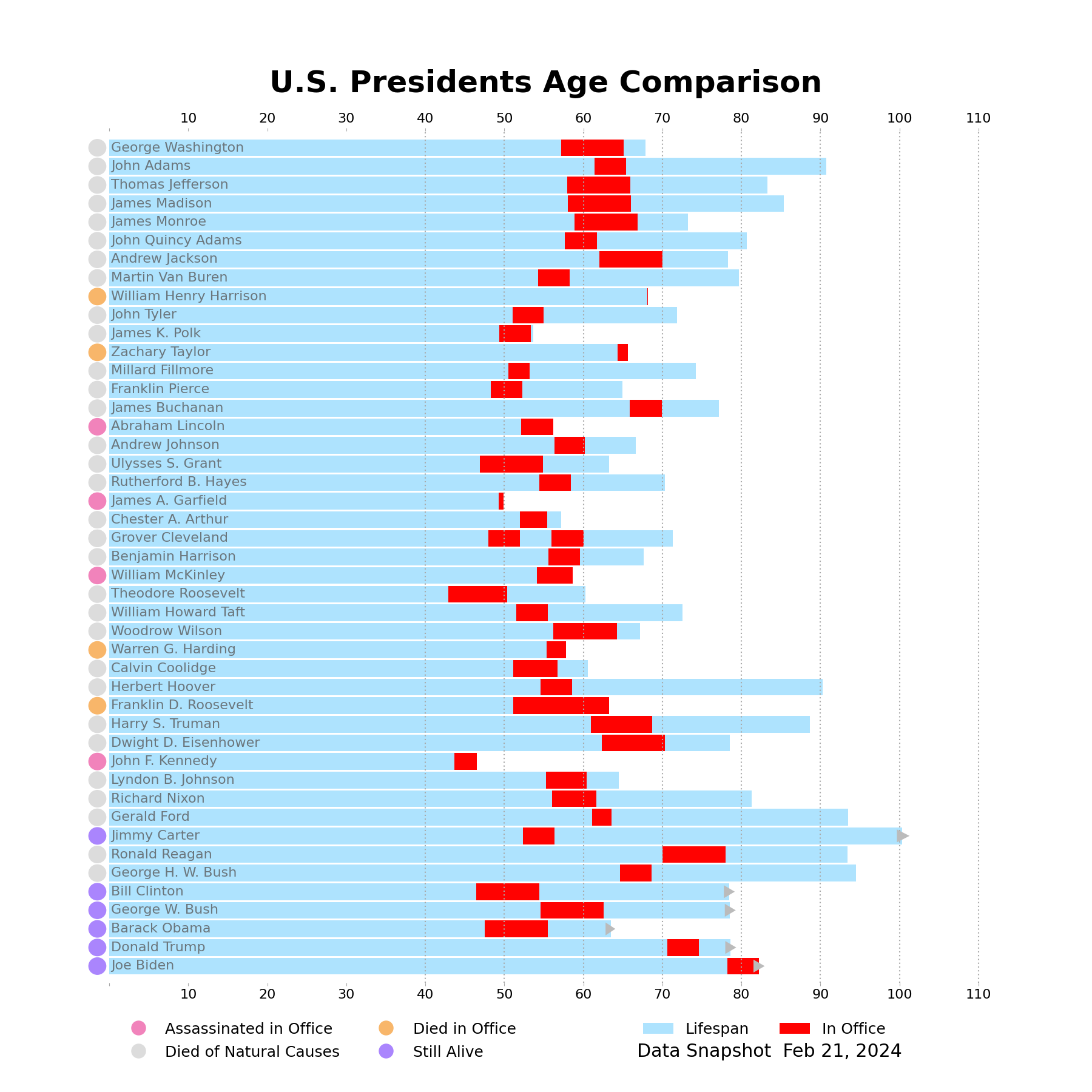
from matplotlib.pyplot import close
close('all')
Wrap Up
That was a fair bit of Matplotlib! As usual, a lot of the code comes from the "fine touches" that I introduce to make sure I accurately recreate a given chart. This one was a lot of fun to recreate, and I can't wait to share some of my ideas as to how we can improve it next week!
What do you think about my approach? Let us know on the DUTC Discord server.
Talk to you all next time!