Plotting without Weekends
Welcome back to Cameron's Corner! This week, I wanted to touch on a timeseries-oriented data visualization question that I came across: "How do I plot hourly data, but omit the weekends?"
On the surface, this sounds like a simple data-filtering question. However, we also need to consider the visual elements that go into visualizing these data. Take a peek down at the Original Visualization section to see an example of the chart that generated this question.
Let's create some synthetic data to work with.
Data
We're going to create three weeks' worth of hourly data with two random signals and completely remove the rows that correspond to weekends.
from pandas import DataFrame, date_range
from numpy.random import default_rng

rng = default_rng(0)

df = (
    DataFrame(
        index=date_range('2000-01-03', freq='h', periods=(size := 24 * 21)),
        data={
            'A': rng.normal(1, .01, size=size).cumprod(),
            'B': rng.normal(1, .05, size=size).cumprod(),
        }
    )
    .loc[lambda d: d.index.weekday < 5]
)

df.head()| A | B | |
|---|---|---|
| 2000-01-03 00:00:00 | 1.001257 | 1.061615 |
| 2000-01-03 01:00:00 | 0.999935 | 1.077451 |
| 2000-01-03 02:00:00 | 1.006338 | 1.076920 |
| 2000-01-03 03:00:00 | 1.007394 | 1.100677 |
| 2000-01-03 04:00:00 | 1.001998 | 1.140359 |
Original Visualization
Now that we have our data, let's visualize the timeseries data to better understand the question at hand here.
%matplotlib aggfrom matplotlib.pyplot import subplots, rc
from matplotlib.dates import WeekdayLocator, DateFormatter
rc('figure', figsize=(7, 4), facecolor='white')
rc('font', size=16)
rc('axes.spines', top=False, right=False)
fig, ax = subplots()
for name, s in df.items():
line, = ax.plot(s.index, s, label=name, lw=2)
ax.annotate(
name,
xy=(s.index[-1], s.iloc[-1]),
xytext=(5, 0), textcoords='offset points',
color=line.get_color(),
va='center',
)
ax.xaxis.set_major_locator(WeekdayLocator([0]))
ax.xaxis.set_major_formatter(DateFormatter('%b %d\n%Y'))
ax.margins(x=.01)
display(fig)
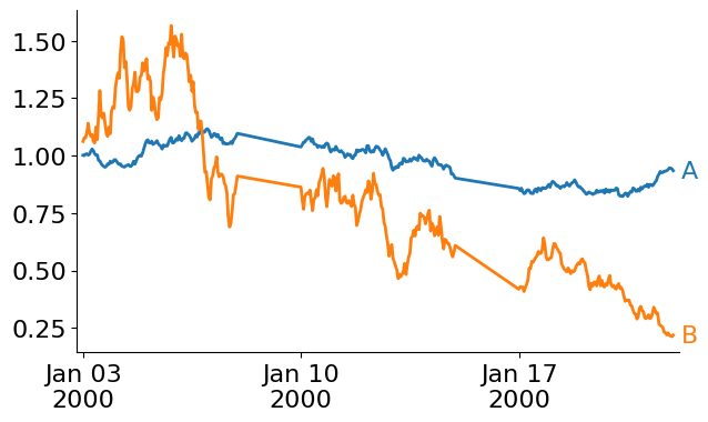
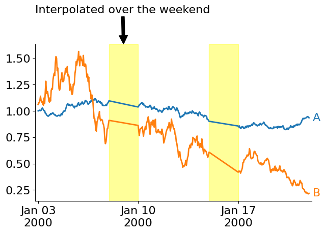
Notice that since we do not have weekends in our dataset, Matplotlib simply interpolates from Friday → Monday each week! If you are struggling to see it, take a look at the chart below that highlights the area of inappropriate interpolation.
from matplotlib.pyplot import close
from pandas import Series, Timedelta
from numpy import diff as np_diff, nan

deltas = Series(df.index.diff())
right_mask = (deltas           > Timedelta(hours=1))
left_mask =  (deltas.shift(-1) > Timedelta(hours=1))

spans = []
for left, right in zip(df.index[left_mask], df.index[right_mask]):
    spans.append(
        ax.axvspan(left, right, 0, 1, color='yellow', alpha=.4)
    )

span_annot = ax.annotate(
    'Interpolated over the weekend',
    xy=(.5, 1), xycoords=spans[0],
    xytext=(0, 1.2), textcoords=ax.transAxes,
    arrowprops=dict(facecolor='black', shrink=.01),
)

display(fig)
close(fig)
As I mentioned earlier, this ends up not being a simple data filtering problem, but a plotting problem. How do we tell Matplotlib not to interpolate between two adjacent values in a line? Thankfully, we have a couple of tricks that we can rely on just for this use case. We can:
Use NaN to break up adjacent cross-weekend values, see a Matplotlib Example.
Plot the weeks as individual lines (or individual elements in a LineCollection).
Use Small Multiples to plot all weeks individually on different charts.
Let's take a look at how each of these would work:
Add NaNs to Weekends
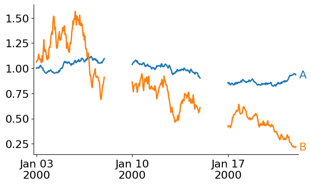
This first approach forces us to reorganize our data. Matplotlib will automatically break apart lines if NaN is present in the underlying array. This means that, if we reintroduce weekends into our data and populate their corresponding values with NaN, then we should be able to visually break apart the weekly data.
# Create index that contains the missing weekends
from pandas import date_range

days = date_range(start=df.index.min(), end=df.index.max(), freq='D')
weekends = days[days.weekday >= 5]

# Introduce the weekends into the index
plot_df = df.reindex(df.index.union(weekends))

# Show new NaN values at a weekend
plot_df.loc['2000-01-07 23':'2000-01-10 00:01']| A | B | |
|---|---|---|
| 2000-01-07 23:00:00 | 1.096312 | 0.910662 |
| 2000-01-08 00:00:00 | NaN | NaN |
| 2000-01-09 00:00:00 | NaN | NaN |
| 2000-01-10 00:00:00 | 1.037425 | 0.862685 |
Now our plotting code stays exactly the same, and we let Matplotlib handle the rest.
fig, ax = subplots()

for name, s in plot_df.items():
    line, = ax.plot(s.index, s, label=name, lw=2)
    ax.annotate(
        name,
        xy=(s.index[-1], s.iloc[-1]),
        xytext=(5, 0), textcoords='offset points',
        color=line.get_color(),
        va='center',
    )

ax.xaxis.set_major_locator(WeekdayLocator([0]))
ax.xaxis.set_major_formatter(DateFormatter('%b %d\n%Y'))
ax.margins(x=.01)

display(fig)
close(fig)
Plot the weeks individually
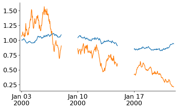
Instead of manipulating the data themselves to coerce our chart to display how we want, we can also simply plot each week of data individually. Depending on the cardinality of your data (here, three weeks is rather small), this may be slow since it requires iterating over the groups. This approach also requires us to manually track the colors associated with each signal.
from pandas import Grouper
from matplotlib import colormaps


fig, ax = subplots()

# iterate over weekly chunks of the data
for wk, data in df.groupby(Grouper(freq='W')):
    for name, color in zip(data.columns, colormaps['tab10'].colors):
        ax.plot(data.index, data[name], color=color)

ax.xaxis.set_major_locator(WeekdayLocator([0]))
ax.xaxis.set_major_formatter(DateFormatter('%b %d\n%Y'))
ax.margins(x=.01)

display(fig)
close(fig)
Instead of plotting within each grouped iteration, we can store the relevant data in a new container and plot those data as a singular LineCollection. The LineCollection is useful when Matplotlib needs to draw many disconnected lines at once to help speed up the rendering process. Check out Matplotlib's documentation for more: Matplotlib LineCollection Example
from matplotlib.collections import LineCollection
from matplotlib.dates import date2num
from numpy import column_stack

fig, ax = subplots()

collections, colors = [], []
for wk, data in df.groupby(Grouper(freq='W')):
    for name, color in zip(data.columns, colormaps['tab10'].colors):
        collections.append(column_stack([date2num(data.index), data[name]]))
        colors.append(color)

for xy in collections:
    ax.update_datalim(xy)
ax.autoscale_view()

lc = LineCollection(collections, color=colors)
ax.add_collection(lc)
ax.xaxis.set_major_locator(WeekdayLocator([0]))
ax.xaxis.set_major_formatter(DateFormatter('%b %d\n%Y'))
ax.margins(x=.01)

display(fig)
close(fig)
Small Multiples
Finally, using my favorite approach, we can create Small Multiples and plot each week's worth of data onto a separate chart. This "fixes" the awkward gaps in our data on the contiguous line charts above and readily allow us to "wrap" our lines around to a new row if we have many weeks to visualize.
n_unique_weeks = (
    (~df.index.isocalendar().duplicated(subset=['year', 'week'], keep='first'))
    .sum()
)

fig, axes = subplots(1, n_unique_weeks, figsize=(12, 3), sharey=True)
for ax, (wk, data) in zip(axes.flat, df.groupby(Grouper(freq='W'))):
    for name, color in zip(data.columns, ['tab:blue', 'tab:orange']):
        ax.plot(data.index, data[name], color=color)

    subtitle = ax.annotate(
        f'{wk:%b-%d}',
        xy=(0, 1), xycoords=ax.transAxes,
        xytext=(0, 10), textcoords='offset points',
        va='bottom',
        size='medium'
    )
    title = ax.annotate(
        f'{wk:%Y week %U}',
        xy=(0, 1), xycoords=subtitle,
        xytext=(0, 5), textcoords='offset points',
        size='x-large',
    )

    ax.xaxis.set_tick_params(bottom=False, labelbottom=False)
    ax.margins(x=0)

display(fig)
close(fig)
Wrap-Up
And that's how you plot weekly timeseries data in Matplotlib without some regular recurring interval! I hope you enjoyed this quick exploration of Matplotlib!
What do you think about my answer to this question? Anything you’d do differently? Something not making sense? Let me know on the DUTC Discord server.
Talk to you all next week!