Exploratory → Communicative Data Viz!
Student Visualization Competition
Last week, I held a review session for awardees of the Michael H. Freilich Student Visualization Competition held by the American Geophysical Union. Here, student presenters had the opportunity to share their data visualization submissions and receive feedback from myself as well as their peers. There was some amazing work that had been submitted that truly pushed the boundaries of what is typically considered to be a "visualization"—there were 3D flythroughs of lava tubes and interactive kinetic displays to understand water runoff.
But the primary purpose of the competition isn't to make a neat visualization or technology, it is to tell a convincing story with data, where visuals end up playing a large role. Amongst all of the innovative technologies being shared, each presenter also had their own slide deck with a data story and some static visualizations. In addition to helping them focus their stories, I also shared a few tips and tricks so that the visualizations themselves helped guide the audience through their story.
Today, I want to share one such example with you all! The visualization displayed a heatmap that exhibited a gradual shift in color along the secondary Axis (top to bottom). So let's create some synthetic data, recreate a rough sketch of the original visualization, and discuss the improvements I would make!
Data & Recreation
Since we had a heatmap, we know we're talking about a two-dimensional dataset. One dimension was time (years), another was region (which I will simplify to "region of the world" for this blog post), and finally the values represented the proportion of ice in a given region at the given time.
from numpy.random import default_rng
from numpy import asarray

rng = default_rng(0)

years =   [*range(2010, 2024)]
regions = [*'ABCDEFGHIJ']

# synthetic starting values for the gradual shift
data = asarray([0, .04, .08, .12, .12, .1, .2, .2, .25, .3, .4, .35, .4, .4])
data = (
    (data[:, None] + .1)
    * 1.3
    + rng.normal(0, .2, size=(len(years), len(regions)))
).clip(0, 1)

data[:5].round(2)
array([[0.16, 0.1 , 0.26, 0.15, 0.02, 0.2 , 0.39, 0.32, 0. , 0. ],
[0.06, 0.19, 0. , 0.14, 0. , 0.04, 0.07, 0.12, 0.26, 0.39],
[0.21, 0.51, 0.1 , 0.3 , 0.41, 0.25, 0.09, 0.05, 0.14, 0.28],
[0.08, 0.24, 0.25, 0.39, 0.33, 0.36, 0.16, 0.26, 0.44, 0.58],
[0.03, 0.59, 0.56, 0.44, 0.34, 0.22, 0.58, 0.68, 0.65, 0.55]])With the data behind us, the visualization should be fairly straightforward. We can use Axes.pcolormesh to create a heatmap with appropriate labels, and then derive a colorbar from the resultant object. It is important that we manually specify vmin=0, vmax=1 here, or else our color palette will not have the appropriate boundaries.
In this case, a value of 0 indicates that the entire region is frozen in a given time period, whereas a value of 1 indicates that the entire region is thawed in a given time period.
from matplotlib.pyplot import subplots, rc, close
from matplotlib.ticker import MultipleLocator

rc('font', size=16)
rc('axes.spines', top=False, right=False, left=False, bottom=False)

base_fig, ax = subplots()
mesh = ax.pcolormesh(regions, years, data, vmin=0, vmax=1, cmap='Blues')
base_fig.colorbar(mesh, ax=ax, label='Proportion Thawed')
ax.yaxis.set_major_locator(MultipleLocator(2))
ax.tick_params(bottom=False, left=False, labelbottom=False, labeltop=True)
ax.invert_yaxis()

display(base_fig)
close(base_fig)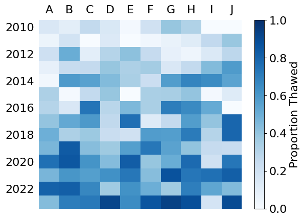
Feedback
The data visualization itself makes a good "exploratory" chart. Meaning that it is easy for one to detect patterns or relationships that exist. And, after a few moments, you might detect a gradual shift of white→blue along the vertical axis of the chart.
The key point is the gradual shift of ice → water over time in each region, but that is not prioritized when presenting with this visualization. Let's talk about the two comparisons we can make with this chart.
Scanning left→right, we observe the changes within each year across the regions.
Scanning top→bottom, we observe the changes within each region across time.
The heatmap gently prioritizes the left→right comparison to US/European audiences since that direction is in line with how we read. However, I wouldn't even say that transposing the data alone is enough to force our perspective.
Guiding Perspective
To really ensure our audience sees this change how we want them to perceive it, we use grid lines to create visual groupings along our comparison of interest. Check out how the below variations aid your perception of the heatmap along the vertical and horizontal axes respectively.
from matplotlib.ticker import MultipleLocator

guided_fig, axes = subplots(1, 2, figsize=(10, 5), layout='constrained', sharex=True, sharey=True)

for ax in axes:
    mesh = ax.pcolormesh(regions, years, data, vmin=0, vmax=1, cmap='Blues')
    guided_fig.colorbar(
        mesh, ax=ax, label='Proportion Thawed', shrink=.8, location='bottom'
    )

    ax.tick_params(
        bottom=False,
        left=False,
        labelbottom=False,
        labeltop=True,
        labelleft=True
    )
    ax.yaxis.set_major_locator(MultipleLocator(2))

ax.invert_yaxis()

vert_ax, horiz_ax = axes

vert_ax.xaxis.set_minor_locator(MultipleLocator(1, offset=.5))
vert_ax.tick_params(which='minor', bottom=False, left=False)
vert_ax.xaxis.grid(which='minor', color='k', lw=2)

horiz_ax.yaxis.set_minor_locator(MultipleLocator(1, offset=.5))
horiz_ax.tick_params(which='minor', bottom=False, left=False)
horiz_ax.yaxis.grid(which='minor', color='k', lw=2)

display(guided_fig)
close(guided_fig)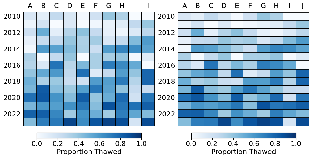
This approach leverages the "Common Region" Gestalt Principle to perceptually group the data such that we highlight our important comparison. This effect is further exacerbated by additionally transposing the data such that our perceptual groups run in parallel to the audience's native reading direction.
from matplotlib.pyplot import setp
from matplotlib.ticker import MultipleLocator

guided_fig, ax = subplots(figsize=(8, 5))
mesh = ax.pcolormesh(years, regions, data.T, vmin=0, vmax=1, cmap='Blues')
guided_fig.colorbar(
    mesh, ax=ax, label='Proportion Thawed',
    shrink=.8, location='bottom', pad=.05
)
ax.tick_params(
    bottom=False, left=False, labelbottom=False, labeltop=True, labelleft=True
)
ax.invert_yaxis()

ax.xaxis.set_major_locator(MultipleLocator(2))
setp(ax.get_xticklabels(), rotation=45, ha='left', rotation_mode='anchor')

ax.yaxis.set_minor_locator(MultipleLocator(1, offset=.5))
ax.tick_params(which='minor', left=False)
ax.yaxis.grid(which='minor', color='k', lw=2)

display(guided_fig)
close(guided_fig)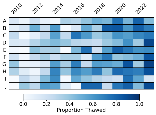
Unidirectional Plots
Given the low volume of regions, we can opt to completely change this chart from a heatmap to a form of ridge plot. In this case, we're going to create numerous small area charts to highlight the proportions of each region that is currently water (blue) or ice (white). Instead of using color as a continuous channel, we are going to use the height of the area chart to represent that that value. Because area charts are naturally read left→right, we can trust that this is the perspective that will be prioritized.
ridge_fig, axes = subplots(
    len(regions), 1, figsize=(8, 4), gridspec_kw={'hspace': 0},
)
ridge_fig.set_facecolor('#F5F5F5')
for (reg, dat, ax) in zip(regions, data.T, axes, strict=True):
    ax.fill_between([*years, years[-1]+1], [*dat, dat[-1]], 1, color='white')
    ax.annotate(
        reg, xy=(-.01, .5), xycoords=ax.transAxes, ha='right', va='center'
    )
    ax.axhline(0, color='k', lw=3)
    ax.set_ylim(bottom=0, top=1)
    ax.set_facecolor('tab:blue')
    ax.tick_params(
        bottom=False, left=False, labelbottom=False, labelleft=False
    )

    ax.margins(x=0)

axes[0].axhline(1, color='k', lw=3)
axes[0].xaxis.set_major_locator(MultipleLocator(1))
axes[0].xaxis.set_minor_locator(MultipleLocator(2, offset=.5))
axes[0].xaxis.set_minor_formatter(lambda x, pos: f'{x-.5:g}')
axes[0].tick_params(
    which='minor', labeltop=True, bottom=False, labelbottom=False,
    labelsize='small',
)
axes[0].tick_params(top=True, bottom=False)
ridge_fig.supylabel('Region', x=.05)

display(ridge_fig)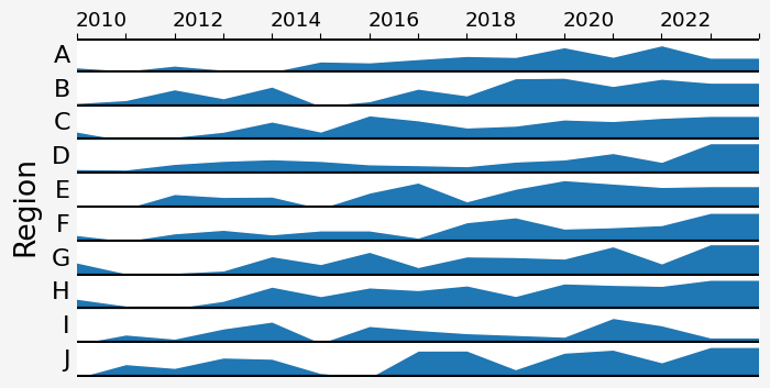
Don’t Mis-Represent Your Data!
The caveat of the above approach is that we have now interpolated data where there used to be discrete boundaries. While this can be useful in drawing attention the magnitude of adjacent differences, it also misleads the audience into thinking these changes have a linear year-over-year change. This change is a bit more subjective as some argue that the gain to aesthetics outweighs the fine-grained interpretative difference. Let’s re-envision this chart to avoid the linear interpolation between adjacent points.
ridge_fig, axes = subplots(
    len(regions), 1, figsize=(8, 4), gridspec_kw={'hspace': 0},
)
ridge_fig.set_facecolor('#F5F5F5')
for (reg, dat, ax) in zip(regions, data.T, axes, strict=True):
    ax.bar(years, dat, width=1, color='tab:blue', align='edge', linewidth=.2, edgecolor='k')
    ax.annotate(
        reg, xy=(-.01, .5), xycoords=ax.transAxes, ha='right', va='center'
    )
    ax.axhline(0, color='k', lw=3)
    ax.set_ylim(bottom=0, top=1)
    ax.tick_params(
        bottom=False, left=False, labelbottom=False, labelleft=False
    )

    ax.margins(x=0)

axes[0].axhline(1, color='k', lw=3)
axes[0].xaxis.set_major_locator(MultipleLocator(1))
axes[0].xaxis.set_minor_locator(MultipleLocator(2, offset=.5))
axes[0].xaxis.set_minor_formatter(lambda x, pos: f'{x-.5:g}')
axes[0].tick_params(
    which='minor', labeltop=True, bottom=False, labelbottom=False,
    labelsize='small',
)
axes[0].tick_params(top=True, bottom=False)
ridge_fig.supylabel('Region', x=.05)

display(ridge_fig)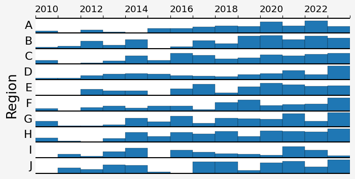
Bottom Line Up Front
The best tip to guide your audience's attention towards a given conclusion is to put the bottom line up front. With our data visualizations, this often means that we should put our assertion in the title and let the chart support our data.
The same rule applies to your slide decks. If you have a PowerPoint/Google slide, put the takeaway at the top of your slide!
from highlight_text import HighlightText
import matplotlib.patheffects as path_effects

def path_effect_stroke(**kwargs):
    return [path_effects.Stroke(**kwargs), path_effects.Normal()]

HighlightText(
    x=0, y=2.2,
    s=(
        'Ocean <ice> gradually thaws to <water>'
        '\n<across numerous regions over the past decade>'
    ),
    size='large',
    ax=axes[0],
    highlight_textprops=[
        {
            'color': 'white',
            'path_effects': path_effect_stroke(linewidth=1, foreground='k'),
            'weight': 'bold',
        },
        {
            'color': 'tab:blue',
            'weight': 'bold',
        },
        {
            'size': 'small'
        },
    ],
    annotationbbox_kw={
        'boxcoords': axes[0].transAxes,
    },
    va='bottom',
)

display(ridge_fig)
close(ridge_fig)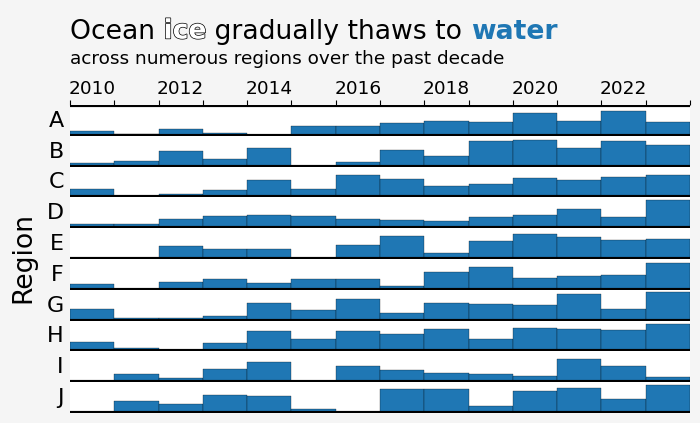
Wrap-Up
That's all for this week. The main takeaway here: always consider your audience! When creating narratives, it is important to think of what your audience will takeaway what you have shown them. Your conclusions should be obvious and supported by your visualizations. While it sounds obvious, it is so often overlooked in data visualization. Hope you consider this in your next data story.
What do you think about my data viz tips? Do you agree with me? Let me know on the DUTC Discord server.
Talk to you all next week!