Overlapping Charts in Matplotlib
It's been a while since I last wrote about Matplotlib, but a recent & fun Stack Overflow question caught my eye. The question asker wanted to create a chart that was visually simiar to the following:

Where the goal is to stack multiple time series plots vertically in a way that made them appear to overlap—without actually occluding one another’s data. This kind of layout is common in scientific papers, but achieving it in Matplotlib takes a few small tricks.
Before we dive into the data-viz code, I want to commend the individual asking this question, as they did an excellent job by providing a minimal reproducible example (MRE). That alone deserves kudos—it makes answering the question way easier and increases the odds of getting a useful answer. Let's jump right into the code that was written and the solution I arrived at.
Data Generation
Let’s first take a look at how the synthetic data was created. This step isn't central to the question, but it's helpful for context. The code simulates three time series—each with slightly different characteristics—to mimic environmental measurements over time.
import numpy as np

years = np.linspace(1300, 2000, 701)

np.random.seed(42)

delta_13C = np.cumsum(np.random.normal(0, 0.1, len(years)))
delta_13C = delta_13C - np.mean(delta_13C)
delta_18O = np.cumsum(np.random.normal(0, 0.08, len(years)))
delta_18O = delta_18O - np.mean(delta_18O)
temp_anomaly = np.cumsum(np.random.normal(0, 0.03, len(years)))
temp_anomaly = temp_anomaly - np.mean(temp_anomaly)
temp_anomaly[-100:] += np.linspace(0, 1.5, 100)

print(
    f'{years[:4]        = }',
    f'{delta_13C[:4]    = }',
    f'{delta_18O[:4]    = }',
    f'{temp_anomaly[:4] = }',
    sep='\n'
)
years[:4] = array([1300., 1301., 1302., 1303.])
delta_13C[:4] = array([0.28248454, 0.26865811, 0.33342697, 0.48572995])
delta_18O[:4] = array([-2.53182461, -2.5881721 , -2.70084901, -2.82537934])
temp_anomaly[:4] = array([-0.8757976 , -0.854229 , -0.82434757, -0.84705142])The Original Attempt
Now we get to the main plotting logic. The original code used a matplotlib.gridspec.GridSpec to arrange three subplots vertically with adjustable spacing (hspace). Each plot has its own color and Y-axis label, and the spines (borders around the plot area) are styled to match the data color.
import matplotlib.pyplot as plt
from matplotlib.gridspec import GridSpec

def original(hspace):
    plt.style.use('default')
    plt.rcParams['font.size'] = 12
    plt.rcParams['axes.linewidth'] = 1.5
    plt.rcParams['axes.labelsize'] = 14

    fig = plt.figure(figsize=(10, 8))
    gs = GridSpec(3, 1, height_ratios=[1, 1, 1], hspace=hspace)

    ax1 = fig.add_subplot(gs[0])
    ax1.plot(years, delta_13C, color='green', linewidth=1.0)
    ax1.set_ylabel('First', color='green', labelpad=10)
    ax1.tick_params(axis='y', colors='green')
    ax1.set_xlim(1300, 2000)
    ax1.set_ylim(-4, 4)
    ax1.xaxis.set_visible(False)
    ax1.spines['top'].set_visible(False)
    ax1.spines['bottom'].set_visible(False)
    ax1.spines['right'].set_visible(False)
    ax1.spines['left'].set_color('green')

    ax2 = fig.add_subplot(gs[1])
    ax2.plot(years, delta_18O, color='blue', linewidth=1.0)
    ax2.yaxis.tick_right()
    ax2.yaxis.set_label_position("right")
    ax2.set_ylabel('Second', color='blue', labelpad=10)
    ax2.tick_params(axis='y', colors='blue')
    ax2.set_xlim(1300, 2000)
    ax2.set_ylim(-3.5, 3.5)
    ax2.xaxis.set_visible(False)
    ax2.spines['top'].set_visible(False)
    ax2.spines['bottom'].set_visible(False)
    ax2.spines['left'].set_visible(False)
    ax2.spines['right'].set_color('blue')

    ax3 = fig.add_subplot(gs[2])
    ax3.plot(years, temp_anomaly, color='gray', linewidth=1.0)
    ax3.set_ylabel('Third', color='black', labelpad=10)
    ax3.set_xlim(1300, 2000)
    ax3.set_ylim(-1.0, 1.5)
    ax3.set_xlabel('Year (CE)')
    ax3.spines['top'].set_visible(False)
    ax3.spines['right'].set_visible(False)

    return fig, [ax1, ax2, ax3]

fig, axes = original(hspace=0.2);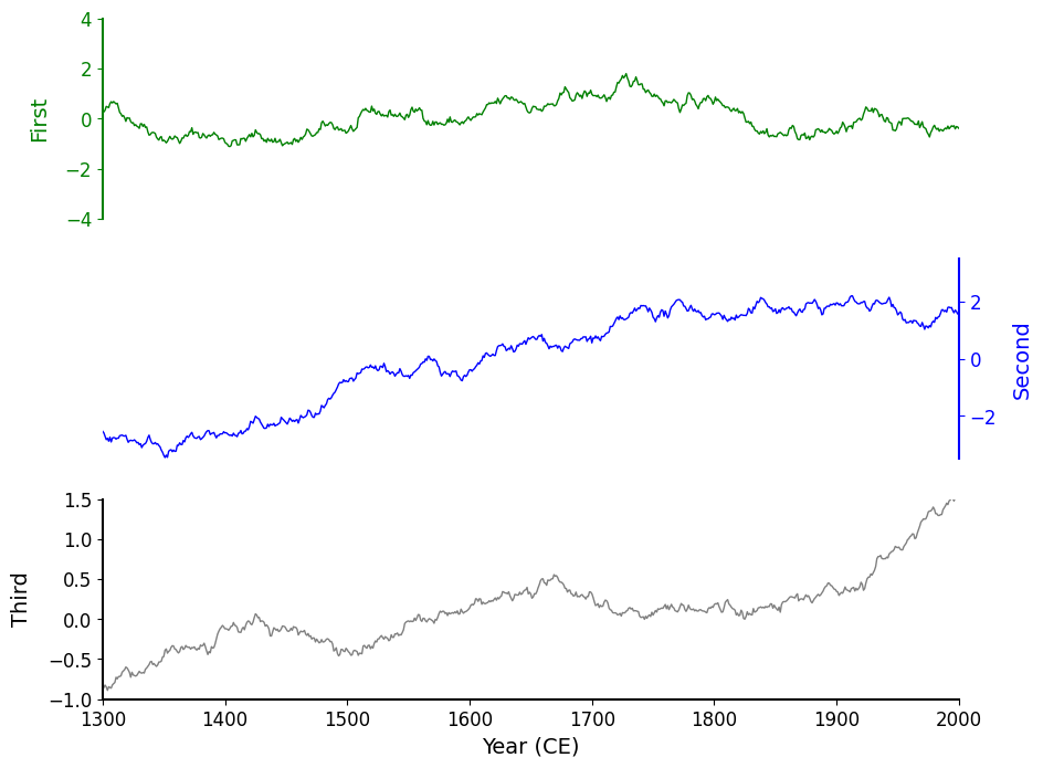
The result looks okay, but clearly we can squeeze these charts a bit more tightly against one another! In Matplotlib we can achieve this via the hspace argument that is passed into a GridSpec. hspace is short for height space — it's a parameter that controls the vertical spacing between rows of subplots when using GridSpec or plt.subplots().
More Overlap!
To get closer to the overlapping effect, I suggested reducing the hspace to a negative value. This brings the axes closer together—so close, in fact, that the axis regions start to stack on top of one another.
fig, axes = original(hspace=-.3)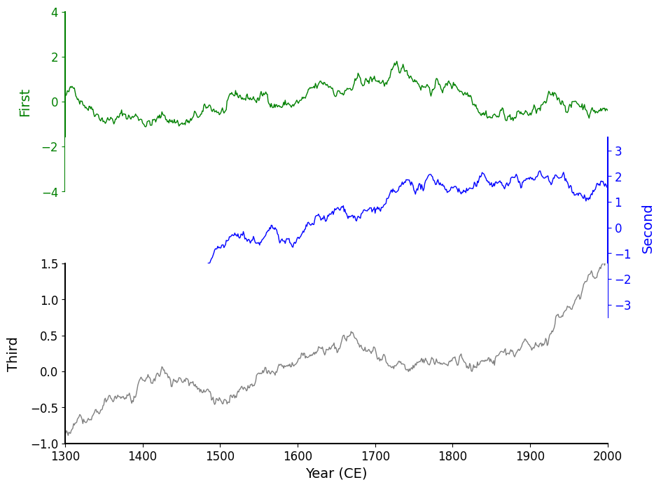
This definitely made the charts overlap more, but now we’ve occluded the first ~20% of the data from the "Second" blue chart! When you encounter issues with occlusion in data visualization, there are two ways to fix this.
Shrink boundaries (e.g. move elements away from one another)
This isn't achieveable since it directly conflicts with our vision for this chart.
Decrease the opacity: make the overlapping elements more transparent.
This can introduce oversaturation if there are a high number of overlapping elements. Thankfully we only have a solid line overlapping with the background of the Axes.
Seeing Where Overlap Occurs
If you are ever dealing with an unknown number of overlapping elements- you should always visualize the bounding boxes of those elements. Here we did this by making the spines visible to us so we can see exactly where the overlap was occurring and were able to conclude the order the overlaps exist in.
fig, axes = original(hspace=-.3)
for ax in axes:
    ax.spines[:].set_visible(True)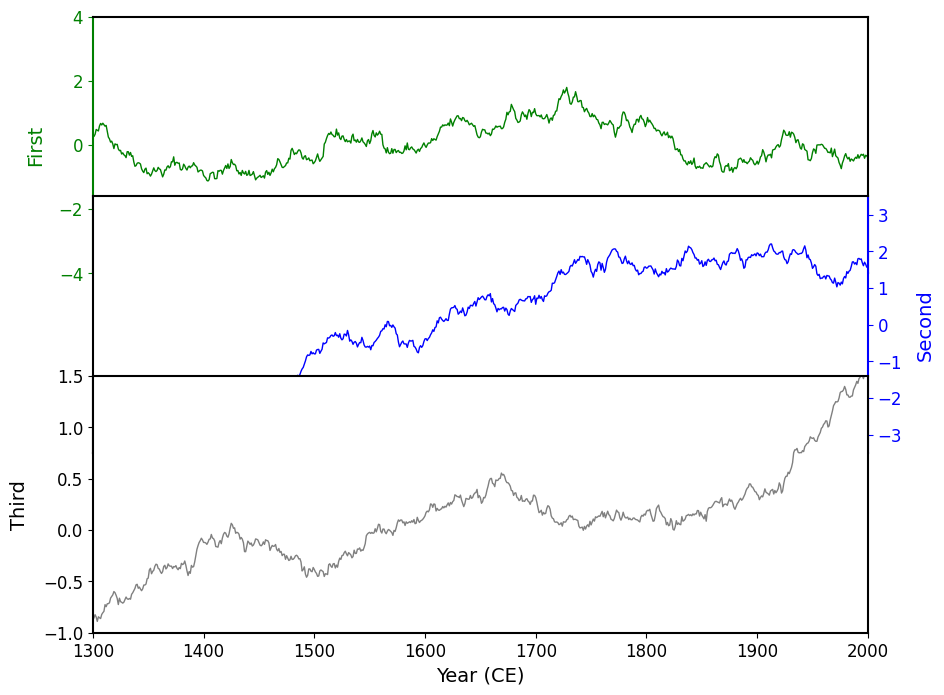
On the above chart, you can see that the charts are overlapping, and exhibit the following pattern: the "Third" chart sits on top (in terms of depth) of the "Second" chart, which sits on top of the "First" chart. This is the reason for the occlusion, so all we need to do is make the background color of each Axes transparent!
Transparent Axes Background
There are numerous ways to create a transparent background on an Axes. It can be controlled at the configuration level
import matplotlib.pyplot as plt
plt.rc('axes', facecolor='none') # 'none' is a special name for transparent for Matplotlib colors
Or directly on an Axes object:
fig, ax = plt.subplots()
ax.set_facecolor('none')
In our case, we don’t have access the the configuration without rewriting some code so I'll opt to set this property directly on each Axes object:
fig, axes = original(hspace=-.3)
for ax in axes:
    ax.set_facecolor('none')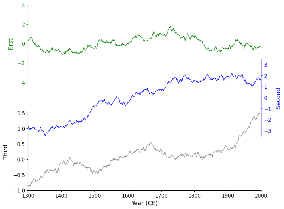
Now it really looks like the plots are layered directly on top of each other. The result is more visually compact and feels cohesive.
Refactoring Matplotlib Code
As a final step, I refactored the plotting code to make it cleaner and easier to reuse. Rather than manually configuring each axis with repetitive code, I defined a small namedtuple called PlotSettings to hold the styling for each plot. I also switched to using pyplot.subplots() with sharex=True and a custom hspace, which is a bit more streamlined than setting up GridSpec manually (though less flexible).
from collections import namedtuple
import matplotlib.pyplot as plt

plt.style.use('default')
plt.rc('font', size=12)

# instead of setting axes.set_facecolor(…) for each Axes manually
plt.rc('axes', linewidth=1.5, labelsize=14, facecolor='none')

PlotSettings = namedtuple('PlotSettings', ['data', 'linecolor', 'labelcolor', 'ylabel', 'yrange'])

# organize data and shared dynamic visual attributes
configurations = [
    PlotSettings(delta_13C,    linecolor='green', labelcolor='green', ylabel='First',  yrange=(-4  , 4  )),
    PlotSettings(delta_18O,    linecolor='blue',  labelcolor='blue',  ylabel='Second', yrange=(-3.5, 3.5)),
    PlotSettings(temp_anomaly, linecolor='gray',  labelcolor='black', ylabel='Third',  yrange=(-1  , 1.5)),
]

# Set up the figure and Axes layout using subplots(…)
#   this allows us to circumvent the explicit/manual use of a GridSpec object.
fig, axes = plt.subplots(
    nrows=len(configurations), ncols=1, figsize=(10, 8),
    sharex=True, sharey=False,
    gridspec_kw={'hspace': -.3}, # instead of using GridSpec manually
)

for i, (config, ax) in enumerate(zip(configurations, axes.flat)):
    ax.plot(years, config.data, color=config.linecolor, linewidth=1.0)

    # Format the X/Y Axes
    ax.set_ylabel(config.ylabel, color=config.labelcolor, labelpad=10)
    ax.tick_params(axis='y', colors=config.labelcolor)
    ax.set_ylim(*config.yrange)
    ax.xaxis.set_visible(False)

    # Format the spines
    ax.spines[['top', 'bottom']].set_visible(False)
    if (i % 2) == 0:
        ax.spines['right'].set_visible(False)
        ax.spines['left' ].set_visible(True)
        ax.spines['left' ].set_color(config.labelcolor)
    else:
        ax.spines['right'].set_visible(True)
        ax.spines['left' ].set_visible(False)
        ax.spines['right'].set_color(config.labelcolor)
        ax.yaxis.tick_right()
        ax.yaxis.set_label_position("right")

# Make special adjustments to the bottom-most plot
axes.flat[-1].spines['bottom'].set_visible(True)
axes.flat[-1].xaxis.set_visible(True)
axes.flat[-1].set_xlabel('Year (CE)')
axes.flat[-1].set_xlim(1300, 2000) # setting a single xlim updates all Axes x-limits since they are shared.

axes.flat[0].set_title('Overlapping Charts in Matplotlib', fontsize='xx-large');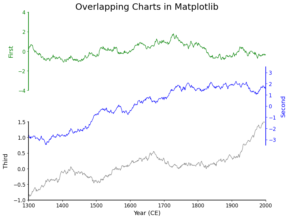
Wrap Up
Matplotlib gives you a massive amount of control when it comes to subplot layout — and with a little fine-tuning (like tweaking hspace or using transparent backgrounds), you can create overlapping charts that look clean and intentional rather than cluttered or confusing.
The original question on Stack Overflow was a great example of someone doing most things right — sharing a clear, minimal example and asking a thoughtful question. Sometimes all it takes is a tiny nudge to arrive at the visual result you’re after.
If you're doing this kind of thing often, I'd encourage experimenting directly with GridSpec and SubplotSpec for some more advanced layouts. There's even the (subfigure interface for really custom work as well!
Let me know if you’ve seen (or made!) any creative Matplotlib layouts recently — I’d love to take a look.