Better Categorical Color Palettes
In data visualization, we often reach for "categorical" or "qualitative" color palettes to present data with a limited number of known categories. However, not all categorical data is created equal. As you may know, we distinguish between categories that are nominal (having no inherent order, e.g., a list of city names) and those that are ordinal (having a meaningful order, e.g., a list of rankings).
Despite this distinction, many visualizations treat all categorical data the same, using the same color palettes for both types. The result? Misleading, confusing, or just plain noisy plots.
In this post, we’ll walk through a simple dataset of restaurant customer traffic and show how your choice of color palette should reflect the type of categorical data you're working with.
In particular, we'll observe that:
Nominal data (like restaurant names) should use qualitative or categorical color palettes, where each label is visually distinct but unordered.
Ordinal data (like years) benefit from discretized sequential palettes, where color suggests progression or ranking.
The Data
To get started, we’ll generate a small synthetic dataset that mimics restaurant foot traffic over time. Each record contains a restaurant name (nominal), a date, and the number of customers on that date (continuous).
from numpy import arange
from numpy.random import default_rng
from pandas import Series, concat, date_range


def gen_data(rng):
    s = Series(
        index=(idx := date_range('2000-01-01', '2010-12-31', freq='D')),
        data=rng.integers(300, 500, size=len(idx)),
        dtype='Int64'
    )

    mask = s.index.month.isin([5, 6, 7, 8])              # summer surge
    s.loc[mask] = (s * 1.2).astype(s.dtype)

    s *= ((s.index.year - s.index.year.min()) * .05 + 1) # annual increase
    s = s.rolling('10D').mean().dropna().astype(int)
    return s


rng = default_rng(0)
restaurants = ["The Spicy Fig", "Oak & Ember", "Noodlecraft Bistro"]
data = {
    # between restaurant offsets
    rest: (
        ((s := gen_data(rng).rename('n_customers')) + (100 * i))
        * arange(20, len(s)+20) / 1000
    )
    for i, rest in enumerate(restaurants, start=1)
}

df = concat(data, names=['restaurant', 'date']).reset_index()
df| restaurant | date | n_customers | |
|---|---|---|---|
| 0 | The Spicy Fig | 2000-01-01 | 11.400 |
| 1 | The Spicy Fig | 2000-01-02 | 11.508 |
| 2 | The Spicy Fig | 2000-01-03 | 11.726 |
| 3 | The Spicy Fig | 2000-01-04 | 11.799 |
| 4 | The Spicy Fig | 2000-01-05 | 12.048 |
| ... | ... | ... | ... |
| 12049 | Noodlecraft Bistro | 2010-12-27 | 3649.865 |
| 12050 | Noodlecraft Bistro | 2010-12-28 | 3634.634 |
| 12051 | Noodlecraft Bistro | 2010-12-29 | 3655.710 |
| 12052 | Noodlecraft Bistro | 2010-12-30 | 3588.004 |
| 12053 | Noodlecraft Bistro | 2010-12-31 | 3637.337 |
12054 rows × 3 columns
The Obvious Categorical
Let’s begin by plotting all three restaurants over time. Since there’s no meaningful order to the restaurant names, they are best treated as nominal categories.
For that reason, we can use a standard categorical color palette where each color sharply contrasts with the others, helping us distinguish each line with ease.
# some default settings for all plots
from matplotlib.pyplot import rc

rc('figure', figsize=(8, 4))
rc('font', size=12)
rc('axes.spines', top=False, right=False, left=False, bottom=False)
from matplotlib.pyplot import subplots, rc
from matplotlib.dates import YearLocator, DateFormatter
fig, ax = subplots()
for label, group in df.groupby('restaurant'):
ax.plot(group['date'], group['n_customers'], label=label, clip_on=False)
ax.set_title('Noodlecraft Bistro is the Most Popular Restaurant')
ax.set_ylabel('Customers')
ax.legend(title='Restaurant', fontsize=10)
ax.xaxis.set_major_locator(YearLocator(3))
ax.xaxis.set_major_formatter(DateFormatter('%Y'))
ax.yaxis.grid(alpha=.3)
ax.yaxis.tick_right()
ax.yaxis.set_label_position('right')
ax.yaxis.set_tick_params(right=False)
ax.yaxis.set_major_formatter(lambda x, pos: f'{x/1000:g}k')
ax.margins(x=0, y=0)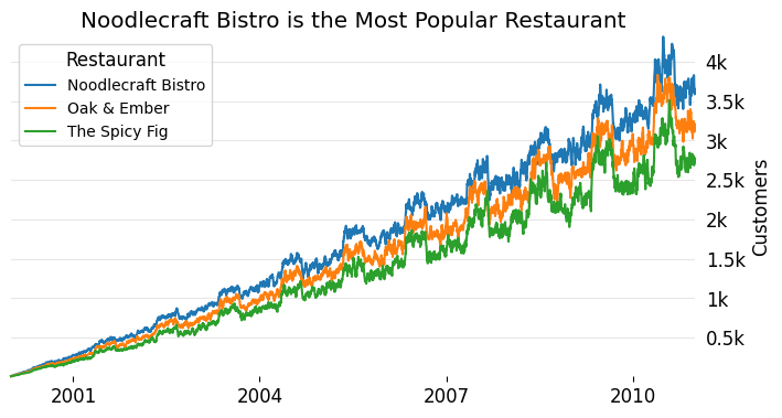
You've probably seen many plots like this one before. We have multiple lines, each representing a different level of a category. It's immediately clear that the blue line—representing Noodlecraft Bistro—consistently outperforms the other two.
This is a perfect use of a categorical color palette. Since the restaurant names have no inherent order, we want a palette that makes each line visually distinct, without implying any kind of ranking. The goal is to separate the labels clearly, not to suggest progression.
Categorical Color Palette vs Ordinal Data
Considering the rampant success of Noodlecraft Bistro, let's take a closer look at the data. From the above plot, it appears that there is some type of seasonal pattern (noting that there is a seemingly periodic increase/decrease) in the number of customers our restaurant attracts.
To investigate that, we can align each year of data to the same 12-month calendar and plot them together. This means treating year as a categorical variable, but this time it’s ordinal, since years have a meaningful order.
from matplotlib.pyplot import subplots, rc
from matplotlib.ticker import MultipleLocator
from matplotlib.dates import MonthLocator

def format_yoy_axes(ax):
    ax.xaxis.set_major_locator(MonthLocator([1, 3, 5, 7, 9, 11]))
    ax.xaxis.set_major_formatter(DateFormatter('%b'))
    ax.yaxis.tick_right()
    ax.yaxis.set_label_position('right')
    ax.yaxis.set_tick_params(right=False)
    ax.yaxis.set_major_locator(MultipleLocator(1000))
    ax.yaxis.set_major_formatter(lambda x, pos: f'{x/1000:g}k')
    ax.margins(x=0, y=0)
    return ax

noodle_df = (
    df.query('restaurant == "Noodlecraft Bistro"')
    .assign(
        year=lambda d: d['date'].dt.year,
        # the year component of the date is meaningless now
        date=lambda d: d['date'].map(lambda v: v.replace(year=2000))
    )
)

fig, ax = subplots()
for label, group in noodle_df.groupby('year'):
    ax.plot(group['date'], group['n_customers'], label=label, clip_on=False)

ax.set_title('Noodlecraft Bistro is the Most Popular Restaurant')
ax.set_ylabel('Customers')
ax.legend(title='Year', fontsize=10, loc='upper left', bbox_to_anchor=(1.15, 1))

format_yoy_axes(ax);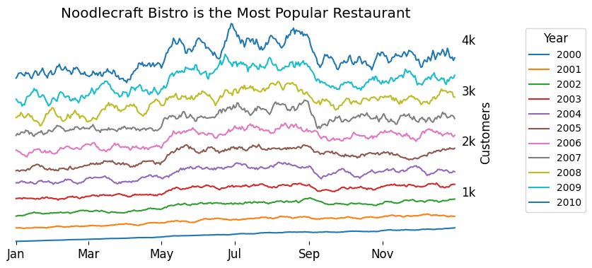
Here, we’re grouping data by year and plotting all years on the same x-axis (Jan–Dec). While we can already spot the general summer surge, it’s hard to compare the scale of the surge year to year. The legend offers some information, but it’s slow and not intuitive.
The issue? We’ve made a mistake in our color mapping. Year is an ordinal variable, yet we used a categorical palette. That palette doesn’t communicate the natural progression of time, making the plot harder to read.
Let’s fix that.
A Discretized Sequential Color Palette
We can better visualize ordinal data by using a discretized sequential palette, where color encodes progression. In this case, lighter or darker hues can imply earlier or later years.
Matplotlib supports this with continuous colormaps like 'viridis', which we can .resample(…) into a discrete number of bins (e.g., one for each year in our dataset).
from matplotlib.pyplot import get_cmap

# a discretized color palette
cmap = get_cmap('viridis').resampled(noodle_df['year'].nunique())
noodle_df = noodle_df.sort_values(['year', 'date'])

fig, ax = subplots()
for i, (label, group) in enumerate(noodle_df.groupby('year')):
    ax.plot(
        group['date'], group['n_customers'],
        label=label,
        clip_on=False,
        c=cmap(i) # use the i-th color of the discrete palette
    )

subtitle = ax.text(
    s='The surge becomes more exaggerated over the years',
    x=0, y=1.04, va='bottom', transform=ax.transAxes,
    size='small',
    color='gray',
)
ax.annotate(
    'Noodlecraft Bistro Sees more Customers In The Summer',
    xy=(0, 1), xycoords=subtitle, va='bottom',
    size='large',
)

ax.set_ylabel('Customers')
ax.legend(
    title='Year',
    fontsize=10,
    loc='upper left',
    bbox_to_anchor=(1.15, 1),
    reverse=True
)

format_yoy_axes(ax);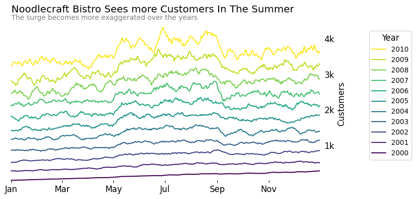
By using a sequential palette, we can instantly see that the summer surge has grown more intense in recent years. The relationship between year and customer traffic is now embedded in the visual structure of the chart, without relying on the legend or manual comparison.
Wrap-Up
Categorical color palettes are powerful, but they’re not one-size-fits-all. When working with categorical data, it’s crucial to ask: Is this nominal or ordinal?
For nominal data (e.g., restaurant names, city codes, categories without order), use qualitative/categorical color palettes. These are designed to clearly separate labels without suggesting ranking.
For ordinal data (e.g., age bands, percentiles, years), use sequential color palettes—ideally discretized when the number of levels is small. These allow viewers to intuitively pick up on progression.
Using the wrong palette won’t just make your chart harder to read; it can also undermine the story you’re trying to tell. Choose your palette based on the structure of your data, and your visualizations will be both more effective and more truthful.
What are your thoughts? Let me know on the DUTC Discord server!