Small Multiples in Matplotlib
Data visualization is all about helping our eyes do the heavy lifting. But when we want to compare patterns across multiple categories, it’s easy to drown in overlapping lines or end up with a confusing mess.
Imagine you want to compare daily temperatures across different regions of the United States. If you cram everything onto one chart, it looks like a bowl of spaghetti. But if you give each region its own giant chart, you’ll end up scrolling forever.
Small multiples offer a solution, keeping things compact but still comparable. Like a comic strip for your data, they repeat the same structure across panels, but each one tells its own story.
What Are Small Multiples?
Small multiples are a classic trick in the visualization toolbox. You line up a series of little charts that all share the same scales, so it’s easy to compare shapes and levels across categories. Instead of one overwhelming figure, you get a neat grid that invites exploration.
To make this work, though, you need to think about two different strategies for visualizing many data series:
Superimposition: stack everything on top of each other in a single chart. Typically, one would assign each data series a unique color to disambiguate them. This is compact, but it can get messy when lines overlap.
Juxtaposition: put each series in its own panel. This makes differences clearer, but requires more care in arranging the layout.
Done well, small multiples feel effortless, but there’s some tricky setup behind the scenes.
Data
Let’s set the stage with some synthetic temperature data. Each region gets a seasonal pattern plus its own climate offset.
%matplotlib aggimport numpy as np
from numpy.random import default_rng
import pandas as pd
rng = default_rng(2)
regions = {
"Northeast": -2, # colder winters, mild summers
"Southeast": +5, # generally warmer, humid
"Midwest": -3, # colder winters, mild summers
"Southwest": +8, # desert heat
"Northwest": 0, # mild overall
"West": +3, # coastal California warmth
"Great Plains": -1, # continental climate, slightly cooler
}
dates = pd.date_range("2024-01-01", periods=365, freq="D")
base_temp = 50 + 20 * np.sin(2 * np.pi * dates.dayofyear / 365)
offsets = np.asarray([*regions.values()]) * 3
data = rng.normal(base_temp.to_numpy()[:, None], 3) + rng.normal(offsets, 1, size=(len(dates), len(offsets)))
df = pd.DataFrame(data, index=dates, columns=[*regions.keys()]).rename_axis("date")
df.head()| Northeast | Southeast | Midwest | Southwest | Northwest | West | Great Plains | |
|---|---|---|---|---|---|---|---|
| date | |||||||
| 2024-01-01 | 46.090759 | 64.601824 | 42.836818 | 72.919615 | 48.750394 | 59.792059 | 47.918157 |
| 2024-01-02 | 43.562988 | 62.472802 | 40.060248 | 73.246712 | 50.375392 | 58.016347 | 46.649179 |
| 2024-01-03 | 42.815777 | 64.605648 | 40.347667 | 74.496507 | 48.804383 | 57.958880 | 47.369191 |
| 2024-01-04 | 39.841083 | 59.434350 | 35.355207 | 67.705504 | 45.140072 | 53.591563 | 42.784839 |
| 2024-01-05 | 51.449130 | 71.169741 | 47.548477 | 80.131014 | 55.867597 | 67.382136 | 54.925755 |
The Superimposed Plot
Our first attempt throws all the regions onto one plot. This is superimposition in action. It works fine for a couple of lines, but once you add more, it becomes more difficult to glean insites from the chart.
ax = df.plot(figsize=(8, 4), legend=False)
ax.legend(loc='upper left', bbox_to_anchor=(1,1))
ax.set_title('Temperatures within US Regions')
ax.yaxis.set_major_formatter(lambda x, pos: f'{x:g}°F')

ax.figure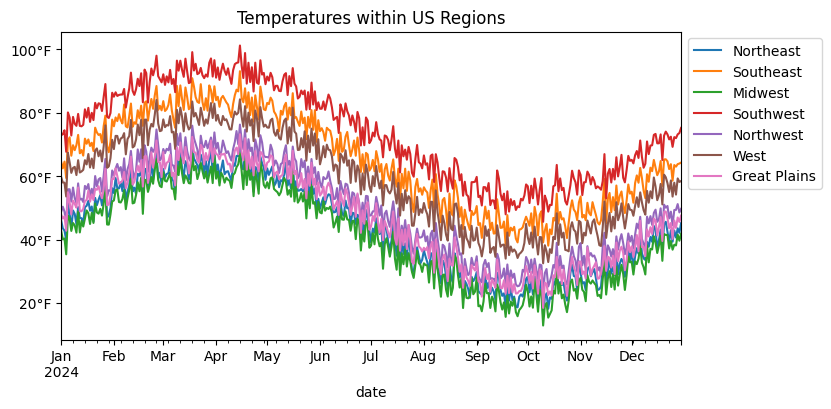
Superimposing everything gave us a quick overview, but it also turned into a bit of a tangle. The seasonal rhythm is there, but it’s hard to tell which region is which without constantly chasing the legend.
This is the classic tradeoff with superimposition: compactness versus clarity. The more lines you pile on, the harder it gets to follow any single one.
Alternatively, we can separate the series into their own little panels. That way, each region gets the spotlight, but we still keep the layout tight enough for easy side-by-side comparison. This strategy is called juxtaposition, and when you do it systematically in a grid where each chart in the grid shares the same x/y axes, you get small multiples.
The First Small Multiples Attempt
Creating a small multiples chart in Matplotlib is quite straight-forward. We just need to...
Figure out the number of cells in our grid of charts.
Iterate over our data and plot onto each chart.
Remove any Axes that were not plotted onto.
import matplotlib.pyplot as plt
from matplotlib.dates import ConciseDateFormatter, AutoDateLocator
from math import ceil

# (1) Calculate the number of rows our plot needs when provided the number of columns
ncols = 4
nrows = ceil(len(df.columns) / ncols)

# (2) set up the chart & plot the data
fig, axes = plt.subplots(ncols=ncols, nrows=nrows, figsize=(12, 4), sharex=True, sharey=True)
for (label, s), ax in zip(df.items(), axes.flat):
    ax.plot(df.drop(label, axis='columns'), color='gainsboro', lw=.5)
    ax.plot(s.index, s, lw=1)

    ax.set_title(label, loc='left')
    ax.spines[['top', 'right']].set_visible(False)

locator = AutoDateLocator()
ax.xaxis.set_major_locator(locator)
ax.xaxis.set_major_formatter(ConciseDateFormatter(locator))

fig.tight_layout()
fig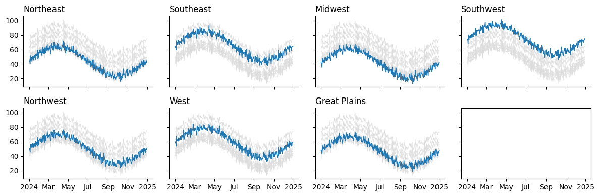
Looks like we forgot to remove the unused Axes in the bottom left. We have seven regions, but eight spaces for charts according to our grid. Thankfully, we can accomplish this programmatically:
# (3) Clean unused Axes (otherwise we would have blank Axes!)
for ax in axes.flat[len(df.columns):]:
    ax.set_visible(False)

plt.close(fig)
fig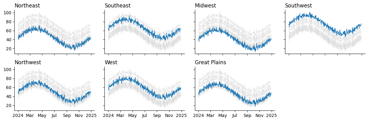
And there we have a pretty clean grid of charts! But the code behind it is a bit clunky. We had to...
Manually calculate how many rows and columns we need.
Flatten the axes array just to zip it with the data.
Hide any unused axes if the grid wasn’t perfectly filled.
None of this is hard, but it is distracting. Every time you want to make a grid of plots, you end up rewriting the same boilerplate.
A Reusable Generator for Axes
Let’s refactor. Instead of juggling rows, columns, and cleanup ourselves, we can write a helper that does the busywork. I've used variations of this helper across numerous exploratory notebooks. Having my own convenience tools on top of Matplotlib ensures that I can write code that is flexible enough to handle any task without hitting hard walls that some frameworks may encounter.
from matplotlib.dates import ConciseDateFormatter, AutoDateLocator
from math import ceil

def gen_multiples(fig, naxes, nrows=None, ncols=None):
    # handles the automatic derivation of nrows/ncols
    match (nrows, ncols):
        case (None, int):
            nrows = ceil(naxes / ncols)
        case (int, None):
            ncols = ceil(naxes / nrows)
        case (None, None):
            nrows, ncols = 1, naxes

    prev_ax = None
    for i in range(naxes):
        ax = fig.add_subplot(nrows, ncols, i+1, sharex=prev_ax, sharey=prev_ax)
        yield ax
        prev_ax = ax

fig = plt.figure(figsize=(12, 4))
ax_gen = gen_multiples(fig, len(df.columns), ncols=4)

# as we iterate over `ax_gen` we create the Axes on the fly,
#   meaning we don't have to "hide" unused Axes when we finish
for (label, s), ax in zip(df.items(), ax_gen):
    ax.plot(df.drop(label, axis='columns'), color='gainsboro', lw=.5)
    ax.plot(s.index, s, lw=1)

    ax.set_title(label, loc='left')
    ax.spines[['top', 'right']].set_visible(False)

locator = AutoDateLocator()
ax.xaxis.set_major_locator(locator)
ax.xaxis.set_major_formatter(ConciseDateFormatter(locator))

fig.tight_layout()
plt.close(fig)
fig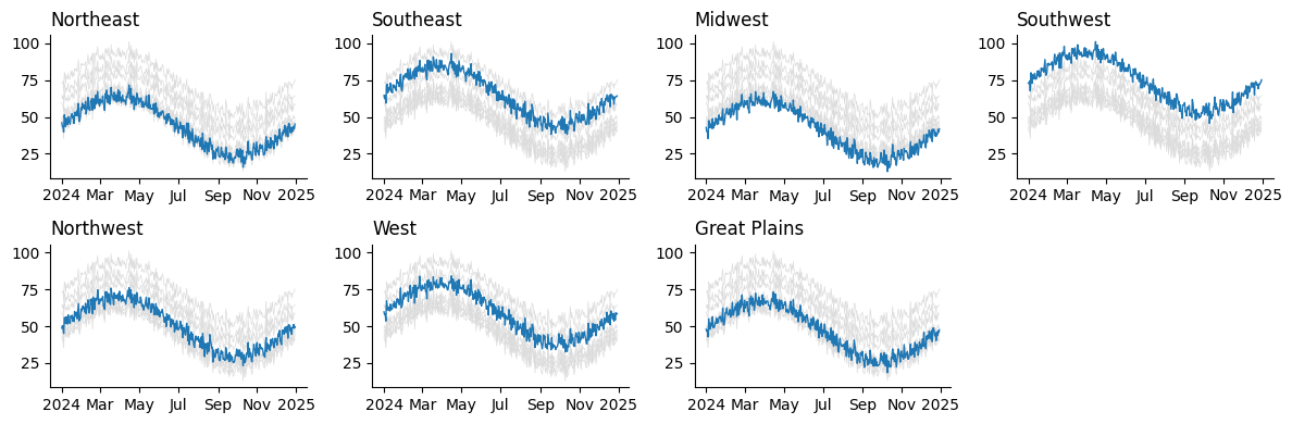
Bonus: Small Multiples from Long Data
Sometimes your data is in long format, with a region column instead of separate columns for each region. Thankfully, this is not a problem. Our generator still works, and we can facet by groups just as easily with just a few tweaks to the input code.
long_df = df.rename_axis('region', axis='columns').stack().rename('temperature').reset_index('region')
long_df| region | temperature | |
|---|---|---|
| date | ||
| 2024-01-01 | Northeast | 46.090759 |
| 2024-01-01 | Southeast | 64.601824 |
| 2024-01-01 | Midwest | 42.836818 |
| 2024-01-01 | Southwest | 72.919615 |
| 2024-01-01 | Northwest | 48.750394 |
| ... | ... | ... |
| 2024-12-30 | Midwest | 41.858889 |
| 2024-12-30 | Southwest | 75.239150 |
| 2024-12-30 | Northwest | 49.698884 |
| 2024-12-30 | West | 58.480237 |
| 2024-12-30 | Great Plains | 47.551059 |
2555 rows × 2 columns
fig = plt.figure(figsize=(12, 4))
grouped = long_df.groupby('region')['temperature']      # pandas GroupBy object
ax_gen = gen_multiples(fig, grouped.ngroups, ncols=4)   # .ngroups gets us the total number of datasets to plot

for (label, s), ax in zip(grouped, ax_gen):             # the GroupBy object produces each group upon iteration!
    ax.plot(df.drop(label, axis='columns'), color='gainsboro', lw=.5)
    ax.plot(s.index, s, lw=1)

    ax.set_title(label, loc='left')
    ax.spines[['top', 'right']].set_visible(False)

locator = AutoDateLocator()
ax.xaxis.set_major_locator(locator)
ax.xaxis.set_major_formatter(ConciseDateFormatter(locator))

fig.tight_layout()
plt.close(fig)
fig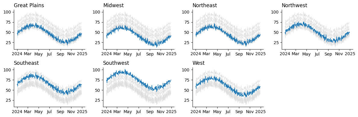
Wrap-Up
Clear visualization isn't just about the chart type, but about how you structure comparisons. Superimposition can get messy once more than a few series are involved. Instead, try reaching for small multiples. With cleaner code handling the setup, you can spend less time wrangling plots and more time telling a story with your data.
What are your thoughts? Let me know on the DUTC Discord server!