Matplotlib TickLocators and TickFormatters
There’s a particular phase in building a plot where everything seems fine: the data is correct, the lines look good, and the proportions feel right. But then you notice the ticks.
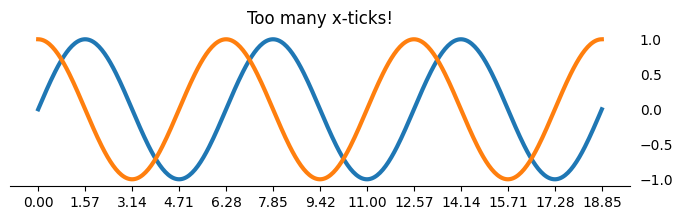
Not because they’re wrong. They’re usually technically correct. But they’re not quite aligned with how you’d naturally talk about the data. Perhaps there are too many, which makes the plot feel crowded.
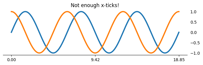
Or maybe there's not enough, leaving your audience to make rough estimates over large volumes of whitespace.
There must be a happy medium when it comes to placing ticks along a given axis. But how do we do this in Matplotlib? Let's explore the options!
Our Starting Point
Let's start with a familiar plot where no intentional changes have been made to the ticks on either axis.
import matplotlib.pyplot as plt
from numpy import pi, sin, cos, linspace, round as np_round

xs = linspace(0, 6*pi, 400)
fig, ax = plt.subplots(figsize=(8, 2))

ax.plot(xs, sin(xs), label='sin', lw=3)
ax.plot(xs, cos(xs), label='cos', lw=3)
ax.yaxis.set_tick_params(labelleft=False, left=False, labelright=True)
The plot looks fine, arguably even good. But the x-axis is doing us no favors. We’re plotting sine and cosine over several multiples of π, yet the tick labels are plain floating-point numbers. Anyone reading this plot has to mentally reverse-engineer how many units of π are in 12.5.
So we do what most of us do first: compute the ticks ourselves.
Manual Tick Placement
We look at the data range, decide how many multiples of π we want, build an array of positions, and then build a matching list of labels. And at the end of the day, it works. But it’s also where the trouble begins.
from numpy import arange, ceil

base_ticks = arange(ceil(xs.max() / pi) + 1)
xticks, labels = base_ticks * pi, [f'{t:.0f}$\\pi$' for t in base_ticks]

ax.set_xticks(xticks, labels=labels)
ax.set_yticks([-1, 0, 1])

fig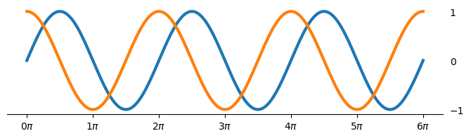
Manually setting tick locations and labels is an attractive option because it gives you immediate control.
But it quietly couples three things together:
The data range
The tick placement
The string formatting
Change any one of those, and you’re back to editing and transforming numpy arrays.
As it turns out, Matplotlib has a different model in mind. Instead of manually creating arrays based on data limits, one can instead describe rules that place the ticks for you.
If our previous array-based approach means “put ticks exactly here with exactly these labels,” then our rule-based approach allows us to say things like:
Put a tick every π
Never show more than five y-axis ticks
Format values as signed numbers with one decimal place
The rules I'm talking about are Matplotlibs's TickLocators and TickFormatters.
TickLocators
We can use TickLocators in conjunction with Axes.{x,y}axis.set_major_locator to place ticks along a given axis without needing to bother constructing those values on our own.
Similarly, we can use a TickFormatter to transform the values created by a TickLocator into readable text that makes the axis more usable to a viewer.
from matplotlib.ticker import MultipleLocator, MaxNLocator

# add tick marks at every multiple of pi along the x-axis;
#   format the values at the tick marks to appear in units of pi
ax.xaxis.set_major_locator(MultipleLocator(pi))
ax.xaxis.set_major_formatter(lambda x, pos: f'{round(x/pi, 0):.0f}$\\pi$')

# add a maximum of 5 tick marks to the y-axis, let matplotlib figure out some
#   good values to display
ax.yaxis.set_major_locator(MaxNLocator(5))

# display both the positive/negative signs & use a monospace font
ax.yaxis.set_major_formatter(lambda x, pos: f'{x:+.1f}')
ax.yaxis.set_tick_params(labelfontfamily='monospace')

# add a short tick at every multiple of pi, starting at /2
ax.xaxis.set_minor_locator(MultipleLocator(pi, offset=pi/2))

fig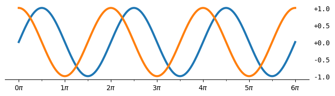
Notice that we never asked how wide the plot is, nor checked the axis limits, nor counted how many ticks would fit. We described intent, and Matplotlib handled the mechanics.
While this produces a very similar chart to our "manual" approach, by using Matplotlib's TickLocator/TickFormatter, we gain these advantages:
Separation of concerns: TickLocator controls where ticks go, and TickFormatter controls how they’re displayed. This keeps layout logic and presentation logic decoupled instead of tangled together in set_xticks(…, labels=…) and/or set_xticklabels(…).
Automatic adaptation to data and zooming: Locators recompute ticks when axis limits change (pan, zoom, rescale), while manually set ticks are static and often become misleading or cluttered.
Readability: Seeing a MaxNLocator, MultipleLocator, or FuncFormatter immediately communicates why ticks look the way they do, rather than forcing readers to reverse-engineer transformations to a list/ndarray of numbers.
Trust me, the development team at Matplotlib has thought way harder than any of us have about how to make the programmatic placement of ticks visually appealing/useful. We should be taking advantage of this instead of re-inventing the wheel via numpy.linspace.
TickLocator Gallery
To make this a bit more concrete, here are some examples of commonly used Matplotlib TickLocators. There is no one-size-fits-all solution here, so it is important for you to choose the TickLocator that best conveys the meaning of your data by having a useful axis.
from functools import partial
from numpy import pi, sin, cos, linspace, round as np_round
from matplotlib.ticker import (
    AutoLocator, FixedLocator, LinearLocator,
    MaxNLocator, MultipleLocator, IndexLocator,
)
import matplotlib.pyplot as plt

locators = [
    partial(AutoLocator),
    partial(FixedLocator, [0, .5*pi, 2*pi]),
    partial(LinearLocator, 5),
    partial(MaxNLocator, 5),
    partial(MultipleLocator, pi),
]

xs = linspace(0, 6*pi, 400)
fig, axes = plt.subplots(
    nrows=len(locators),
    figsize=(8, len(locators)),
    layout='constrained',
    gridspec_kw={
        'bottom': .6, 'height_ratios': [len(locators)] + [1] * (len(locators) - 1)
    }
)
axes[0].plot(xs, sin(xs), label='sin', lw=3)
axes[0].plot(xs, cos(xs), label='cos', lw=3)
axes[0].yaxis.set_tick_params(labelleft=False, left=False, labelright=True)
axes[0].yaxis.set_major_locator(MultipleLocator(1))
axes[0].margins(y=.3)
axes[0].set_title(
    'Fixed & Programmatic Tick Locations in matplotlib',
    loc='left',
    weight='semibold',
    x=0,
)

for loc, ax in zip(locators, axes.flat):
    ax.set_xlim(*axes[0].get_xlim())
    ax.xaxis.set_major_locator(loc())
    ax.xaxis.set_tick_params(labeltop=False, top=False, labelbottom=True, bottom=True)
    ax.yaxis.set_tick_params(left=False, labelleft=False)
    ax.spines[['left', 'top', 'right']].set_visible(False)

    docs_text = ax.annotate(
        ' '.join(loc.func.__doc__.strip().split('.')[0].split()),
        xy=(.01, 0), xycoords=ax.spines['bottom'],
        xytext=(0, 4), textcoords='offset points',
        va='bottom',
        size='small',
    )

    args = tuple(type(arg)(np_round(arg, 2).tolist()) for arg in loc.args)
    arg_string = repr(args).removeprefix("(").removesuffix(")").removesuffix(",")
    ax.annotate(
        f'{loc.func.__name__}({arg_string})',
        xy=(0, 1), xycoords=docs_text,
        xytext=(0, 2), textcoords='offset points',
        va='bottom',
        color='tab:red',
    )


plt.show()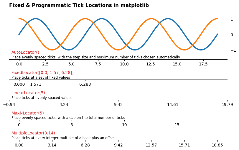
Wrap-Up
As you can see, some locators are fully automatic, others strictly fixed (the same as .set_xticks!), and others live in between. Each one encodes a different philosophy about how much control you want versus how much you’re willing to delegate.
As I mentioned, the takeaway isn’t that one locator is "best." It's that Matplotlib gives you a vocabulary for expressing intent, and once you use it, ticks stop being a hack at the end of plotting and become a first-class design choice.
What are your thoughts? Let me know on the DUTC Discord server!