You’ve Been Writing Matplotlib Abstractions Wrong
Everyone wants clean plotting functions. We like functions where we can pass a dozen arguments, tweak a few things, and get a nice figure without thinking.
Many data visualization libraries build on top of Matplotlib this way, creating what I call “god-functions.” These are functions where every parameter eventually trickles down into some Matplotlib call somewhere deep in the code.
I’m here to tell you: that’s a mistake.
Single Entrypoint, Too Much Responsibility
The appeal of a single plotting function is obvious. You call one thing, pass in your data, maybe tweak a few parameters, and out comes a complete chart. It feels clean, contained, and easy to reuse. But the moment you try to step even slightly outside of the defaults, the cracks start to show.
Take a look at the example below, where we have a function that produces a grouped bar-chart.
%matplotlib aggfrom matplotlib import pyplot as plt
from itertools import groupby
from operator import itemgetter
plt.rc('axes.spines', left=False, top=False, right=False)
def grouped_barplot(ax=None, /, *, x, y, group, bar_width=.2, bar_gap=0, group_width=1, group_gap=.2):
if ax is None:
ax = plt.gca()
data = sorted(zip(group, x, y, strict=True), key=itemgetter(0, 1))
xlabels = []
all_xs = []
bar_centers = []
for grp_i, (label, grp_data) in enumerate(groupby(data, key=itemgetter(0))):
xs, ys = [], []
for x_i, (_, x, y) in enumerate(grp_data):
xloc = grp_i * (group_width + group_gap) + x_i * (bar_width + bar_gap)
xs.append(xloc)
ys.append(y)
xlabels.append(x)
ax.bar(xs, ys, width=bar_width, edgecolor="k", label=label)
all_xs.extend(xs)
bar_centers.append((xs[0] + ((xs[-1] - xs[0]) / 2), label))
# add below-chart xtick labels
ax.set_xticks(all_xs, xlabels)
# add centered labels above each bar group
for xloc, label in bar_centers:
ax.annotate(
text=label,
xy=(xloc, 1),
xycoords=ax.get_xaxis_transform(),
fontsize="large",
)
ax.spines[["top", "left", "right"]].set_visible(False)
return ax
data = {
"x": ["Q1", "Q1", "Q2", "Q2", "Q3", "Q3", "Q4", "Q4"],
"y": [15, 20, 25, 18, 30, 22, 28, 25],
"group": ["A", "B", "A", "B", "A", "B", "A", "B"]
}
fig, ax = plt.subplots()
grouped_barplot(ax, x=data["x"], y=data["y"], group=data["group"])
fig
And this produces a pretty nice figure! I can further adjust things like the title or the y-axis using the Axes (ax) object. But what if I want to change something that has been managed by our grouped_barplot function?
Take the edgecolor of the bars as an example. How would you turn it from black to white? That value is exposed, so now the function needs another argument edgecolor=….
Of course, this problem only gets worse as the number of visual or aesthetic tweaks grows, especially when those tweaks conflict with the decisions baked into grouped_barplot. What started as a simple function call turns into passing dictionaries of keyword arguments that eventually get forwarded into ax.bar. At that point, you are not using a clean abstraction anymore. You are guessing which Matplotlib arguments are supported, usually by reading someone else’s source code and hoping it lines up with your expectations.
It gets worse when you want to remove behavior instead of adding it. Maybe you do not want the x-axis labels. Maybe you do not want the group annotations. Now the function needs modes. Flags that turn features on and off. Each one introduces a new branch in behavior, and those branches start to interact in ways that are difficult to reason about.
Every new feature adds another argument. Every argument interacts with the others. And before long, the function stops being a convenience and starts being a configuration system.
This is how god-functions are born.
Reusing Artists
Thankfully, there is another way to approach this that looks almost too simple at first. Instead of doing everything in one place, do the minimum amount of work required to draw the chart and return the objects that were created. In Matplotlib, those objects are usually Artists (the ones that belong to a given Axes). They are the actual rectangles, lines, and text that make up your visualization.
from matplotlib import pyplot as plt
from itertools import groupby
from operator import itemgetter

def grouped_barplot(ax=None, /, *, x, y, group, bar_width=.2, bar_gap=0, group_width=1, group_gap=.2):
    if ax is None:
        ax = plt.gca()

    artists: dict[str, list[BarContainer]] = {}
    data = sorted(zip(group, x, y, strict=True), key=itemgetter(0, 1))
    for grp_i, (grp_label, grp_data) in enumerate(groupby(data, key=itemgetter(0))):
        xs, ys, xlabels = [], [], []
        for x_i, (_, x, y) in enumerate(grp_data):
            xloc = grp_i * (group_width + group_gap) + x_i * (bar_width + bar_gap)
            xs.append(xloc)
            ys.append(y)
            xlabels.append(x)

        artists[grp_label] = ax.bar(xs, ys, width=bar_width, label=xlabels,  edgecolor="k")

    return artists

data = {
    "x": ["Q1", "Q1", "Q2", "Q2", "Q3", "Q3", "Q4", "Q4"],
    "y": [15, 20, 25, 18, 30, 22, 28, 25],
    "group": ["A", "B", "A", "B", "A", "B", "A", "B"]
}

fig, ax = plt.subplots()
artists= grouped_barplot(ax, x=data["x"], y=data["y"], group=data["group"])

fig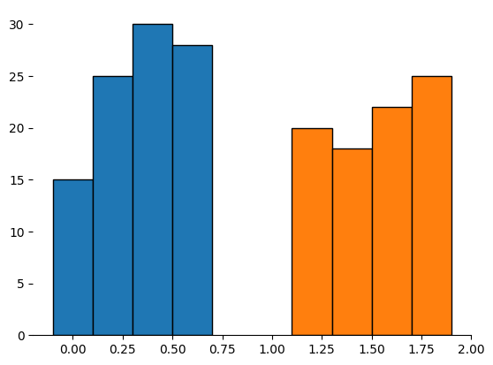
The chart that comes out of this approach is not “complete” in the way the previous version was. It does not have labels, it does not have annotations, and it may not look particularly polished. But that is the point. You now have direct access to the pieces that matter, and you can modify them after the fact without rewriting your plotting function.
This function now returns the entities created by Matplotlib that were added to the chart. Many don't take advantage of the fact that you can further customize your chart by manipulating these objects, and they are full of useful data.
For example, I can write my own custom code that adds the appropriate labels back to my chart, all without relying on my original dataset.
# sets the edgecolor on the bar-rectangles
for bc in artists.values():
    for rect in bc:
        rect.set(edgecolor="white")

# add above axis group labels
for label, bc in artists.items():
    x0 = bc[0].get_xy()[0]
    x1 = bc[-1].get_x() + bc[-1].get_width()
    center = x0 + ((x1 - x0) / 2)
    ax.annotate(
        text=label,
        xy=(center, 1),
        xycoords=ax.get_xaxis_transform(),
        fontsize="large",
    )

# add below axis xlabels
xticks, xticklabels = [], []
for bc in artists.values():
    for rect in bc:
        xticks.append(rect.get_center()[0])
        xticklabels.append(rect.get_label())
ax.set_xticks(xticks, labels=xticklabels)

fig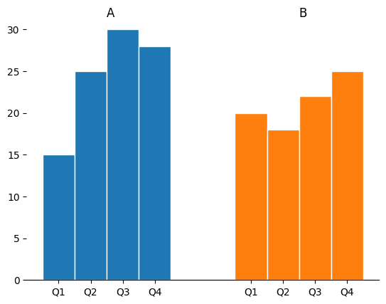
This changes the workflow entirely. Instead of passing arguments into a black box, you operate on real objects. If you want to change the edgecolor of the bars, you iterate over the rectangles and set it. If you want to add annotations, you compute positions from the bars themselves. The logic becomes explicit, local, and composable.
The function is smaller. The behavior is clearer. And the user has control again.
Composing Artists
Once you start returning Artists, something interesting happens. You stop thinking in terms of a single function that does everything, and you start thinking in terms of small functions that do one thing well. Instead of a massive function with modes, you now have a collection of composable operations.
from matplotlib import pyplot as plt
from matplotlib.container import BarContainer
from matplotlib.patches import Rectangle
from itertools import groupby
from operator import itemgetter

def grouped_barplot(ax=None, /, *, x, y, group, bar_width=.2, bar_gap=0, group_width=1, group_gap=.2):
    if ax is None:
        ax = plt.gca()

    artists: dict[str, list[BarContainer]] = {}
    data = sorted(zip(group, x, y, strict=True), key=itemgetter(0, 1))
    for grp_i, (grp_label, grp_data) in enumerate(groupby(data, key=itemgetter(0))):
        xs, ys, xlabels = [], [], []
        for x_i, (_, x, y) in enumerate(grp_data):
            xloc = grp_i * (group_width + group_gap) + x_i * (bar_width + bar_gap)
            xs.append(xloc)
            ys.append(y)
            xlabels.append(x)
        artists[grp_label] = ax.bar(xs, ys, width=bar_width, label=xlabels, edgecolor="k")

    return artists

def add_xlabels(ax, /, artists: dict[str, BarContainer], labels=None):
    """add below-axis bar labels"""
    rects = [rect for bc in artists.values() for rect in bc]
    if labels is None:
        labels = (r.get_label() for r in rects)

    xticks, xticklabels = [], []
    for r, lab in zip(rects, labels):
        xticks.append(r.get_center()[0])
        xticklabels.append(lab)
    return ax.set_xticks(xticks, labels=xticklabels)

def add_grouplabels(ax, /, artists: dict[str, BarContainer], labels=None):
    """add above axis group labels"""
    texts = []
    for grp_label, bc in artists.items():
        x0 = bc[0].get_xy()[0]
        x1 = bc[-1].get_x() + bc[-1].get_width()
        center = x0 + ((x1 - x0) / 2)
        t = ax.annotate(
            text=grp_label,
            xy=(center, 1),
            xycoords=ax.get_xaxis_transform(),
            fontsize="large",
        )
        texts.append(t)
    return texts

data = {
    "x": ["Q1", "Q1", "Q2", "Q2", "Q3", "Q3", "Q4", "Q4"],
    "y": [15, 20, 25, 18, 30, 22, 28, 25],
    "group": ["A", "B", "A", "B", "A", "B", "A", "B"]
}

fig, ax = plt.subplots()
artists = grouped_barplot(ax, x=data["x"], y=data["y"], group=data["group"])
add_xlabels(ax, artists)
add_grouplabels(ax, artists)

fig
Want x-axis labels? Call a function that adds them. Want group labels? Call another function. Each of these functions operates on the Artists returned by your base plotting function, and each one has a narrow, well-defined responsibility. There is no need for flags or modes because the user decides what to apply and when.
This also simplifies customization. Because each function does one thing, you can use normal arguments to control behavior. You are no longer passing dictionaries into the abyss and hoping they get applied correctly. You are calling a function with a clear interface that directly manipulates known objects.
This approach also naturally leads to more testable Matplotlib code. When your plotting logic is split into small functions that return and operate on Artists, you can test each piece in isolation without needing to render a full figure and visually inspect it. You can assert on concrete properties like positions, labels, colors, and counts of objects instead of only relying on image comparisons or manual review. Each function has a clear input and output, which makes it easier to reason about and verify. Instead of testing a monolithic plotting routine, you are testing simple transformations on well-defined objects, which is both faster and far more reliable.
The result is not just cleaner code. It is a different way of thinking about plotting because you are no longer hiding Matplotlib behind an abstraction. You are building on top of it, one small, understandable piece at a time.
Wrap-Up
The instinct to wrap Matplotlib in a single, powerful function is understandable. It feels like you are making things easier, more reusable, and more consistent. But in practice, you are trading short-term convenience for long-term rigidity. Every new requirement turns into another argument, another mode, another layer of indirection.
Returning Matplotlib Artists forces a different discipline. It asks you to do less up front and trust that composition will handle the rest. It gives users real control instead of simulated flexibility, and it keeps your code aligned with how Matplotlib actually works.
Maybe, just maybe, you don't need a bigger abstraction. You just need smaller pieces, which in turn leads to code that is easier to use, understand, test, and extend when your needs change.
What are your thoughts? Let me know on the DUTC Discord server!