Matplotlib: Place Things Where You Want
I have recently done a couple of seminars on matplotlib. Among these seminars I demonstrate how to conceptually approach matplotlib: its 2 apis, convenience layers vs essential layers, dichotomous artist types, and coordinate systems/transforms.
Once you understand these ideas, the entire utility of matplotlib begins to snap into place. This week, I want to highlight one of these concepts: coordinate systems & transforms. The first step to making an aesthetically appealing graphic is to have confidence in placing Artists where you want them. Their existance (or lack thereof) on your Figure should not be a surprise, and by understanding matplotlibs coordinate systems we gain more power over the aesthetic of our plots.
Coordinate Systems
Matplotlib has many coordinate systems, but in my experience the three most important ones are the "data", "axes" coordinate systems. These both refer to coordinate systems that exist within an Axes.
In matplotlib, the "axes" systems are represents a proportional coordinate systems within the Axes. This space ranges from 0-1 on its horizontal and vertical dimensions, where in the x-dimension 0 is the left-hand side of the Axes and 1 is the right-hand side. Then in the vertical dimension 0 represents the bottom of the Axes, and 1 represents the top. This means that a coordinate of (.3, .8) represents a coordinate that exists 30% away from the left side of the Axes and 80% away from the bottom.
Contrarily, the "data" coordinate system exists embedded within the axes coordinates. This coordinate system is bound by the x and y axis of a given Axes instance.
Transforms
These coordinate systems are important because we can use them to place Artists on our figures and axes through their transform parameter. All matplotlib Artists have a transform parameter that we can use to instruct matplotlib how to interpret the supplied coordinates. In general the usecases for these transforms as follows:
coordinate |
transform |
display purpose |
|---|---|---|
"axes" |
ax.transAxes |
display an artist on an Axes in a static position |
"data" |
ax.transData |
display an artist on an Axes |
We typically think of Axes as existing in a data-space. When we run the following code, we create a plot that has a line who exists in data-space. The points we feed into the line as x and y coordinates are drawn according to the x and y-axis of our Axes
from matplotlib.pyplot import subplots, rcParams
from numpy import arange

# force solid white background on figure
xs = arange(1, 10)

fig, ax = subplots()
fig.set_facecolor('white')
ax.plot(xs, xs ** 2, label="line");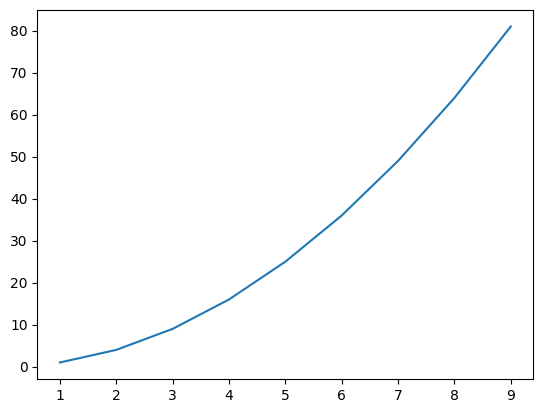
But what if we wanted to draw something on these axes that ignored data space. Like a Text that always appears in the upper left hand corner of the plot? To insert Artists in a static position on the Axes we need to use the axes proportional coordinate system, not the axes data coordinate system.
from matplotlib.pyplot import subplots
from numpy import arange

# Aesthetics
rcParams['font.size'] = 12
for side in ['left', 'right', 'top', 'bottom']:
    rcParams[f'axes.spines.{side}'] = True

fig, axes = subplots(1, 2, figsize=(12, 6))
fig.set_facecolor('white')

for ax, max_x in zip(axes.flat, [10, 20]):
    xs = arange(1, max_x)

    ax.plot(xs, xs ** 2, label="line")

    ax.text(
        x=.05, y=.95,
        s='proportional coords (.05, .95)',
        transform=ax.transAxes
    )

    # ax.text defaults to using transform=ax.transData
    ax.text(
        x=5, y=20,
        s='data coords (5, 20)',
        transform=ax.transData
    )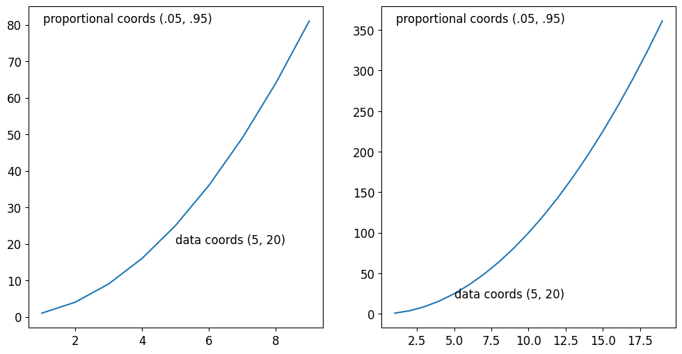
On the plots above, you can see there is a text in the upper left-hand corner. By inputting x=.05, y=.95, ... transform=ax.transAxes I was able to align the left hand side of that text to 5% acrpss the x-axis, and 95% up the y-axis.
Contrarily, when I specified x=5, y=20, transform=ax.transData I was able to insert text at the location of (5, 20) on the x and y axis. This text label seemingly shifted places from the left hand Axes to the right hand Axes. This is because the scale of our x and y axis changed which shifts the overall placement of the text.
We can use this idea of transforms and coordinate systems to create very powerful visualizations. In fact, I used this idea to replicate a plot I encountered on Twitter where I created multiple nested Axes on a blended coordinate system to draw histograms that overlap with bars from a barplot as a way to highlight the average value and spread of a couple datasets:
from matplotlib.pyplot import subplots, show, rcParams
from numpy.random import default_rng
from pandas import DataFrame

# Aesthetics: increase font size & remove spines
rcParams['figure.facecolor'] = (1, 1, 1, 1)
rcParams['font.size'] = 16
for side in ['left', 'right', 'top', 'bottom']:
    rcParams[f'axes.spines.{side}'] = False

# Generate some data
rng = default_rng(0)

df = DataFrame({
    '$\mu=40,\sigma=3$': rng.normal(40, 3, size=300),
    '$\mu=65,\sigma=5$': rng.normal(65, 5, size=300),
    '$\mu=50,\sigma=8$': rng.normal(50, 10, size=300),
})
agg_df = df.mean()

fig, ax = subplots(figsize=(8,5))
fig.set_facecolor('white')

bars = ax.bar(agg_df.index, agg_df)

for rect, label in zip(bars, df.columns):
    x_data_pos = rect.get_x()

    # ax.get_xaxis_transform() returns a "blended transform"
    #   this means that I can specify my x-coordinates
    #   in data units, and my y-coordinate
    #   in proportional coordinates
    hist_ax = ax.inset_axes(
        (x_data_pos, 0, rect.get_width(), 1),
        transform=ax.get_xaxis_transform(),
        sharey=ax # share the y-axis with the parent `Axes`
    )

    # draw a histogram from the dataset onto this new Axes
    hist_ax.hist(
        df[label], orientation='horizontal',
        ec='gray', fc='white',
        alpha=.6, rwidth=.7
    )

    # make the background of our child axes invisible (or else it hides the bar)
    hist_ax.patch.set_alpha(0)
    hist_ax.xaxis.set_visible(False)
    hist_ax.yaxis.set_visible(False)

ax.patch.set_color('#f4f4f4')
ax.yaxis.grid(color='lightgray')
ax.yaxis.set_tick_params(width=0)
ax.set_axisbelow(True)

ax.set_title('Insetting a histogram on each bar\nof a bar chart');
And there you have it- leveraging matplotlib's coordinate systems through transform! By understanding this concept, you will have the ability to place anything anywhere on your plots. This opens the door to create powerful visualizations by having complete control of the placement of your annotations, legends, and other Artists. This matplotlib binge has been a lot of fun, and I can't wait to share with you what visualizations I'll come up with next.