Working with Long Labels In Matplotlib
Hey all, I came across a fun blog post covering how to work with long tick labels in R's ggplot2. I couldn't resist the urge to recreate the visualizations in matplotlib and wanted to share with you how you can deal with long tick labels in Python!
First we’ll need some data- using the same source as the above linked blog post, we can fetch and process our data like so:
from pandas import read_csv

s = (
    read_csv('https://datavizs22.classes.andrewheiss.com/projects/04-exercise/data/EssentialConstruction.csv')
    .groupby('CATEGORY')['CATEGORY'].count()
    .sort_values(ascending=False)
)

print(s)
CATEGORY
Approved Work 4189
Schools 1280
Public Housing 1014
Affordable Housing 372
Hospital / Health Care 259
Utility 90
Homeless Shelter 5
Name: CATEGORY, dtype: int64For most of these examples, you'll note that I opt to use the matplotlib API in favor of pandas .plot api. This is primarily because pandas applies some transformations to the visualizations that I do not want, as I want to highlight how one can use matplotlib to explicitly perform visual transformations instead of letting some other package handle it for you.
If you want complete control over your visualizations, matplotlib is the tool for you.
First we want to apply some default settings for our plots, I'm opting to use a slightly larger font size (this is all about large labels right?), slightly shorter figure size (don’t want inline plots being too large), removing the top & right spines, as well as a left aligned title for our plots.
from matplotlib.pyplot import rc
from matplotlib import rcdefaults

rcdefaults()
rc('font', size=12)
rc('figure', figsize=(8,2))
rc('axes', titlesize=16, titlelocation='left')
rc('axes.spines', top=False, right=False)
With our default settings set, we are ready to make some figures! Let's take a look at our default barplot.
Default Barplot
from matplotlib.pyplot import subplots

fig, ax = subplots()
ax.bar(s.index, s)
ax.set_title('Default barplot')
Text(0.0, 1.0, 'Default barplot')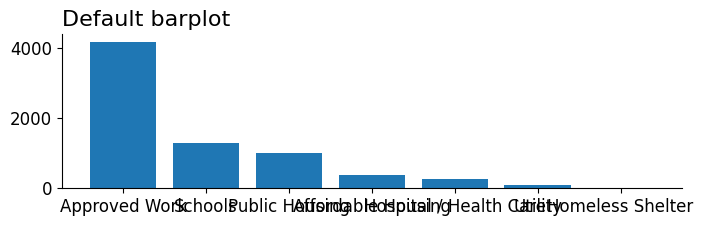
Oh no! Look at those extremely overlapping xtick labels. It's almost impossible to make out any of those labels individually. Let's take a look at some techniques we can use to fit these labels in the figure so they're more legible.
Manually Recoded Labels
Our first fix involves manually recoding our labels. We can reliably do this by performing a transformation on our data using a dictionary that maps old labels → to new ones. These new labels are designed to be shorter or have built-in newlines that help the display of the tick labels to become more clear.
# Manually Recode
fig, ax = subplots()
new_names = {
    'Approved Work': 'App. Work',
    'Affordable Housing': 'Aff. House',
    'Hospital / Health Care': 'Hosp\n& Health',
    'Public Housing': 'Pub. Hous.',
    'Homeless Shelter': 'Homeless\nShelter'
}
ax.bar(s.rename(new_names).index, s)
ax.set_title('Manually Recoded')
Text(0.0, 1.0, 'Manually Recoded')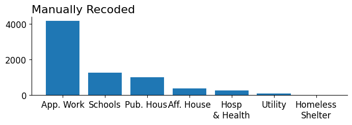
That seemed to work fairly well! The labels are no longer overlapping (though in some cases they're quite close). Let's move on to our next approach and see how else we can account for long tick labels.
Wider Plot
Widen the plot (or figure). This is a fairly straightforward approach that reliably works if you only have a single plot on your figure. When you have a layout of plots, you need to be careful that you are not unintentionally stretching other plots, and may need to make use of a subplot manager such as a GridSpec to ensure the plot you want to widen has access to more space on your figure than other plots.
As a follow-up note, you can always shrink the font sizes as well (since creating a larger plot effectively shrinks text).
fig, ax = subplots(figsize=(18, 2))
ax.bar(s.index, s)
ax.set_title('Wider Plot')
Text(0.0, 1.0, 'Wider Plot')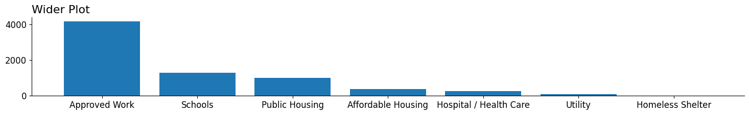
Swap x and y- axes
One of the most straightforward ways to account for long text labels is to simply change the orientation of the plot. English text is read from left to right and we can maintain this readable layout by simply reorienting the plot enabling more horizontal space for our labels.
# Swap x and y
fig, ax = subplots()
ax.barh(s.index, s)

# our underlying data is already sorted,
#  we need to invert the yaxis to ensure bars are
#  ordered longest to shortest
ax.invert_yaxis()
ax.set_title('Swap X & Y- axes')
Text(0.0, 1.0, 'Swap X & Y- axes')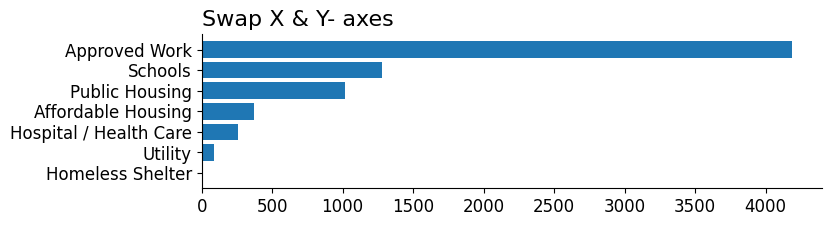
Rotate the Labels
Following a similar intuition as transposing our plot (swapping x & y), another way we can create more horizontal space for our labels is to rotate them. By doing this we enable the text to avoid overlapping with one another and fall in a near parallel instead. Additionally, rotating to a 'near horizontal' maintains readability quite well.
Two arguments I want to highlight here are the ha (horizontal alignment) and the rotation_mode. By setting ha='right' we are informing matplotlib that we want the right-hand side of the label to line up against the tick. This means that when we rotate, the right side of the label will still line up with the tick itself. If we did not do this, our rotated text would be center aligned against the bar it corresponds to introducing overlap with other artists and ambiguity as to which label corresponds to which bar.
The rotation_mode is more of a fit & finish argument. Essentially rotation_mode determines whether the label is rotated and then aligned to the xtick (default) or if the label is aligned and then rotated around the point of alignment (anchor). For our usecase here, the latter is more useful at ensuring our xtick labels remain close to their corresponding ticks.
from matplotlib.pyplot import setp

fig, ax = subplots()

ax.bar(s.index, s)
setp(ax.get_xticklabels(), rotation=20, ha='right', rotation_mode='anchor');

# setp is a convenience for setting properties on an
#   Artist or a list of Artist objects equivalent code below
# for text in ax.get_xticklabels():
#   text.set(rotation=20, ha='right', rotation_mode='anchor')

ax.set_title('Rotate Labels')
Text(0.0, 1.0, 'Rotate Labels')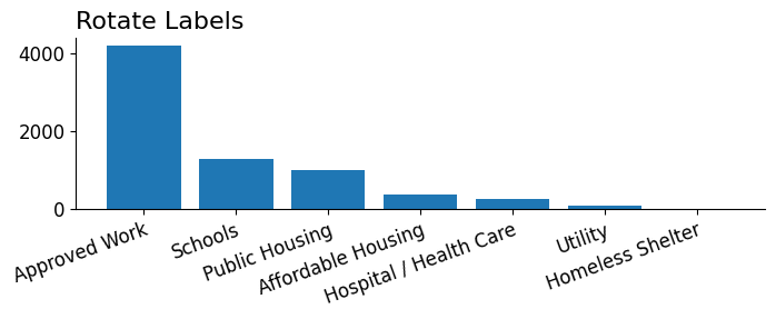
Dodge Labels
In contrast to some of the above approaches that aim to increase the amount of horizontal space we have access to. Dodging the labels allows us to more effectively use the vertical space our labels have access to. Unfortunately, dodging is not a built-in supported feature of matplotlib so the implementation here is a little hacky. We essentially take every other label and move it down such that it won't overlap with its immediately adjacent labels. An important point to note here is that even though we implemented a dodge on every other label, we still have issues determining which label corresponds to which tick ultimately reducing the usefulness of this approach.
fig, ax = subplots()

ax.bar(s.index, s)
for text in ax.get_xticklabels()[1::2]:
    text.set_y(-.2)

ax.set_title('Dodge Labels')
Text(0.0, 1.0, 'Dodge Labels')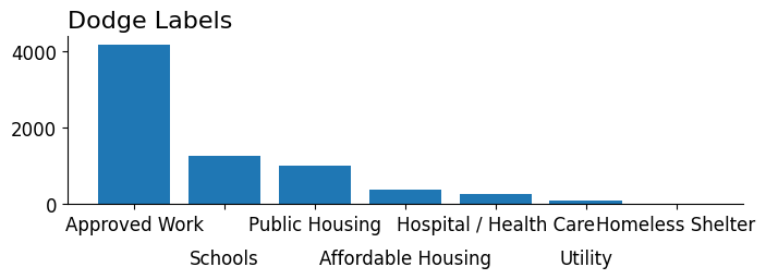
Text Wrapping
Last, but certainly not least, is using a great helper function from Python's built-in textwrap library to perform whitespace wrapping for us. We could achieve a similar result by replaccing any whitespace with a newline character, but textwrap uniquely lets us specify a width where we want to insert newlines via textwrap.fill.
I also want to point out that matplotlib has some built-in support for auto wrapping of text, but since we can't specify a width parameter directly I found it more convenient to specify the text wrapping manually.
from textwrap import fill

fig, ax = subplots()
ax.bar([fill(s, width=10) for s in s.index], s)
ax.set_title('Text Wrapping')
Text(0.0, 1.0, 'Text Wrapping')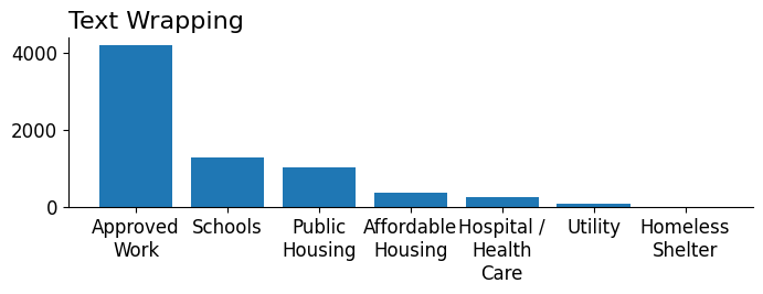
Wrap Up
And that takes us to the end of ways that we can work with long tick labels in matplotlib. I personally think the label rotation, axes swap, and text wrapping are the most successful methods in dealing with this type of problem. I additionally put all of these tricks into a single figure (and gist) located gist. So feel free to use it as a reference whenever you need to make some fine tweaks to your tick labels!
