Estimating The Standard Deviation of a Population from a Sample
Welcome back to another edition of Cameron's Corner! We have some exciting events coming up, including a NEW seminar series and a code review workshop series. In our brand new seminar series, we will share with you some of the hardest problems we have had to solve in pandas and NumPy (and, in our bonus session, hard problems that we have had to solve in Matplotlib!). Then, next month starting October 12th, we will be holding our first ever “No Tears Code Review,” where we'll take attendees througha a code review that will actually help them gain insight into their code and cause meaningful improvements to their approach.
For Cameron's Corner this week, I wanted to take some time to talk about another statistical visualization I’m working on that covers Bessel’s Correction. Ready for some advanced matplotlib with a sprinkle of statistics? Let’s dive in!
Simulating Our Samples
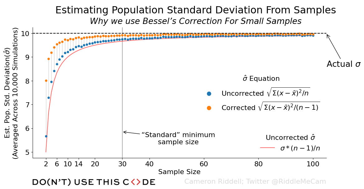
To observe why Bessel’s Correction is appropriate for small samples, we first need to simulate some data drawn from a population. We will draw from this population at sample sizes n=2 up to n=100 10,000 times for each sample size and report the averaged standard deviation from each of those sampling distributions.
from scipy.stats import norm
from numpy import arange, stack
from numpy.random import default_rng

from dataclasses import dataclass

@dataclass
class DDOFLabel:
    '''A dataclass to track simulation parameters and render a nice label'''
    ddof: int
    label: str

    def dollarmath_formula(self):
        '''The statistical formula for estimating population standard deviation'''
        if self.ddof > 0:
            return r'$\sqrt{\Sigma(x - \bar{x})^2/(n - %d)}$' % self.ddof
        else:
            return r'$\sqrt{\Sigma(x - \bar{x})^2/n}$'

    def render(self):
        return f'{self.label} {self.dollarmath_formula()}'

    def __hash__(self):
        return hash((self.ddof, self.label))

rng = default_rng(0)
population = norm(loc=70, scale=10)
n_simulations = 10_000
sample_sizes = arange(2, 100 + 1)

# Track the averaged standard deviations
stdev_data = {
    k: [] for k in
    [DDOFLabel(0, 'Uncorrected'), DDOFLabel(1, 'Corrected')]
}

# Run the simulations at each sample size
for s_size in sample_sizes:
    sample_sims = population.rvs(size=(n_simulations, s_size), random_state=rng)
    for ddof_label, avg_stdevs in stdev_data.items():
        sstdevs = sample_sims.std(ddof=ddof_label.ddof, axis=1)
        avg_stdevs.append(sstdevs.mean())

from pandas import DataFrame # DataFrame just to show the results
DataFrame(stdev_data, index=sample_sizes).rename_axis(index='sample size').head(5)| DDOFLabel(ddof=0, label='Uncorrected') | DDOFLabel(ddof=1, label='Corrected') | |
|---|---|---|
| sample size | ||
| 2 | 5.661647 | 8.006778 |
| 3 | 7.287101 | 8.924840 |
| 4 | 7.962079 | 9.193817 |
| 5 | 8.420809 | 9.414751 |
| 6 | 8.708239 | 9.539398 |
Above, you can see the data we want to visualize, where each of the estimates are averaged across the 10,000 simulations we ran.
How do we convey this information? We could simply plot each point separately. But, this lacks context and meaning—for that, we’ll need to add a few annotations, as well as a line representing what the uncorrected estimates converge on. This should supply the reader with enough information to derive why Bessel’s correction is needed, but it also depends on some background understanding of statistics.
Visualization The Simulated Standard Deviations
To create our plot, as always, we’ll set up some preliminary aesthetics. Nothing too fancy, but we'll remove some of the spines and force the figure facecolor to be white.
While reading through the below code, pay special attention to:
The use of transforms
The use of offsetboxes (VPacker, TextArea, and AnchoredOffsetbox)
from matplotlib.pyplot import rc

rc('font', size=16)
rc('axes.spines', top=False, right=False)
rc('figure', facecolor='white')
from matplotlib.pyplot import subplots
from matplotlib.offsetbox import VPacker, TextArea, AnchoredOffsetbox
from matplotlib.image import imread
from matplotlib.transforms import blended_transform_factory
# Establish the base figure and single Axes
fig, ax = subplots(
figsize=(14,6),
gridspec_kw={'right': .8, 'bottom': .15, 'top': .85},
dpi=100
)
for ddof_label, avg_stdev in stdev_data.items():
ax.scatter(sample_sizes, avg_stdev, label=ddof_label.render(), s=20)
all_simulations = stack([*stdev_data.values()])
ax.vlines(
sample_sizes, all_simulations.min(axis=0), all_simulations.max(axis=0),
color='lightgray', lw=1, zorder=-1, label='_'
)
# ALL OF THE PLOTTING IS DONE. EVERYTHING BELOW IS ANNOTATIONS
# Set the basic labels
ax.set(
ylabel=(
f'Est. Pop. Std. Deviation'
'($\hat{\sigma}$)\n(Averaged Across '
f'{n_simulations:,d} Simulations)'
),
xlabel='Sample Size',
# Manual xticks to better orient readers to changes in est.
# stdev at changes in small sample sizes
xticks=[2, 6, 10, 14, 20, 30, 40, 60, 80, 100],
)
# Horizontal line to show where the true population standard deviation lies
# we also draw some text & an arrow to further indicate this
ax.axhline(population.std(), color='black', ls='dashed')
ax.annotate(
text='Actual $\sigma$',
xy=(1, population.std()), xycoords=ax.get_yaxis_transform(),
xytext=(1, .7), textcoords='axes fraction',
arrowprops=dict(arrowstyle='->'), size='large'
)
# Most experiments operate under an idea n>=30 for stable parameter
# estimates. Let's denote this to give the readers a point to anchor on to.
ax.axvline(30, zorder=-1, color='gray', lw=1)
ax.annotate(
text='“Standard” minimum\nsample size',
xy=(30, .2), xycoords=ax.get_xaxis_transform(),
xytext=(130, 0), textcoords='offset points',
arrowprops=dict(arrowstyle='->'), ha='center', va='top',
)
# Draw our first legend to denote the points and their meaning
legend = ax.legend(
loc='center right', title='$\hat{\sigma}$ Equation',
markerscale=2, frameon=False
)
ax.add_artist(legend)
# Add in an (n-1)/n line as this is what the uncorrected estimate
# converges on. We'll also make a separate legend for this.
est_fn, = ax.plot(
sample_sizes, population.std() * (sample_sizes - 1) / sample_sizes,
color='red', alpha=.6, zorder=-1,
label='$\sigma * (n - 1) / n$'
)
legend = ax.legend(
handles=[est_fn], labels=[est_fn.get_label()],
title='Uncorrected $\hat{\sigma}$', frameon=False
)
legend.get_title().set(ha='center')
# Create a figure title and subtitle, to align them and use separate styles
figure_title = VPacker(
align='center', pad=0, sep=5,
children=[
TextArea(
'Estimating Population Standard Deviation From Samples',
textprops={'size': 'x-large'}
),
TextArea(
'Why we use Bessel’s Correction For Small Samples',
textprops={'size': 'large', 'style': 'italic'}
)
])
fig.add_artist(
AnchoredOffsetbox(
loc='upper center', child=figure_title,
bbox_to_anchor=(0.5, 1.0), bbox_transform=fig.transFigure,
frameon=False
)
)
# Add in our DUTC logo, makes everything more official looking
imax = fig.add_axes([.125, 0, .4, .04])
imax.set_aspect('equal', anchor='SW')
imax.axis('off')
imax.imshow(
imread('../_static/images/DUTC_Logo_Horizontal_1001x61.png'),
origin='upper'
)
# Personal watermark
fig.text(
1, imax.get_position().y1,
s='Cameron Riddell; Twitter @RiddleMeCam',
ha='right', va='top', color='lightgray', alpha=.8,
transform=blended_transform_factory(ax.transAxes, fig.transFigure)
);
Wrap Up
As you can see, matplotlib code is quite verbose. Factor in that I like to code vertically (many of my function calls span multiple lines), and we end up with a lot of lines of code. However, one can leverage matplotlib's explicitness to create extremely customized plots. I have full control over where I put each annotation, and I am able to create a clean final product.
I put a good number of tricks in here, so if you're not familiar with matplotlib, I'd say this is an example that worth reading over a few times to see how everything works out. With that being said, I'll talk to you all next week!