A Funnel Chart in Matplotlib
Hey there again! This week, I wanted to share a small snippet of what I will cover in my seminar “My Matplotlib can beat up your Matplotlib” on March 30th.
This seminar focuses on creating plots that are not directly offered by Matplotlib—or even other high-level API's like seaborn (though admittedly plotly does have many of these plots). We're not talking about bar charts or box plots, we're talking about “funnel charts,” “tree diagrams,” “sunbursts,” “waffle charts,” and “parallel coordinates/categories.” If you don't want to install a third-party dependency just to create a plot, then I'll have you covered in the seminar! In addition to highlighting these varied chart types, I will also cover the Matplotlib concepts you need to create truly out-of-the-box charts.
Funnel Charts
A fairly popular chart is a funnel chart, which is used to represent filtering barriers to a common metric. These are most commonly used for marketing or sales pipelines to visualize how much of your audience is lost at each step (e.g., if we run an ad by 100 people, how many of them followed the link in the advertisement? Then, from that subset, who followed the link, and how many actually purchased a product?).
The advantage of a funnel chart is its simplicity. It is more of an info-graphic chart than something you would see in an academic paper because it conveys a simple narrative in a very intuitive way.
The “no advanced Matplotlib required” approach
Say we have some data from our newsletter: out of 7,932 people on our mailing list, 7,152 of them open it, 4,634 click on a link in the newsletter, and 1,469 actually purchase something from our store.
This is perfect data for a funnel chart!
from pandas import Series

s = Series(
    data= [7_932,      7_152,    4_634,     1_469],
    index=['received', 'opened', 'clicked', 'purchased']
)

s
received 7932
opened 7152
clicked 4634
purchased 1469
dtype: int64If all we use are the basic plotting Matplotlib plotting methods, then we might come to create a horizontal bar chart—or some iteration on a broken_hbar chart. We can model this with the following:
from matplotlib.pyplot import subplots, rc

rc('figure', facecolor='white')
rc('font', size=14)

fig, ax = subplots()
bc = ax.barh(s.index, s)
ax.invert_yaxis()

fig.tight_layout()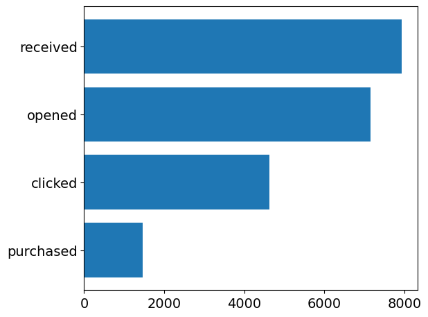
While this visualization conveys some of the meaning, we are missing a few marks that communicate an actual decrement. We have categories on our y-axis as well as ordering, but we fail to communicate that these categories all represent the same broader population—just with increasingly stricter pruning criteria being applied.
An Actual Funnel Chart
Some actual Matplotlib to the rescue here! The above chart is missing very important linkages between each bar in addition to missing out on centering the bars. While I don't think the centering is that important (as it damages our ability to see differences of the total that an aligned axis provides us), I will stay in the spirit of the funnel chart and make sure my bars are centered.
The connection marks will be created with an Axes.fill_betweenx to provide a PolyCollection that can represent the connection of the edges of one bar to the next. To do that, we need to reach into the underlying rectangles that compose each bar to extract the position of its corners.
After the functional elements of the plot are created, the rest is fine-tuning the textual elements (adding labels, removing spines, transforming the y-ticks).
from matplotlib.pyplot import subplots, rc
from matplotlib.patheffects import Stroke, Normal
from itertools import pairwise

fig, ax = subplots(figsize=(10, 6))

sorted_s = s.sort_values()

bc = ax.barh(
    sorted_s.index,
    sorted_s,
    left=(sorted_s.max() - sorted_s) / 2 - sorted_s.max() / 2, lw=0
)

for prev, cur in pairwise(reversed(bc)):
    prev_x0, prev_y0, prev_x1, prev_y1 = prev.get_corners()[::2, :].flat
    cur_x0, cur_y0, cur_x1, cur_y1 = cur.get_corners()[::2, :].flat

    ax.fill_betweenx(
        [prev_y0, cur_y1],
        x1=[prev_x0, cur_x0],
        x2=[prev_x1, cur_x1],
        color=prev.get_facecolor(),
        alpha=.4,
        ec='face'
    )

for rect, (name, value) in zip(bc, sorted_s.items()):
    ax.text(
        s=f'{name.title()}\n{value:,}',
        x=rect.get_x() + (rect.get_width() / 2),
        y=rect.get_y() + (rect.get_height() / 2),
        ha='center',
        va='center',
        color='white',
        path_effects=[
            Stroke(foreground='black', linewidth=1), Normal()
        ]
    )


def formatter():
    def _formatter(x, pos):
        if pos == 0:
            return f'{pcts.loc[locs[pos]] * 100:.2f}\n'
        return '\n'.join([
            f'{pcts.loc[locs[pos]] * 100:.2f}',
            f'(-{pct_diffs.loc[locs[pos]] * 100:.2f})'
        ])

    locs = [t.get_text() for t in ax.get_yticklabels()]
    pcts = s / s.max()
    pct_diffs = s[::-1].diff() / s.max()
    return _formatter


ax.yaxis.set_major_formatter(formatter())
ax.margins(x=0, y=0)
ax.spines[:].set_visible(False)
ax.yaxis.set_tick_params(labelright=True, labelleft=False, left=False)
ax.xaxis.set_tick_params(bottom=False, labelbottom=False)
ax.set_title('Marketing Newsletter Funnel', y=1.05)
Text(0.5, 1.05, 'Marketing Newsletter Funnel')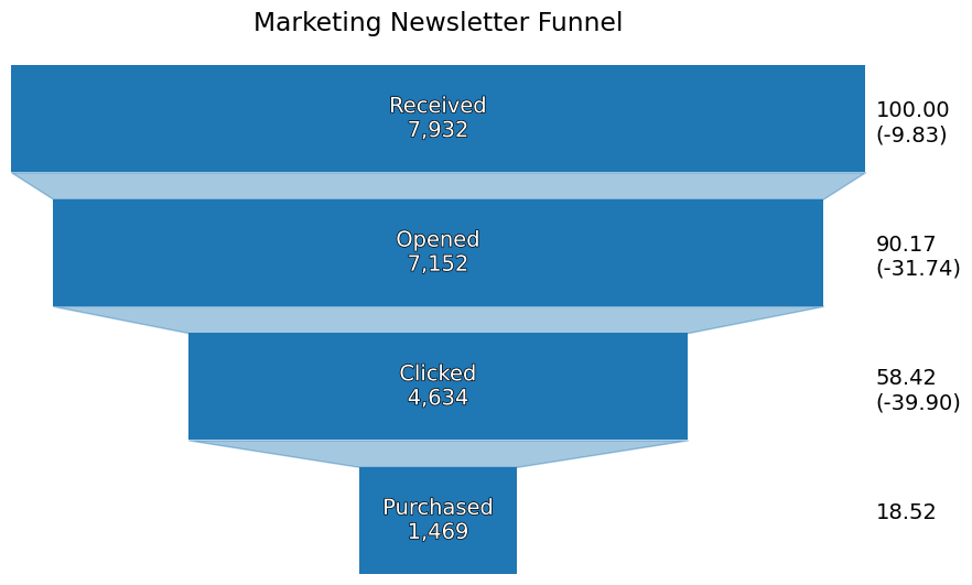
Wrap-Up
And there we have it: a funnel chart entirely in Matplotlib! If you want to see the next iteration of this chart for a stacked funnel chart, you'll have to join the seminar on March 30th! Hope to see you there!