Hierarchical Bar Charts in Matplotlib
If you've heard me talk about bar charts in Matplotlib, then you've probably heard me say that the thing I enjoy the least is creating grouped/hierarchical bar charts. Typically, I dish this responsibility over to methods/packages like pandas or seaborn, but, this week, I wanted to share my favorite fun way to create a grouped barchart in pure Matplotlib.
You may wonder what makes grouped bar charts tricky to create and the answer lies in a core assumption: all data is continuous. That's right, Matplotlib has no notion of an inherently categorical Axis, despite methods like Axes.bar making it seem like our x-axis is categorical. While this approach is very flexible, it also means that, if we want to create grouped bar charts, we need to manually track the positions of each of our categories & subcategories. While this doable, it can be tedious, which is one of the reasons tools like seaborn exist.
Other tools like bokeh have a completely separate Axis type for categorical values. This out-of-band approach might sound great, but it makes it a little trickier if you ever want to plot continuous data on top of categorical data. In my opinion, Matplotlib has the most flexible approach, but you need to be willing to work a little tedious math to lay out your bars where you want them.
%matplotlib inlineThe Data
Let's start with some data depicting the amount of fruit I've eaten over the years. Don't worry, this isn't real data. I did not, in fact, manage to eat 88 apples in 2015, but this is a good example of some hierarchical categorical data.
from numpy.random import default_rng
from pandas import Series, MultiIndex

rng = default_rng(0)

fruits = ['apple', 'orange', 'banana', 'grape', 'strawberry']
years = [2015, 2016, 2017]

index = MultiIndex.from_product([fruits, years], names=['fruit', 'year'])
s = Series(rng.integers(20, 100, size=len(index)), index=index, name='count')

s
fruit year
apple 2015 88
2016 70
2017 60
orange 2015 41
2016 44
2017 23
banana 2015 26
2016 21
2017 34
grape 2015 85
2016 71
2017 93
strawberry 2015 60
2016 68
2017 97
Name: count, dtype: int64Flattening the Categories
The default bar plot you can create involves joining our two separate categories into a single, complex column. This preserves the information in the values, but we lose nearly all ability to convey meaningful information about the distinct levels of our hierarchy.
from matplotlib.pyplot import subplots, setp, rc

rc('font', size=14)

fig, ax = subplots(figsize=(12, 6))

xs = s.index.to_flat_index().map(lambda t: ' '.join(str(t_).title() for t_ in t))
ax.bar(xs, s)

setp(ax.get_xticklabels(), rotation=25, ha='right', rotation_mode='anchor');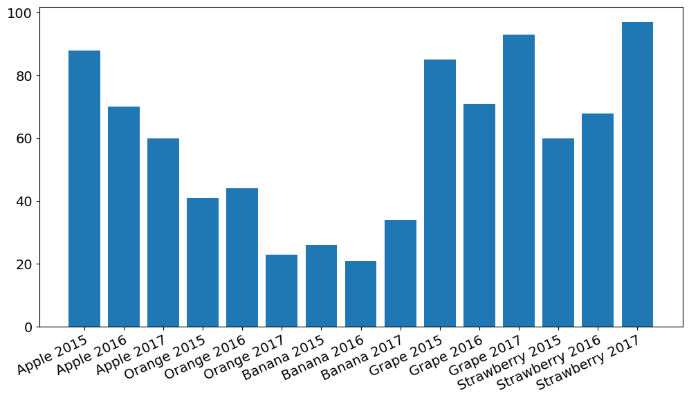
Grouping in seaborn
Thankfully, seaborn comes to the rescue here. Individual offsets are calculated for each category and subcategory which encodes between and within group differences as positional values along the x-axis. Then, the within-group information is redundantly encoded as a color value to increase the salience of the within-group factor, making it easier to compare the lower levels of our hierarchy across groups (e.g., Apple 2015 to Orange 2015).
from seaborn import barplot

fig, ax = subplots(figsize=(12, 6))

barplot(
    data=s.reset_index(),
    x='fruit', y='count', hue='year',
    hue_order=years, palette='Blues',
    ax=ax
)

ax.legend(ncol=3, title='Year', loc='lower right', bbox_to_anchor=(1, 1))

ax.spines[['top', 'right', 'left']].set_visible(False)
ax.yaxis.grid(color=ax.get_facecolor())
ax.set_xticklabels([t.get_text().title() for t in ax.get_xticklabels()]);
ax.set_xlabel('');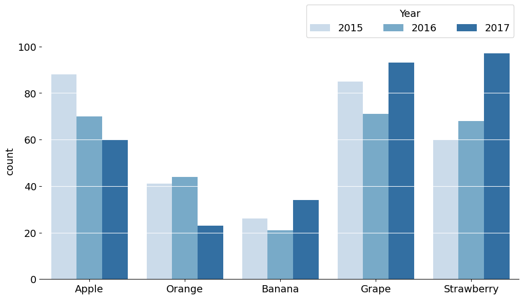
But how did seaborn do this? Let's take a look:
Grouping Bars Manually
We just need to use a little bit of tracking here (I would say math, but it's more logic than math). If it's your first time trying to fit clusters of bars onto a continuous spectrum, this may be a little tricky. The most important point here is that each bar will have some width, and some offset value compared to its base.
We can use this combination of x-location, positional offset, and width to calculate the location of each bar. Then we can perform a final pass to place our labels at the center of each group of bars!
from numpy import arange
from matplotlib.pyplot import get_cmap

blues = get_cmap('Blues').resampled(3 + 2)

fig, ax = subplots(figsize=(12, 7))

# just a little bit of math and manual tracking of bar locations
xs = arange(s.index.get_level_values('fruit').nunique())
width = 1 / (s.index.get_level_values('year').nunique() + 1)
multiplier = 0

for i, (year, group) in enumerate(s.groupby('year'), start=1):
    group = group.droplevel('year')
    offset = width * multiplier
    rects = ax.bar(xs + offset, group, width, label=year, color=blues(i))
    multiplier += 1

ax.set_xticks(xs + width, s.index.get_level_values('fruit').unique())
ax.legend(ncols=3, loc='upper right', bbox_to_anchor=(1, 1), title='Year')
ax.margins(y=.15)
ax.spines[['top', 'right', 'left']].set_visible(False)
ax.yaxis.grid(color=ax.get_facecolor())
ax.set_xticklabels([t.get_text().title() for t in ax.get_xticklabels()]);
ax.set_xlabel('');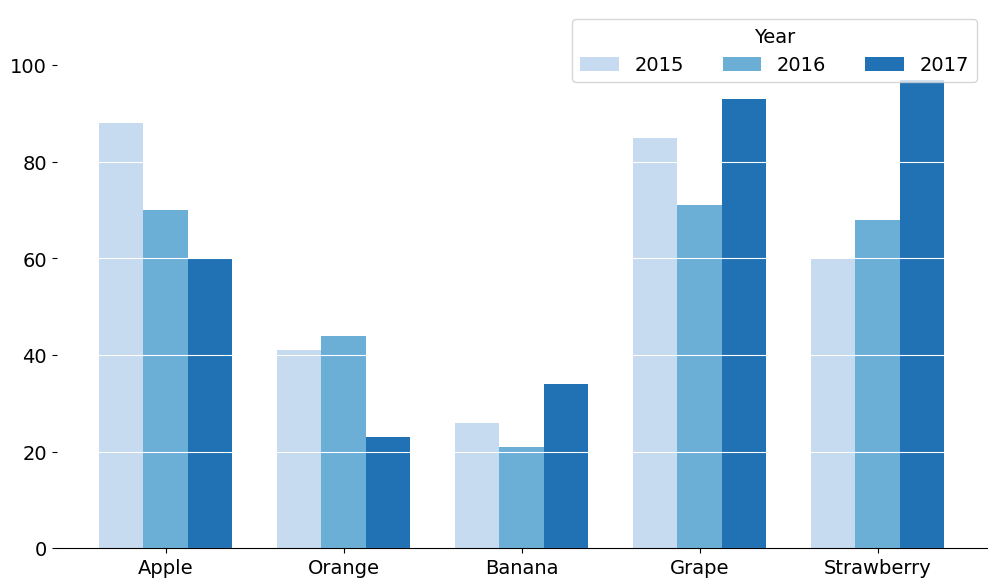
How else can we do this?
But, what if we want a TRULY a hierarchical Axis? Something more visually similar to bokeh's nested categorical axis?
Well, we could use some more math and be very careful while tracking the placement of our bars. Or, we could add some complexity by likening a hierarchical axis to multiple Axes where each within group cluster is its own Axes. We can then remove the spines from each of those Axes and use a line drawn across all of the Axes to provide the illusion that they are all on the same chart. It might look something like this:
from matplotlib.pyplot import subplot_mosaic

blues = get_cmap('Blues').resampled(3 + 2)
colors = [blues(i) for i in range(1, 4)]

fig, axd = subplot_mosaic([fruits], figsize=(12, 6), sharey=True)

for fruit, group in s.groupby('fruit'):
    group = group.droplevel('fruit')
    bc = axd[fruit].bar(group.index.astype(str), group, color=colors)
    axd[fruit].set_xlabel(fruit.title())
    setp(axd[fruit].get_xticklabels(), size='small')

for ax in axd.values():
    ax.spines[:].set_visible(False)
    ax.yaxis.set_tick_params(left=False)
    ax.xaxis.set_tick_params(bottom=False)
    ax.margins(y=.25)
    ax.yaxis.grid(color=ax.get_facecolor())

axd[fruit].legend(
    bc,
    group.index,
    ncols=3,
    loc='upper right',
    bbox_to_anchor=(1, 1),
    title='Year',
)

from matplotlib.patches import ConnectionPatch
conn = ConnectionPatch(
    xyA=(0, 0), coordsA=fig.axes[0].transAxes,
    xyB=(1, 0), coordsB=fig.axes[-1].transAxes,
    lw=ax.spines['bottom'].get_linewidth()
)
fig.add_artist(conn)

fig.suptitle('Faking a Grouped Bar Chart with Multiple Axes')
Text(0.5, 0.98, 'Faking a Grouped Bar Chart with Multiple Axes')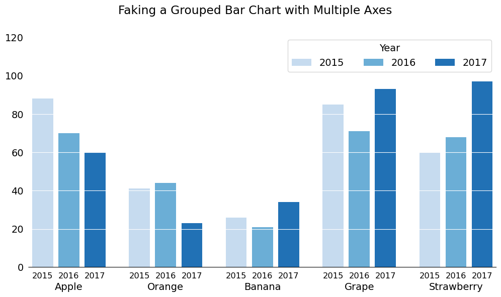
Pretty neat, right? This is my favorite thing about Matplotlib: the incredible flexibility you have when creating charts. I often say that Matplotlib is a drawing tool that lets you make graphs, and you can see here that this approach truly frees your mind and enables you to be very creative with your data visualizations.
Wrap Up
That's all for this week. Make sure you join my FREE seminar this Friday, April 14, 2023 exploring animations in Matplotlib and compare it to one of the NEWEST data visualization tools on the block: vizzu for creating narrative data visualizations with animation. See you there!