Get Rid of Those Legends!
Hey everyone! I'm back with some more data viz! This past week, I received a question about labeling a line chart in Matplotlib without a legend. While there are a few examples demonstrating this idea, I wanted to write up a quick blog post on the topic.
Why Should We Do Away with Legends?
At DUTC, we advocate for the removal of legends in charts whenever possible. Legends cause "jumps" of attention for your audience, meaning that they need to rapidly glance back and forth between data and legend to make sense of the chart.
The most common solution to this problem is to simply 'inline' your labels—that is to say: put the labels directly on the chart. Often, you'll want to redundantly encode this information so that there is a clear connection between your label and the glyph it is representing.
Let's dive in, make up some data, and fix our legends!
Some Fake Data
If you attended my session “Your Matplotlib Is Trash,” you may recognize this data set. It was a solid example of working with multiple lines that share an index.
Here, our values represent revenue in the millions of dollars. For this blog post, I won't dwell on all the small changes we could make to our {X,Y} Axis. Instead, I'll focus on the primary objective: getting rid of the legend.
from numpy import array, arange
from numpy.random import default_rng
from pandas import DataFrame, date_range, MultiIndex

rng = default_rng(0)
p = 91

data = array([
    [10, 12, 14, 14, 15, 17, 19, 18, 20],
    [10,  9, 10,  9,  9,  8,  9, 10, 11],
    [4,   4,  5,  5,  6,  5,  4,  3,  2],
    [3,   2,  2,  2,  3,  2,  2,  2,  4],
    [6,   7,  8,  8,  9, 10,  5,  8,  9],
    [6,   7,  8,  6,  7,  7,  7,  7,  7],
    [9,   8,  7,  5,  6,  6,  5,  5,  3],
    [6,   7,  8,  8,  9, 10,  5,  8,  9],
]).T

data += arange(data.shape[1]) * 5

index = MultiIndex.from_product([[*range(data.shape[0])], [*range(p)]])
columns = [
    'agriculture', 'furniture', 'software', 'hardware', 'games',
    'office supplies', 'cloud services', 'cosmetics',
]
df = (
    DataFrame(data, columns=columns)
    .reindex(index, level=0)
    .add(rng.normal(0, 2, size=(len(index), data.shape[1])))
    .div(p)
    .pipe(lambda d:
        d.set_axis(date_range('2000', freq='D', periods=len(d)))
    )
    .mul(100)
)

df.head()| agriculture | furniture | software | hardware | games | office supplies | cloud services | cosmetics | |
|---|---|---|---|---|---|---|---|---|
| 2000-01-01 | 11.265341 | 16.193176 | 16.792138 | 20.010769 | 27.394133 | 34.860648 | 45.723077 | 47.136442 |
| 2000-01-02 | 9.442340 | 13.702370 | 14.014781 | 19.871046 | 23.461471 | 33.585073 | 40.118877 | 43.445566 |
| 2000-01-03 | 9.792837 | 15.788351 | 16.289298 | 22.071458 | 28.288935 | 37.069150 | 41.395177 | 45.827495 |
| 2000-01-04 | 12.974660 | 16.690137 | 13.750551 | 17.754450 | 27.565438 | 34.549879 | 40.638202 | 44.595219 |
| 2000-01-05 | 10.639066 | 17.672188 | 15.856394 | 20.561259 | 27.134443 | 33.781069 | 44.580166 | 48.337211 |
Default Plots, Default Legends
To plot this data, we can simply rely on pandas to do most of the heavy lifting. We'll need to place the legend outside of the charting area, since there is no good space to squeeze it in.
Also, note that we're opting to smooth the underlying data, as it was a little noisy.
from matplotlib.pyplot import rc
rc('font', size=24)
rc('figure', facecolor='white')
plotting_df = df.rolling('7D').mean()
ax = plotting_df.plot(legend=False, figsize=(20, 10), lw=3)
ax.legend(loc='center left', bbox_to_anchor=(1, .5))
ax.yaxis.set_major_formatter(lambda x, pos: f'${x:g}M')
ax.set_title('Revenue Generated by Department', size='x-large', loc='left', pad=20)Text(0.0, 1.0, 'Revenue Generated by Department')
This approach is fine, but, to gain more control over our plots, let’s recreate this in explicit Matplotlib. This will enable us to explicitly track the glyphs we're adding to the chart allowing us to update them later.
from matplotlib.pyplot import subplots, close
from matplotlib.dates import AutoDateLocator, ConciseDateFormatter

fig, ax = subplots(figsize=(20, 10))

for col in plotting_df.columns:
    ax.plot(plotting_df.index, plotting_df[col], label=col)

ax.margins(x=0)
locator = AutoDateLocator()
formatter = ConciseDateFormatter(
    locator, zero_formats=['', '%b\n%Y', '%b', '%b-%d', '%H:%M', '%H:%M']
)
ax.xaxis.set_major_locator(locator)
ax.xaxis.set_major_formatter(formatter)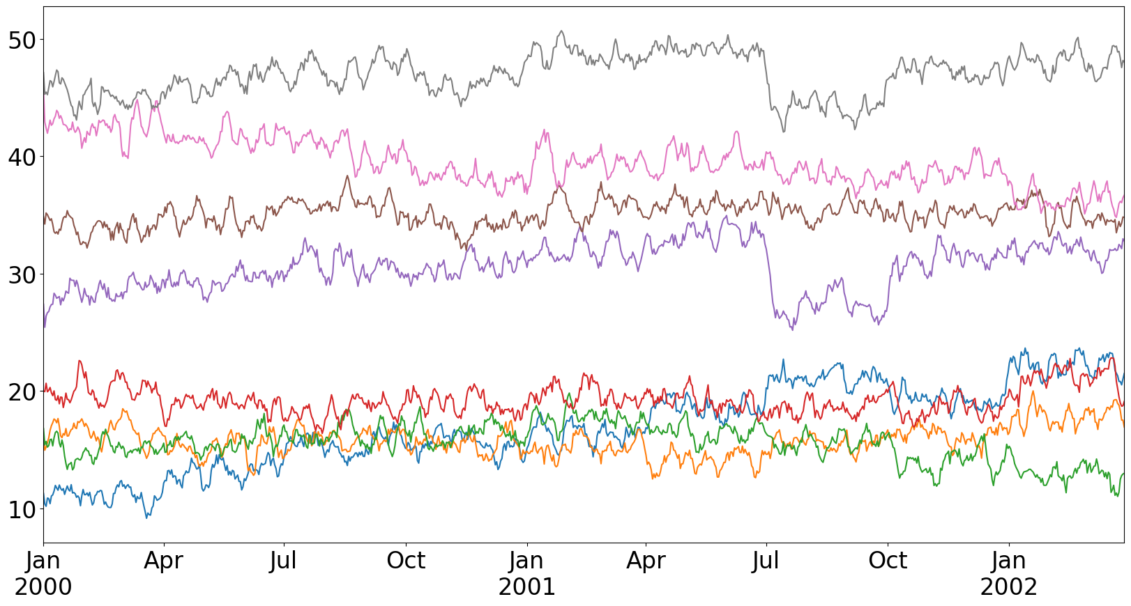
Adding Labels to the End of Each Line
Adding a label to the end of each line is quite straightforward. We'll use the Axes.annotate method as we want some padding between the end of the line and the label itself.
The use of a defaultdict is important as it enables us to apply arbitrary offsets to our labels—a useful technique when dealing with overlapping labels. In this case, our "office supplies" and "games" labels overlap on the chart, so we shift them in the opposite direction along the y-axis.
from collections import defaultdict
from matplotlib.pyplot import subplots, close
from matplotlib.dates import AutoDateLocator, ConciseDateFormatter
from matplotlib.patheffects import Normal, Stroke

rc('axes.spines', right=False, top=False)

fig, ax = subplots(figsize=(20, 10))
offsets = defaultdict(lambda: (0, 0), {'office supplies': (0, -5), 'games': (0, -5)})

for col in plotting_df.columns:
    line, = ax.plot(plotting_df.index, plotting_df[col], label=col, lw=3)

    # the last row contains the coordinates we want to add our text by
    last_row = plotting_df.iloc[-1]
    offx, offy = offsets[col] # use offsets to move labels so they do not overlap
    ax.annotate(
        text=col,
        xy=(last_row.name, last_row[col]), # annotate this point on our plot
        xytext=(offx + 4, offy),             # offset our label in the x/y direction
        textcoords='offset points',         # informs the offset what the units mean
        ha='left', va='center',
        color=line.get_color(),            # label color matches line color
        path_effects=[  # add a slight outline to pop on light backgrounds
            Stroke(linewidth=.1, foreground='k'), Normal()
        ]
    )

# no padding in data on the x-axis
ax.margins(x=0)

# make our ticks/tick labels nicer → slightly surprised pandas did this by default
locator = AutoDateLocator()
formatter = ConciseDateFormatter(
    locator, zero_formats=['', '%b\n%Y', '%b', '%b-%d', '%H:%M', '%H:%M']
)
ax.xaxis.set_major_locator(locator)
ax.xaxis.set_major_formatter(formatter)
ax.yaxis.set_major_formatter(lambda x, pos: f'${x:g}M')
ax.set_title('Revenue Generated by Department', size='x-large', loc='left', pad=20)
Text(0.0, 1.0, 'Revenue Generated by Department')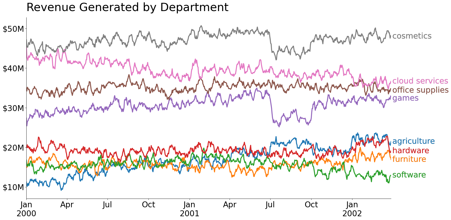
Using Small Multiples
Another trick for reducing the need for a legend is to use small multiples. Instead of plotting and labeling all lines on a single chart, we can create many smaller charts and plot our data there. This approach is typically used to show how data changes over some ordinal factor, so we'll need to include the "background" data for reference. Additionally, adding some order (even to nominal data) can be beneficial for viewing, so I've ordered the charts from highest average revenue to lowest average revenue.
from collections import defaultdict
from matplotlib.pyplot import subplots, close
from matplotlib.dates import AutoDateLocator, ConciseDateFormatter
from matplotlib import colormaps
from math import ceil

rc('axes.spines', right=False, top=False)
rc('font', size=12)

ncols = 3
nrows = ceil(df.columns.size / ncols)
fig, axes = subplots(
    nrows=nrows, ncols=ncols,
    figsize=(14, 10), sharex=True, sharey=True
)

# when possible, small multiples should have some sort of ordering
order = plotting_df.mean().sort_values(ascending=False).index

# preserve categorical color mapping for future use
colors = dict(zip(order, colormaps['tab10'].colors))

for i, (ax, label) in enumerate(zip(axes.flat, order)):
    ax.plot(
        plotting_df.index, plotting_df.drop(columns=label),
        color='gainsboro'
    )
    ax.plot(plotting_df.index, plotting_df[label], color=colors[label], lw=2)
    ax.set_title(label.title(), size='x-large', color=colors[label])

# 'remove' axes that did not have data plotted on them
for ax in axes.flat[i+1:]:
    ax.axis('off')

# the axes above the 'removed' ones display their bottom ticks/labels
if nrows > 1:
    for ax in axes[-2, i + 1 - axes.size:].flat:
        ax.xaxis.set_tick_params(bottom=True, labelbottom=True)

# label the top of all axes, little noisier but lessens the label gap
for ax in axes[0, :]:
    ax.xaxis.set_tick_params(top=True, labeltop=True)

# since x/y axis are shared across all Axes, changing options on 1 Axes
#   changes the options on all other Axes
ax.margins(x=0)
locator = AutoDateLocator()
formatter = ConciseDateFormatter(
    locator, zero_formats=['', '%b\n%Y', '%b', '%b-%d', '%H:%M', '%H:%M']
)
ax.xaxis.set_major_locator(locator)
ax.xaxis.set_major_formatter(formatter)
fig.suptitle('Small Multiples Circumvents need for Legend', size='xx-large')
fig.tight_layout()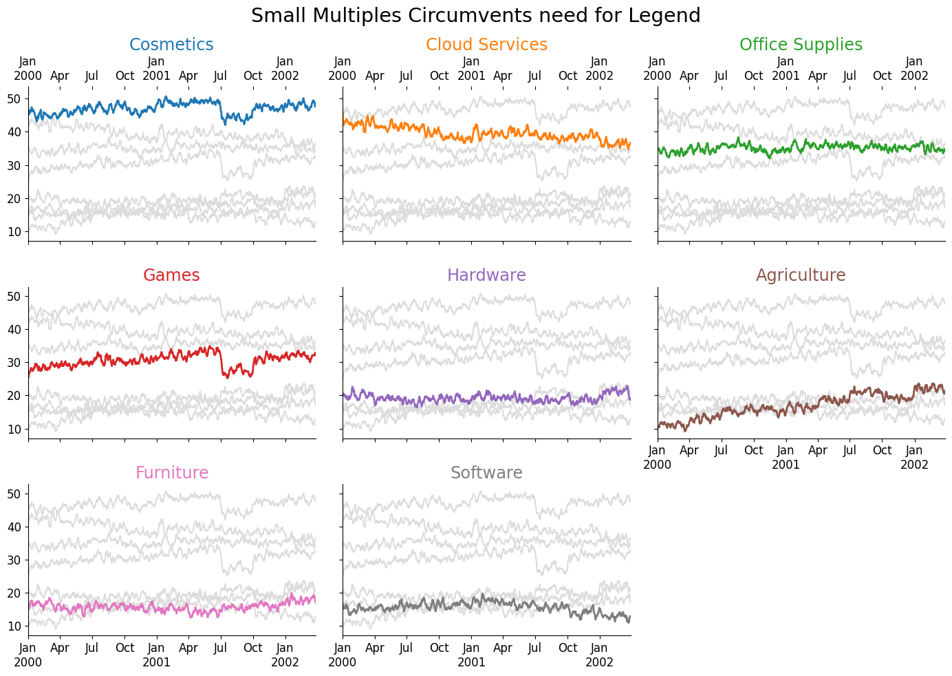
The decision to use a single-labeled chart vs small multiples is not an arbitrary one. You have a trade-off in information density where small multiples are typically more sparse; however, they also have the ability to incorporate more measures. For example, we could very easily visualize the rolling standard deviation (or any measure of uncertainty) on small multiples, whereas if we attempted to do that on a single chart, we would completely obfuscate the underlying lines.
Additionally, small multiples can be used to convey more factors than a single plot, so it is a more 'surefire' method when creating visualizations from uncertain sources. The single plot will be limited by the total number of unique colors one can use to represent unique categories.
Wrap-Up
There you have it: two ways of removing a legend from your line charts. The idea of 'inlining' your labels extends beyond line charts—you can use this concept to add labels directly inside bar charts or next to them. You should always be thinking of your audience when you create a visualization, so it is your job to ensure that your viz is as intuitive as possible!
Talk to you all next week!
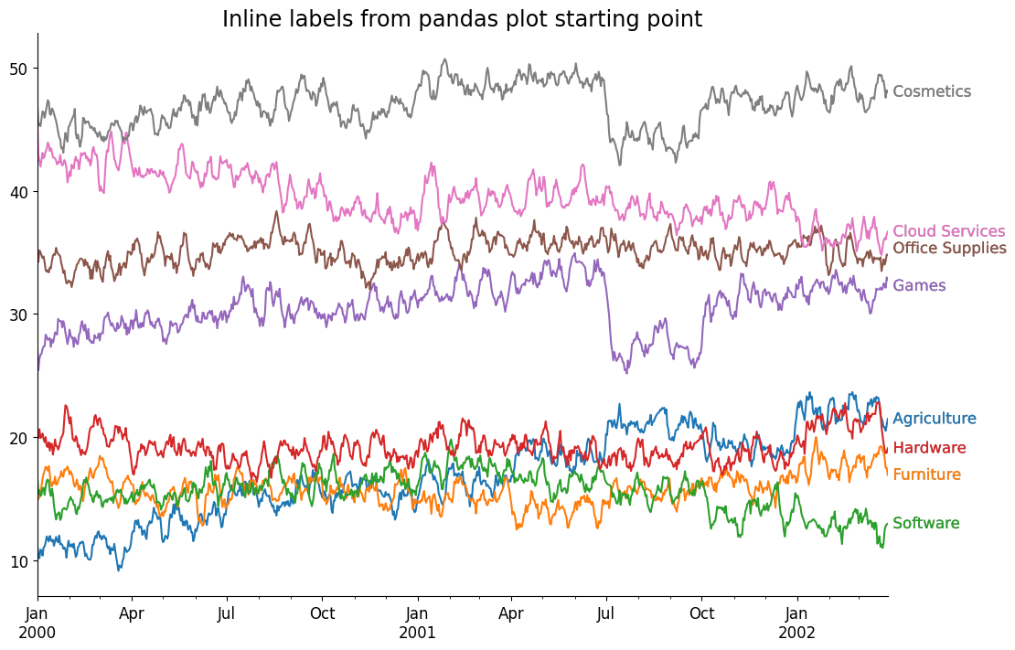
Bonus - Adding Labels from Pandas plotting interface
We can also add labels when creating charts from pandas.{DataFrame,Series}.plot methods, instead of plotting the lines and labels in a large loop, we can use the convenience of pandas methods to create the underlying lines, then iterate over those created lines and grab the underlying data from them. This enables us to rely less on having direct access to the underlying data source by working with the data attached to the line artists themselves.
ax = plotting_df.plot(legend=False, figsize=(12, 8))
offsets = defaultdict(lambda: (0, 0), {'office supplies': (0, +5), 'games': (0, -5)})

for line in ax.lines:
    x, y = line.get_data()

    # use offsets to move labels so they do not overlap
    offx, offy = offsets[line.get_label()]

    ax.annotate(
        text=line.get_label().title(),
        xy=(x[-1], y[-1]),                 # annotate this point on our plot
        xytext=(offx + 4, offy),             # offset our label in the x/y direction
        textcoords='offset points',         # informs the offset what the units mean
        ha='left', va='center',
        color=line.get_color(),            # label color matches line color
        path_effects=[  # add a slight outline to pop on light backgrounds
            Stroke(linewidth=.1, foreground='k'), Normal()
        ]
    )

##
# no padding in data on the x-axis
ax.margins(x=0)

# make our ticks/tick labels nicer → slightly surprised pandas did this by default
locator = AutoDateLocator()
formatter = ConciseDateFormatter(
    locator, zero_formats=['', '%b\n%Y', '%b', '%b-%d', '%H:%M', '%H:%M']
)
ax.xaxis.set_major_locator(locator)
ax.xaxis.set_major_formatter(formatter)
ax.set_title('Inline labels from pandas plot starting point', size='x-large')
Text(0.5, 1.0, 'Inline labels from pandas plot starting point')