Star Trader & Matplotlib: A Live-coded Session
Welcome to Cameron's Corner! This week, I wanted to reflect a on a pop-up seminar I held where I demonstrated some live-coded Matplotlib data visualizations.
In this session, we talked about planning an effective data visualization. My biggest recommendation once you understand the data and have an idea of what you want to convey is to not jump straight into creating visualizations. But instead, plan out your visualization using simple drawing tools—in this case, I chose PowerPoint as it was already installed on my machine. This lets me easily plan and adjust a layout of multiple plots and iterate on my design.
When designing visualizations, it is important to keep your audience in mind and make sure that they can understand it. Then, for complex visualizations such as this with many plots on a layout, we want to organize our summaries and aggregations.
Typically, we want to put the most important 'at-a-glance' metric in the top left.
Lets use the Intergalactic Star Trading example from previous Cameron's Corners: for my audience, which in this case focused on the generation of a trading report, I put my most important metric in the top left corner as I know my intended audience reads top→bottom, left→right.
Once I feel that my layout is organized, I have to make sure it addresses the two questions I had at hand:
How well is our intergalactic Star Trading Branch doing?
Within my team, who is performing well?
Loading In the Data
These data originate from a sqlite database. Considering I know the data are not very large, I loaded all of my tables into memory using pandas.read_sql. For most cases, I wouldn't necessarily recommend reading every table from a database into memory, but this let me work quickly with my data for the live-code demonstration.
from sqlite3 import connect
from pathlib import Path
from pandas import read_sql

path = Path('data') / 'star-trader_live-code.db'

__all__ = ['stars', 'players', 'events', 'prices', 'trades']

with connect(path) as conn:
    stars = (
        read_sql('select * from stars', con=conn)
        .astype('category')
        .set_index('star')
        .sort_index()
    )
    players = (
        read_sql('select * from players', con=conn)
        .assign(
            player=lambda df: df['player'].astype('category')
        )
        .set_index('player')
    )
    events = (
        read_sql('select * from events', con=conn, parse_dates=['date'])
        .squeeze(axis='columns')
        .assign(
            player=lambda df: df['player'].astype(players.index.dtype)
        )
        .set_index(['date', 'player', 'ship'])
        .squeeze(axis='columns')
    )
    prices = (
        read_sql('select * from prices', con=conn, parse_dates=['date'])
        .assign(
            asset=lambda df: df['asset'].astype('category'),
            star=lambda df: df['star'].astype(stars.index.dtype),
        )
        .set_index(['date', 'star', 'asset'])
        .sort_index()
    )
    trades = (
        read_sql('select * from trades', con=conn, parse_dates=['date'])
        .assign(
            player=lambda df: df['player'].astype(players.index.dtype),
            star=lambda df: df['star'].astype(stars.index.dtype),
            asset=lambda df: df['asset'].astype(prices.index.get_level_values('asset').dtype),
        )
        .set_index(['date', 'player', 'ship', 'star', 'asset'])
    )

trades.head()| price | volume | |||||
|---|---|---|---|---|---|---|
| date | player | ship | star | asset | ||
| 2019-01-01 | Alice | 0 | Sol | Medicine | 245.49 | 110 |
| Bob | 2 | Sol | Medicine | 248.40 | -240 | |
| Charlie | 0 | Sol | Metals | 51.20 | -290 | |
| 2 | Sol | Star Gems | 9823.21 | 0 | ||
| 3 | Sol | Equipment | 148.39 | -380 |
I then knew I needed my data to be in a more flexible format as I have already planned out the results I want to see. This enabled me to figure out a common data format so that I could focus on generating measurements for my visualizations instead of playing around too much with the DataFrame shape/format.
from pandas import Categorical, IndexSlice, concat, Grouper

traders = ['Alice', 'Bob', 'Charlie', 'Dana']

trades['direction'] = Categorical.from_codes(
    trades['volume'].lt(0).astype(int), categories=['bought', 'sold']
)
trades['credit'] = trades['price'] * -trades['volume']

trades = trades.loc[IndexSlice[:, traders], :]

clean_trades = (
    trades[['volume', 'credit']].unstack('asset')
    .pipe(lambda d: d['volume'].assign(credit=d['credit'].sum(axis=1)))
    .groupby(['date', 'player', 'star'], observed=True).sum()
)

clean_trades.head()| asset | Equipment | Medicine | Metals | Software | Star Gems | Uranium | credit | ||
|---|---|---|---|---|---|---|---|---|---|
| date | player | star | |||||||
| 2019-01-01 | Alice | Sol | 0.0 | 110.0 | 0.0 | 0.0 | 0.0 | 0.0 | -27003.9 |
| Bob | Sol | 0.0 | -240.0 | 0.0 | 0.0 | 0.0 | 0.0 | 59616.0 | |
| Charlie | Sol | -380.0 | 0.0 | -290.0 | 0.0 | 0.0 | 0.0 | 71236.2 | |
| 2019-01-02 | Charlie | Sol | 0.0 | 0.0 | 0.0 | 0.0 | 0.0 | 90.0 | -89891.1 |
| Dana | Sol | 0.0 | 0.0 | 0.0 | 0.0 | -10.0 | 0.0 | 95294.8 |
In the clean_trades DataFrame, each row represents a single transaction, and the columns Equipment:Uranium represent the total volume of those assets that were traded. Finally, the column credit represents the number of credits exchanged for those assets.
With our data ready in a workable format, we are ready to plot!
Note: For the purposes of this blog post, I am going to use the agg backend for Matplotlib. This will prevent my figure from being shown automatically so that I can build each step of this plot iteratively.
%matplotlib aggStar Trader Report
I make these two changes for nearly every Matplotlib plot I create. Most plots do not need the right and top spines, and the increased font size helps because I use relative values for all of my test (e.g., 'small', 'large', 'x-large').
from matplotlib.pyplot import subplot_mosaic, show, rc
rc('font', size=14)
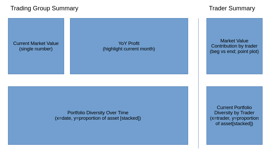
rc('axes.spines', top=False, right=False)Now I can easily use pyplot.subplot_mosaic to mimic the layout of my chart. I like to use the intended titles for each chart to link each Axes object to its intended location in the final report.
mosaic = [
    ['Current Market Value', 'Market Value Year over Year', 'Trader Market Value'],
    ['Portfolio Diversity',   'Portfolio Diversity',           'Trader Portfolio Diversity'],
]

fig, axd = subplot_mosaic(mosaic, gridspec_kw={'width_ratios': [1, 2, 1], 'wspace': .3}, figsize=(18, 10), dpi=200)
for title, ax in axd.items():
    ax.set_title(title, size='large', loc='left')

display(fig)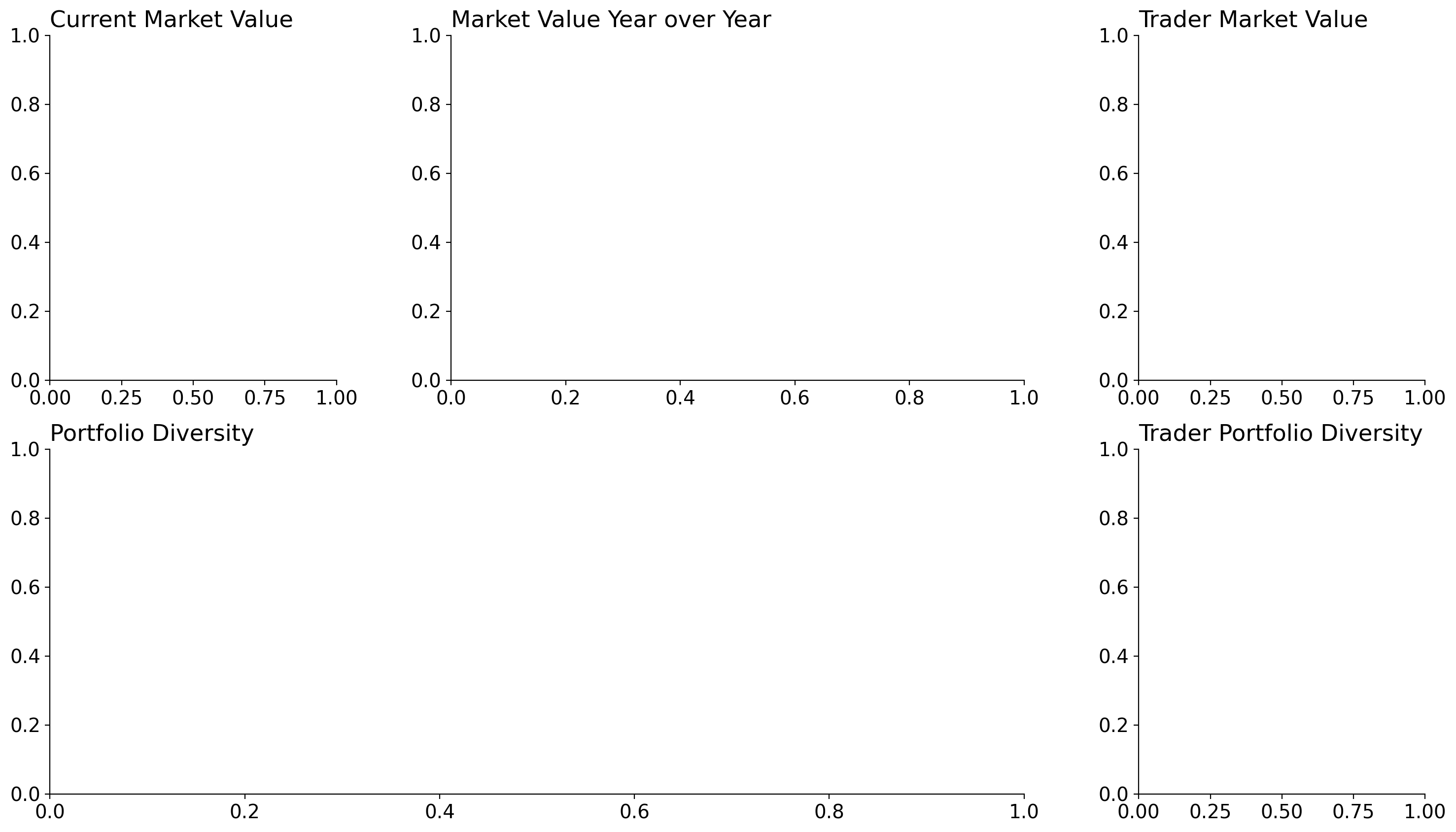
Current Market Value
I want the top left of this report to have its most defining metric in the upper left. This provides the audience with an 'at-a-glance' summary that they can take away, even if they do not examine the rest of the charts closely.
Unfortunately, our intergalactic trading branch is not doing too well.
axd['Current Market Value'].text(
    .5, .5, s=f'${clean_trades["credit"].sum()/1_000:,.0f}k',
    transform=axd['Current Market Value'].transAxes,
    ha='center', va='bottom', size='xx-large'
)
axd['Current Market Value'].patch.set_color('red')
axd['Current Market Value'].patch.set_alpha(.4)
axd['Current Market Value'].spines[:].set_visible(False)
axd['Current Market Value'].yaxis.set_visible(False)
axd['Current Market Value'].xaxis.set_visible(False)

display(fig)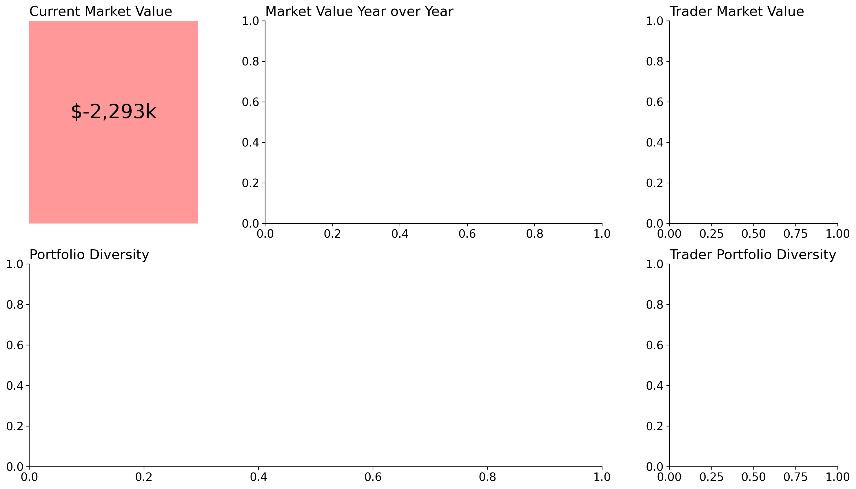
Market Value Year over Year
If there is one thing I can never remember how to do- its make a grouped barchart in pure Matplotlib. So I'll reach into seaborn (or the pandas plotting interface) nearly every time I want to make a grouped bar chart. I also wanted to highlight the "current" month of the report (December in this case) so that the reader would know which of these groups is the most relevant. To do this, I simply lowered the alpha value of other groups so that 'December' was relatively more salient than the rest of the months.
from seaborn import barplot
value = (
    clean_trades.groupby([Grouper(freq='ME', level='date')])['credit'].sum()
    .to_frame()
    .assign(
        month=lambda d: d.index.get_level_values('date').strftime('%b'),
        year=lambda d: d.index.get_level_values('date').year
    )
)
barplot(data=value, x='month', y='credit', hue='year', ax=axd['Market Value Year over Year'])
axd['Market Value Year over Year'].legend(loc='upper right', bbox_to_anchor=(.9, 1), ncols=2)

interest_pos = next(
    (i for i, tick in
     enumerate(axd['Market Value Year over Year'].get_xticklabels())
    if tick.get_text() == 'Dec')
)
for container in axd['Market Value Year over Year'].containers:
    for i, bar in enumerate(container):
        if i == interest_pos:
            continue
        bar.set_alpha(.5)

axd['Market Value Year over Year'].set_ylabel(None)
axd['Market Value Year over Year'].set_xlabel(None)

from matplotlib.pyplot import setp
setp(axd['Market Value Year over Year'].get_xticklabels(), rotation=35, ha='right', rotation_mode='anchor')

display(fig)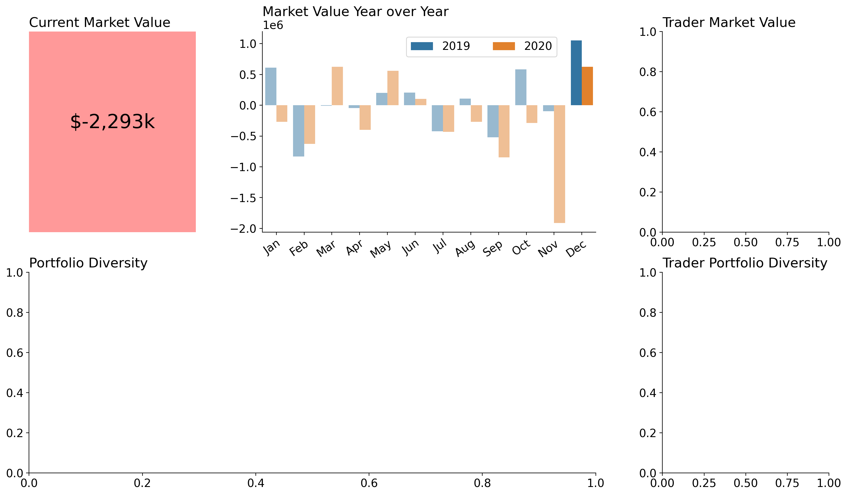
Trader Market Value
I wanted to make a slope chart that highlights our most improved trader between the previous year (2019) and the current trade year (2020). Here, I've highlighted the differences between these two years and highlighted the slope of the most improved trader.
trader_value_change = (
    clean_trades
    .groupby([Grouper(freq='YE', level='date'), 'player'], observed=True)
    ['credit'].sum()
    .unstack('date')
    .rename(columns=lambda col: col.year)
)

most_improved_trader = trader_value_change.diff(axis=1)[2020].idxmax()

for pl, row in trader_value_change.iterrows():
    color = 'tab:green' if pl == most_improved_trader else 'gainsboro'
    axd['Trader Market Value'].plot(
        ['2019', '2020'], [row[2019], row[2020]], color=color, marker='o'
    )
    axd['Trader Market Value'].annotate(
        text=pl,
        xy=('2020', row[2020]), xytext=(8, 0), textcoords='offset points',
        va='center',
    )

axd['Trader Market Value'].spines[['top', 'right', 'left']].set_visible(False)

display(fig)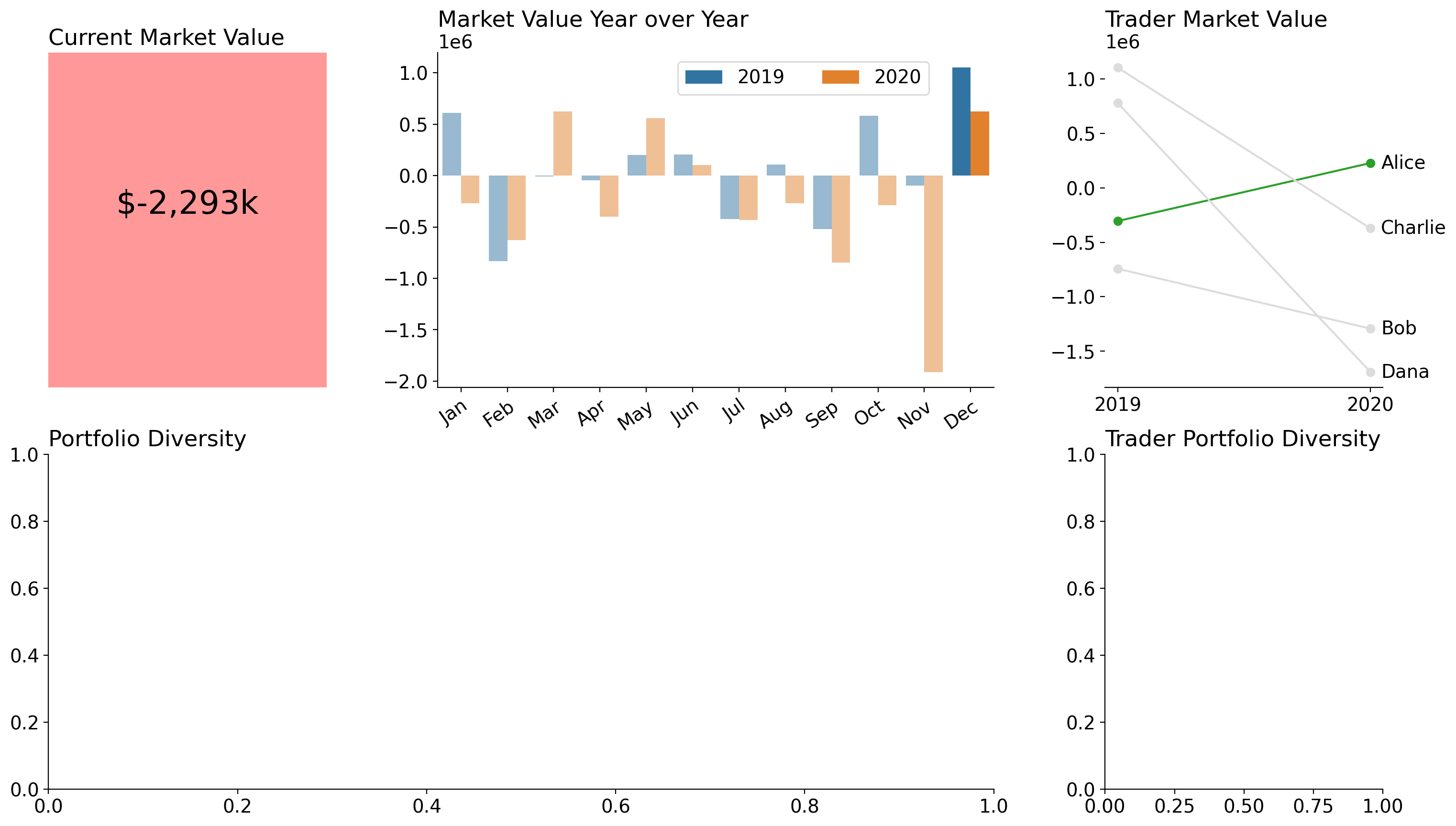
Portfolio Diversity
Now, I wanted to visualize the assets that have been traded. I use a stacked area chart to do so, and I split across 0 to show negative vs positive amounts of assets. To achieve this I had to plot two separate stackplots so that the cumulative values would be represented appropriately visually. Lastly, because this chart requires a legend that does not fit into the Axes well, I shrunk the Axes so the legend would fit in nicely.
This legend will be used for both the group-level plot and the individual-level plot since they are both stacks of assets.
from matplotlib import colormaps

buys = (
    clean_trades.groupby('date').sum()
    .cumsum().drop(columns=['credit'])
    .where(lambda d: d > 0, 0)
)

axd['Portfolio Diversity'].stackplot(buys.index, buys.T, labels=buys.columns, colors=colormaps['tab10'].colors)

sells = (
    clean_trades.groupby('date').sum()
    .cumsum().drop(columns=['credit'])
    .where(lambda d: d < 0, 0)
)
axd['Portfolio Diversity'].stackplot(sells.index, sells.T, colors=colormaps['tab10'].colors)
axd['Portfolio Diversity'].margins(x=0)
axd['Portfolio Diversity'].legend(loc='center left', frameon=False, bbox_to_anchor=(1, .5))

new_bbox = axd['Portfolio Diversity'].get_position().shrunk(.8, 1)
axd['Portfolio Diversity'].set_position(new_bbox)
axd['Portfolio Diversity'].spines[:].set_visible(False)

from matplotlib.dates import AutoDateLocator, ConciseDateFormatter

date_loc = AutoDateLocator()
axd['Portfolio Diversity'].xaxis.set_major_locator(date_loc)
axd['Portfolio Diversity'].xaxis.set_major_formatter(ConciseDateFormatter(date_loc))

display(fig)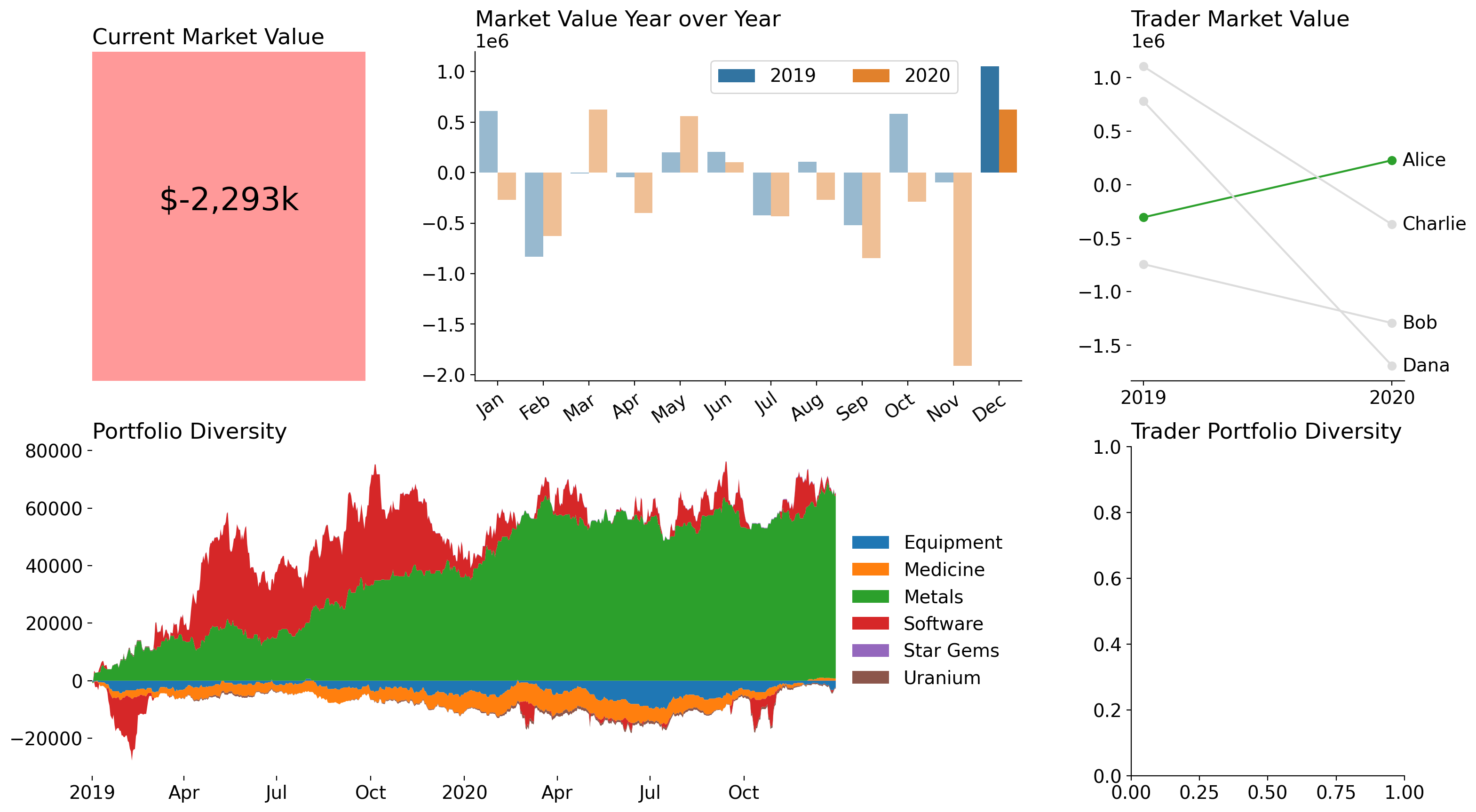
Trader Portfolio Diversity
Finally, I wanted to show the net assets traded by each trader. This was a fairly straightforward stacked bar chart, which I decided to calculate manually for the same reason as the above stacked area chart: I don't want negative values to be mixed with positive values. The end result is a chart that shows the same data as the group-level portfolio diversity, but I've aggregated across the time component and included each trader as a factor. I also remove the left spine as this plot will share the legend with the one to its left.
player_assets = (
    clean_trades.groupby('player', observed=True).sum()
    .drop(columns='credit')
)

player_pos_assets = player_assets.where(lambda d: d >= 0, 0)
player_neg_assets = player_assets.where(lambda d: d < 0, 0)

for asset, color in zip(player_assets.columns, colormaps['tab10'].colors):
    for data in [player_pos_assets, player_neg_assets]:
        height = data[asset]
        bottom = data.loc[:, :asset].drop(columns=asset).sum(axis=1)
        axd['Trader Portfolio Diversity'].bar(
            player_assets.index, height, bottom=bottom, color=color, label=asset
        )
axd['Trader Portfolio Diversity'].sharey(axd['Portfolio Diversity'])
axd['Trader Portfolio Diversity'].spines['left'].set_visible(False)

display(fig)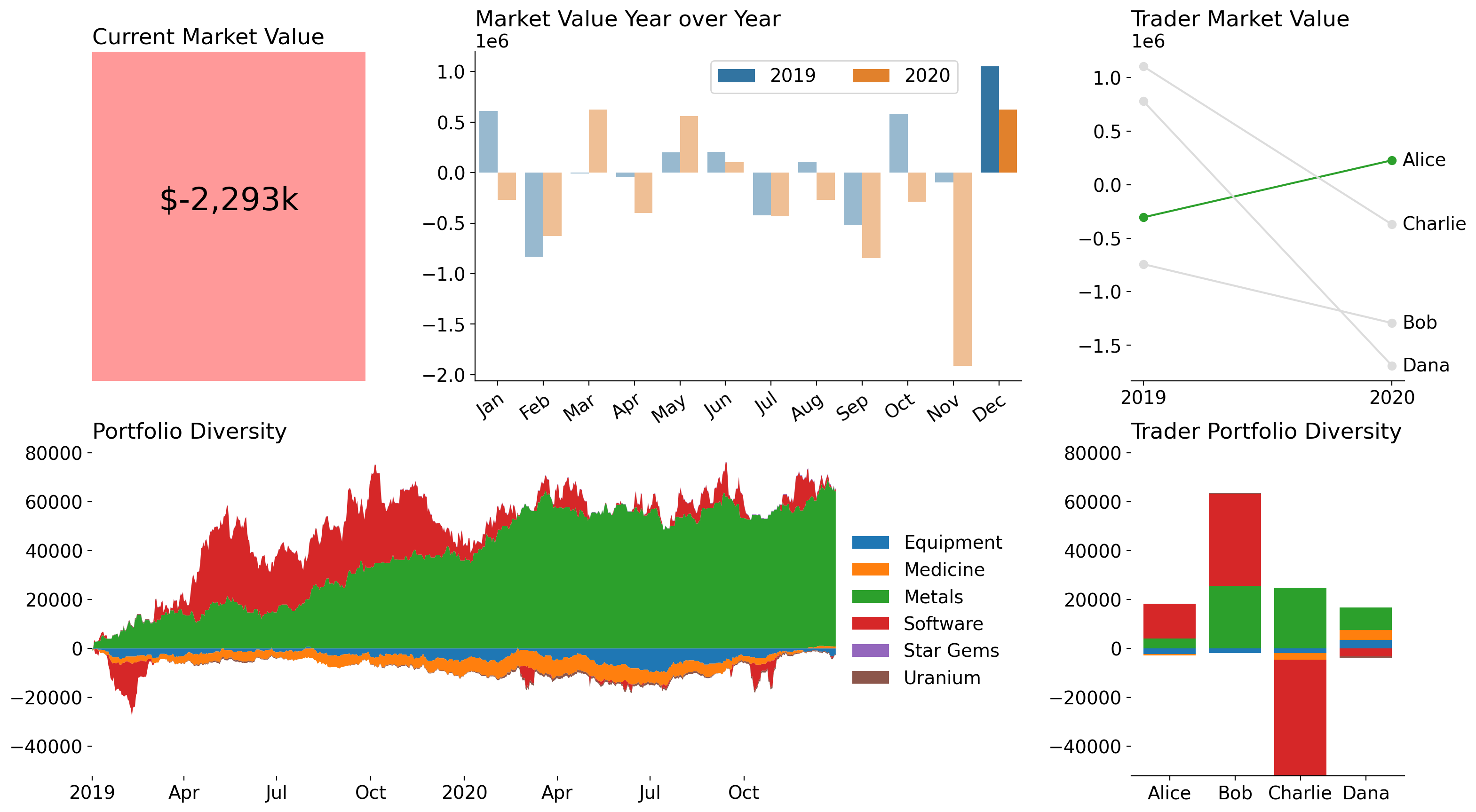
Finishing Touches
Just a few aesthetic changes left. Each y-axis has values which could be represented in the thousands. I added a tick formatter to accommodate that. I also want to add a superior title (title for the whole figure) and ensure that it is flush with the text underneath of it.
from matplotlib.transforms import blended_transform_factory

thousands_formatter = lambda x, pos: f'{x/1_000:.0f}k'
for ax in fig.axes:
    ax.yaxis.set_major_formatter(thousands_formatter)

fig.suptitle(
    'Intergalactic Trade is Down, but Alice Is on the Rise!',
    x=0,
    y=.95,
    size='xx-large',
    transform=blended_transform_factory(
        fig.axes[0].transAxes, fig.transFigure
    ),
    ha='left',
    font={'weight': 'semibold'}
)

display(fig)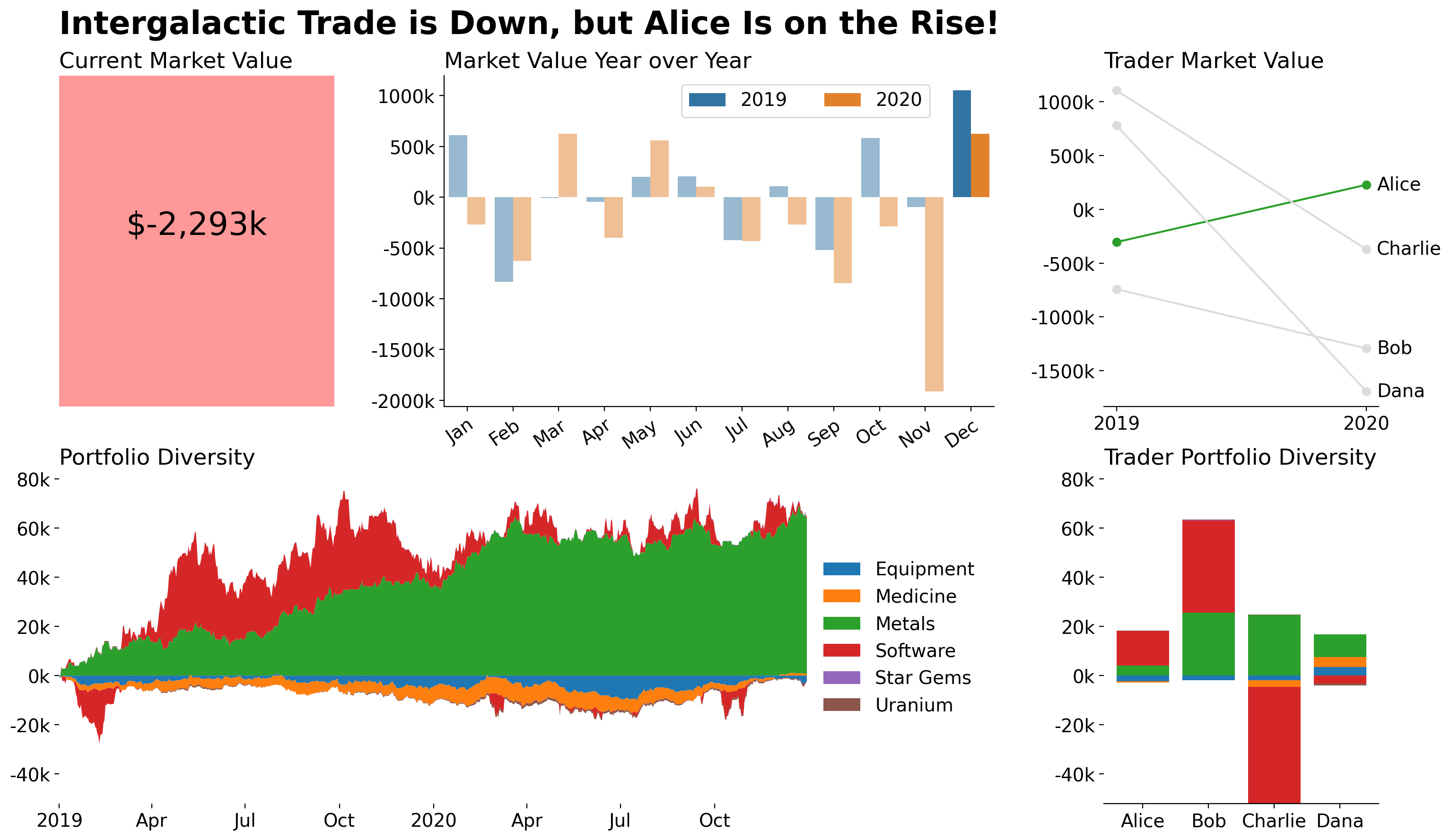
Wrap Up
That’s it for this week! Thanks for tuning in and make sure you don't miss our upcoming seminar, "Everything About Python Concurrency," where we'll explore the different concurrency models available in Python and how to use them effectively. And, until Friday, June 9th, you can register for 25% off!
I hope I see you there!