Fix those overlapping labels!
Hello, everyone! Welcome back to Cameron's Corner! This week, I want to resolve a common frustration I encounter in Matplotlib: overlapping labels.
Ever since Matplotlib 3.4, we have had an easy Axes.bar_label to quickly introduce labels on top of our bars. The example is fairly straightforward and nicely highlights centered labels.
However, examples often only go so far—and with this approach, it's very easy to end up with overlapping Annotations. As for overlaying labels on a bar plot, we often see this when there are bars that are small relative to those around it (especially in a stacked bar chart).
To highlight this example, let's take a look at some data we want to visualize: here we have some monthly expense data. A stacked bar chart can easily let us compare the total expense from month-to-month AND the relative contribution of each category within each month. Stacked bar charts are not good at category details across month comparisons due to the uneven baselines of the stacked bars.
from numpy.random import default_rng
from pandas import DataFrame, period_range

rng = default_rng(0)

expenses = DataFrame(
    data={
        'rent': [1_000] * 8 + [1_200] * 4,
        'food': rng.normal(700, 20, size=12),
        'fun': rng.normal(400, 40, size=12),
        'gas': rng.normal(200, 10, size=12),
    },
    index=period_range('2020-01', freq='M', periods=12),
)

expenses| rent | food | fun | gas | |
|---|---|---|---|---|
| 2020-01 | 1000 | 702.514604 | 306.998769 | 209.034702 |
| 2020-02 | 1000 | 697.357903 | 391.248333 | 200.940123 |
| 2020-03 | 1000 | 712.808453 | 350.163562 | 192.565008 |
| 2020-04 | 1000 | 702.098002 | 370.709306 | 190.782746 |
| 2020-05 | 1000 | 689.286613 | 378.229641 | 195.422742 |
| 2020-06 | 1000 | 707.231901 | 387.347994 | 202.201951 |
| 2020-07 | 1000 | 726.080001 | 416.465221 | 189.903818 |
| 2020-08 | 1000 | 718.941619 | 441.700535 | 197.908244 |
| 2020-09 | 1200 | 685.925295 | 394.858613 | 198.407750 |
| 2020-10 | 1200 | 674.691571 | 454.658539 | 205.408456 |
| 2020-11 | 1200 | 687.534511 | 373.392213 | 202.146591 |
| 2020-12 | 1200 | 700.826520 | 414.060403 | 203.553727 |
To turn these data into a stacked bar chart, we could use the DataFrame.plot.bar(stacked=True), but, since we are going to be creating a figure that will need some very finely-tuned tweaks, I prefer to expose those controls by just relying on Matplotlib's object oriented API. We'll need a little extra work, like tracking the bottom position of each set of bars, but the process is fairly straightforward.
%matplotlib aggfrom matplotlib.pyplot import rc
rc('figure', dpi=120)
rc('axes.spines', top=False, right=False, left=False)
rc('xtick.major', size=0)
rc('ytick.major', size=0)
rc('font', size=14)from numpy import zeros
from pandas import Timedelta
from matplotlib.pyplot import subplots, setp
fig, ax = subplots()
x = expenses.index.strftime('%b')
bottom = zeros(shape=(expenses.shape[0],), dtype=float)
bars = []
for col in expenses.columns:
bc = ax.bar(x, height=expenses[col], bottom=bottom)
bars.append(bc)
bottom += expenses[col]
setp(ax.get_xticklabels(), size='small')
display(fig)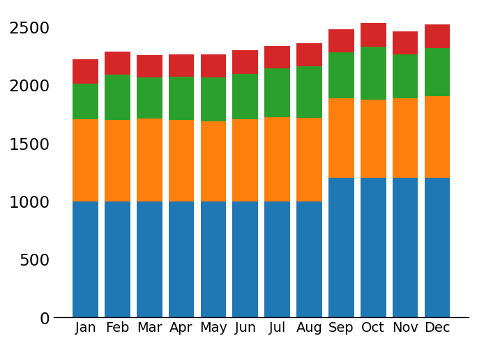
If we want to add labels to these bars, we can use the aforementioned Axes.bar_label approach like so:
for bc in bars:
    i = ax.bar_label(bc, fmt='{:.0f}', size='xx-small', color='white')

display(fig)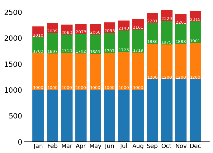
But what if we have a column with values that are relatively small compared to those around it? This would cause our labels to overlap.
expenses.insert(2, 'gifts', rng.normal(5, 5, size=len(expenses)).clip(0, None))
expenses| rent | food | gifts | fun | gas | |
|---|---|---|---|---|---|
| 2020-01 | 1000 | 702.514604 | 1.730857 | 306.998769 | 209.034702 |
| 2020-02 | 1000 | 697.357903 | 4.351932 | 391.248333 | 200.940123 |
| 2020-03 | 1000 | 712.808453 | 8.919877 | 350.163562 | 192.565008 |
| 2020-04 | 1000 | 702.098002 | 12.467156 | 370.709306 | 190.782746 |
| 2020-05 | 1000 | 689.286613 | 0.000000 | 378.229641 | 195.422742 |
| 2020-06 | 1000 | 707.231901 | 12.569619 | 387.347994 | 202.201951 |
| 2020-07 | 1000 | 726.080001 | 11.729377 | 416.465221 | 189.903818 |
| 2020-08 | 1000 | 718.941619 | 8.906557 | 441.700535 | 197.908244 |
| 2020-09 | 1200 | 685.925295 | 6.322278 | 394.858613 | 198.407750 |
| 2020-10 | 1200 | 674.691571 | 3.430386 | 454.658539 | 205.408456 |
| 2020-11 | 1200 | 687.534511 | 12.290103 | 373.392213 | 202.146591 |
| 2020-12 | 1200 | 700.826520 | 14.801292 | 414.060403 | 203.553727 |
from itertools import pairwise
from collections import defaultdict
from matplotlib.pyplot import subplots, setp

fig, ax = subplots(figsize=(8, 5))

x = expenses.index.strftime('%b')
bottom = zeros(shape=(expenses.shape[0],), dtype=float)

bars = {}
annotations = defaultdict(list)
for col in expenses.columns:
    bars[col] = ax.bar(x, height=expenses[col], bottom=bottom)

    for x_value, bar in zip(x, bars[col]):
        # we'll add our own Annotations to have slightly more control than
        #  Axes.bar_label
        annot = ax.annotate(
            f'{bar.get_height():.0f}',
            xy=(x_value,  bar.get_y() + bar.get_height()),
            xytext=(0, -3),
            textcoords='offset points',
            ha='center',
            va='top',
            color='white',
            size='x-small',
        )
        annotations[col].append(annot)
    bottom += expenses[col]

setp(ax.get_xticklabels(), size='small')

display(fig)
OVERLAP ALERT! We can see that the text near the top of the orange bars are illegible because the text that corresponds to the green bars is right underneath it. How can we fix this?
Adjusting Annotation Position
We’ll need a couple of features here:
Figure.canvas.draw/Figure.canvas.draw_idle
Matplotlib cannot know the size of text unless it is drawn. This is because fonts come in all shapes and sizes, widths and heights. We need to explicitly draw our figure in order to work with the bounding box of our texts and to check if they're overlapping
BoundingBox- all Matplotlib artists have some notion of a rectangular BoundingBox (a rectangle that contains the entire thing being drawn). We can use these to grab the x/y & width/height of our Annotations (in screen units).
This object also has a very convenient overlaps method which we can check to see if a given BoundingBox overlaps with another. This is how we can determine if any 2 Annotations are overlapping.
Transform.inverted() Matplotlib uses transforms to map either the fractional coordinate space or data space onto screen units. We can invert these Transforms to calculate data units from screen units! This is useful for calculating where our Text objects are located in data space so that we can easily update their position as needed.
Instead of adding new labels, I'm just going to update the position of the existing ones, if they have an overlap with another Annotation. Since this is a stacked bar chart, I am only going to be concerned with overlapping text in a vertical stack. A little bit of Python goes a long way here.
fig.canvas.draw_idle()
for bc, vert_labels in zip(zip(*bars.values()), zip(*annotations.values())):
    for (lb, lt), (ub, ut)  in pairwise(zip(bc, vert_labels)):
        # if the stacked text overlap, bottom align the top label and reset the
        #   xytext value (accessed via xyann)
        if ut.get_window_extent().overlaps(lt.get_window_extent()):
            ut.set_va('bottom')
            ut.xyann = (0, 0)

display(fig)

from matplotlib.pyplot import close
close('all')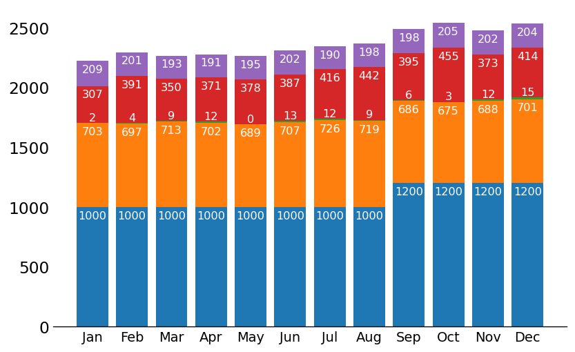
Wrap-Up
And that's how you adjust the Annotation objects so that they don't overlap! Hope you enjoyed this dive into a little bit of the lower levels of Matplotlib.
I'll see you all next time!