Time-series Alignment & Viz
Hey all, welcome back to Cameron's Corner. This week, we are taking an even deeper dive into our use of Gantt charts to represent binary signals. We'll certainly cover visualizing these data but I also want to get into some of the signal processing tricks we can apply to align multiple signals against each other.
Speaking of visualization, don't forget to join me on August 17th for a FREE seminar, “Visualizations: Exploratory → Communicative,” where I'll demonstrate how to harness the power of Matplotlib to create impactful data visualizations. From exploratory analysis to communicative visualizations, I'll guide you through uncovering insights and effectively conveying your message. Discover the techniques to profile your audience, focus their attention, and deliver precise and compelling data visualizations.
Data Creation
Before we can get into visualization, let’s create some data to play around with. In our data set, we have multiple signals we're tracking ('signal_id') and each of these will have a specific 'start', 'stop' and 'delta' for each signal. Note that these signals will overlap with one another AND will also overlap internally, meaning that multiple occurrences of signal A may happen and that occurrences of signal A & B may overlap as well.
from numpy.random import default_rng
from pandas import DataFrame

rng = default_rng(0)

df = DataFrame({
    'signal_id': rng.choice(['A', 'B', 'C'], size=(n := 50)),
    'start': (start := rng.uniform(0, 1_300, size=n).cumsum().clip(0)),
    'stop': start + rng.uniform(100, 1_500, size=n),
}).eval('delta = stop - start')

df.head()| signal_id | start | stop | delta | |
|---|---|---|---|---|
| 0 | C | 498.780821 | 1194.100895 | 695.320075 |
| 1 | B | 1795.153737 | 2763.452570 | 968.298833 |
| 2 | B | 3070.239677 | 4563.374785 | 1493.135107 |
| 3 | A | 3961.444257 | 5389.965402 | 1428.521145 |
| 4 | A | 4807.041316 | 5551.104511 | 744.063195 |
Context
In my blog post last week, we examined visualizing time series data in the fashion of a Gantt chart via Matplotlib. This week, I want to focus on a little more of the data manipulation: how do we count the number of overlapping signals at any given point in time?
%matplotlib aggfrom matplotlib.pyplot import rc
rc('figure', facecolor='white')
rc('font', size=20)
rc('axes.spines', top=False, right=False, left=False)Let’s create a quick Gantt chart to show the starts and duration of these time series.
from numpy import arange
from matplotlib.ticker import MultipleLocator
from matplotlib.pyplot import subplots, get_cmap

colors = get_cmap('Set1').colors
fig, ax = subplots(figsize=(16, 3))
total_height = .8
indv_height = total_height / df['signal_id'].nunique()
offsets = arange(df['signal_id'].nunique()) * indv_height - (total_height / 2)

collections = {}
for i, (color, off, (signal, group)) in enumerate(zip(colors, offsets, df.groupby('signal_id'))):
    collections[signal] = ax.broken_barh(
        xranges=group[['start', 'delta']].to_numpy(), yrange=(off, indv_height),
        color=color, lw=0,
    )
    label = signal
    if i == 0:
        label = f'Signal {signal}'
    ax.annotate(
        label, xy=(0, off + (indv_height/2)), xycoords=ax.get_yaxis_transform(),
        xytext=(-5, 0), textcoords='offset points',
        ha='right', color=color, size='medium'
    )

ax.yaxis.set_tick_params(labelleft=False, left=False, which='major')
ax.margins(0)

ax.invert_yaxis()
ax.xaxis.set_major_formatter(lambda x, pos: f'{x / 1000:g}')
ax.set_xlabel('Elapsed Time (ms)')
ax.set_title('Signal State across multiple sources', loc='left', pad=30, size='x-large')

display(fig)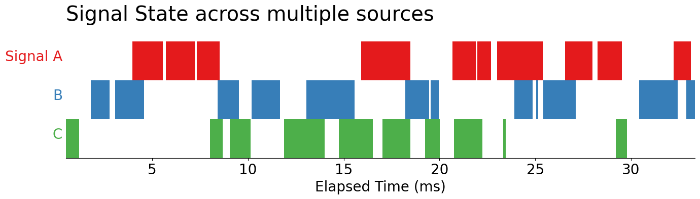
Now, let’s take a closer look at these signals: by reducing the alpha on our PolyCollection objects returned by the .broken_barh method, we see overlaps occurring within each of our signals. Since we are relying on alpha-blending, we take the darker areas of the chart to represent more overlapping signals.
For example, in Signal A, when we see darker shades of red, we understand that there are parallel occurrences of Signal A. This means that two or more instances of signal A are overlapping. This could not be observed until we turned down the alpha level.
# from itertools import chain.from_iterable

for c in collections.values():
    c.set_alpha(.3)

display(fig)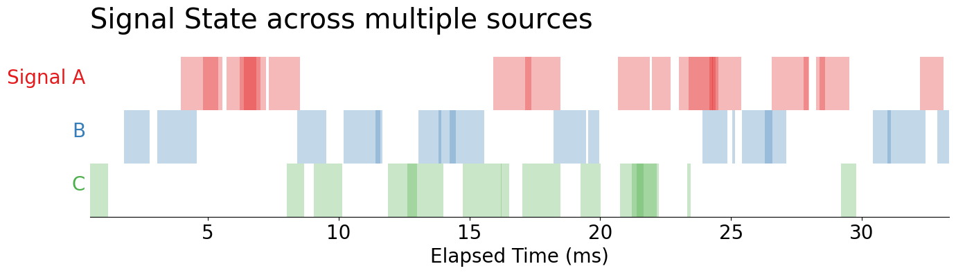
This leaves us with this question: how low do we need to set the alpha in order to observe overlaps in our data? The answer is that we shouldn't be relying on alpha in this manner in the first place because the detecting differences in opacity is going to be much harder than detecting differences in adjacent colors. So, we should re-encode our color channel to more directly represent the number of overlaps.
Which leads us to the trickiest question of the day: how do I count overlaps within a binary signal?
Identifying Overlaps In Stateful Signals
Given our data, we need to be able to see overlapping events within A, B, or C as well as across one another (e.g., where signal A & C, A & B, or B & C overlap).
df.head()| signal_id | start | stop | delta | |
|---|---|---|---|---|
| 0 | C | 498.780821 | 1194.100895 | 695.320075 |
| 1 | B | 1795.153737 | 2763.452570 | 968.298833 |
| 2 | B | 3070.239677 | 4563.374785 | 1493.135107 |
| 3 | A | 3961.444257 | 5389.965402 | 1428.521145 |
| 4 | A | 4807.041316 | 5551.104511 | 744.063195 |
Within Signal Overlaps
Using our above dataset, we'll need to align ALL of the signals onto the same continuous time series. This means we'll want to stack the start and stop times on top of each other while also maintaining their correspondence to each unique signal and whether any given event is a start or a stop.
full_ts = (
    df.melt(
        id_vars=['signal_id'], value_vars=['start', 'stop'],
        var_name='event', value_name='ts'
    )
    .pivot(index='ts', columns='signal_id', values='event')
    .astype('string')
    .sort_index()
)

full_ts.head(10).fillna('') # fillna for presentation| signal_id | A | B | C |
|---|---|---|---|
| ts | |||
| 498.780821 | start | ||
| 1194.100895 | stop | ||
| 1795.153737 | start | ||
| 2763.452570 | stop | ||
| 3070.239677 | start | ||
| 3961.444257 | start | ||
| 4563.374785 | stop | ||
| 4807.041316 | start | ||
| 5389.965402 | stop | ||
| 5551.104511 | stop |
The above DataFrame represents when each signal starts, stops, and uses its index to highlight the alignment of all signals. Using these data, we can easily calculate how many overlapping instances of each signal occur within a given window. The trick here will be to replace start and stop for 1 and -1, respectively. This will allow us to take the cumulative sum of each column and determine how many signal overlaps are in each column!
full_ts = (
    full_ts.apply(lambda s: s.map({'start': 1, 'stop': -1}))
    .fillna(0)
    .astype(int)
    .cumsum() # capture duration of each signal at all observed timepoints
)

full_ts.head(10).mask(lambda d: d==0, '') # mask 0's for presentation| signal_id | A | B | C |
|---|---|---|---|
| ts | |||
| 498.780821 | 1 | ||
| 1194.100895 | |||
| 1795.153737 | 1 | ||
| 2763.452570 | |||
| 3070.239677 | 1 | ||
| 3961.444257 | 1 | 1 | |
| 4563.374785 | 1 | ||
| 4807.041316 | 2 | ||
| 5389.965402 | 1 | ||
| 5551.104511 |
For example, where we see 1, in the first row of column C, we know that the C signal started and then stopped at the next time point. Now, take a look at column A. Here we see that, in the 6th row (ts == 3961), we observe an instance of signal A. Then, in the 7th row, we see a new instance of signal A (ts == 4807). Finally, in the next row (ts == 5389), we see that on of those signals stopped.
We've successfully counted the overlaps!
However, our data is in a MUCH different format than when we started, and, using an Axes.broken_barh is going to be much trickier than it was previously. But, if you look closely at our data, we actually have all of the information needed to create a Gantt chart via Axes.pcolormesh! Take a look: we have a True value every area we have a signal and we have an index and columns that both map the location of each of those values. We can use the X, Y, C specification of .pcolormesh along with a touch of data reshaping to produce our plot.
from numpy import array, arange
from matplotlib.colors import BoundaryNorm

cmap = (
    get_cmap('viridis', full_ts.max().max())
    .with_extremes(under=(1, 1, 1))
)
norm = BoundaryNorm(bounds := arange(1, full_ts.max().max()+2), cmap.N)

fig, ax = subplots(figsize=(16, 3))

im = ax.pcolormesh(
    full_ts.index,                  # X → the time series
    arange(len(full_ts.columns)+1), # Y → 0 to number of signals + 1
    full_ts.iloc[:-1, ::-1].T,      # C → shading of each cell in pcolormesh
    cmap=cmap, norm=norm
)

# Colorbar
cbar = fig.colorbar(im, ax=ax)
cbar.ax.set_yticks(bounds[:-1]+.5, bounds[:-1])
cbar.ax.set_ylabel('Overlapping Signals', size='small')
cbar.ax.yaxis.set_tick_params(which='both', right=False)

# Y-axis
ax.set_yticks(arange(len(full_ts.columns))+.5, labels=full_ts.columns[::-1])
ax.yaxis.set_tick_params(which='major', left=False)

# X-axis
ax.xaxis.set_major_formatter(lambda x, pos: f'{x / 1000:g}')
ax.set_xlabel('Elapsed Time (ms)')

ax.set_title('Overlap Within Signal', loc='left', pad=30, size='x-large')

ax.margins(0)

display(fig)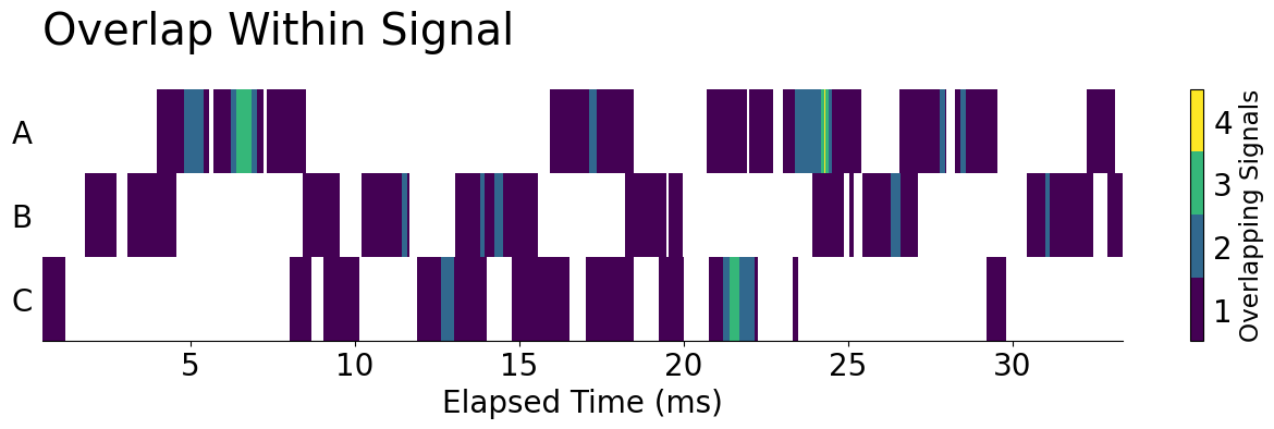
A Brief Blog Intermission…
Now that’s a lot of Matplotlib! In summary, we took a dive into time-series alignment and visualization. I discussed how to take a record-based representation of time series signals, transform it into a dense time series of events, and visualize the number of overlaps! Now, let's take this idea one step further and visualize the number of overlaps across signals instead of within them.
Before I get started again, I want to remind everyone about James' upcoming FREE seminar on Thursday of this week (24th of August), "An Overview of PyTorch." In this session, you’ll learn how to set up and configure PyTorch on your machine, and how to use PyTorch to perform computations on your GPU for even faster performance. Then we’ll explore the basics of PyTorch, including tensor operations, dynamic computation graphs, and automatic differentiation.
Across Signal Overlaps
Now, let's get started! In this example, let's calculate when our signals overlap with each other rather than with themselves. This will use the same full_ts DataFrame that we created before and will ignore overlaps within a signal by casting each column to a Boolean value. (True = signal, False = no signal). From there, we can find overlaps quite readily by finding the sum across these Boolean columns.
across_ts = (
    full_ts.gt(0)
    .assign(Overlaps=lambda d: d.sum(axis='columns'))
    .astype(int)
)

across_ts.head(10).mask(lambda d: d == 0, '') # mask 0's for presentation| signal_id | A | B | C | Overlaps |
|---|---|---|---|---|
| ts | ||||
| 498.780821 | 1 | 1 | ||
| 1194.100895 | ||||
| 1795.153737 | 1 | 1 | ||
| 2763.452570 | ||||
| 3070.239677 | 1 | 1 | ||
| 3961.444257 | 1 | 1 | 2 | |
| 4563.374785 | 1 | 1 | ||
| 4807.041316 | 1 | 1 | ||
| 5389.965402 | 1 | 1 | ||
| 5551.104511 |
from numpy import array
from matplotlib.colors import BoundaryNorm
from matplotlib.ticker import FixedLocator, FixedFormatter

cmap = (
    get_cmap('viridis', across_ts['Overlaps'].max())
    .with_extremes(under=(1, 1, 1))
)
bounds = arange(1, cmap.N+2)
norm = BoundaryNorm(bounds, cmap.N)

fig, ax = subplots(figsize=(16, 3))

plot_ts = across_ts
im = ax.pcolormesh(
    across_ts.index,
    arange(len(across_ts.columns)+1),
    across_ts.iloc[:-1, ::-1].T,
    cmap=cmap, norm=norm
)

# Colorbar
cbar = fig.colorbar(im, ax=ax)
cbar.ax.set_yticks(bounds[:-1]+.5, bounds[:-1])
cbar.ax.set_ylabel('Overlapping Signals', size='small')
cbar.ax.yaxis.set_tick_params(which='both', right=False)

# Y-axis
ax.yaxis.set_tick_params(which='major', left=False)
ax.set_yticks(arange(0, len(across_ts.columns))+.5, labels=across_ts.columns[::-1])

# X-axis
ax.xaxis.set_major_formatter(lambda x, pos: f'{x / 1000:g}')
ax.set_xlabel('Elapsed Time (ms)')

ax.set_title('Signal State across multiple sources', loc='left', pad=30, size='x-large')
ax.axhline(1, color='tab:red', lw=4)

ax.margins(0)

display(fig)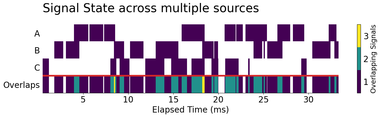
Highlighting N Overlaps
Now, let's turn this into something that closely mirrors our original broken_barh Gantt chart. To do this, we can continue to use .pcolormesh, but we'll need to re-use our original 'Set1' color palette. Since we're using color to track unique signals, we won't be able to use it to count the number of overlaps, meaning that we'll need to pin that aspect of our data down. I'm going to only highlight actual overlaps from any of at least two signal sources.
n_overlaps = 2

n_across_ts = (
    across_ts
    .assign(Overlaps=lambda d: d['Overlaps'].ge(n_overlaps).astype(int))
    .mask(lambda d: d == 0)
)

n_across_ts.head(10).fillna('') # need to convert to numpy.ndarray for plotting| signal_id | A | B | C | Overlaps |
|---|---|---|---|---|
| ts | ||||
| 498.780821 | 1.0 | |||
| 1194.100895 | ||||
| 1795.153737 | 1.0 | |||
| 2763.452570 | ||||
| 3070.239677 | 1.0 | |||
| 3961.444257 | 1.0 | 1.0 | 1.0 | |
| 4563.374785 | 1.0 | |||
| 4807.041316 | 1.0 | |||
| 5389.965402 | 1.0 | |||
| 5551.104511 |
From here, all we need are some final data transformation steps to draw our image with .pcolormesh. One of the major tricks, that you may have noticed here is that we are using the numbered values in our resultant n_across_ts DataFrame to encode the color that will be presented in the pcolormesh.
fig, ax = subplots(figsize=(16, 4))

cmap = get_cmap('Set1')

ax.pcolormesh(
    n_across_ts.index,
    arange(len(n_across_ts.columns)+1),
    n_across_ts.iloc[:-1, ::-1].T,
    cmap=cmap, vmin=0, vmax=cmap.N
)

labels = [*n_across_ts.columns[::-1]]
labels[0] = f'Overlaps\n(≥ {n_overlaps})'
ax.set_yticks(arange(0, len(n_across_ts.columns))+.5, labels=labels)
ax.yaxis.set_tick_params(which='major', left=False)

ax.xaxis.set_major_formatter(lambda x, pos: f'{x / 1000:g}')
ax.set_xlabel('Elapsed Time (ms)')

ax.set_title('Signal State across multiple sources', loc='left', pad=30, size='x-large')

ax.margins(0)
ax.axhline(1, color='tab:red', lw=4)

display(fig)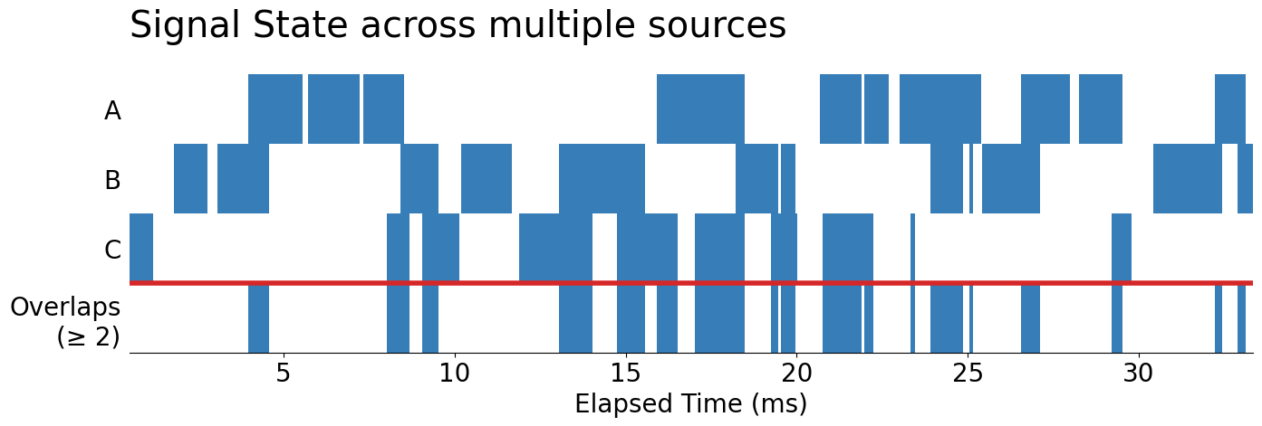
Wrap-Up
There you have it! How to take a record-based representation of time series signals, transform it into a dense time series of events, and visualize the number of overlapping signals both within and across channels!
Talk to you all next time!