Working With Slightly Messy Data
Hello, everyone! This week, I want to discuss working with real-world datasets. Specifically, how it's common (and even expected) to encounter a number of data quality issues.
Some common questions you want to ask yourself when working with a new dataset are...
Can the values be worked with in their existing format?
Are there null values and, if so, why might there be null values?
Is this dataset from a primary or secondary source? How much preprocessing has already been done to it that was not in my control?
These questions are very important to consider when working with data as they will guide you on how you should clean your data. Let's walk through an example of some data pulled from the internet.
If this is interesting for you, then you're going to love our next seminar, "Spot the Lies Told with this Data," which I'll be hosting on March 11th!
Grabbing Some Data
The dataset we'll be working with is a weather report from Newark Liberty International Airport. There are near-hourly recordings of the weather for a given day (In this case, February 22, 1980.) The dataset is quite small but will serve as a good example for working with some slightly messy data.
The data is served by a third-party API to wunderground.com/history. (This means that the tables are populated by javascript API calls after the page has loaded.) I was feeling a little too lazy to investigate the API calls the site was making, so I decided to leverage a "headless" selenium session to allow the data to be loaded via javascript before scraping the table out of the html.
Want to check out the url in question? Here's the link: https://www.wunderground.com/history/daily/KEWR/date/1980-2-22
from pandas import read_html

from io import StringIO
from selenium import webdriver
from selenium.webdriver.common.by import By
from selenium.webdriver.support.wait import WebDriverWait

options = webdriver.ChromeOptions()
options.add_argument('--headless')

driver = webdriver.Chrome(options=options)
driver.get("https://www.wunderground.com/history/daily/KEWR/date/1980-2-22")
WebDriverWait(driver, timeout=10).until(
    lambda d: d.find_element(By.TAG_NAME, "table")
)

temperatures_df = read_html(StringIO(driver.page_source))[1]
temperatures_df.to_pickle('data/KEWR-weather-1980-02-22.pickle')
from pandas import read_pickle
temperatures_df = read_pickle('data/KEWR-weather-1980-02-22.pickle')
temperatures_df.head()| Time | Temperature | Dew Point | Humidity | Wind | Wind Speed | Wind Gust | Pressure | Precip. | Condition | |
|---|---|---|---|---|---|---|---|---|---|---|
| 0 | 1:00 AM | 40 °F | 0 °F | 73 °% | NNE | 13 °mph | 0 °mph | 30.03 °in | 0.0 °in | Partly Cloudy |
| 1 | 2:00 AM | 38 °F | 31 °F | 76 °% | N | 7 °mph | 0 °mph | 30.09 °in | 0.0 °in | Cloudy |
| 2 | 3:00 AM | 39 °F | 31 °F | 73 °% | NE | 5 °mph | 0 °mph | 30.08 °in | 0.0 °in | Cloudy |
| 3 | 4:00 AM | 38 °F | 31 °F | 76 °% | NNE | 7 °mph | 0 °mph | 30.06 °in | 0.0 °in | Cloudy |
| 4 | 5:00 AM | 40 °F | 31 °F | 70 °% | NE | 9 °mph | 0 °mph | 30.06 °in | 0.0 °in | Cloudy |
Inspecting Your Data
As the saying goes, "A picture is worth a thousand words", and in the case of data visualization, this is especially true. With a small number of features, we can effectively communicate inferences about the data with simple tables. This is because there isn't much information to wade through and not many branching paths one can take when investigating summaries of smaller datasets.
from IPython.display import display, Markdown

display(
    Markdown(f'**Number of Rows in data {len(temperatures_df)}**'),
    Markdown('**Describe:**'),
    temperatures_df.describe(include='all'),
    Markdown('**Dtypes**'),
    temperatures_df.dtypes,
    Markdown('**5 row sample**'),
    temperatures_df.sample(5, random_state=0)
)
Number of Rows in data 44
Describe:
| Time | Temperature | Dew Point | Humidity | Wind | Wind Speed | Wind Gust | Pressure | Precip. | Condition | |
|---|---|---|---|---|---|---|---|---|---|---|
| count | 34 | 34 | 34 | 34 | 33 | 34 | 34 | 34 | 34 | 34 |
| unique | 34 | 7 | 5 | 10 | 6 | 9 | 1 | 17 | 3 | 3 |
| top | 1:00 AM | 0 °F | 0 °F | 0 °% | NE | 10 °mph | 0 °mph | 30.10 °in | 0.0 °in | Cloudy |
| freq | 1 | 11 | 16 | 12 | 10 | 8 | 34 | 7 | 32 | 32 |
Dtypes
Time           object
Temperature    object
Dew Point      object
Humidity       object
Wind           object
Wind Speed     object
Wind Gust      object
Pressure       object
Precip.        object
Condition      object
dtype: object
5 row sample
| Time | Temperature | Dew Point | Humidity | Wind | Wind Speed | Wind Gust | Pressure | Precip. | Condition | |
|---|---|---|---|---|---|---|---|---|---|---|
| 30 | 10:00 PM | 36 °F | 33 °F | 89 °% | N | 12 °mph | 0 °mph | 29.78 °in | 0.0 °in | Cloudy |
| 37 | NaN | NaN | NaN | NaN | NaN | NaN | NaN | NaN | NaN | NaN |
| 27 | 8:16 PM | 0 °F | 0 °F | 0 °% | ENE | 14 °mph | 0 °mph | 29.76 °in | 0.0 °in | Mostly Cloudy |
| 4 | 5:00 AM | 40 °F | 31 °F | 70 °% | NE | 9 °mph | 0 °mph | 30.06 °in | 0.0 °in | Cloudy |
| 10 | 8:00 AM | 34 °F | 0 °F | 92 °% | E | 10 °mph | 0 °mph | 30.11 °in | 0.3 °in | Cloudy |
Before we discuss NaN values, we have a parsing issue: many columns have their units as part of their data. To work effectively here, we should instead move the units into the column names so we are working with truly numeric data.
Parsing Values from Units
An important aspect of working in a notebook format is to ensure that each cell can be run independently of the cells below it. By enforcing this linear design, we want to ensure that...
Each cell can be run multiple times without needing to refresh upstream cells
Changes downstream should not change upstream cells. This means you should try to avoid reusing the same variable names.
from pandas import DataFrame, to_numeric, to_datetime

units = {
    'Temperature': '°F',
    'Dew Point': '°F',
    'Humidity': '°%',
    'Wind Speed': '°mph',
    'Wind Gust': '°mph',
    'Pressure': '°in',
    'Precip.': '°in'
}

parsed_data = {}
for colname, unit in units.items():
    parsed_col = (
        temperatures_df[colname].str.extract(fr'(\d+)\s*{unit}', expand=False)
    )
    parsed_data[f'{colname} ({unit})'] = to_numeric(parsed_col)


parsed_df = (
    DataFrame(parsed_data).join(temperatures_df.drop(columns=units.keys()))
    .assign(
        Time=lambda d: to_datetime('1980-02-22'+d['Time'], format='%Y-%m-%d%I:%M %p')
   )
)

display(
    Markdown('**Describe:**'),
    parsed_df.describe(include='all'),
    Markdown('**Dtypes**'),
    parsed_df.dtypes,
    Markdown('**5 row sample**'),
    parsed_df.sample(5, random_state=0)
)
Describe:
| Temperature (°F) | Dew Point (°F) | Humidity (°%) | Wind Speed (°mph) | Wind Gust (°mph) | Pressure (°in) | Precip. (°in) | Time | Wind | Condition | |
|---|---|---|---|---|---|---|---|---|---|---|
| count | 34.000000 | 34.000000 | 34.000000 | 34.000000 | 34.0 | 34.000000 | 34.000000 | 34 | 33 | 34 |
| unique | NaN | NaN | NaN | NaN | NaN | NaN | NaN | NaN | 6 | 3 |
| top | NaN | NaN | NaN | NaN | NaN | NaN | NaN | NaN | NE | Cloudy |
| freq | NaN | NaN | NaN | NaN | NaN | NaN | NaN | NaN | 10 | 32 |
| mean | 24.558824 | 16.823529 | 54.382353 | 10.382353 | 0.0 | 38.882353 | 0.117647 | 1980-02-22 11:40:30 | NaN | NaN |
| min | 0.000000 | 0.000000 | 0.000000 | 0.000000 | 0.0 | 3.000000 | 0.000000 | 1980-02-22 00:00:00 | NaN | NaN |
| 25% | 0.000000 | 0.000000 | 0.000000 | 9.000000 | 0.0 | 9.000000 | 0.000000 | 1980-02-22 07:24:15 | NaN | NaN |
| 50% | 35.000000 | 30.000000 | 74.500000 | 10.000000 | 0.0 | 10.000000 | 0.000000 | 1980-02-22 09:48:30 | NaN | NaN |
| 75% | 36.000000 | 31.000000 | 89.000000 | 12.750000 | 0.0 | 79.000000 | 0.000000 | 1980-02-22 17:45:00 | NaN | NaN |
| max | 40.000000 | 34.000000 | 93.000000 | 14.000000 | 0.0 | 96.000000 | 3.000000 | 1980-02-22 23:00:00 | NaN | NaN |
| std | 17.322592 | 16.127279 | 41.272938 | 2.902608 | 0.0 | 37.529596 | 0.537373 | NaN | NaN | NaN |
Dtypes
Temperature (°F)            float64
Dew Point (°F)              float64
Humidity (°%)               float64
Wind Speed (°mph)           float64
Wind Gust (°mph)            float64
Pressure (°in)              float64
Precip. (°in)               float64
Time                 datetime64[ns]
Wind                         object
Condition                    object
dtype: object
5 row sample
| Temperature (°F) | Dew Point (°F) | Humidity (°%) | Wind Speed (°mph) | Wind Gust (°mph) | Pressure (°in) | Precip. (°in) | Time | Wind | Condition | |
|---|---|---|---|---|---|---|---|---|---|---|
| 30 | 36.0 | 33.0 | 89.0 | 12.0 | 0.0 | 78.0 | 0.0 | 1980-02-22 22:00:00 | N | Cloudy |
| 37 | NaN | NaN | NaN | NaN | NaN | NaN | NaN | NaT | NaN | NaN |
| 27 | 0.0 | 0.0 | 0.0 | 14.0 | 0.0 | 76.0 | 0.0 | 1980-02-22 20:16:00 | ENE | Mostly Cloudy |
| 4 | 40.0 | 31.0 | 70.0 | 9.0 | 0.0 | 6.0 | 0.0 | 1980-02-22 05:00:00 | NE | Cloudy |
| 10 | 34.0 | 0.0 | 92.0 | 10.0 | 0.0 | 11.0 | 3.0 | 1980-02-22 08:00:00 | E | Cloudy |
Null Value Exploration
With the datatype parsing (mostly) complete (Wind and Condition could be categorical, but I'll skip that for now), we can move onto our NaNs.
Clearly, we have a NaN issue. This is fairly common when scraping data as the input is not always ingested reliably, or the HTML is not always formatted correctly. In this case, the table element was built dynamically with JavaScript, so we should expect some data cleanliness issues.
But before we go charging ahead with nan-filling, dropping, or interpolation, let's examine where the NaN values are in our data. This can be done through a number of summary metrics and some neat visualizations.
display(
    Markdown('**Number of NaN per feature**'),
    (
        parsed_df.agg(['count', 'size']).T
        .assign(delta_nulls=lambda d: d['size'] - d['count'])
    )
)
Number of NaN per feature
| count | size | delta_nulls | |
|---|---|---|---|
| Temperature (°F) | 34 | 44 | 10 |
| Dew Point (°F) | 34 | 44 | 10 |
| Humidity (°%) | 34 | 44 | 10 |
| Wind Speed (°mph) | 34 | 44 | 10 |
| Wind Gust (°mph) | 34 | 44 | 10 |
| Pressure (°in) | 34 | 44 | 10 |
| Precip. (°in) | 34 | 44 | 10 |
| Time | 34 | 44 | 10 |
| Wind | 33 | 44 | 11 |
| Condition | 34 | 44 | 10 |
Visualizing Null Values
We can see that there is a static number of NaN values per feature (aside from "Wind" where there is 1 extra null value!). While it's important to know this as a summary statistic, it is also important to know where these values occur in our data. Are they all in the same row? Do they exhibit any relationship?
A simple exploratory visualization can help answer these questions for us:
from matplotlib.pyplot import subplots, setp
from matplotlib.ticker import MultipleLocator

def plot_nulls(df, ax):
    ax.pcolormesh(df.columns, df.index, df.isna(), cmap='Greys')

    # Add vertical gridlines to distinguish columns
    ax.xaxis.grid(which='minor')
    ax.xaxis.set_minor_locator(MultipleLocator(0.5))
    ax.xaxis.set_tick_params(which='both', length=0, width=0)

    # invert heatmap & move the xticks to the top to
    #   tighten relationship to DataFrame
    ax.xaxis.tick_top()
    ax.invert_yaxis()

    setp(
        ax.get_xticklabels(), rotation=-30, ha='right',
        va='center', rotation_mode='anchor'
    )
    return ax

fig, ax = subplots()
ax = plot_nulls(parsed_df, ax=ax)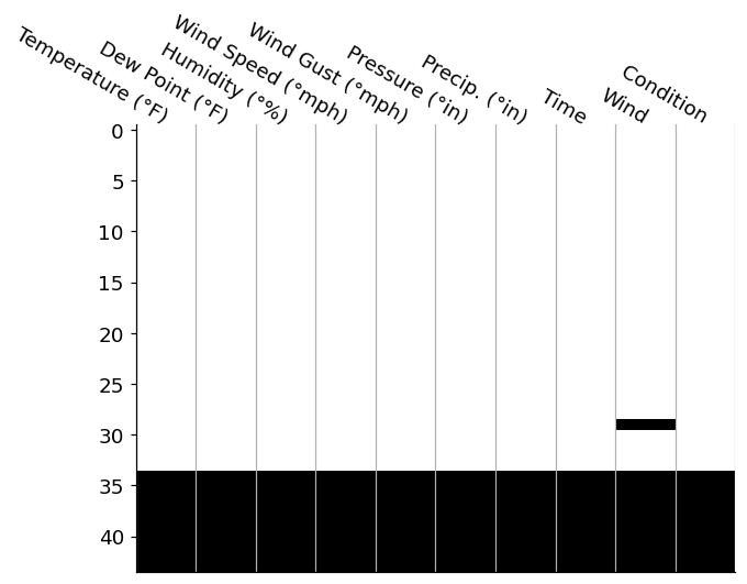
This is a fairly standard way to investigate where null values occur in your DataFrame. We've reduced each value in our DataFrame to a color: black or white. In this case, whereever you see a black tile is where we have a null value in our data. We can add features like spark lines and total counts in the margins, which I'd personally add in manually (I enjoy the control matplotlib provides), but we can also reach for the missingno package.
Regardless of your route of ending up for this null-matrix, this visualization draws our attention to the large block of null values across all columns in the bottom ~10 rows of our data. Since these nulls span acorss every single columns, it may be safe to assum that this was due to a data parsing issue, so we are probably safe to drop these values rows entirely.
from matplotlib.pyplot import subplot_mosaic
from matplotlib.ticker import IndexLocator, MultipleLocator

parsed_df = parsed_df.dropna(how='all')

# Let's spruce up the visualization even more too!
mosaic = [
    ['matrix', 'spark'],
    ['totals', '.'     ],
]

fig, axd = subplot_mosaic(
    mosaic, dpi=120, figsize=(8, 6),
    gridspec_kw={
        'width_ratios': [4, 1], 'height_ratios': [3, 1], 'top': .8,
        'hspace': .1, 'wspace': .1
    },
)

plot_nulls(parsed_df, ax=axd['matrix'])
axd['matrix'].spines['bottom'].set_visible(False)

axd['spark'].step(parsed_df.isna().sum(axis='columns'), parsed_df.index, where='post')
axd['spark'].sharey(axd['matrix'])
axd['spark'].set_title('Row-wise null count', ha='left', loc='left')
axd['spark'].yaxis.set_label_position('right')
axd['spark'].yaxis.set_visible(False)
axd['spark'].spines['left'].set_visible(False)

axd['totals'].bar(parsed_df.columns, parsed_df.isna().sum().div(len(parsed_df)))
axd['totals'].set_ylim(bottom=0, top=1)
axd['totals'].sharex(axd['matrix'])
axd['totals'].xaxis.set_tick_params('both', length=0, width=0)
axd['totals'].yaxis.set_major_locator(MultipleLocator(.5))
axd['totals'].yaxis.set_major_formatter(lambda x, pos: f'{100*x:g}%')
axd['totals'].set_xlabel('Column-wise Null Fraction')
setp(axd['totals'].get_xticklabels(), visible=False);

fig.suptitle('Exploring Null Values in our Data');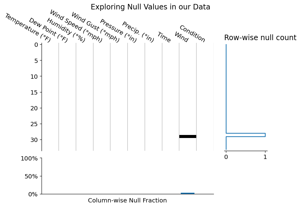
Since the above layout was a little boring, let's see how this visualization would look if we had many more null data points in our dataset!
from numpy.random import default_rng
from matplotlib.pyplot import subplot_mosaic
from matplotlib.ticker import IndexLocator, MultipleLocator

rng = default_rng(0)
mask = rng.choice([0, 1], p=[.7, .3], size=parsed_df.shape).astype(bool)
more_nulls = parsed_df.mask(mask)

from matplotlib.pyplot import subplot_mosaic
from matplotlib.ticker import IndexLocator, MultipleLocator

parsed_df = parsed_df.dropna(how='all')

# Let's spruce up the visualization even more too!
mosaic = [
    ['matrix', 'spark'],
    ['totals', '.'     ],
]

fig, axd = subplot_mosaic(
    mosaic, dpi=120, figsize=(8, 6),
    gridspec_kw={
        'width_ratios': [4, 1], 'height_ratios': [3, 1], 'top': .8,
        'hspace': .1, 'wspace': .1
    },
)

plot_nulls(more_nulls, ax=axd['matrix'])
axd['matrix'].spines['bottom'].set_visible(False)

axd['spark'].step(more_nulls.isna().sum(axis='columns'), parsed_df.index, where='post')
axd['spark'].sharey(axd['matrix'])
axd['spark'].set_title('Row-wise null count', ha='left', loc='left')
axd['spark'].yaxis.set_label_position('right')
axd['spark'].yaxis.set_visible(False)
axd['spark'].spines['left'].set_visible(False)
axd['spark'].xaxis.set_major_locator(MultipleLocator(2))

axd['totals'].bar(more_nulls.columns, more_nulls.isna().sum().div(len(more_nulls)))
axd['totals'].set_ylim(bottom=0, top=1)
axd['totals'].sharex(axd['matrix'])
axd['totals'].xaxis.set_tick_params('both', length=0, width=0)
axd['totals'].yaxis.set_major_locator(MultipleLocator(.5))
axd['totals'].yaxis.set_major_formatter(lambda x, pos: f'{100*x:g}%')
axd['totals'].set_xlabel('Column-wise Null Fraction')
setp(axd['totals'].get_xticklabels(), visible=False);

fig.suptitle('Exploring Null Values in our Data');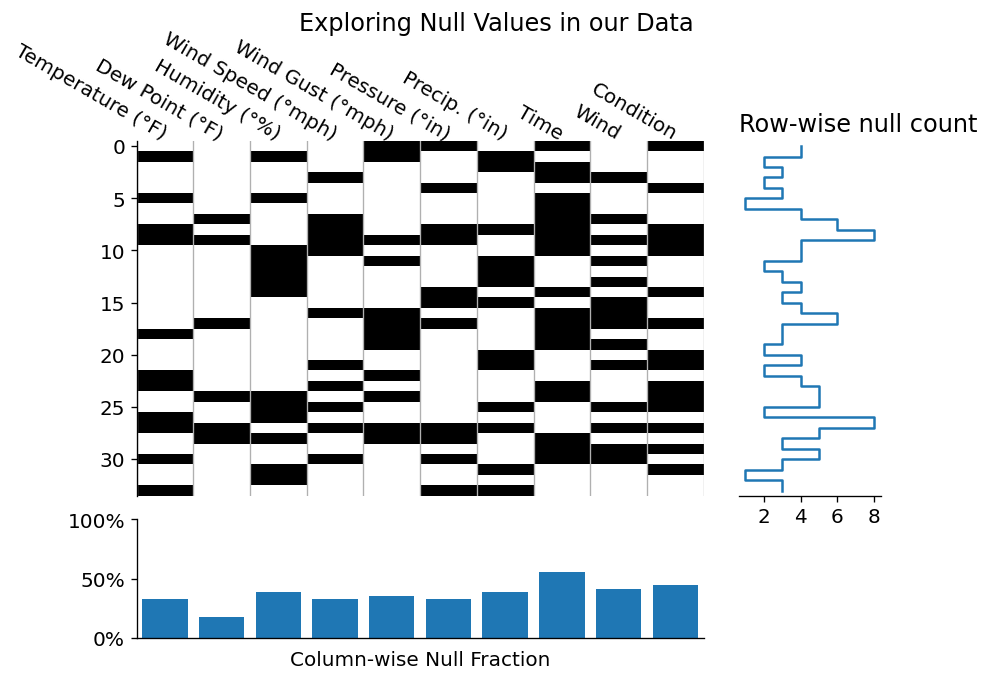
It seems that we successfully dropped those null rows, and even generated some marginal plots for quick at a glance summaries! Obviously this type of plotting would be more meaningful for a larger dataset, but I wanted to familiarize you with some of the way that you can investigate a dataset visually.
After inspecting our data for nulls, one might want to investigate the cause of null values by inspecting their relationship. Do any features have high null correlation? If so, what was the data generation process that created those values?
Since our dataset only has one NaN value remaining, we should instead focus on the values we have:
Visualizing Numeric Data
from matplotlib.dates import DateFormatter
from math import ceil
ncols = 2

numeric_data = parsed_df.set_index('Time').select_dtypes('number').sort_index()

fig, axes = subplots(
    ceil(numeric_data.columns.size / ncols), ncols, figsize=(12, 6),
    sharex=True, sharey=False, gridspec_kw={'top': .85, 'hspace': 1},
)

for i, (ax, col) in enumerate(zip(axes.flat, numeric_data.columns)):
    s = numeric_data[col]
    ax.plot(s.index, s)
    ax.set_title(col)


for ax in axes[-1, :]:
    ax.set_xlabel('Hour of Day')
    ax.xaxis.set_major_formatter(DateFormatter('%I'))

for ax in axes.flat[i+1:]:
    ax.yaxis.set_visible(False)
    ax.spines['left'].set_visible(False)
    ax.set_xlabel('Hour of Day')

fig.suptitle('Numeric Dtype Columns From Weather Data');
After investigating the timeseries data above, it seems that we have a few odd readings on Temperature, Dew Point, and Humidity. I'm no climate scientist, but I've never seen outdoor temperatures drop from ~30-40 degrees F down to 0, then back up again in a matter of minutes.
Considering that this data is not a primary source, I'm going to assume that these values were filled in with 0s by some other piece of automation. For my investigation, these should probably be replaced with NaN values. This allows me to either interpolate them or deal with them in another manner.
from numpy import nan

replacements = {
    'Temperature (°F)': {0: nan},
    'Dew Point (°F)' : {0: nan},
    'Humidity (°%)': {0: nan},
}
interpolated_data = (
    numeric_data.replace(replacements)
    .interpolate(method='time') # our index is time-aware
)

fig, axes = subplots(
    ceil(interpolated_data.columns.size / ncols), ncols, figsize=(12, 6),
    sharex=True, sharey=False, gridspec_kw={'top': .85, 'hspace': 1},
)

for i, (ax, col) in enumerate(zip(axes.flat, interpolated_data.columns)):
    s = interpolated_data[col]
    ax.plot(s.index, s)
    ax.set_title(col)


for ax in axes[-1, :]:
    ax.set_xlabel('Hour of Day')
    ax.xaxis.set_major_formatter(DateFormatter('%I'))

for ax in axes.flat[i+1:]:
    ax.yaxis.set_visible(False)
    ax.spines['left'].set_visible(False)
    ax.set_xlabel('Hour of Day')

fig.suptitle('Numeric Dtype Columns From Weather Data');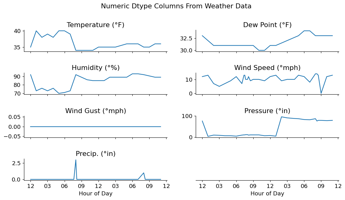
Wrap-up
That's it for this week! I hoped you enjoyed this quick dive into working with slightly messy data.
If you'd like to dig a little deeper into this topic, join us for our upcoming seminar, "Spot the Lies Told with this Data" which I'll be hosting on March 11th!
And, being a reader of our blog, use the link below to save 10% off of any ticket tier! "Spot the Lies Told with this Data,"
Talk to you again next week!