Less is More: Creating Focused Data Visualizations
Last month...
I held a review session for awardees of the Michael H. Freilich Student Visualization Competition held by the American Geophysical Union. Here, student presenters had the opportunity to share their data visualization submissions and receive feedback from myself as well as their peers. There was some amazing work that had been submitted that truly pushed the boundaries of what is typically considered to be a "visualization"—there were 3D flythroughs of lava tubes and interactive kinetic displays to understand water runoff. — Exploratory → Communicative Data Viz!
This week, I am sharing more of the broad data visualization concepts that came up during that session. You may already know that I encourage everyone to try to Get Rid of Those Legends! But I wanted to share some further thoughts on how we can also guide visual attention to create graphics that can be understood quickly and easily. Let's start with a fairly basic data set where we have some raw observed values alongside their smoothed transform with a set of "critical values." Our narrative for these data is to show how much of the observed data fall outside of this range of "critical values".
The Data
Of course, we'll need some data to get started. Our data is going to be a bit abstract since the focus here will be on our visualizations rather than the semantic meaning of our data.
from numpy.random import default_rng
import pandas as pd

rng = default_rng(0)
s = pd.Series(
    index=(idx := pd.date_range('2000-03-14', freq='min', periods=500)),
    data=1_000 * rng.normal(1, .01, size=idx.size).cumprod(),
)
smooth = s.rolling('30min', center=True).mean()

critical_range = (950, 10_50)
display(
    pd.DataFrame({'raw': s, 'smooth': smooth}).head(),
    f'{critical_range = }',
)| raw | smooth | |
|---|---|---|
| 2000-03-14 00:00:00 | 1001.257302 | 998.855178 |
| 2000-03-14 00:01:00 | 999.934593 | 996.125961 |
| 2000-03-14 00:02:00 | 1006.338400 | 993.532622 |
| 2000-03-14 00:03:00 | 1007.394050 | 991.417962 |
| 2000-03-14 00:04:00 | 1001.997749 | 990.011710 |
'critical_range = (950, 1050)'Starting Visualization
Remember that our narrative goal is
... to show how much of the observed data fall outside of this range of "critical values."
So let's start by simply plotting everything! We'll even add an informative title to help our audience focus on our message.
from matplotlib.dates import AutoDateLocator, ConciseDateFormatter
from matplotlib.pyplot import rc, subplots

rc('font', size=14)
rc('figure', facecolor='white', figsize=(12, 6))
rc('axes.spines', right=False, top=False)

fig, ax = subplots()

crit_min, crit_max = critical_range
ax.plot(smooth.index, smooth, label='smoothed')
ax.scatter(s.index, s, s=2, lw=0, label='observed')
ax.margins(x=0)

ax.xaxis.set_major_locator(loc := AutoDateLocator())
ax.xaxis.set_major_formatter(ConciseDateFormatter(loc))

ax.axhline(crit_min, color='tab:purple', label='lower threshold')
ax.axhline(crit_max, color='tab:red', label='upper threshold')

ax.set_title(
    f'{(~s.between(crit_min, crit_max)).mean():.0%} of values fall outside the critical value range',
    loc='left', size='x-large'
)
ax.legend(
    loc='upper right',
    bbox_to_anchor=(1, 1),
    markerscale=3,
    ncol=4,
    fontsize='xx-small',
    labelspacing=0,
    scatterpoints=4
);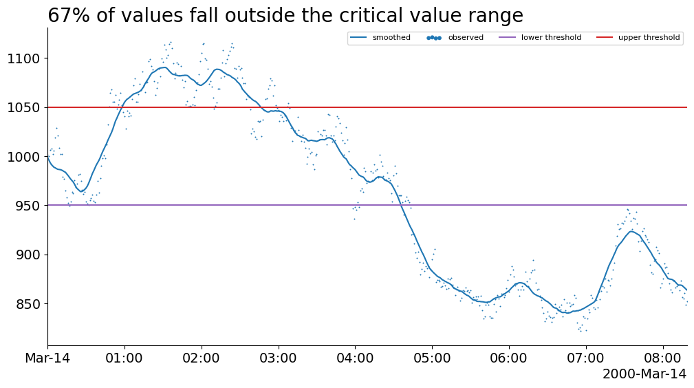
Unfortunately, the best thing we have on this chart is probably the title. This chart creates a weak narrative because our visual attention is not being guided toward the features that support the title. In this case, the colors of each of the lines is confusing and our legend has multiple colors and shapes in it for us to keep track of. This means that we repeatedly need to glance between the data and the legend in order to make sense.
Occlude Area of Non-interest
Most data visualizations can be improved by embedding information from the legend into other channels. Considering our goal narrative, we want to divert attention away from the area between the "critical region" threshold lines. Thankfully, we can do that with a simple occluding trick (putting something in front of that region) and even directly label this region instead of reporting their labels in the legend!
fig, ax = subplots()

crit_min, crit_max = critical_range
ax.plot(smooth.index, smooth, label='smoothed')
ax.scatter(s.index, s, s=2, lw=0, label='observed')
ax.margins(x=0)

ax.xaxis.set_major_locator(loc := AutoDateLocator())
ax.xaxis.set_major_formatter(ConciseDateFormatter(loc))

hspan = ax.axhspan(
    ymin=crit_min, ymax=crit_max, alpha=.5, color='gainsboro', zorder=2
)
ax.axhline(crit_min,  color='gainsboro', alpha=.7)
ax.axhline(crit_max, color='gainsboro', alpha=.7)

ax.set_title(
    f'{(~s.between(crit_min, crit_max)).mean():.0%} of values fall outside the critical value range',
    loc='left', size='x-large'
)
ax.legend(
    loc='upper right',
    markerscale=3, fontsize='xx-small',
    bbox_to_anchor=(1, 1),
    scatterpoints=4
)
ax.annotate(
    text='critical value range',
    xy=(1, 1),
    xycoords=hspan,
    va='top',
    ha='right',
    size='x-small'
);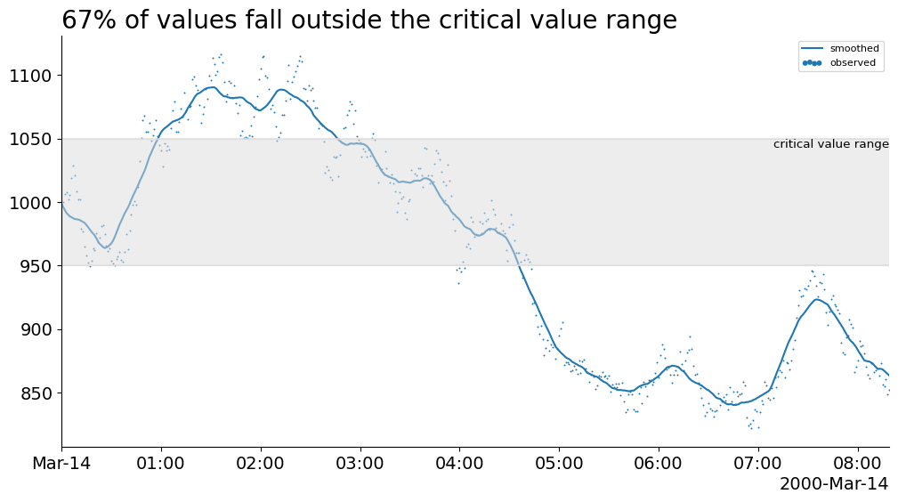
This chart is much cleaner because it visually divides the space into distinct regions. However, it is not obvious if we should focus on the data within or outside the critical value range.
We can also make an argument to remove the legend entirely—typically, we would incorporate these labels into the y-axis or somewhere in the title.
Highlight Interest Area & Occlude Non-interest
The visual shaded region trick worked quite well. What if we tried it again? This time, instead of attempting to slightly occlude (hide) data, we want to use a shaded region to draw attention. To do this, we can use a strong color, like red, to grab the audiences attention.
fig, ax = subplots()

crit_min, crit_max = critical_range
ax.plot(smooth.index, smooth, label='smoothed')
ax.scatter(s.index, s, s=2, lw=0, label='observed')
ax.margins(x=0)

ax.xaxis.set_major_locator(loc := AutoDateLocator())
ax.xaxis.set_major_formatter(ConciseDateFormatter(loc))

ax.set_title(
    f'{(~s.between(crit_min, crit_max)).mean():.0%} of values fall outside the critical value range',
    loc='left', size='x-large'
)

ax.axhspan(ymin=crit_min, ymax=crit_max, alpha=.5, color='gainsboro', zorder=2)
ax.axhspan(ymin=ax.get_ylim()[0], ymax=crit_min, alpha=.3, color='tab:red')
ax.axhspan(ymin=crit_max, ymax=ax.get_ylim()[1], alpha=.3, color='tab:red')
ax.set_ylim(ax.get_ylim());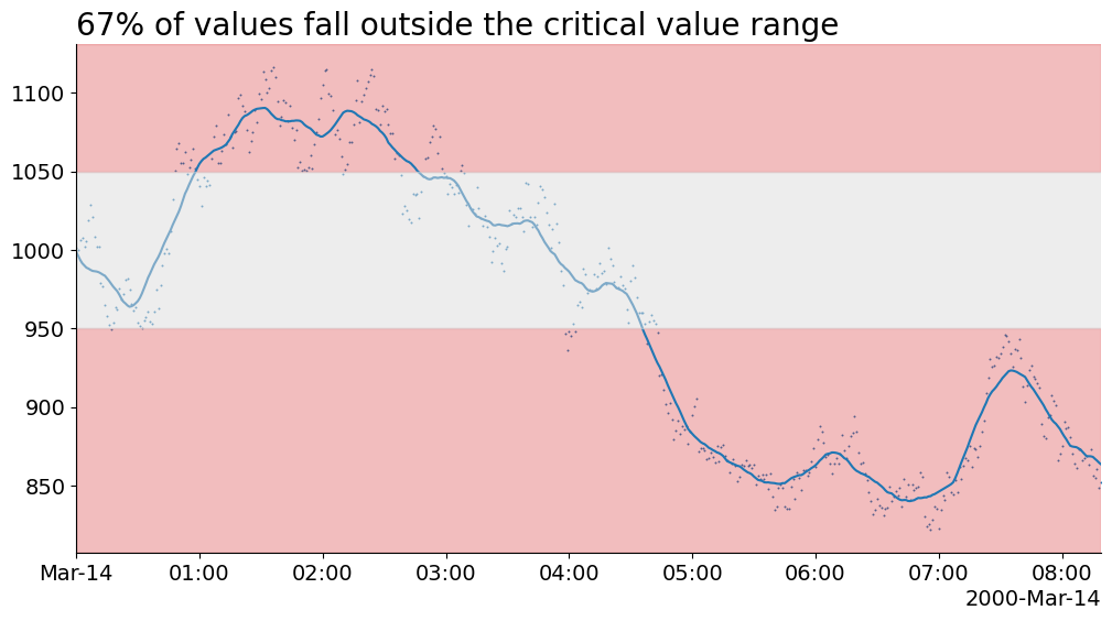
Unfortunately, applying the same shaded region trick almost works against us. As we are highlighting a broad area of the chart, it creates a slight ambiguity: is the area itself important or just the data in the highlighted area?
Highlight Interest Values & Occlude non-interest Region
Instead of highlighting an area of the chart, let's highlight just the relevant data with a red color. Additionally, we can tie in these highlighted data with our title to create a direct link between our narrative and its supporting evidence. This is a powerful way to help us guide our audience's attention from our message to specific features of the chart.
from flexitext import flexitext

fig, ax = subplots()

crit_min, crit_max = critical_range

ax.xaxis.set_major_locator(loc := AutoDateLocator())
ax.xaxis.set_major_formatter(ConciseDateFormatter(loc))

annot = flexitext(
    x=0, y=1,
    s=(
        '<size:large><color:tab:red>67% of values</>'
        ' fall outside the <color:gray>critical value range</></>'
    ),
    va='bottom',
)

ax.axhspan(ymin=crit_min, ymax=crit_max, alpha=.5, color='gainsboro', zorder=2)
extrema = ~smooth.between(crit_min, crit_max)
groups = (extrema != extrema.shift()).cumsum()
for extreme, data in smooth.groupby(groups):
    if 950 < data.iloc[0] < 1050:
        ax.plot(data.index, smooth.loc[data.index], color='tab:blue', alpha=.4)
    else:
        ax.plot(data.index, smooth.loc[data.index], color='tab:red', zorder=3)

extrema = ~s.between(crit_min, crit_max)
groups = (extrema != extrema.shift()).cumsum()
for extreme, data in s.groupby(groups):
    if 950 < data.iloc[0] < 1050:
        ax.scatter(data.index, data, color='tab:blue', alpha=.4, s=2)
    else:
        ax.scatter(data.index, data, color='tab:red', alpha=.6, s=2, zorder=3)


ax.axhline(crit_min,  label='upper threshold', color='gainsboro', alpha=.7)
ax.axhline(crit_max, label='lower threshold', color='gainsboro', alpha=.7)

ax.annotate(
    'Critical Value Range',
    xy=(1, 1050), xycoords=(ax.transAxes, ax.transData),
    xytext=(0, -5), textcoords='offset points',
    va='top',
    ha='right',
    size='small',
)

ax.set_xlim(s.index[0], s.index[-1])
ax.yaxis.set_tick_params(bottom=False, pad=0)
ax.spines['left'].set_visible(False);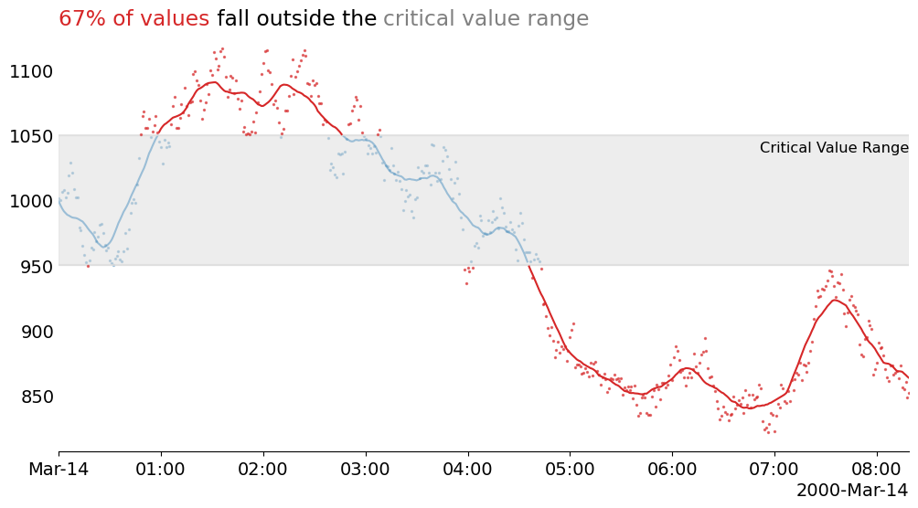
Wrap-Up
Visually linking elements from your title to your visualization is a powerful way to guide attention from your communicated message to its supporting evidence. Furthermore, we streamlined the chart by completely removing the legend, thus making for a visual that is less distracting and can be quickly understood.
If you want to learn more about data visualization, or the Matplotlib tricks I used here then find me on the DUTC Discord server. Talk to you next time!