Edward Tufte’s NYC Weather In Bokeh
Hello, everyone! Welcome back to Cameron’s Corner. This week, I wanted to expand upon using Bokeh to visualize the weather by revisiting the Edward Tufte NYC Weather in 2003 visualization I recreated in Matplotlib. Except, this time, I want to see if Bokeh is up to the challenge.
All of the data & set up will be identical to the previous post from March, so we can gloss over those details. If you’re up to date, feel free to skip down to the Recreating Tufte in Bokeh section.
Cleaning the Weather Data
If you're curious where these data originated, check out my original blog post that focuses on this same visualization in matplotlib: where I made the data downloading code available
Once we've downloaded the data, let's focus on working into a more useful state.
from IPython.display import display, Markdown
from pandas import read_parquet

nyc_historical = (
    read_parquet(
        'data/NYC_weather.parquet',
        columns=['date', 'measurement', 'value', 'm_flag', 'q_flag'],
    )
    .loc[lambda df:
         ~df['q_flag'].isin(['I', 'W', 'X'])
         & df['m_flag'].isna()
         & df['measurement'].isin(['PRCP', 'TMAX', 'TMIN', 'SNOW'])
    ]
    .pivot(index='date', columns='measurement', values='value')
    .eval('''
        TMAX = 9/5 * (TMAX/10) + 32
        TMIN = 9/5 * (TMIN/10) + 32
        PRCP = PRCP / 10 / 25.4
        SNOW = SNOW / 25.4
    ''')
    .rename(columns={               # units post-conversion
        'TMAX': 'daily_max',        # farenheit
        'TMIN': 'daily_min',        # farenheit
        'PRCP': 'precipitation',    # inches
        'SNOW': 'snowfall'          # inches
    })
    .rename_axis(columns=None)
    .sort_index()
)

nyc_2003 = nyc_historical.loc['2003'].copy()

display(
    nyc_2003.head(3),
    Markdown('...'),
    nyc_2003.tail(3),
    Markdown(f'{len(nyc_2003)} rows')
)| precipitation | snowfall | daily_max | daily_min | |
|---|---|---|---|---|
| date | ||||
| 2003-01-01 | 1.098425 | 0.000000 | 50.00 | 37.04 |
| 2003-01-02 | 0.039370 | NaN | 39.02 | 30.02 |
| 2003-01-03 | 0.299213 | 0.393701 | 35.06 | 30.02 |
...
| precipitation | snowfall | daily_max | daily_min | |
|---|---|---|---|---|
| date | ||||
| 2003-12-29 | 0.0 | 0.0 | 55.04 | 37.04 |
| 2003-12-30 | NaN | 0.0 | 53.06 | 41.00 |
| 2003-12-31 | 0.0 | 0.0 | 46.94 | 37.94 |
365 rows
Historical Elements
I'll need daily historical averages and ranges for this viz. Thankfully, this is a quick .groupby operation, grouping on the day of year contained within our index.
from pandas import to_datetime, to_timedelta

historical_range = (
    nyc_historical.groupby(nyc_historical.index.dayofyear)
    .agg(
        historical_min=('daily_min', 'min'),
        historical_max=('daily_max', 'max'),
        normal_min=('daily_min', 'mean'),
        normal_max=('daily_max', 'mean'),
    )
)

historical_range.head()| historical_min | historical_max | normal_min | normal_max | |
|---|---|---|---|---|
| date | ||||
| 1 | 8.24 | 60.08 | 29.938571 | 41.315000 |
| 2 | 8.96 | 60.08 | 29.197143 | 40.871429 |
| 3 | 10.22 | 62.96 | 29.930000 | 39.881429 |
| 4 | 3.92 | 66.02 | 29.252857 | 40.625000 |
| 5 | 8.96 | 64.04 | 28.250000 | 39.410000 |
Combine Data
Since I will be plotting this data onto a set of shared (time-based) x-axes, I'll first manually align the data. This will make accessing any specific observation straightforward and allow me to work seamlessly with pandas and Matplotlib. This will also quickly derive cumulative monthly precipitation and add that as a feature to the data set.
historical_align_index = (
    to_datetime('2002-12-31') + to_timedelta(historical_range.index, unit='D')
)

plot_data = (
    nyc_2003.join(historical_range.set_index(historical_align_index))
    .assign(
        monthly_cumul_precip=lambda d:
            d.fillna({'precipitation': 0})
            .resample('ME')['precipitation']
            .cumsum()
   )
)

plot_data.head()| precipitation | snowfall | daily_max | daily_min | historical_min | historical_max | normal_min | normal_max | monthly_cumul_precip | |
|---|---|---|---|---|---|---|---|---|---|
| date | |||||||||
| 2003-01-01 | 1.098425 | 0.000000 | 50.00 | 37.04 | 8.24 | 60.08 | 29.938571 | 41.315000 | 1.098425 |
| 2003-01-02 | 0.039370 | NaN | 39.02 | 30.02 | 8.96 | 60.08 | 29.197143 | 40.871429 | 1.137795 |
| 2003-01-03 | 0.299213 | 0.393701 | 35.06 | 30.02 | 10.22 | 62.96 | 29.930000 | 39.881429 | 1.437008 |
| 2003-01-04 | 0.031496 | NaN | 35.96 | 32.00 | 3.92 | 66.02 | 29.252857 | 40.625000 | 1.468504 |
| 2003-01-05 | 0.051181 | 0.393701 | 35.06 | 33.08 | 8.96 | 64.04 | 28.250000 | 39.410000 | 1.519685 |
Recreating Tufte in Bokeh
Whew! Preparing that data required a fair bit of code (though locating the data was much harder than cleaning it). Now we can get started with the visualization!
Here is Tufte’s “NYC Weather in 2003” which we will be re-creating in bokeh.
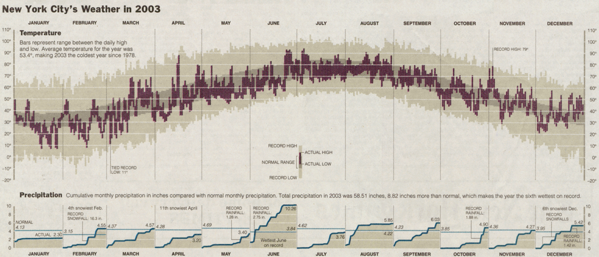
If you haven't yet had a chance to read it- I have already recreated this graphic
in Matplotlib: 
from pathlib import Path
Path('tufte-bokeh').mkdir(exist_ok=True)

from bokeh.io import show, save, output_file, export_png
Note
A standard workflow with Bokeh and a notebook format will use the bokeh.io.output_notebook however for the deomnstrative purpose of this blog post, I will create multiple different documents each capturing the current state of a Bokeh chart. This will on occasion cause me to use a workaround (which I annotate in the code itself). However I would advocate for anyone to use bokeh.io.output_notebook if you're just starting wit Bokeh inside of Jupyter!
Choosing The Defaults
Bokeh has a different approach to styling than Matplotlib does; thankfully, it does have some global defaults we can customize for colors and font sizes/styles. Of course, we will need to manually tweak things as we go, but this will give us a good start.
from bokeh.io import curdoc
from bokeh.io.state import curstate
from bokeh.themes import Theme

from bokeh.models import GlobalInlineStyleSheet

palette = {
    'background': '#e5e1d8',
    'daily_range': '#5f3946',
    'record_range': '#c8c0aa',
    'normal_range': '#9c9280',
}

theme_attrs = {
    'Plot': {
        'background_fill_color': palette['background'],
        'border_fill_color':  palette['background'],
    },
    'Axis': {
        'major_label_text_font_size': '10pt',
        'major_label_text_font_style': 'bold',
        'major_tick_line_alpha': 0,

        'axis_line_alpha': 0,
    },
    'Grid': {
        'grid_line_alpha': .8
    },
    'UIElement': {'stylesheets': [
        GlobalInlineStyleSheet(
            css=".bk-GridPlot { background-color: %s; }" % (palette['background'], ))
    ]},
}

doc = curdoc()
doc.theme = Theme(json={'attrs': theme_attrs})
Temperature
Let's begin with the temperature plot. We have a few things to accomplish here. We'll need to create our Figure and add on our data (figure.vbar). One thing to note is that the VBar Glyph in Bokeh will center the resultant rectangle on the supplied x-coordinate. So we’ll need to apply a transformation on the resultant data in order to position the bars in the correct place on the chart.
Create Figure
Add Historical min/max
Add Normal min/max
Add daily min/max
from bokeh.plotting import figure, ColumnDataSource
from bokeh.io import show, save
from bokeh.models import (
    CustomJSTransform,
    DaysTicker, CustomJSTickFormatter,
    SingleIntervalTicker, PrintfTickFormatter,
    Div, Title
)
from bokeh.layouts import column
from pandas import Timedelta, DateOffset

output_file('tufte-bokeh/01.html')

# ① Create Figure for plotting temperature data
# ratio 3x1
temperature_p = figure(
    frame_width=1200, frame_height=400,
    x_axis_type='datetime', x_axis_location='above',
    y_range=[-20, 110]
)

# matplotlib exposes an `align` parameter for whether the bars should be centered
#   or left aligned. Bokeh lacks this convenience so we can transform the data on
#   the javascript side (note that we could also do this on the Python side as well)
left_align_bars = CustomJSTransform(v_func=f'''
    const delta = {Timedelta('12h').total_seconds() * 1000};
    return xs.map(x => x + delta);
''')

# Bokeh tracks data via the ColumnDataSource, this enables us to have all layers
#   of the plot refer to the same source.
temperature_cds = ColumnDataSource(plot_data)

# ② Add Historical min/max
temperature_p.vbar(
    # x    : Use the `date` column and apply the CustomJSTransform
    # width: Bokeh uses a milliseconds since unix epoch
    #   https://docs.bokeh.org/en/latest/docs/user_guide/topics/timeseries.html#units
    x={'field': 'date', 'transform': left_align_bars}, width=Timedelta('1D'),
    top='historical_max', bottom='historical_min',
    source=temperature_cds,
    color=palette['record_range'],
    name='daily range', # supply a name so we can access this renderer later
)

# ③ Add Normal min/max
temperature_p.vbar(
    x={'field': 'date', 'transform': left_align_bars}, width=Timedelta('1D'),
    top='normal_max', bottom='normal_min',
    source=temperature_cds,
    color=palette['normal_range'],
)

# ④ Add Daily min/max
temperature_p.vbar(
    x={'field': 'date', 'transform': left_align_bars}, width=Timedelta('1D') * .9,
    top='daily_max', bottom='daily_min',
    source=temperature_cds,
    color=palette['daily_range'],
    line_width=0,
)

save(temperature_p)
export_png(temperature_p, filename='tufte-bokeh/01.png');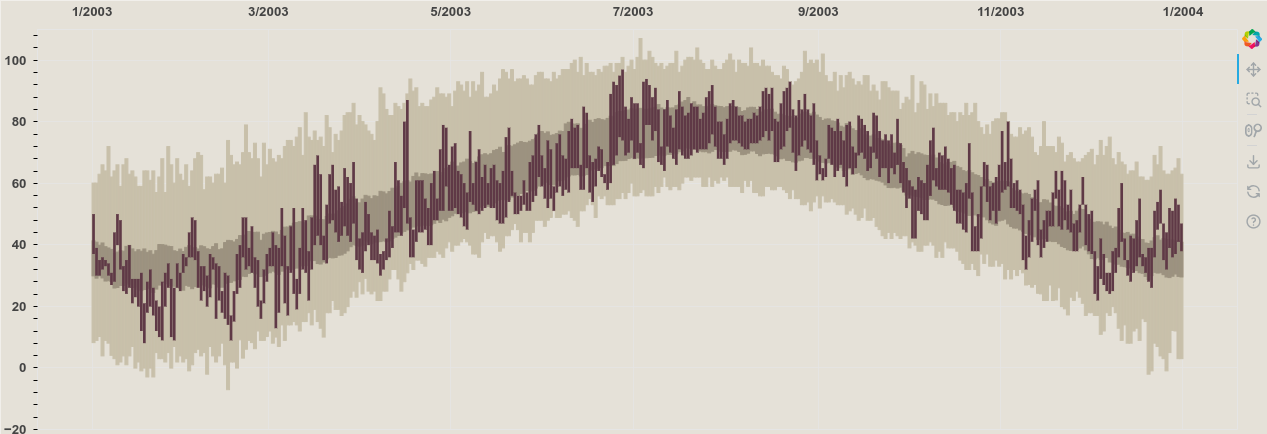
Tickers, Grids, & Labels
Now let’s start making it prettier. This will involve...
Adding x-axis tick labels in the center of each month
Adding x-axis grid lines at the beginning of each month
Adding y-axis ticks every ten units
Removing y-axis minor ticks
Adding y-axis grid lines whose color is same as background
Adding y-axis ticks to the right side of the plot (in addition to the left)
Adding y-axis tick formatting to include the digit and ° (degree symbol)
Removing excess margin on left/right of x-axis
output_file('tufte-bokeh/02.html')

# ① tick labels in center of month
# Hacky workaround- supplying single Day btwn 13-31 in DaysTicker results
#   in some ticks not appearing. Need to investigate on the JS side.
temperature_p.xaxis.ticker = DaysTicker(days=[1, 15])
temperature_p.xaxis.formatter = CustomJSTickFormatter(code="""
    var date = new Date(tick)
    var day = date.getUTCDate()
    if ( day == 15 ) { return date.toLocaleString('default', { month: 'long' }) }
    else { return "" }
""")

# ② xaxis grid lines
#   the separation of xaxis.ticker & xgrid.ticker is quite nice
temperature_p.xgrid.ticker = DaysTicker(days=[1])
temperature_p.xgrid.grid_line_color = 'gray'
temperature_p.xgrid.level = 'guide' # ensure gridlines sit on top of data (zorder)
temperature_p.xgrid.grid_line_dash = 'dotted'

# ③ & ④ yaxis ticks every 10 units, no minor ticks
temperature_p.yaxis.ticker = SingleIntervalTicker(interval=10, num_minor_ticks=0)

# ⑤ yaxis grid lines whose color is same as background
temperature_p.ygrid.ticker = temperature_p.yaxis.ticker
temperature_p.ygrid.grid_line_color = palette['background']
temperature_p.ygrid.level = 'guide'

# ⑥ yaxis ticks to the right side of the plot (in addition to the left)
temperature_p.add_layout(temperature_p.yaxis[0].clone(), 'right')

# ⑦ yaxis tick format
temperature_p.yaxis.formatter = PrintfTickFormatter(format='%d°')

# ⑧ xaxis remove excess margins
temperature_p.x_range.range_padding = 0

save(temperature_p, 'tufte-bokeh/02.html')
export_png(temperature_p, filename='tufte-bokeh/02.png');
Custom Legend/Key
For this chart we’ll need to create an entirely custom legend- meaning we are not going to rely on any built-in legend interface since it is unsuitable for our needs. This custom legend will drill down into an example of a single set of bars, labelling what each color/region means. In order to do this we will create some synthetic data that allows us to easily see the edge of each bar, which will require just a bit of playing around.
From there we'll need to add labels for each region of bars to appropriately annotate them. The steps for this process should be as follows:
Cover up the gridlines that will interfere with our annotations (reduce noise)
Create synthetic data for our bars & Add bars onto chart
Label each region of bars.
from bokeh.models import BoxAnnotation, Label

# ① Cover up gridlines in lower center of plot to reduce noise around legend
for date in ['2003-07', '2003-08']:
    date = to_datetime(date)
    text_area = BoxAnnotation(
        left=date - Timedelta('4h'),
        right=date + Timedelta('4h'),
        top=plot_data.loc[date, 'historical_min'],
        fill_color=palette['background'],
        fill_alpha=1,
        line_color=palette['background'],
        line_alpha=1,
        line_width=1,
    )
    temperature_p.add_layout(text_area)

# ② Create data for legend/key
temperature_legend_cds = ColumnDataSource({
    'historical_max': [30],
    'historical_min': [-10],
    'normal_max':     [24],
    'normal_min':     [-4],
    'daily_max':      [18],
    'daily_min':      [2],
    'x':              [to_datetime('2003-07-15')],
    'width':          [Timedelta('5D')],
})

# ② Create bars from synthetic data for legend
temperature_p.vbar(
    x='x', top='historical_max', bottom='historical_min', width='width',
    source=temperature_legend_cds, color=palette['record_range'],
    level='annotation'
)

temperature_p.vbar(
    x='x', top='normal_max', bottom='normal_min', width='width',
    source=temperature_legend_cds, color=palette['normal_range'],
    level='annotation'
)

temperature_p.vbar(
    x='x', top='daily_max', bottom='daily_min', width='width',
    source=temperature_legend_cds, color=palette['daily_range'],
    level='annotation'
)


# ③ Add labels for bar regions
data = {k: v[0] for k, v in temperature_legend_cds.data.items()}
temperature_p.add_layout(
    Label(
        text='RECORD HIGH',
        x=data['x'] - data['width'], y=data['historical_max'],
        text_align='right', text_baseline='bottom',
        text_font_size='10pt',
    )
)

temperature_p.add_layout(
    Label(
        text='RECORD LOW',
        x=data['x'] - data['width'], y=data['historical_min'],
        text_align='right', text_baseline='top',
        text_font_size='10pt',
    )
)

temperature_p.add_layout(
    Label(
        text='ACTUAL HIGH',
        x=data['x'] + data['width'], y=data['daily_max'],
        text_align='left', text_baseline='middle',
        text_font_size='10pt',
    )
)
temperature_p.add_layout(
    Label(
        text='ACTUAL LOW',
        x=data['x'] + data['width'], y=data['daily_min'],
        text_align='left', text_baseline='middle',
        text_font_size='10pt',
    )
)

# Create lines for legend → NORMAL RANGE label
right = data['x'] - (data['width'] / 2)
left = right - Timedelta('3D')
temperature_p.line(
    x=[right, left, left, right],
    y=[data['normal_max'], data['normal_max'], data['normal_min'], data['normal_min']],
    level='annotation', line_width=3, color='black'
)
temperature_p.add_layout(
    Label(
        text='NORMAL RANGE',
        x=left, y=(data['normal_max'] + data['normal_min']) / 2,
        x_offset=-5,
        text_align='right', text_baseline='middle',
        text_font_size='10pt',
    )
)

save(temperature_p, 'tufte-bokeh/03.html')
export_png(temperature_p, filename='tufte-bokeh/03.png');
Title & Description
Let's go ahead and add the descriptive annotation for this chart. We report a couple of values and provide an inner title. To do this we'll recycle the grid masking trick we saw earlier and add two more labels in the upper left hand corner of the chart.
Mask gridlines in upper left corner
Add title in bold
Add description in smaller font below title
output_file('tufte-bokeh/04.html')

from textwrap import dedent

# ① Cover up gridlines in upper left hand corner of plot
#  add text on top of this space.
for date in ['2003-02', '2003-03']:
    date = to_datetime(date)
    text_area = BoxAnnotation(
        left=date - Timedelta('2h'),
        right=date + Timedelta('2h'),
        bottom=plot_data.loc[date, 'historical_max'],
        fill_color=palette['background'],
        fill_alpha=1,
        line_color=palette['background'],
        line_alpha=1,
        line_width=1,
    )
    temperature_p.add_layout(text_area)

# ② Add title in bold
temperature_title = Label(
    x=temperature_p.frame_width * .01, y=temperature_p.frame_height * .99,
    x_units='screen', y_units='screen',
    text='Temperature',
    background_fill_color=palette['background'],
    text_baseline='top',
    text_font_size='14pt',
    text_font_style='bold',
)
temperature_p.add_layout(temperature_title)

# ③ Add description below title
temperature_desc_params = {
    'year_avg': plot_data[['daily_min', 'daily_max']].mean().mean(),
}
temperature_desc = Label(
    # 14 pt font, 96/72 for conversion
    x=temperature_title.x, y=temperature_title.y - 14*96/72, y_offset=-10,
    x_units='screen', y_units='screen',
    text=dedent('''
    Bars represent range between the daily high
    and low. Average temperature for the year was
    {year_avg:.1f}°F.
    ''').strip().format(**temperature_desc_params),
    text_baseline='top',
    text_font_size='8pt',
)
temperature_p.add_layout(temperature_desc)

save(temperature_p, 'tufte-bokeh/04.html')
export_png(temperature_p, filename='tufte-bokeh/04.png');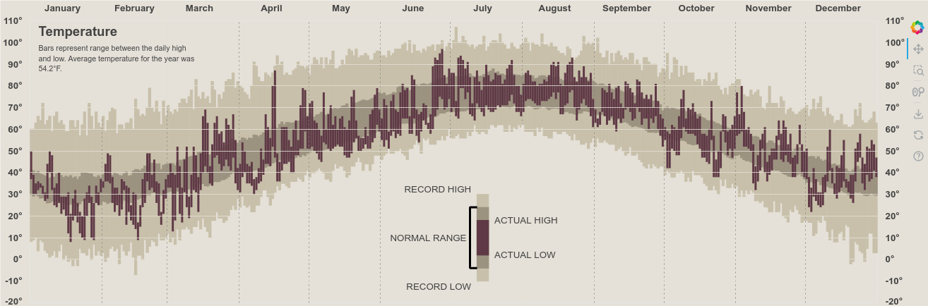
Precipitation
You know I love Matplotlib and, if you do too, make sure you join me for my FREE seminar this Thursday the 3rd of August for "Matplotlib Without matplotlib.pyplot," where we'll explore Matplotlib's backend API for customized plotting! (Did I mention it's free?)
With the temperature chart in a finished state, we can move onto our precipitation data. For this chart, we are going to visualize the cumulative precipitation within and annotate the average historical volume precipitation for each month.
One thing that makes this chart tricky is that Bokeh doesn't break vareas on nan values in the same way that Matplotlib does. This means that we will need to create individual varea glyphs for each month in our dataset.
Since we have already computed the monthly cumulative totals of precipitation, we can get straight to visualizing! We can iterate over each month of our data and draw VArea and Line glyphs. Additionally, I'd like to hold onto those ColumnDataSources just in case I need to update or manipulate them in the future.
output_file('tufte-bokeh/05.html')

from bokeh.model import collect_models
for model in collect_models(temperature_p):
    model.document = None

precip_p = figure(
    frame_width=temperature_p.frame_width, frame_height=temperature_p.frame_height//3,
    y_range=[0, 10], x_axis_type='datetime', x_range=temperature_p.x_range,
)

precip_sources = {}
for date, group in plot_data['precipitation'].fillna(0).resample('ME'):
    group = group.cumsum()
    group.loc[date + DateOffset(days=1)] = group[date]
    group = group.to_frame()
    group['baseline'] = 0
    cds = ColumnDataSource(group)

    precip_p.varea(
        x='date', y1='baseline', y2='precipitation',
        source=cds, color=palette['record_range']
    )
    precip_p.line(
        x='date', y='precipitation',
        source=cds,
        line_width=4
    )

    precip_sources[date.strftime('%b')] = cds

# Same aesthetics as the temperature chart
precip_p.xaxis.ticker = DaysTicker(days=[1, 15])
precip_p.xaxis.formatter = CustomJSTickFormatter(code="""
    var date = new Date(tick)
    var day = date.getUTCDate()
    if ( day == 15 ) { return date.toLocaleString('default', { month: 'long' }) }
    else { return "" }
""")
precip_p.xgrid.ticker = DaysTicker(days=[1])
precip_p.xgrid.grid_line_color = 'gray'
precip_p.xgrid.level = 'guide'
precip_p.xgrid.grid_line_dash = 'dotted'
precip_p.x_range.range_padding = 0

precip_p.yaxis.ticker = SingleIntervalTicker(interval=2, num_minor_ticks=0)
precip_p.ygrid.ticker = precip_p.yaxis.ticker
precip_p.ygrid.grid_line_color = palette['background']
precip_p.ygrid.level = 'guide'
precip_p.yaxis.formatter = PrintfTickFormatter(format='%d°')
precip_p.add_layout(precip_p.yaxis[0].clone(), 'right')

save(precip_p, 'tufte-bokeh/05.html')
export_png(precip_p, filename='tufte-bokeh/05.png');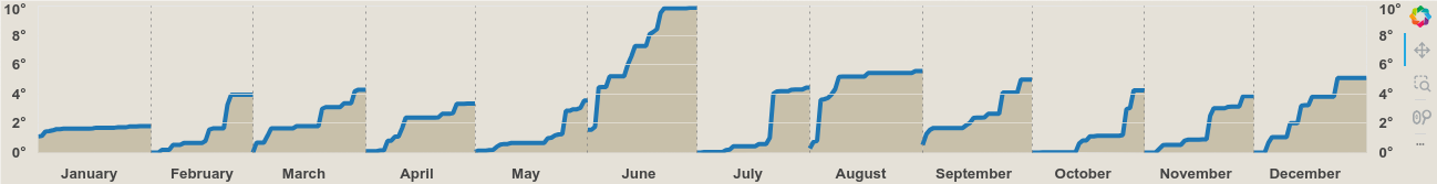
Contextual Data
With the cumulative monthly precipitation visualized, we now need to add horizontal lines to represent the normal volume of precipitation.
This requires a fairly straightforward data manipulation of a resample to calculate the monthly totals from each year, and then taking the average of each month across all years.
From there, we can use a MultiLine glyph to effectively draw many independent lines on our chart.
output_file('tufte-bokeh/06.html')

from numpy import column_stack
from pandas import Timestamp

precip_monthly = (
    nyc_2003.resample('MS')['precipitation'].sum()
    .to_frame('actual')
    .assign(normal=(
        nyc_historical.resample('MS')['precipitation'].sum()
        .pipe(lambda s: s.groupby(s.index.month).mean())
        .pipe(lambda s:
              s.set_axis(
                  [Timestamp(year=2003, month=i, day=1) for i in s.index]
              )
        ))
    )
)

from bokeh.models import MultiLine

source = ColumnDataSource({
    'xs': [*zip(precip_monthly.index,     precip_monthly.index + DateOffset(months=1))],
    'ys': [*zip(precip_monthly['normal'], precip_monthly['normal'])]
})

precip_p.multi_line(
    xs='xs', ys='ys', line_width=2, line_color='#1f77b4',
    source=source
)

save(precip_p, 'tufte-bokeh/06.html')
export_png(precip_p, filename='tufte-bokeh/06.png');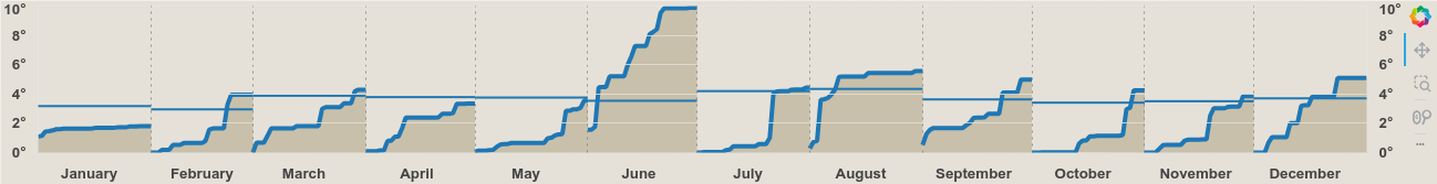
Labelling
Now we need to add some annotations or bokeh.models.Labels to this chart. This is actually a near 1:1 direct translation from my original Matplotlib code. All I did was change Axes.annotate for Label and supply the x_offset and y_offset instead of the xytext parameters of Axes.annotate.
The things we want to accomplish here is to label the Normal and Actual (observed) precipitation amounts. We simply iterate through our data and apply some defaults to ensure everything is placed into the correct locations.
output_file('tufte-bokeh/07.html')

from calendar import month_name
from bokeh.models import Label

precip_annot_defaults = {
    'normal': {'x_offset':  1, 'y_offset': 3, 'text_align': 'left', 'text_baseline': 'bottom', 'text_font_size': '8pt', 'text_font_style': 'italic'},
    'actual': {'x_offset': -1, 'y_offset': 3, 'text_align': 'right', 'text_baseline': 'bottom', 'text_font_size': '8pt'}
}

monthly_options = {
    'April': {'actual': {'text_baseline': 'top', 'x_offset': -2, 'y_offset': -18}},
    'June': {
        'normal': {'text_align': 'right', 'x_offset': -2, 'y_offset': 3},
        'actual': {'text_baseline': 'top', 'x_offset': -2, 'y_offset': -5}
    },
    'August': {'normal': {'text_align': 'right', 'text_baseline': 'top', 'x_offset': -5, 'y_offset': -5}}
}

for m in month_name[1:]:
    opts = monthly_options.get(m, {})
    opts['normal'] = precip_annot_defaults['normal'] | opts.get('normal', {})
    opts['actual'] = precip_annot_defaults['actual'] | opts.get('actual', {})
    monthly_options[m] = opts

for i, (date, row) in enumerate(precip_monthly.iterrows()):
    if i == 0:
        normal_prefix, actual_prefix = 'NORMAL\n', 'ACTUAL '
    else:
        normal_prefix, actual_prefix = '', ''

    left, right = date + DateOffset(days=1, minutes=-1), date + DateOffset(months=1, days=-1)
    options = (
        monthly_options.get(date.strftime('%B'))
    )

    x = left if options['normal']['text_align'] == 'left' else right
    normal_label = Label(
        text=f"{normal_prefix}{row['normal']:.2f}",
        x=x, y=row['normal'],
        **options['normal']
    )
    precip_p.add_layout(normal_label)

    x = left if options['actual']['text_align'] == 'left' else right
    actual_label = Label(
        text=f"{actual_prefix}{row['actual']:.2f}",
        x=x, y=row['actual'],
        **options['actual']
    )
    precip_p.add_layout(actual_label)

save(precip_p, 'tufte-bokeh/07.html')
export_png(precip_p, filename='tufte-bokeh/07.png');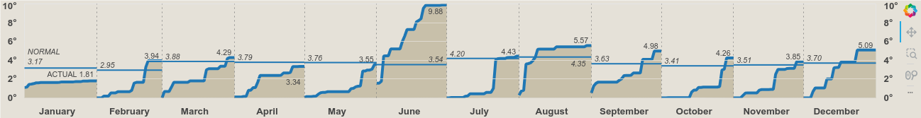
It's that time again! For the past few weeks, we've been working through the issue of Time-series alignment and visualization. In this final part, we're putting it all together into the perfect data viz!
But, before we get started, make sure you sign up for my seminar tomorrow, August 31st, titled, "How Do I Write Tests Using Pytest and Hypothesis?." Together, we'll unravel the art of writing comprehensive tests using Pytest and Hypothesis. Get 15% off your ticket by using discount code ALMOST_HERE or by using the link above.
Let's Combine It All!
Of course, we'll need to add in our Precipitation title/annotation and overall title. Our precipitation title will simply be a Title object that we create and add above our chart. We'll also take care that it has the same offset as the temperature title so that they are aligned with one another.
Finally, we'll add a super title for the entire chart and stick each of these piece together into a gridplot. I opted for the use of a bokeh.layouts.gridplot over the bokeh.layouts.column, simply for the convenience of the merge_tools argument that allows us to easily combine the toolbars from each of the respective temperature and precipitation plots.
We'll also configure some tools on this step:
from bokeh.layouts import gridplot
from bokeh.models import WheelZoomTool, PanTool, ResetTool, HoverTool, VBar

output_file('tufte-bokeh/08.html')

precip_annual = (
    nyc_historical.resample('YS')['precipitation'].agg(['sum', 'count'])
    .query('count > 300')
    .assign(rank=lambda d: d['sum'].rank(ascending=False))
)

precip_annots = {
    'total': precip_annual.loc['2003-01-01', 'sum'],
    'rank': precip_annual.loc['2003-01-01', 'rank'],
    'normal_diff': (
        precip_annual.loc['2003-01-01', 'sum'] -
        precip_annual.loc[:'2003-01-01', 'sum'].mean()
    )
}

# Better MathText coming… https://github.com/bokeh/bokeh/discussions/12632
#  would prefer composable text objects for applying different styles specifically
precip_title = Title(text=dedent(r'''
    $$\bf{Precipitaton}\textsf{  Cumulative monthly precipitation in inches
    compared with normal monthly precipitation. Total precipitation in 2003 was
    %.2f inches, %.2f more than normal, which
    makes the year the %dth wettest on record}$$
    ''' % (precip_annots['total'], precip_annots['normal_diff'], precip_annots['rank']))
    .strip().replace('\n', ' '),
    text_font_style='normal',
    text_font_size='7pt',
    offset=temperature_title.x
)
precip_p.add_layout(precip_title, 'above',)

suptitle = Div(text='New York City’s Weather in 2003', styles={'font-size': '20pt', 'font-weight': 'bold'})

# Ad-hoc toolbar customization, typically is easier to do this on figure creation
for p in [temperature_p, precip_p]:
    p.tools = [PanTool(dimensions='width'), (zoom := WheelZoomTool(dimensions='width')), ResetTool()]
    p.toolbar.active_scroll = zoom

# Add a hover tool so we can hover on our individual temperature values
temperature_p.tools.append(
    HoverTool(
        mode='vline',
        tooltips = [
            ('historical max', '@historical_max'),
            ('normal max', '@normal_max'),
            ('daily max', '@daily_max'),
            ('daily min', '@daily_min'),
            ('normal min', '@normal_min'),
            ('historical min', '@historical_min'),
            ('date', '@date{%F}'),
        ],
        formatters={'@date': 'datetime'},
        line_policy='prev',
        renderers=temperature_p.select('daily range')
))

# Slight workaround to maintain the blogpost style of using Bokeh
#   typically one would not save partial outputs while building a chart
from bokeh.model import collect_models
col = gridplot(
    [suptitle, temperature_p, precip_p], ncols=1, merge_tools=True,
)
for model in collect_models(col):
    model.document = None

save(col, 'tufte-bokeh/08.html')
export_png(col, filename='tufte-bokeh/08.png');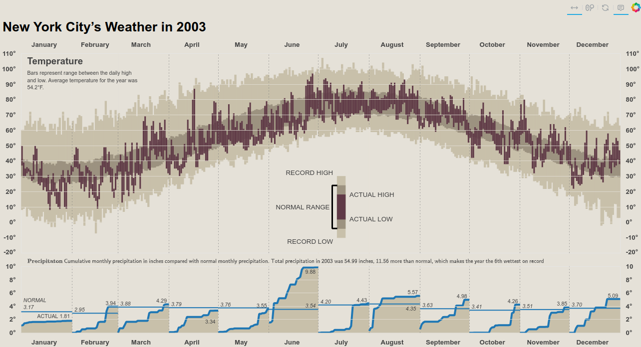
Note that all of the interactive tools we just added will only be available if you click the "See the interactive version here" button.
Wrap Up
And there we have it: a (pseudo) recreation of Edward Tufte’s famous NYC Weather from 2003, this time done in Bokeh! As a final touch, we could add things like contextual annotations, which were primarily related to the precipitation chart. However, I think we have accomplished what we set out to do without those additional labels. Bokeh has proven to be a fairly flexible tool, especially considering all of the state and message passing that it needs to do in addition to visualizing data.
If you need to create very high-touch, interactive, web-based data visualizations, I would highly recommend Bokeh. Talk to you all next time!